You can easily allow adding multiple images at once using repeating image fields. Here, we show you how to then display these images as galleries on the front-end.
Creating Galleries Using Repeating Image Fields
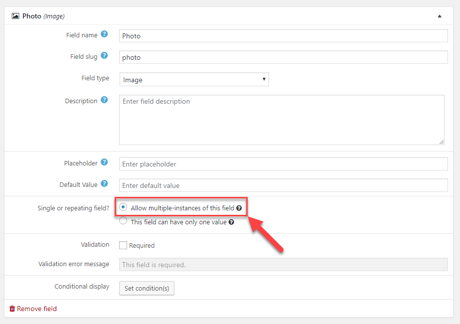
When creating or editing custom image fields you can see the Single or repeating field setting. Select Allow multiple-instances of this field to be able to add more than one image to your post.
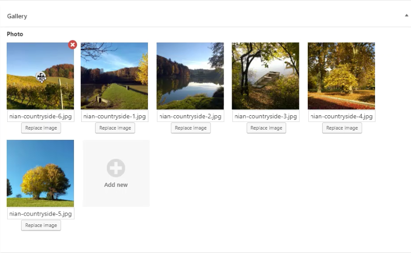
Now, users can add multiple images to posts that use your repeating image field. After adding images they can simply use drag-and-drop to rearrange them.
Using Views Shortcodes to display Images as a Gallery
Now that we can have multiple images in a single field, we want to display them as a gallery. We’ll do that by using the wpv-for-each shortcode and some additional CSS styling.
Here is an example of the code you can use inside your Content Templates:
<div class="tb-repeating-field tb-repeating-field--crop">
	<div class="tb-repeating-field--grid">
		[wpv-for-each field="wpcf-gallery"]
		<div>
			<a href="[types field='gallery' url='true' align='none' size='full' proportional='true' resize='proportional' title='%%TITLE%%' alt='%%ALT%%'][/types]">
			[types field='gallery' output='normal' align='none' size='full' proportional='true' resize='proportional' title='%%TITLE%%' alt='%%ALT%%'][/types]
			</a>
		</div>
		[/wpv-for-each"]
	</div>
</div>
This code does the following:
- Sets up the structure for a custom gallery output.
- Uses the wpv-for-each shortcode to go through all images found for the repeating image field.
- Outputs the image, with a link to the full-size version, so that the lightbox effect can be easily applied.
Note the tb-repeating-field–grid class on the second line. It calls our custom CSS to display gallery images in a grid. In our example, there are two more ways you can display the images with, CSS Flexbox and Masonry.
To use one of these gallery styles, simply replace the class on the second line with one of the following two classes.
- tb-repeating-field–flexbox for Flexbox
- tb-repeating-field–masonry for Masonry
Finally, let’s add our custom CSS. The following snippet covers all three gallery styles.
.tb-repeating-field--grid {
  grid-template-columns: 1fr 1fr 1fr ;
  grid-column-gap: 2px;
  grid-row-gap: 2px;
  display: grid;
  justify-items: center; }
  .tb-repeating-field--grid img,
  .tb-repeating-field--grid video {
    max-width: 100%;
    display: block;
    box-shadow: none !important; }

.tb-repeating-field:not(.tb-repeating-field--crop) .tb-repeating-field--grid {
  align-items: center; }

.tb-repeating-field--crop .tb-repeating-field--grid div,
.tb-repeating-field--crop .tb-repeating-field--flexbox div {
  width: 100%; }
  .tb-repeating-field--crop .tb-repeating-field--grid div img,
  .tb-repeating-field--crop .tb-repeating-field--flexbox div img {
    -o-object-fit: cover;
       object-fit: cover;
    height: 100%;
    width: 100%; }

.tb-repeating-field--flexbox {
  display: flex; }
  .tb-repeating-field--flexbox img {
    display: block;
    box-shadow: none !important; }

.tb-repeating-field--masonry {
  display: flex;
  flex-flow: row wrap;
  margin-left: -8px;
  /* Adjustment for the gutter */
  width: 100%; }
  .tb-repeating-field--masonry-brick {
    flex: auto;
    height: 250px;
    min-width: 150px;
    margin: 0 8px 8px 0;
    /* Some gutter */ }
    @media only screen and (min-width: 1024px) {
      .tb-repeating-field--masonry-brick:nth-child(4n+1) {
        width: 250px; }
      .tb-repeating-field--masonry-brick:nth-child(4n+2) {
        width: 325px; }
      .tb-repeating-field--masonry-brick:nth-child(4n+3) {
        width: 180px; }
      .tb-repeating-field--masonry-brick:nth-child(4n+4) {
        width: 380px; } }
    @media only screen and (max-width: 1023px) and (min-width: 768px) {
      .tb-repeating-field--masonry-brick:nth-child(4n+1) {
        width: 200px; }
      .tb-repeating-field--masonry-brick:nth-child(4n+2) {
        width: 250px; }
      .tb-repeating-field--masonry-brick:nth-child(4n+3) {
        width: 120px; }
      .tb-repeating-field--masonry-brick:nth-child(4n+4) {
        width: 280px; } }
    .tb-repeating-field--masonry-brick img,
    .tb-repeating-field--masonry-brick iframe,
    .tb-repeating-field--masonry-brick video {
      -o-object-fit: cover;
         object-fit: cover;
      width: 100% !important;
      height: 100% !important;
      display: block; }
  .editor-block-list__block-edit .tb-repeating-field--masonry-brick {
    height: 130px; }
    .editor-block-list__block-edit .tb-repeating-field--masonry-brick:nth-child(4n+1) {
      width: 150px; }
    .editor-block-list__block-edit .tb-repeating-field--masonry-brick:nth-child(4n+2) {
      width: 180px; }
    .editor-block-list__block-edit .tb-repeating-field--masonry-brick:nth-child(4n+3) {
      width: 90px; }
    .editor-block-list__block-edit .tb-repeating-field--masonry-brick:nth-child(4n+4) {
      width: 210px; }