Different pages and sites often need to be optimized for different device sizes. By allowing you to select the column width of your layouts grid, Layouts enables you to optimize your designs for a specific screen size.
Some sites need to look good on mobile phones and their small-sized screens, for example, a website about mobile phones. However, if you are selling desktop software, it is probably a good idea to optimize at least the download page for big desktop screens.

What is a column width of a grid?
Since Layouts uses the Bootstrap grid to position elements, it enables you to select the column width of that grid. Column width is basically a Bootstrap CSS class used for the rows and cells in your layout.
The following markup is an example of a layout’s row output on the front-end.
<div class="row" >
	<div class="col-md-12">
		CONTENTS GO HERE ...
	</div>
</div>
In Layouts, the default column width (class) is col-md- for Bootstrap 4 and col-sm- for Bootstrap 3. This means that layouts are optimized for small devices by default. The numeric part of the class, 12 (i.e. col-md-12), specifies the number of columns that the element uses, or “fills”.
To learn more about Bootstrap grids, classes, and related sizes, please visit the official documentation about grid options.
Changing the default column width for the entire site
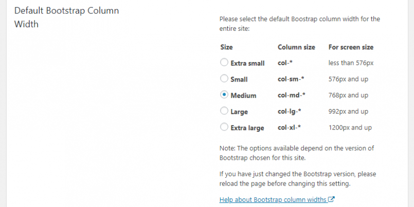
The Layouts plugin allows you to change the default column width for the entire site. This affects all the new layouts created in the site, as well as all the existing layouts that do not have this setting changed individually.
Please note that layouts for which you individually set the column width are not affected by changing the default column width globally.
To change the default column width for your site, go to the Toolset -> Settings page and click on the Layouts tab. There, scroll to Default Bootstrap Column Width and select the preferred option.
Changing a layout’s column width
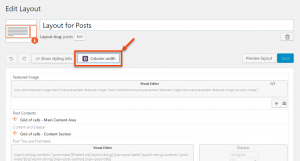
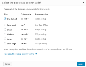
To change the column width of any layout’s grid, click on Column width button in the layout editor. There, simply select a preferred column width in the pop-up dialog that appears.
| Column width button in the editor | Column width selection dialog |
|---|---|
 |
 |
How to customize the grid manually
Sometimes, as you design layouts for different sites and pages, you need a specific, custom “logic” to specify how elements are presented on the screens of various devices and sizes.
For example, on extremely small devices, you might want a featured image of a news article to appear above the text, while on the medium and big-sized devices, you may want the image to appear next to the same text.
You can easily achieve this and more, by applying specific Bootstrap classes to the elements of your layouts. Learn how to do this in our tutorial about creating responsive designs.
