A layout is made up of one or more rows. Layouts let you select the row type to determine how rows appear on the front-end. Normal rows display inside the parent container while full-width rows let you extend the background and the cell content.
The two main types of layouts, layouts for templates and layouts for single posts and pages, feature slightly different types of rows.
Row types in layouts for templates
With layouts for templates, you are designing your whole page, including the content and any sidebars. Using different row types allows you to design parts of the content that use a defined, limited width, or the ones that spread across the whole browser window.
The following table lists the three main row types. Please note that some theme integrations feature additional, theme-specific row types. You can learn more about them in our documentation for theme integrations.
| Row mode | Icon | Recommended usage | Front-end example |
|---|---|---|---|
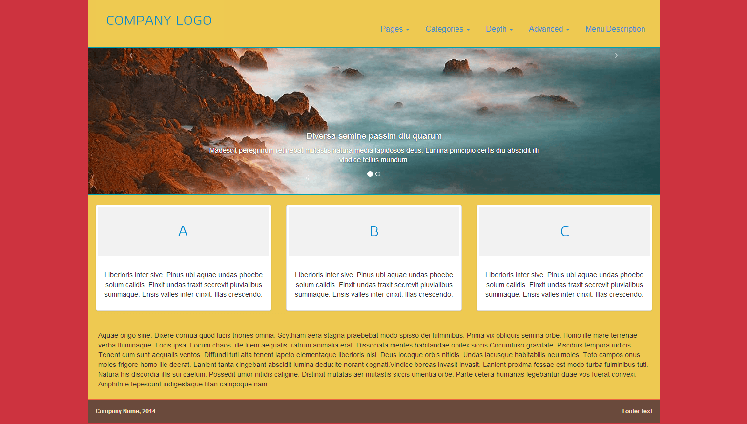
| Row same as container width | 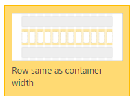 |
Use when you want the content to have a limited width within a page.
On large screens, this will make the content of the layout 1200 pixels in width. |
 HTML & CSS OUTPUT |
| Row background extends to full width | 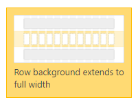 |
Use when you want the content to have limited width but want the row background to extend to the full width of the browser window. | 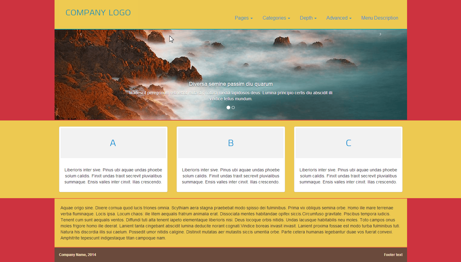
|
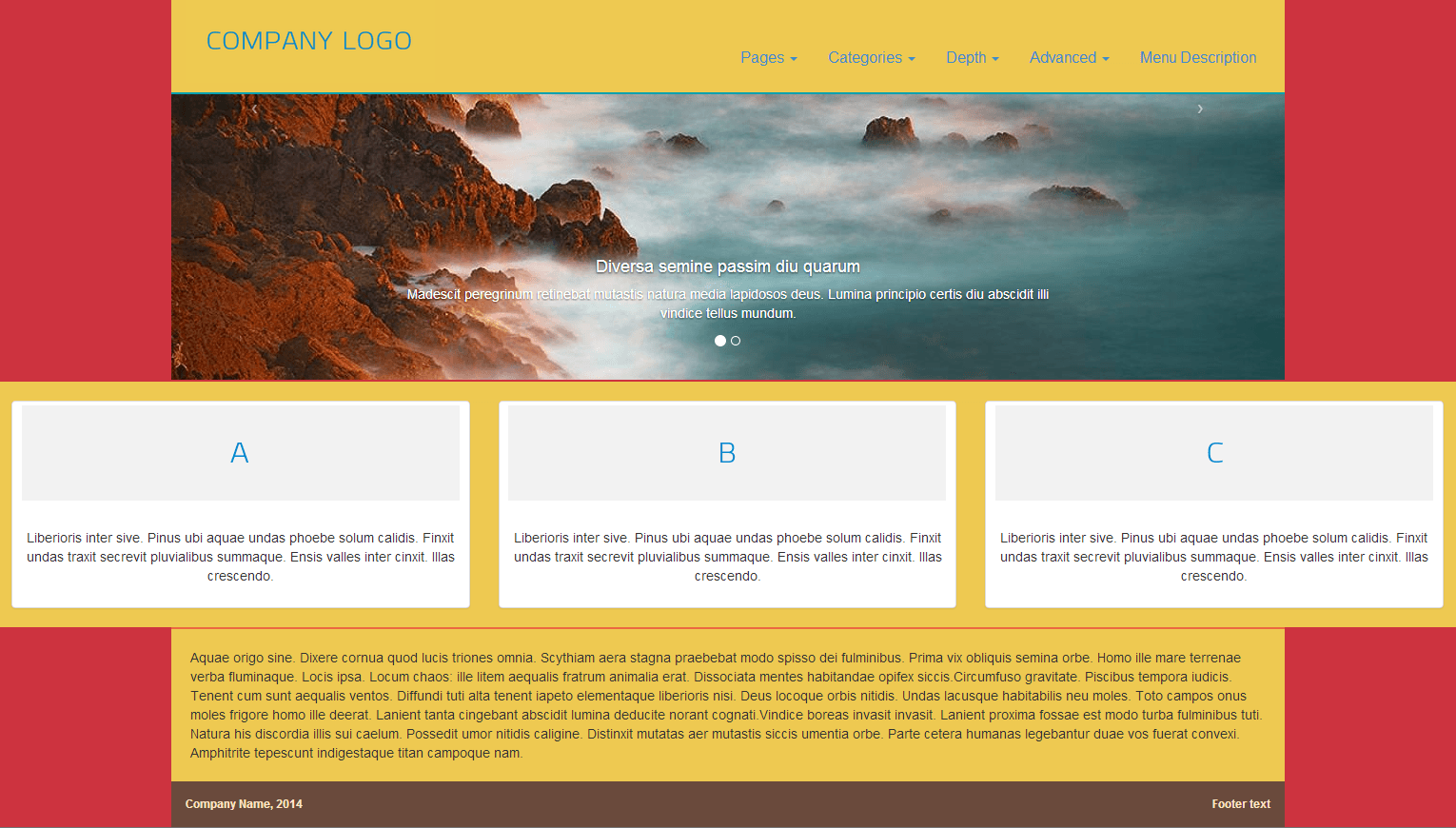
| Cells extend to the full width | 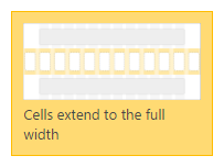 |
Use when you want the whole content, including its background, to extend to the full width of the browser window.
This row type is useful for creating special pages like a homepage and landing pages. |
|
Row types in layouts for single pages
When creating layouts for single pages, you are only designing the content part of the page. The design of other areas on the page, including the header, sidebar, and footer is defined by the template layout, parent layout, or theme itself.
This means that the row types you choose inside your layouts for single pages are relative to the available content area.

The following table lists the three main row types available in layouts for single pages.
| Row mode | Icon | Recommended usage | Front-end example |
|---|---|---|---|
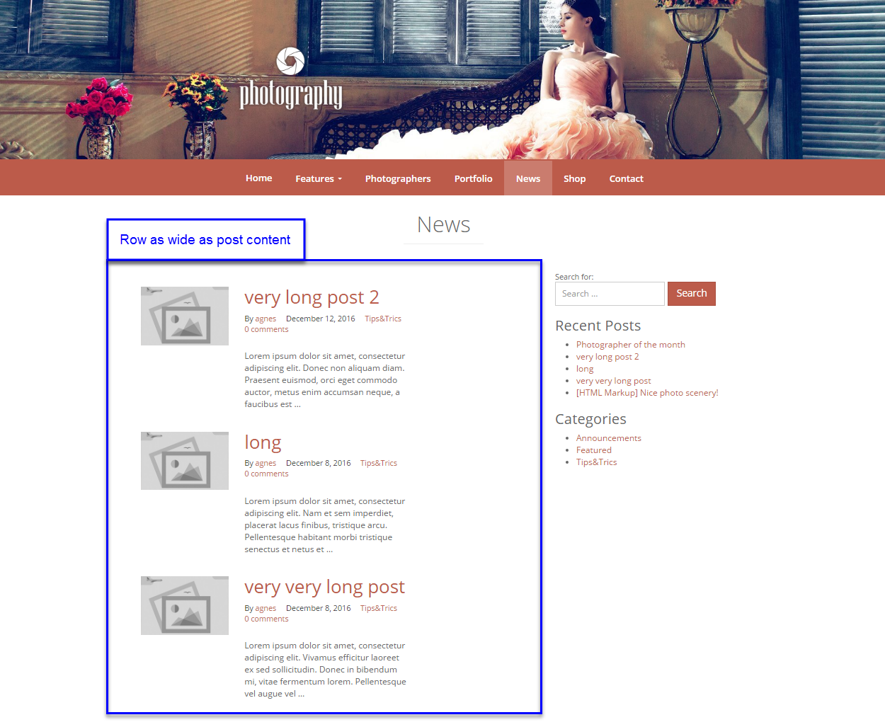
| Row as wide as post content | 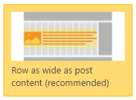 |
Use when you want the post contents to be exactly as wide as it is defined by the template layout or the theme.
This is the default, recommended row type. |
 HTML & CSS OUTPUT |
| Row as wide as Bootstrap .container | 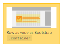 |
Post contents appear in the middle of the layout’s content area.
Please note that this row type will work well only when theme width is 1200 pixels, plus the width of a sidebar (if one is used). Otherwise, the page output will appear broken. |
 HTML & CSS OUTPUT |
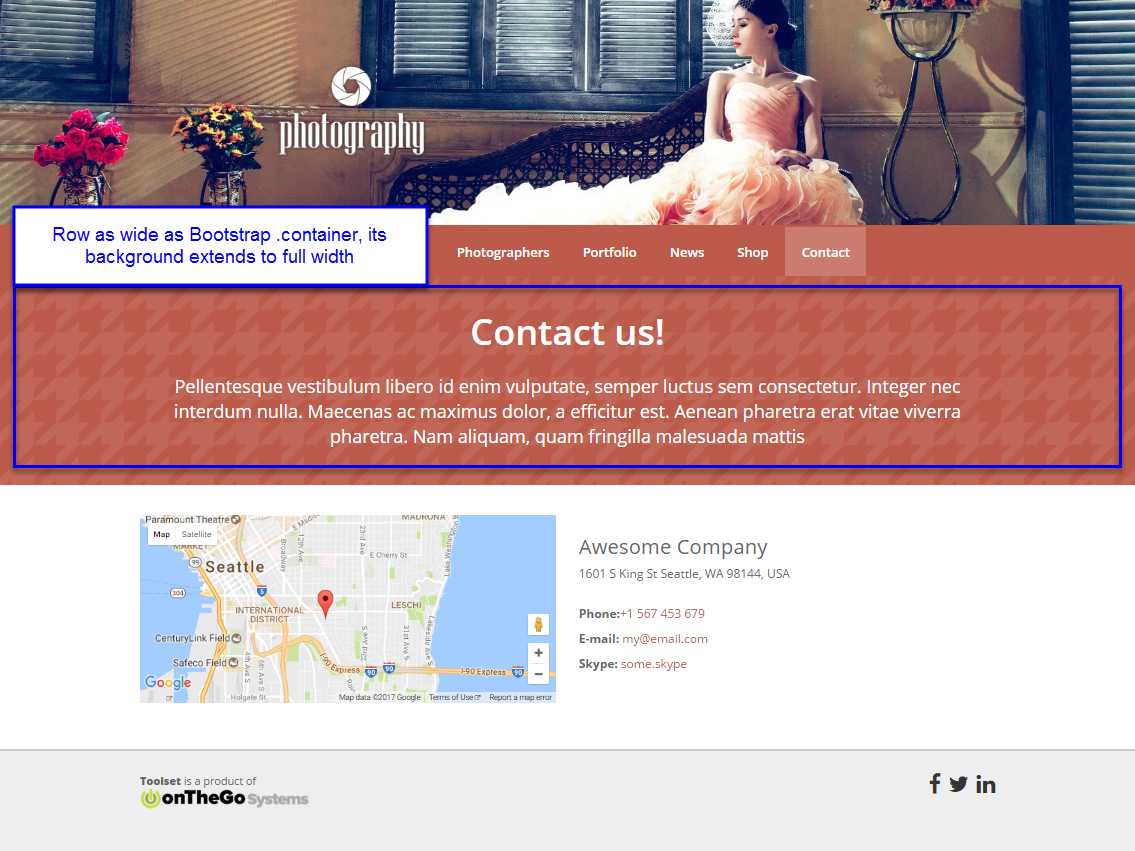
| Row as wide as Bootstrap .container, its background extends to full width | 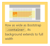 |
Post contents are stretched to the full width of the layout template’s or the theme’s container.
Please note that if the template layout or the theme features any sidebar, it will overlap with the contents and look broken. |
 HTML & CSS OUTPUT |