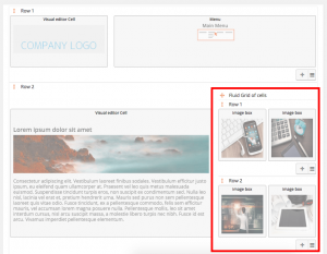
Grids are cells which contain one or more rows of other cells. Since Bootstrap version 3, cells have a fluid width.
Fluid-width grids may contain 1, 2, 3, 5, 6, or 12 equally spaced columns. The columns become wider or narrower as the grid cell is resized.
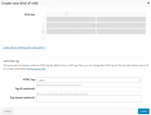
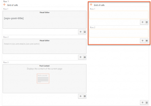
Now, we will add a fluid grid of 2 columns and 2 rows. You can set the number of columns in the grid when you create it.
Now, we have a grid 2 columns wide with 2 rows.
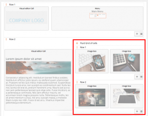
We can add content to each cell in the grid, by clicking on the cells.
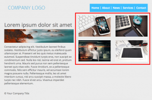
Finally, we can check the result in the front-end.
When we resize fluid grids, the cells inside the grid will become larger or smaller. We’ll make the grid take up 4 columns in the parent row. The cells in the grid will be made smaller to fit into the 4 columns.
You can add more rows to the fluid grid by clicking on the “Plus” button.
