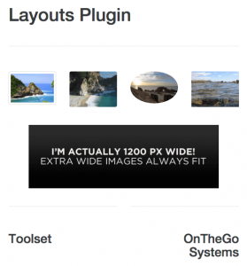
The Image cell allows you to add images with their title and a description to layouts.
Image effects and options
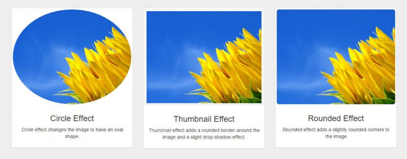
You can apply three built-in effects to images:
- Circle
- Thumbnail
- Rounded
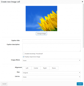
Besides these, the Image cell also features all of the standard WordPress image options:
- Alignment – alignment of the image inside its allocated space in a layout. Important because it influences how image Caption title and Caption description are positioned in regards to the image itself.
- Size – choose from all standard and custom WordPress image sizes
- Link to – what image links (points) to
- Image title attribute – title attribute added to the image tag
- Image CSS class – CSS class added to the image tag
- Link rel – the rel attribute added to the link that the image points to
- Link CSS class – CSS class added to the link that the image points to
Title and captions using HTML formatting
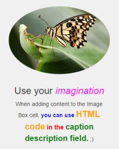
The Image cell allows you to use any HTML inside the Caption title and Caption description fields. Using HTML markup, you can format the text to your liking, as shown in the following image.
Using responsive images in your layouts
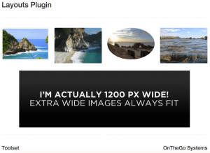
Using responsive images is a crucial part of building responsive sites in general. It allows you to select a single image with the size and quality of your preference, which will then be automatically resized based on the size of the screen (device) that is rendering the website.
We offer image responsiveness by default because only in very specific cases do you want to preserve the exact size of an image, regardless of the side effects this may produce.
If you want to disable the “Responsive image” feature, simply uncheck the default Display responsive image option. Please be aware that this decision can negatively impact page rendering when the viewport reduces in size.
Let’s examine three examples of this on the front-end.
1. A page displayed on a bigger screen (e.g. desktop), where all images are responsive.
2. A page in which one image is forced not to be responsive and the screen is considerably reduced in size (e.g., on a mobile phone). Notice how the images overlap. This happens because the non-responsive image does not adapt to the smaller screen.
3. A page in which the screen remains small (e.g., on a mobile phone), but the images are responsive, allowing them to preserve their properties, proportions, and positioning.
As shown, this is essentially a “one image file for all screen sizes” approach. Its importance lies in being able to adapt to different devices and in reducing the overall loading time and size of your site.
Because the Layouts plugin uses a Bootstrap framework, the Image cell also uses its built-in features related to responsive images.
Two options are related to responsive images:
- Display responsive image—checked by default
- Display image as a thumbnail—unchecked by default
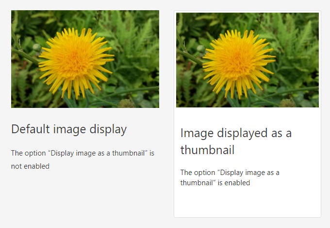
If you want to add an aesthetic “photo look”, enable the Display image as a thumbnail. The following image displays the difference when this effect is turned on and off.
The Image cell displays responsive images by adding an img-fluid class to them. This means that the image will adapt to the size of the screen on which it is rendered: compact on a small and expanded on a large.
If you want to disable image responsiveness for any reason, check the Disable responsive image option.
