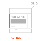
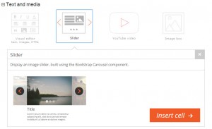
The custom cells API allows you to turn custom theme functionality into cells, which users can drag and drop. To produce aesthetically appealing cells inside the layouts editor, we recommend that you generate matching cell graphics. In this manner, your custom cells will appear as native parts of Layouts and will be easy for your users to find and comprehend.
Every cell, including built-in and custom cells that you develop, require two images:
File Format
For optimal visual quality, we recommend to prepare your cell icon in SVG image format. PNG image format will also work but with less overall image quality.
The cell detailed image must be prepared in PNG image format because images of this kind are too complex for the SVG format.
Color schemes
When creating your custom cell graphics, you may use any preferred color scheme. However, for visual consistency, we recommend using the scheme implemented in the Layouts cell-insertion dialog:
- Light grey for the grid; color code: #CCCCCC
- Orange for highlighting the action/purpose of the cell; color code: #F15A24

Stroke width
For the design of the Cell icon, the minimum stroke width should be 2 Pt (points).
For the design of the Cell detailed image, using a stroke width of at least 1 pt is important. If the design allows it, we recommend using a stroke width of 2 pt.
Fonts
Because the design for both the cell’s icon and detailed image is saved in PNG or SVG format, the selection of the used font is not critical because it is not a “live text.”
However, the Open Sans font family is highly recommended for its clarity and simplicity. It supports many languages and displays extremely well in different platforms. Open Sans is a free font, available on the Google fonts website: http://www.google.com/fonts.
