LnRiLWNvbnRhaW5lciAudGItY29udGFpbmVyLWlubmVye3dpZHRoOjEwMCU7bWFyZ2luOjAgYXV0b30gLndwLWJsb2NrLXRvb2xzZXQtYmxvY2tzLWNvbnRhaW5lci50Yi1jb250YWluZXJbZGF0YS10b29sc2V0LWJsb2Nrcy1jb250YWluZXI9ImQyYzRlYjkyZGIxZTM5ODQ5NmZiYWE0MjRkNmViNzAxIl0geyBwYWRkaW5nOiAwcHggMHB4IDQwcHggMHB4OyB9IC50Yi1jb250YWluZXIgLnRiLWNvbnRhaW5lci1pbm5lcnt3aWR0aDoxMDAlO21hcmdpbjowIGF1dG99IC53cC1ibG9jay10b29sc2V0LWJsb2Nrcy1jb250YWluZXIudGItY29udGFpbmVyW2RhdGEtdG9vbHNldC1ibG9ja3MtY29udGFpbmVyPSI5NmRkNDkzYzE4MzkzYjY2YWQ3N2UzZmEyMjdhNzIyNyJdIHsgcGFkZGluZzogNDBweCAwcHggMHB4IDBweDsgfSAudGItZmllbGRbZGF0YS10b29sc2V0LWJsb2Nrcy1maWVsZD0iN2Q5MzVhZGE3ODIxM2MwOWQ1NDczZjM3YjI5M2I0ZDciXSB7IHRleHQtYWxpZ246IGxlZnQ7IH0gLnRiLWZpZWxkW2RhdGEtdG9vbHNldC1ibG9ja3MtZmllbGQ9IjdkOTM1YWRhNzgyMTNjMDlkNTQ3M2YzN2IyOTNiNGQ3Il0gYSB7IHRleHQtZGVjb3JhdGlvbjogbm9uZTsgfSAgLnRiLWltYWdle3Bvc2l0aW9uOnJlbGF0aXZlO3RyYW5zaXRpb246dHJhbnNmb3JtIDAuMjVzIGVhc2V9LndwLWJsb2NrLWltYWdlIC50Yi1pbWFnZS5hbGlnbmNlbnRlcnttYXJnaW4tbGVmdDphdXRvO21hcmdpbi1yaWdodDphdXRvfS50Yi1pbWFnZSBpbWd7bWF4LXdpZHRoOjEwMCU7aGVpZ2h0OmF1dG87d2lkdGg6YXV0bzt0cmFuc2l0aW9uOnRyYW5zZm9ybSAwLjI1cyBlYXNlfS50Yi1pbWFnZSAudGItaW1hZ2UtY2FwdGlvbi1maXQtdG8taW1hZ2V7ZGlzcGxheTp0YWJsZX0udGItaW1hZ2UgLnRiLWltYWdlLWNhcHRpb24tZml0LXRvLWltYWdlIC50Yi1pbWFnZS1jYXB0aW9ue2Rpc3BsYXk6dGFibGUtY2FwdGlvbjtjYXB0aW9uLXNpZGU6Ym90dG9tfSAudGItaW1hZ2VbZGF0YS10b29sc2V0LWJsb2Nrcy1pbWFnZT0iZGI5ODk2YjViNjQyOGM0MzBjNjUzYzliYzkzMjk5NDQiXSB7IG1heC13aWR0aDogMTAwJTsgfSAudGItaW1hZ2VbZGF0YS10b29sc2V0LWJsb2Nrcy1pbWFnZT0iZGI5ODk2YjViNjQyOGM0MzBjNjUzYzliYzkzMjk5NDQiXSBpbWcgeyBib3JkZXI6IDFweCBzb2xpZCByZ2JhKCAyMjIsIDIyMiwgMjIyLCAxICk7IH0gLnRiLWltYWdle3Bvc2l0aW9uOnJlbGF0aXZlO3RyYW5zaXRpb246dHJhbnNmb3JtIDAuMjVzIGVhc2V9LndwLWJsb2NrLWltYWdlIC50Yi1pbWFnZS5hbGlnbmNlbnRlcnttYXJnaW4tbGVmdDphdXRvO21hcmdpbi1yaWdodDphdXRvfS50Yi1pbWFnZSBpbWd7bWF4LXdpZHRoOjEwMCU7aGVpZ2h0OmF1dG87d2lkdGg6YXV0bzt0cmFuc2l0aW9uOnRyYW5zZm9ybSAwLjI1cyBlYXNlfS50Yi1pbWFnZSAudGItaW1hZ2UtY2FwdGlvbi1maXQtdG8taW1hZ2V7ZGlzcGxheTp0YWJsZX0udGItaW1hZ2UgLnRiLWltYWdlLWNhcHRpb24tZml0LXRvLWltYWdlIC50Yi1pbWFnZS1jYXB0aW9ue2Rpc3BsYXk6dGFibGUtY2FwdGlvbjtjYXB0aW9uLXNpZGU6Ym90dG9tfSAudGItaW1hZ2VbZGF0YS10b29sc2V0LWJsb2Nrcy1pbWFnZT0iODVkMWVmMDdlNzc1ZjIyNGU5OWEzOTI5N2Y2NGZkNjAiXSB7IG1heC13aWR0aDogMTAwJTsgfSAudGItaW1hZ2VbZGF0YS10b29sc2V0LWJsb2Nrcy1pbWFnZT0iODVkMWVmMDdlNzc1ZjIyNGU5OWEzOTI5N2Y2NGZkNjAiXSBpbWcgeyBib3JkZXI6IDFweCBzb2xpZCByZ2JhKCAyMjIsIDIyMiwgMjIyLCAxICk7IH0gLnRiLWltYWdle3Bvc2l0aW9uOnJlbGF0aXZlO3RyYW5zaXRpb246dHJhbnNmb3JtIDAuMjVzIGVhc2V9LndwLWJsb2NrLWltYWdlIC50Yi1pbWFnZS5hbGlnbmNlbnRlcnttYXJnaW4tbGVmdDphdXRvO21hcmdpbi1yaWdodDphdXRvfS50Yi1pbWFnZSBpbWd7bWF4LXdpZHRoOjEwMCU7aGVpZ2h0OmF1dG87d2lkdGg6YXV0bzt0cmFuc2l0aW9uOnRyYW5zZm9ybSAwLjI1cyBlYXNlfS50Yi1pbWFnZSAudGItaW1hZ2UtY2FwdGlvbi1maXQtdG8taW1hZ2V7ZGlzcGxheTp0YWJsZX0udGItaW1hZ2UgLnRiLWltYWdlLWNhcHRpb24tZml0LXRvLWltYWdlIC50Yi1pbWFnZS1jYXB0aW9ue2Rpc3BsYXk6dGFibGUtY2FwdGlvbjtjYXB0aW9uLXNpZGU6Ym90dG9tfSAudGItaW1hZ2VbZGF0YS10b29sc2V0LWJsb2Nrcy1pbWFnZT0iZWQwYzdkMmVjMWJlYThlNWI1MjEwMWRlZjVhZGEyOGYiXSB7IG1heC13aWR0aDogMTAwJTsgfSAudGItaW1hZ2VbZGF0YS10b29sc2V0LWJsb2Nrcy1pbWFnZT0iZWQwYzdkMmVjMWJlYThlNWI1MjEwMWRlZjVhZGEyOGYiXSBpbWcgeyBib3JkZXI6IDFweCBzb2xpZCByZ2JhKCAyMjIsIDIyMiwgMjIyLCAxICk7IH0gLnRiLWltYWdle3Bvc2l0aW9uOnJlbGF0aXZlO3RyYW5zaXRpb246dHJhbnNmb3JtIDAuMjVzIGVhc2V9LndwLWJsb2NrLWltYWdlIC50Yi1pbWFnZS5hbGlnbmNlbnRlcnttYXJnaW4tbGVmdDphdXRvO21hcmdpbi1yaWdodDphdXRvfS50Yi1pbWFnZSBpbWd7bWF4LXdpZHRoOjEwMCU7aGVpZ2h0OmF1dG87d2lkdGg6YXV0bzt0cmFuc2l0aW9uOnRyYW5zZm9ybSAwLjI1cyBlYXNlfS50Yi1pbWFnZSAudGItaW1hZ2UtY2FwdGlvbi1maXQtdG8taW1hZ2V7ZGlzcGxheTp0YWJsZX0udGItaW1hZ2UgLnRiLWltYWdlLWNhcHRpb24tZml0LXRvLWltYWdlIC50Yi1pbWFnZS1jYXB0aW9ue2Rpc3BsYXk6dGFibGUtY2FwdGlvbjtjYXB0aW9uLXNpZGU6Ym90dG9tfSAudGItaW1hZ2VbZGF0YS10b29sc2V0LWJsb2Nrcy1pbWFnZT0iNDhiMDBjZGRjOTc5YTg5NDkzNmE4OTk5ZjIwYjBjZmYiXSB7IG1heC13aWR0aDogMTAwJTsgfSAudGItaW1hZ2VbZGF0YS10b29sc2V0LWJsb2Nrcy1pbWFnZT0iNDhiMDBjZGRjOTc5YTg5NDkzNmE4OTk5ZjIwYjBjZmYiXSBpbWcgeyBib3JkZXI6IDFweCBzb2xpZCByZ2JhKCAyMjIsIDIyMiwgMjIyLCAxICk7IH0gLnRiLWltYWdle3Bvc2l0aW9uOnJlbGF0aXZlO3RyYW5zaXRpb246dHJhbnNmb3JtIDAuMjVzIGVhc2V9LndwLWJsb2NrLWltYWdlIC50Yi1pbWFnZS5hbGlnbmNlbnRlcnttYXJnaW4tbGVmdDphdXRvO21hcmdpbi1yaWdodDphdXRvfS50Yi1pbWFnZSBpbWd7bWF4LXdpZHRoOjEwMCU7aGVpZ2h0OmF1dG87d2lkdGg6YXV0bzt0cmFuc2l0aW9uOnRyYW5zZm9ybSAwLjI1cyBlYXNlfS50Yi1pbWFnZSAudGItaW1hZ2UtY2FwdGlvbi1maXQtdG8taW1hZ2V7ZGlzcGxheTp0YWJsZX0udGItaW1hZ2UgLnRiLWltYWdlLWNhcHRpb24tZml0LXRvLWltYWdlIC50Yi1pbWFnZS1jYXB0aW9ue2Rpc3BsYXk6dGFibGUtY2FwdGlvbjtjYXB0aW9uLXNpZGU6Ym90dG9tfSAudGItaW1hZ2VbZGF0YS10b29sc2V0LWJsb2Nrcy1pbWFnZT0iNWExYjY1MWQ0OTI5YTYxYjFjYzJiZjk3NzJlZDYwYTEiXSB7IG1heC13aWR0aDogMTAwJTsgfSAudGItaW1hZ2VbZGF0YS10b29sc2V0LWJsb2Nrcy1pbWFnZT0iNWExYjY1MWQ0OTI5YTYxYjFjYzJiZjk3NzJlZDYwYTEiXSBpbWcgeyBib3JkZXI6IDFweCBzb2xpZCByZ2JhKCAyMjIsIDIyMiwgMjIyLCAxICk7IH0gLnRiLWltYWdle3Bvc2l0aW9uOnJlbGF0aXZlO3RyYW5zaXRpb246dHJhbnNmb3JtIDAuMjVzIGVhc2V9LndwLWJsb2NrLWltYWdlIC50Yi1pbWFnZS5hbGlnbmNlbnRlcnttYXJnaW4tbGVmdDphdXRvO21hcmdpbi1yaWdodDphdXRvfS50Yi1pbWFnZSBpbWd7bWF4LXdpZHRoOjEwMCU7aGVpZ2h0OmF1dG87d2lkdGg6YXV0bzt0cmFuc2l0aW9uOnRyYW5zZm9ybSAwLjI1cyBlYXNlfS50Yi1pbWFnZSAudGItaW1hZ2UtY2FwdGlvbi1maXQtdG8taW1hZ2V7ZGlzcGxheTp0YWJsZX0udGItaW1hZ2UgLnRiLWltYWdlLWNhcHRpb24tZml0LXRvLWltYWdlIC50Yi1pbWFnZS1jYXB0aW9ue2Rpc3BsYXk6dGFibGUtY2FwdGlvbjtjYXB0aW9uLXNpZGU6Ym90dG9tfSAudGItaW1hZ2VbZGF0YS10b29sc2V0LWJsb2Nrcy1pbWFnZT0iZGY0MDY5ZWI3NDJlYzM5ZjY3M2EwYTdiYjY0MGQ3MGYiXSB7IG1heC13aWR0aDogMTAwJTsgfSAudGItaW1hZ2VbZGF0YS10b29sc2V0LWJsb2Nrcy1pbWFnZT0iZGY0MDY5ZWI3NDJlYzM5ZjY3M2EwYTdiYjY0MGQ3MGYiXSBpbWcgeyBib3JkZXI6IDFweCBzb2xpZCByZ2JhKCAyMjIsIDIyMiwgMjIyLCAxICk7IH0gLnRiLWltYWdle3Bvc2l0aW9uOnJlbGF0aXZlO3RyYW5zaXRpb246dHJhbnNmb3JtIDAuMjVzIGVhc2V9LndwLWJsb2NrLWltYWdlIC50Yi1pbWFnZS5hbGlnbmNlbnRlcnttYXJnaW4tbGVmdDphdXRvO21hcmdpbi1yaWdodDphdXRvfS50Yi1pbWFnZSBpbWd7bWF4LXdpZHRoOjEwMCU7aGVpZ2h0OmF1dG87d2lkdGg6YXV0bzt0cmFuc2l0aW9uOnRyYW5zZm9ybSAwLjI1cyBlYXNlfS50Yi1pbWFnZSAudGItaW1hZ2UtY2FwdGlvbi1maXQtdG8taW1hZ2V7ZGlzcGxheTp0YWJsZX0udGItaW1hZ2UgLnRiLWltYWdlLWNhcHRpb24tZml0LXRvLWltYWdlIC50Yi1pbWFnZS1jYXB0aW9ue2Rpc3BsYXk6dGFibGUtY2FwdGlvbjtjYXB0aW9uLXNpZGU6Ym90dG9tfSAudGItaW1hZ2VbZGF0YS10b29sc2V0LWJsb2Nrcy1pbWFnZT0iYWQ1ZmQ0MDc3MzI4ZDg5Yjc3OWVhYzI3OTdkN2FhZmEiXSB7IG1heC13aWR0aDogMTAwJTsgfSAudGItaW1hZ2VbZGF0YS10b29sc2V0LWJsb2Nrcy1pbWFnZT0iYWQ1ZmQ0MDc3MzI4ZDg5Yjc3OWVhYzI3OTdkN2FhZmEiXSBpbWcgeyBib3JkZXI6IDFweCBzb2xpZCByZ2JhKCAyMjIsIDIyMiwgMjIyLCAxICk7IH0gLnRiLWltYWdle3Bvc2l0aW9uOnJlbGF0aXZlO3RyYW5zaXRpb246dHJhbnNmb3JtIDAuMjVzIGVhc2V9LndwLWJsb2NrLWltYWdlIC50Yi1pbWFnZS5hbGlnbmNlbnRlcnttYXJnaW4tbGVmdDphdXRvO21hcmdpbi1yaWdodDphdXRvfS50Yi1pbWFnZSBpbWd7bWF4LXdpZHRoOjEwMCU7aGVpZ2h0OmF1dG87d2lkdGg6YXV0bzt0cmFuc2l0aW9uOnRyYW5zZm9ybSAwLjI1cyBlYXNlfS50Yi1pbWFnZSAudGItaW1hZ2UtY2FwdGlvbi1maXQtdG8taW1hZ2V7ZGlzcGxheTp0YWJsZX0udGItaW1hZ2UgLnRiLWltYWdlLWNhcHRpb24tZml0LXRvLWltYWdlIC50Yi1pbWFnZS1jYXB0aW9ue2Rpc3BsYXk6dGFibGUtY2FwdGlvbjtjYXB0aW9uLXNpZGU6Ym90dG9tfSAudGItaW1hZ2VbZGF0YS10b29sc2V0LWJsb2Nrcy1pbWFnZT0iMjc3YjM5MTk5YTFlZjI0YmUxOWQzMWJkMTA2NmNiMjIiXSB7IG1heC13aWR0aDogMTAwJTsgfSAudGItaW1hZ2VbZGF0YS10b29sc2V0LWJsb2Nrcy1pbWFnZT0iMjc3YjM5MTk5YTFlZjI0YmUxOWQzMWJkMTA2NmNiMjIiXSBpbWcgeyBib3JkZXI6IDFweCBzb2xpZCByZ2JhKCAyMjIsIDIyMiwgMjIyLCAxICk7IH0gLnRiLWltYWdle3Bvc2l0aW9uOnJlbGF0aXZlO3RyYW5zaXRpb246dHJhbnNmb3JtIDAuMjVzIGVhc2V9LndwLWJsb2NrLWltYWdlIC50Yi1pbWFnZS5hbGlnbmNlbnRlcnttYXJnaW4tbGVmdDphdXRvO21hcmdpbi1yaWdodDphdXRvfS50Yi1pbWFnZSBpbWd7bWF4LXdpZHRoOjEwMCU7aGVpZ2h0OmF1dG87d2lkdGg6YXV0bzt0cmFuc2l0aW9uOnRyYW5zZm9ybSAwLjI1cyBlYXNlfS50Yi1pbWFnZSAudGItaW1hZ2UtY2FwdGlvbi1maXQtdG8taW1hZ2V7ZGlzcGxheTp0YWJsZX0udGItaW1hZ2UgLnRiLWltYWdlLWNhcHRpb24tZml0LXRvLWltYWdlIC50Yi1pbWFnZS1jYXB0aW9ue2Rpc3BsYXk6dGFibGUtY2FwdGlvbjtjYXB0aW9uLXNpZGU6Ym90dG9tfSAudGItaW1hZ2VbZGF0YS10b29sc2V0LWJsb2Nrcy1pbWFnZT0iNTQwZDBkMzI3Nzk5ZGY4NDJlNzJjNmM3OGMyOThlNGYiXSB7IG1heC13aWR0aDogMTAwJTsgfSAudGItaW1hZ2VbZGF0YS10b29sc2V0LWJsb2Nrcy1pbWFnZT0iNTQwZDBkMzI3Nzk5ZGY4NDJlNzJjNmM3OGMyOThlNGYiXSBpbWcgeyBib3JkZXI6IDFweCBzb2xpZCByZ2JhKCAyMjIsIDIyMiwgMjIyLCAxICk7IH0gLnRiLWltYWdle3Bvc2l0aW9uOnJlbGF0aXZlO3RyYW5zaXRpb246dHJhbnNmb3JtIDAuMjVzIGVhc2V9LndwLWJsb2NrLWltYWdlIC50Yi1pbWFnZS5hbGlnbmNlbnRlcnttYXJnaW4tbGVmdDphdXRvO21hcmdpbi1yaWdodDphdXRvfS50Yi1pbWFnZSBpbWd7bWF4LXdpZHRoOjEwMCU7aGVpZ2h0OmF1dG87d2lkdGg6YXV0bzt0cmFuc2l0aW9uOnRyYW5zZm9ybSAwLjI1cyBlYXNlfS50Yi1pbWFnZSAudGItaW1hZ2UtY2FwdGlvbi1maXQtdG8taW1hZ2V7ZGlzcGxheTp0YWJsZX0udGItaW1hZ2UgLnRiLWltYWdlLWNhcHRpb24tZml0LXRvLWltYWdlIC50Yi1pbWFnZS1jYXB0aW9ue2Rpc3BsYXk6dGFibGUtY2FwdGlvbjtjYXB0aW9uLXNpZGU6Ym90dG9tfSAudGItaW1hZ2VbZGF0YS10b29sc2V0LWJsb2Nrcy1pbWFnZT0iYmFlZTYxNTg4MzQ1NDA4ZDcyNzZkMTg1MjAyNTVmM2IiXSB7IG1heC13aWR0aDogMTAwJTsgfSAudGItaW1hZ2VbZGF0YS10b29sc2V0LWJsb2Nrcy1pbWFnZT0iYmFlZTYxNTg4MzQ1NDA4ZDcyNzZkMTg1MjAyNTVmM2IiXSBpbWcgeyBib3JkZXI6IDFweCBzb2xpZCByZ2JhKCAyMjIsIDIyMiwgMjIyLCAxICk7IH0gLnRiLWltYWdle3Bvc2l0aW9uOnJlbGF0aXZlO3RyYW5zaXRpb246dHJhbnNmb3JtIDAuMjVzIGVhc2V9LndwLWJsb2NrLWltYWdlIC50Yi1pbWFnZS5hbGlnbmNlbnRlcnttYXJnaW4tbGVmdDphdXRvO21hcmdpbi1yaWdodDphdXRvfS50Yi1pbWFnZSBpbWd7bWF4LXdpZHRoOjEwMCU7aGVpZ2h0OmF1dG87d2lkdGg6YXV0bzt0cmFuc2l0aW9uOnRyYW5zZm9ybSAwLjI1cyBlYXNlfS50Yi1pbWFnZSAudGItaW1hZ2UtY2FwdGlvbi1maXQtdG8taW1hZ2V7ZGlzcGxheTp0YWJsZX0udGItaW1hZ2UgLnRiLWltYWdlLWNhcHRpb24tZml0LXRvLWltYWdlIC50Yi1pbWFnZS1jYXB0aW9ue2Rpc3BsYXk6dGFibGUtY2FwdGlvbjtjYXB0aW9uLXNpZGU6Ym90dG9tfSAudGItaW1hZ2VbZGF0YS10b29sc2V0LWJsb2Nrcy1pbWFnZT0iMzdhMTBjMDE3YjU3ZTE5NzUzNzQzZDUwNzUxZWE4NzciXSB7IG1heC13aWR0aDogMTAwJTsgfSAudGItaW1hZ2VbZGF0YS10b29sc2V0LWJsb2Nrcy1pbWFnZT0iMzdhMTBjMDE3YjU3ZTE5NzUzNzQzZDUwNzUxZWE4NzciXSBpbWcgeyBib3JkZXI6IDFweCBzb2xpZCByZ2JhKCAyMjIsIDIyMiwgMjIyLCAxICk7IH0gLnRiLWdyaWQsLnRiLWdyaWQ+LmJsb2NrLWVkaXRvci1pbm5lci1ibG9ja3M+LmJsb2NrLWVkaXRvci1ibG9jay1saXN0X19sYXlvdXR7ZGlzcGxheTpncmlkO2dyaWQtcm93LWdhcDoyNXB4O2dyaWQtY29sdW1uLWdhcDoyNXB4fS50Yi1ncmlkLWl0ZW17YmFja2dyb3VuZDojZDM4YTAzO3BhZGRpbmc6MzBweH0udGItZ3JpZC1jb2x1bW57ZmxleC13cmFwOndyYXB9LnRiLWdyaWQtY29sdW1uPip7d2lkdGg6MTAwJX0udGItZ3JpZC1jb2x1bW4udGItZ3JpZC1hbGlnbi10b3B7d2lkdGg6MTAwJTtkaXNwbGF5OmZsZXg7YWxpZ24tY29udGVudDpmbGV4LXN0YXJ0fS50Yi1ncmlkLWNvbHVtbi50Yi1ncmlkLWFsaWduLWNlbnRlcnt3aWR0aDoxMDAlO2Rpc3BsYXk6ZmxleDthbGlnbi1jb250ZW50OmNlbnRlcn0udGItZ3JpZC1jb2x1bW4udGItZ3JpZC1hbGlnbi1ib3R0b217d2lkdGg6MTAwJTtkaXNwbGF5OmZsZXg7YWxpZ24tY29udGVudDpmbGV4LWVuZH0gLndwLWJsb2NrLXRvb2xzZXQtYmxvY2tzLWdyaWQudGItZ3JpZFtkYXRhLXRvb2xzZXQtYmxvY2tzLWdyaWQ9IjNkOWMzOTlmZTYyNWUxYjk3MmY4MTdhMDY4MDIyOWY2Il0geyBncmlkLXRlbXBsYXRlLWNvbHVtbnM6IG1pbm1heCgwLCAwLjVmcikgbWlubWF4KDAsIDAuNWZyKTtncmlkLWF1dG8tZmxvdzogcm93IH0gLndwLWJsb2NrLXRvb2xzZXQtYmxvY2tzLWdyaWQudGItZ3JpZFtkYXRhLXRvb2xzZXQtYmxvY2tzLWdyaWQ9IjNkOWMzOTlmZTYyNWUxYjk3MmY4MTdhMDY4MDIyOWY2Il0gPiAudGItZ3JpZC1jb2x1bW46bnRoLW9mLXR5cGUoMm4gKyAxKSB7IGdyaWQtY29sdW1uOiAxIH0gLndwLWJsb2NrLXRvb2xzZXQtYmxvY2tzLWdyaWQudGItZ3JpZFtkYXRhLXRvb2xzZXQtYmxvY2tzLWdyaWQ9IjNkOWMzOTlmZTYyNWUxYjk3MmY4MTdhMDY4MDIyOWY2Il0gPiAudGItZ3JpZC1jb2x1bW46bnRoLW9mLXR5cGUoMm4gKyAyKSB7IGdyaWQtY29sdW1uOiAyIH0gLnRiLWltYWdle3Bvc2l0aW9uOnJlbGF0aXZlO3RyYW5zaXRpb246dHJhbnNmb3JtIDAuMjVzIGVhc2V9LndwLWJsb2NrLWltYWdlIC50Yi1pbWFnZS5hbGlnbmNlbnRlcnttYXJnaW4tbGVmdDphdXRvO21hcmdpbi1yaWdodDphdXRvfS50Yi1pbWFnZSBpbWd7bWF4LXdpZHRoOjEwMCU7aGVpZ2h0OmF1dG87d2lkdGg6YXV0bzt0cmFuc2l0aW9uOnRyYW5zZm9ybSAwLjI1cyBlYXNlfS50Yi1pbWFnZSAudGItaW1hZ2UtY2FwdGlvbi1maXQtdG8taW1hZ2V7ZGlzcGxheTp0YWJsZX0udGItaW1hZ2UgLnRiLWltYWdlLWNhcHRpb24tZml0LXRvLWltYWdlIC50Yi1pbWFnZS1jYXB0aW9ue2Rpc3BsYXk6dGFibGUtY2FwdGlvbjtjYXB0aW9uLXNpZGU6Ym90dG9tfSAudGItaW1hZ2VbZGF0YS10b29sc2V0LWJsb2Nrcy1pbWFnZT0iY2RjYWE1ZGVmZmM2MmQ0M2M4NGU2MDk5MjY0ZDZjZjAiXSB7IG1heC13aWR0aDogMTAwJTsgfSAudGItaW1hZ2VbZGF0YS10b29sc2V0LWJsb2Nrcy1pbWFnZT0iY2RjYWE1ZGVmZmM2MmQ0M2M4NGU2MDk5MjY0ZDZjZjAiXSBpbWcgeyBib3JkZXI6IDFweCBzb2xpZCByZ2JhKCAyMjIsIDIyMiwgMjIyLCAxICk7IH0gLnRiLWltYWdle3Bvc2l0aW9uOnJlbGF0aXZlO3RyYW5zaXRpb246dHJhbnNmb3JtIDAuMjVzIGVhc2V9LndwLWJsb2NrLWltYWdlIC50Yi1pbWFnZS5hbGlnbmNlbnRlcnttYXJnaW4tbGVmdDphdXRvO21hcmdpbi1yaWdodDphdXRvfS50Yi1pbWFnZSBpbWd7bWF4LXdpZHRoOjEwMCU7aGVpZ2h0OmF1dG87d2lkdGg6YXV0bzt0cmFuc2l0aW9uOnRyYW5zZm9ybSAwLjI1cyBlYXNlfS50Yi1pbWFnZSAudGItaW1hZ2UtY2FwdGlvbi1maXQtdG8taW1hZ2V7ZGlzcGxheTp0YWJsZX0udGItaW1hZ2UgLnRiLWltYWdlLWNhcHRpb24tZml0LXRvLWltYWdlIC50Yi1pbWFnZS1jYXB0aW9ue2Rpc3BsYXk6dGFibGUtY2FwdGlvbjtjYXB0aW9uLXNpZGU6Ym90dG9tfSAudGItaW1hZ2VbZGF0YS10b29sc2V0LWJsb2Nrcy1pbWFnZT0iNTU0ZTRjMjY5MDIzZGM0ZTZiMWViMzdhZTA1NjZlZTMiXSB7IG1heC13aWR0aDogMTAwJTsgfSAudGItaW1hZ2VbZGF0YS10b29sc2V0LWJsb2Nrcy1pbWFnZT0iNTU0ZTRjMjY5MDIzZGM0ZTZiMWViMzdhZTA1NjZlZTMiXSBpbWcgeyBib3JkZXI6IDFweCBzb2xpZCByZ2JhKCAyMjIsIDIyMiwgMjIyLCAxICk7IH0gLnRiLWltYWdle3Bvc2l0aW9uOnJlbGF0aXZlO3RyYW5zaXRpb246dHJhbnNmb3JtIDAuMjVzIGVhc2V9LndwLWJsb2NrLWltYWdlIC50Yi1pbWFnZS5hbGlnbmNlbnRlcnttYXJnaW4tbGVmdDphdXRvO21hcmdpbi1yaWdodDphdXRvfS50Yi1pbWFnZSBpbWd7bWF4LXdpZHRoOjEwMCU7aGVpZ2h0OmF1dG87d2lkdGg6YXV0bzt0cmFuc2l0aW9uOnRyYW5zZm9ybSAwLjI1cyBlYXNlfS50Yi1pbWFnZSAudGItaW1hZ2UtY2FwdGlvbi1maXQtdG8taW1hZ2V7ZGlzcGxheTp0YWJsZX0udGItaW1hZ2UgLnRiLWltYWdlLWNhcHRpb24tZml0LXRvLWltYWdlIC50Yi1pbWFnZS1jYXB0aW9ue2Rpc3BsYXk6dGFibGUtY2FwdGlvbjtjYXB0aW9uLXNpZGU6Ym90dG9tfSAudGItaW1hZ2VbZGF0YS10b29sc2V0LWJsb2Nrcy1pbWFnZT0iYTA2ZWQ0ZjFmOGYzOTI0YzY0NTJmNjIzNzg5ZjA2MDYiXSB7IG1heC13aWR0aDogMTAwJTsgfSAudGItaW1hZ2VbZGF0YS10b29sc2V0LWJsb2Nrcy1pbWFnZT0iYTA2ZWQ0ZjFmOGYzOTI0YzY0NTJmNjIzNzg5ZjA2MDYiXSBpbWcgeyBib3JkZXI6IDFweCBzb2xpZCByZ2JhKCAyMjIsIDIyMiwgMjIyLCAxICk7IH0gLnRiLWltYWdle3Bvc2l0aW9uOnJlbGF0aXZlO3RyYW5zaXRpb246dHJhbnNmb3JtIDAuMjVzIGVhc2V9LndwLWJsb2NrLWltYWdlIC50Yi1pbWFnZS5hbGlnbmNlbnRlcnttYXJnaW4tbGVmdDphdXRvO21hcmdpbi1yaWdodDphdXRvfS50Yi1pbWFnZSBpbWd7bWF4LXdpZHRoOjEwMCU7aGVpZ2h0OmF1dG87d2lkdGg6YXV0bzt0cmFuc2l0aW9uOnRyYW5zZm9ybSAwLjI1cyBlYXNlfS50Yi1pbWFnZSAudGItaW1hZ2UtY2FwdGlvbi1maXQtdG8taW1hZ2V7ZGlzcGxheTp0YWJsZX0udGItaW1hZ2UgLnRiLWltYWdlLWNhcHRpb24tZml0LXRvLWltYWdlIC50Yi1pbWFnZS1jYXB0aW9ue2Rpc3BsYXk6dGFibGUtY2FwdGlvbjtjYXB0aW9uLXNpZGU6Ym90dG9tfSAudGItaW1hZ2VbZGF0YS10b29sc2V0LWJsb2Nrcy1pbWFnZT0iYjAzZTIzYjgwNGQyMjkzY2UyNGUwMDNiNzVjNTNjNGEiXSB7IG1heC13aWR0aDogMTAwJTsgfSAudGItaW1hZ2VbZGF0YS10b29sc2V0LWJsb2Nrcy1pbWFnZT0iYjAzZTIzYjgwNGQyMjkzY2UyNGUwMDNiNzVjNTNjNGEiXSBpbWcgeyBib3JkZXI6IDFweCBzb2xpZCByZ2JhKCAyMjIsIDIyMiwgMjIyLCAxICk7IH0gLnRiLWltYWdle3Bvc2l0aW9uOnJlbGF0aXZlO3RyYW5zaXRpb246dHJhbnNmb3JtIDAuMjVzIGVhc2V9LndwLWJsb2NrLWltYWdlIC50Yi1pbWFnZS5hbGlnbmNlbnRlcnttYXJnaW4tbGVmdDphdXRvO21hcmdpbi1yaWdodDphdXRvfS50Yi1pbWFnZSBpbWd7bWF4LXdpZHRoOjEwMCU7aGVpZ2h0OmF1dG87d2lkdGg6YXV0bzt0cmFuc2l0aW9uOnRyYW5zZm9ybSAwLjI1cyBlYXNlfS50Yi1pbWFnZSAudGItaW1hZ2UtY2FwdGlvbi1maXQtdG8taW1hZ2V7ZGlzcGxheTp0YWJsZX0udGItaW1hZ2UgLnRiLWltYWdlLWNhcHRpb24tZml0LXRvLWltYWdlIC50Yi1pbWFnZS1jYXB0aW9ue2Rpc3BsYXk6dGFibGUtY2FwdGlvbjtjYXB0aW9uLXNpZGU6Ym90dG9tfSAudGItaW1hZ2VbZGF0YS10b29sc2V0LWJsb2Nrcy1pbWFnZT0iNjcxZGNiYzc2ZWMyN2MwNDBmMzY0MDNkNDYxOTZhOTQiXSB7IG1heC13aWR0aDogMTAwJTsgfSAudGItaW1hZ2VbZGF0YS10b29sc2V0LWJsb2Nrcy1pbWFnZT0iNjcxZGNiYzc2ZWMyN2MwNDBmMzY0MDNkNDYxOTZhOTQiXSBpbWcgeyBib3JkZXI6IDFweCBzb2xpZCByZ2JhKCAyMjIsIDIyMiwgMjIyLCAxICk7IH0gLnRiLWltYWdle3Bvc2l0aW9uOnJlbGF0aXZlO3RyYW5zaXRpb246dHJhbnNmb3JtIDAuMjVzIGVhc2V9LndwLWJsb2NrLWltYWdlIC50Yi1pbWFnZS5hbGlnbmNlbnRlcnttYXJnaW4tbGVmdDphdXRvO21hcmdpbi1yaWdodDphdXRvfS50Yi1pbWFnZSBpbWd7bWF4LXdpZHRoOjEwMCU7aGVpZ2h0OmF1dG87d2lkdGg6YXV0bzt0cmFuc2l0aW9uOnRyYW5zZm9ybSAwLjI1cyBlYXNlfS50Yi1pbWFnZSAudGItaW1hZ2UtY2FwdGlvbi1maXQtdG8taW1hZ2V7ZGlzcGxheTp0YWJsZX0udGItaW1hZ2UgLnRiLWltYWdlLWNhcHRpb24tZml0LXRvLWltYWdlIC50Yi1pbWFnZS1jYXB0aW9ue2Rpc3BsYXk6dGFibGUtY2FwdGlvbjtjYXB0aW9uLXNpZGU6Ym90dG9tfSAudGItaW1hZ2VbZGF0YS10b29sc2V0LWJsb2Nrcy1pbWFnZT0iNThkMWZiZGYwOWY0YzEzYzExNzBmNTRjZmI4YzRkZjIiXSB7IG1heC13aWR0aDogMTAwJTsgfSAudGItaW1hZ2VbZGF0YS10b29sc2V0LWJsb2Nrcy1pbWFnZT0iNThkMWZiZGYwOWY0YzEzYzExNzBmNTRjZmI4YzRkZjIiXSBpbWcgeyBib3JkZXI6IDFweCBzb2xpZCByZ2JhKCAyMjIsIDIyMiwgMjIyLCAxICk7IH0gLnRiLWltYWdle3Bvc2l0aW9uOnJlbGF0aXZlO3RyYW5zaXRpb246dHJhbnNmb3JtIDAuMjVzIGVhc2V9LndwLWJsb2NrLWltYWdlIC50Yi1pbWFnZS5hbGlnbmNlbnRlcnttYXJnaW4tbGVmdDphdXRvO21hcmdpbi1yaWdodDphdXRvfS50Yi1pbWFnZSBpbWd7bWF4LXdpZHRoOjEwMCU7aGVpZ2h0OmF1dG87d2lkdGg6YXV0bzt0cmFuc2l0aW9uOnRyYW5zZm9ybSAwLjI1cyBlYXNlfS50Yi1pbWFnZSAudGItaW1hZ2UtY2FwdGlvbi1maXQtdG8taW1hZ2V7ZGlzcGxheTp0YWJsZX0udGItaW1hZ2UgLnRiLWltYWdlLWNhcHRpb24tZml0LXRvLWltYWdlIC50Yi1pbWFnZS1jYXB0aW9ue2Rpc3BsYXk6dGFibGUtY2FwdGlvbjtjYXB0aW9uLXNpZGU6Ym90dG9tfSAudGItaW1hZ2VbZGF0YS10b29sc2V0LWJsb2Nrcy1pbWFnZT0iM2MyMmY3MDA3MDRmMmNlODU1ZDgxZTEwNTk0NzE4NWYiXSB7IG1heC13aWR0aDogMTAwJTsgfSAudGItaW1hZ2VbZGF0YS10b29sc2V0LWJsb2Nrcy1pbWFnZT0iM2MyMmY3MDA3MDRmMmNlODU1ZDgxZTEwNTk0NzE4NWYiXSBpbWcgeyBib3JkZXI6IDFweCBzb2xpZCByZ2JhKCAyMjIsIDIyMiwgMjIyLCAxICk7IH0gLnRiLWltYWdle3Bvc2l0aW9uOnJlbGF0aXZlO3RyYW5zaXRpb246dHJhbnNmb3JtIDAuMjVzIGVhc2V9LndwLWJsb2NrLWltYWdlIC50Yi1pbWFnZS5hbGlnbmNlbnRlcnttYXJnaW4tbGVmdDphdXRvO21hcmdpbi1yaWdodDphdXRvfS50Yi1pbWFnZSBpbWd7bWF4LXdpZHRoOjEwMCU7aGVpZ2h0OmF1dG87d2lkdGg6YXV0bzt0cmFuc2l0aW9uOnRyYW5zZm9ybSAwLjI1cyBlYXNlfS50Yi1pbWFnZSAudGItaW1hZ2UtY2FwdGlvbi1maXQtdG8taW1hZ2V7ZGlzcGxheTp0YWJsZX0udGItaW1hZ2UgLnRiLWltYWdlLWNhcHRpb24tZml0LXRvLWltYWdlIC50Yi1pbWFnZS1jYXB0aW9ue2Rpc3BsYXk6dGFibGUtY2FwdGlvbjtjYXB0aW9uLXNpZGU6Ym90dG9tfSAudGItaW1hZ2VbZGF0YS10b29sc2V0LWJsb2Nrcy1pbWFnZT0iMzdhNTllMzM1YzY5ZTMxZTM5MmU2MWQ2YjYyNzA5NGYiXSB7IG1heC13aWR0aDogMTAwJTsgfSAudGItaW1hZ2VbZGF0YS10b29sc2V0LWJsb2Nrcy1pbWFnZT0iMzdhNTllMzM1YzY5ZTMxZTM5MmU2MWQ2YjYyNzA5NGYiXSBpbWcgeyBib3JkZXI6IDFweCBzb2xpZCByZ2JhKCAyMjIsIDIyMiwgMjIyLCAxICk7IH0gLnRiLWltYWdle3Bvc2l0aW9uOnJlbGF0aXZlO3RyYW5zaXRpb246dHJhbnNmb3JtIDAuMjVzIGVhc2V9LndwLWJsb2NrLWltYWdlIC50Yi1pbWFnZS5hbGlnbmNlbnRlcnttYXJnaW4tbGVmdDphdXRvO21hcmdpbi1yaWdodDphdXRvfS50Yi1pbWFnZSBpbWd7bWF4LXdpZHRoOjEwMCU7aGVpZ2h0OmF1dG87d2lkdGg6YXV0bzt0cmFuc2l0aW9uOnRyYW5zZm9ybSAwLjI1cyBlYXNlfS50Yi1pbWFnZSAudGItaW1hZ2UtY2FwdGlvbi1maXQtdG8taW1hZ2V7ZGlzcGxheTp0YWJsZX0udGItaW1hZ2UgLnRiLWltYWdlLWNhcHRpb24tZml0LXRvLWltYWdlIC50Yi1pbWFnZS1jYXB0aW9ue2Rpc3BsYXk6dGFibGUtY2FwdGlvbjtjYXB0aW9uLXNpZGU6Ym90dG9tfSAudGItaW1hZ2VbZGF0YS10b29sc2V0LWJsb2Nrcy1pbWFnZT0iYmRiOGJkYTEzZGU5ZmE1ODY2MWJmMjdhZTFiNzA3MmQiXSB7IG1heC13aWR0aDogMTAwJTsgfSAudGItaW1hZ2VbZGF0YS10b29sc2V0LWJsb2Nrcy1pbWFnZT0iYmRiOGJkYTEzZGU5ZmE1ODY2MWJmMjdhZTFiNzA3MmQiXSBpbWcgeyBib3JkZXI6IDFweCBzb2xpZCByZ2JhKCAyMjIsIDIyMiwgMjIyLCAxICk7IH0gLnRiLWltYWdle3Bvc2l0aW9uOnJlbGF0aXZlO3RyYW5zaXRpb246dHJhbnNmb3JtIDAuMjVzIGVhc2V9LndwLWJsb2NrLWltYWdlIC50Yi1pbWFnZS5hbGlnbmNlbnRlcnttYXJnaW4tbGVmdDphdXRvO21hcmdpbi1yaWdodDphdXRvfS50Yi1pbWFnZSBpbWd7bWF4LXdpZHRoOjEwMCU7aGVpZ2h0OmF1dG87d2lkdGg6YXV0bzt0cmFuc2l0aW9uOnRyYW5zZm9ybSAwLjI1cyBlYXNlfS50Yi1pbWFnZSAudGItaW1hZ2UtY2FwdGlvbi1maXQtdG8taW1hZ2V7ZGlzcGxheTp0YWJsZX0udGItaW1hZ2UgLnRiLWltYWdlLWNhcHRpb24tZml0LXRvLWltYWdlIC50Yi1pbWFnZS1jYXB0aW9ue2Rpc3BsYXk6dGFibGUtY2FwdGlvbjtjYXB0aW9uLXNpZGU6Ym90dG9tfSAudGItaW1hZ2VbZGF0YS10b29sc2V0LWJsb2Nrcy1pbWFnZT0iMGEwZGFhNjQ0OTE1MzFjMTIyNGFlZmZlZDA0NzJhYTQiXSB7IG1heC13aWR0aDogMTAwJTsgfSAudGItaW1hZ2VbZGF0YS10b29sc2V0LWJsb2Nrcy1pbWFnZT0iMGEwZGFhNjQ0OTE1MzFjMTIyNGFlZmZlZDA0NzJhYTQiXSBpbWcgeyBib3JkZXI6IDFweCBzb2xpZCByZ2JhKCAyMjIsIDIyMiwgMjIyLCAxICk7IH0gLnRiLWdyaWQsLnRiLWdyaWQ+LmJsb2NrLWVkaXRvci1pbm5lci1ibG9ja3M+LmJsb2NrLWVkaXRvci1ibG9jay1saXN0X19sYXlvdXR7ZGlzcGxheTpncmlkO2dyaWQtcm93LWdhcDoyNXB4O2dyaWQtY29sdW1uLWdhcDoyNXB4fS50Yi1ncmlkLWl0ZW17YmFja2dyb3VuZDojZDM4YTAzO3BhZGRpbmc6MzBweH0udGItZ3JpZC1jb2x1bW57ZmxleC13cmFwOndyYXB9LnRiLWdyaWQtY29sdW1uPip7d2lkdGg6MTAwJX0udGItZ3JpZC1jb2x1bW4udGItZ3JpZC1hbGlnbi10b3B7d2lkdGg6MTAwJTtkaXNwbGF5OmZsZXg7YWxpZ24tY29udGVudDpmbGV4LXN0YXJ0fS50Yi1ncmlkLWNvbHVtbi50Yi1ncmlkLWFsaWduLWNlbnRlcnt3aWR0aDoxMDAlO2Rpc3BsYXk6ZmxleDthbGlnbi1jb250ZW50OmNlbnRlcn0udGItZ3JpZC1jb2x1bW4udGItZ3JpZC1hbGlnbi1ib3R0b217d2lkdGg6MTAwJTtkaXNwbGF5OmZsZXg7YWxpZ24tY29udGVudDpmbGV4LWVuZH0gLndwLWJsb2NrLXRvb2xzZXQtYmxvY2tzLWdyaWQudGItZ3JpZFtkYXRhLXRvb2xzZXQtYmxvY2tzLWdyaWQ9IjRiOWU4NDU3ZmNhZDViODRlODAwMDYyNDQzM2YyYmI5Il0geyBtYXJnaW4tYm90dG9tOiAzMHB4O2dyaWQtdGVtcGxhdGUtY29sdW1uczogbWlubWF4KDAsIDAuNWZyKSBtaW5tYXgoMCwgMC41ZnIpO2dyaWQtYXV0by1mbG93OiByb3cgfSAud3AtYmxvY2stdG9vbHNldC1ibG9ja3MtZ3JpZC50Yi1ncmlkW2RhdGEtdG9vbHNldC1ibG9ja3MtZ3JpZD0iNGI5ZTg0NTdmY2FkNWI4NGU4MDAwNjI0NDMzZjJiYjkiXSA+IC50Yi1ncmlkLWNvbHVtbjpudGgtb2YtdHlwZSgybiArIDEpIHsgZ3JpZC1jb2x1bW46IDEgfSAud3AtYmxvY2stdG9vbHNldC1ibG9ja3MtZ3JpZC50Yi1ncmlkW2RhdGEtdG9vbHNldC1ibG9ja3MtZ3JpZD0iNGI5ZTg0NTdmY2FkNWI4NGU4MDAwNjI0NDMzZjJiYjkiXSA+IC50Yi1ncmlkLWNvbHVtbjpudGgtb2YtdHlwZSgybiArIDIpIHsgZ3JpZC1jb2x1bW46IDIgfSAudGItaW1hZ2V7cG9zaXRpb246cmVsYXRpdmU7dHJhbnNpdGlvbjp0cmFuc2Zvcm0gMC4yNXMgZWFzZX0ud3AtYmxvY2staW1hZ2UgLnRiLWltYWdlLmFsaWduY2VudGVye21hcmdpbi1sZWZ0OmF1dG87bWFyZ2luLXJpZ2h0OmF1dG99LnRiLWltYWdlIGltZ3ttYXgtd2lkdGg6MTAwJTtoZWlnaHQ6YXV0bzt3aWR0aDphdXRvO3RyYW5zaXRpb246dHJhbnNmb3JtIDAuMjVzIGVhc2V9LnRiLWltYWdlIC50Yi1pbWFnZS1jYXB0aW9uLWZpdC10by1pbWFnZXtkaXNwbGF5OnRhYmxlfS50Yi1pbWFnZSAudGItaW1hZ2UtY2FwdGlvbi1maXQtdG8taW1hZ2UgLnRiLWltYWdlLWNhcHRpb257ZGlzcGxheTp0YWJsZS1jYXB0aW9uO2NhcHRpb24tc2lkZTpib3R0b219IC50Yi1pbWFnZVtkYXRhLXRvb2xzZXQtYmxvY2tzLWltYWdlPSI5MWUzYWY3ZTJiNjhjOGVmNDg1ZTY5NmQ0ZDNkYzE1MiJdIHsgbWF4LXdpZHRoOiAxMDAlOyB9IC50Yi1pbWFnZVtkYXRhLXRvb2xzZXQtYmxvY2tzLWltYWdlPSI5MWUzYWY3ZTJiNjhjOGVmNDg1ZTY5NmQ0ZDNkYzE1MiJdIGltZyB7IGJvcmRlcjogMXB4IHNvbGlkIHJnYmEoIDIyMiwgMjIyLCAyMjIsIDEgKTsgfSAud3AtYmxvY2stdG9vbHNldC1ibG9ja3MtZ3JpZC1jb2x1bW4udGItZ3JpZC1jb2x1bW5bZGF0YS10b29sc2V0LWJsb2Nrcy1ncmlkLWNvbHVtbj0iMzAzNGZiZTg4NmMxMTA1NGU5NWI0NmIwOWQzZTQxMTIiXSB7IGRpc3BsYXk6IGZsZXg7IH0gLnRiLWltYWdle3Bvc2l0aW9uOnJlbGF0aXZlO3RyYW5zaXRpb246dHJhbnNmb3JtIDAuMjVzIGVhc2V9LndwLWJsb2NrLWltYWdlIC50Yi1pbWFnZS5hbGlnbmNlbnRlcnttYXJnaW4tbGVmdDphdXRvO21hcmdpbi1yaWdodDphdXRvfS50Yi1pbWFnZSBpbWd7bWF4LXdpZHRoOjEwMCU7aGVpZ2h0OmF1dG87d2lkdGg6YXV0bzt0cmFuc2l0aW9uOnRyYW5zZm9ybSAwLjI1cyBlYXNlfS50Yi1pbWFnZSAudGItaW1hZ2UtY2FwdGlvbi1maXQtdG8taW1hZ2V7ZGlzcGxheTp0YWJsZX0udGItaW1hZ2UgLnRiLWltYWdlLWNhcHRpb24tZml0LXRvLWltYWdlIC50Yi1pbWFnZS1jYXB0aW9ue2Rpc3BsYXk6dGFibGUtY2FwdGlvbjtjYXB0aW9uLXNpZGU6Ym90dG9tfSAudGItaW1hZ2VbZGF0YS10b29sc2V0LWJsb2Nrcy1pbWFnZT0iMDQ4ODIwMzQ2M2RmZmYzYjIwOGFjYjc3NjNmOGQxNGMiXSB7IG1heC13aWR0aDogMTAwJTsgfSAudGItaW1hZ2VbZGF0YS10b29sc2V0LWJsb2Nrcy1pbWFnZT0iMDQ4ODIwMzQ2M2RmZmYzYjIwOGFjYjc3NjNmOGQxNGMiXSBpbWcgeyBib3JkZXI6IDFweCBzb2xpZCByZ2JhKCAyMjIsIDIyMiwgMjIyLCAxICk7IH0gLnRiLWltYWdle3Bvc2l0aW9uOnJlbGF0aXZlO3RyYW5zaXRpb246dHJhbnNmb3JtIDAuMjVzIGVhc2V9LndwLWJsb2NrLWltYWdlIC50Yi1pbWFnZS5hbGlnbmNlbnRlcnttYXJnaW4tbGVmdDphdXRvO21hcmdpbi1yaWdodDphdXRvfS50Yi1pbWFnZSBpbWd7bWF4LXdpZHRoOjEwMCU7aGVpZ2h0OmF1dG87d2lkdGg6YXV0bzt0cmFuc2l0aW9uOnRyYW5zZm9ybSAwLjI1cyBlYXNlfS50Yi1pbWFnZSAudGItaW1hZ2UtY2FwdGlvbi1maXQtdG8taW1hZ2V7ZGlzcGxheTp0YWJsZX0udGItaW1hZ2UgLnRiLWltYWdlLWNhcHRpb24tZml0LXRvLWltYWdlIC50Yi1pbWFnZS1jYXB0aW9ue2Rpc3BsYXk6dGFibGUtY2FwdGlvbjtjYXB0aW9uLXNpZGU6Ym90dG9tfSAudGItaW1hZ2VbZGF0YS10b29sc2V0LWJsb2Nrcy1pbWFnZT0iZDVkMmIwYmZhYjAxMTkyN2M2YzJhNjNjYWFmZWQ3NjUiXSB7IG1heC13aWR0aDogMTAwJTsgfSAudGItaW1hZ2VbZGF0YS10b29sc2V0LWJsb2Nrcy1pbWFnZT0iZDVkMmIwYmZhYjAxMTkyN2M2YzJhNjNjYWFmZWQ3NjUiXSBpbWcgeyBib3JkZXI6IDFweCBzb2xpZCByZ2JhKCAyMjIsIDIyMiwgMjIyLCAxICk7IH0gLnRiLWltYWdle3Bvc2l0aW9uOnJlbGF0aXZlO3RyYW5zaXRpb246dHJhbnNmb3JtIDAuMjVzIGVhc2V9LndwLWJsb2NrLWltYWdlIC50Yi1pbWFnZS5hbGlnbmNlbnRlcnttYXJnaW4tbGVmdDphdXRvO21hcmdpbi1yaWdodDphdXRvfS50Yi1pbWFnZSBpbWd7bWF4LXdpZHRoOjEwMCU7aGVpZ2h0OmF1dG87d2lkdGg6YXV0bzt0cmFuc2l0aW9uOnRyYW5zZm9ybSAwLjI1cyBlYXNlfS50Yi1pbWFnZSAudGItaW1hZ2UtY2FwdGlvbi1maXQtdG8taW1hZ2V7ZGlzcGxheTp0YWJsZX0udGItaW1hZ2UgLnRiLWltYWdlLWNhcHRpb24tZml0LXRvLWltYWdlIC50Yi1pbWFnZS1jYXB0aW9ue2Rpc3BsYXk6dGFibGUtY2FwdGlvbjtjYXB0aW9uLXNpZGU6Ym90dG9tfSAudGItaW1hZ2VbZGF0YS10b29sc2V0LWJsb2Nrcy1pbWFnZT0iMGIxZTJiOWJlMjM0ZDJmOWQ1MDViZWE5MTg3MjhjOWMiXSB7IG1heC13aWR0aDogMTAwJTsgfSAudGItaW1hZ2VbZGF0YS10b29sc2V0LWJsb2Nrcy1pbWFnZT0iMGIxZTJiOWJlMjM0ZDJmOWQ1MDViZWE5MTg3MjhjOWMiXSBpbWcgeyBib3JkZXI6IDFweCBzb2xpZCByZ2JhKCAyMjIsIDIyMiwgMjIyLCAxICk7IH0gQG1lZGlhIG9ubHkgc2NyZWVuIGFuZCAobWF4LXdpZHRoOiA5OTFweCkgeyAudGItY29udGFpbmVyIC50Yi1jb250YWluZXItaW5uZXJ7d2lkdGg6MTAwJTttYXJnaW46MCBhdXRvfS50Yi1jb250YWluZXIgLnRiLWNvbnRhaW5lci1pbm5lcnt3aWR0aDoxMDAlO21hcmdpbjowIGF1dG99LnRiLWZpZWxkW2RhdGEtdG9vbHNldC1ibG9ja3MtZmllbGQ9IjdkOTM1YWRhNzgyMTNjMDlkNTQ3M2YzN2IyOTNiNGQ3Il0gYSB7IHRleHQtZGVjb3JhdGlvbjogbm9uZTsgfSAgLnRiLWltYWdle3Bvc2l0aW9uOnJlbGF0aXZlO3RyYW5zaXRpb246dHJhbnNmb3JtIDAuMjVzIGVhc2V9LndwLWJsb2NrLWltYWdlIC50Yi1pbWFnZS5hbGlnbmNlbnRlcnttYXJnaW4tbGVmdDphdXRvO21hcmdpbi1yaWdodDphdXRvfS50Yi1pbWFnZSBpbWd7bWF4LXdpZHRoOjEwMCU7aGVpZ2h0OmF1dG87d2lkdGg6YXV0bzt0cmFuc2l0aW9uOnRyYW5zZm9ybSAwLjI1cyBlYXNlfS50Yi1pbWFnZSAudGItaW1hZ2UtY2FwdGlvbi1maXQtdG8taW1hZ2V7ZGlzcGxheTp0YWJsZX0udGItaW1hZ2UgLnRiLWltYWdlLWNhcHRpb24tZml0LXRvLWltYWdlIC50Yi1pbWFnZS1jYXB0aW9ue2Rpc3BsYXk6dGFibGUtY2FwdGlvbjtjYXB0aW9uLXNpZGU6Ym90dG9tfS50Yi1pbWFnZXtwb3NpdGlvbjpyZWxhdGl2ZTt0cmFuc2l0aW9uOnRyYW5zZm9ybSAwLjI1cyBlYXNlfS53cC1ibG9jay1pbWFnZSAudGItaW1hZ2UuYWxpZ25jZW50ZXJ7bWFyZ2luLWxlZnQ6YXV0bzttYXJnaW4tcmlnaHQ6YXV0b30udGItaW1hZ2UgaW1ne21heC13aWR0aDoxMDAlO2hlaWdodDphdXRvO3dpZHRoOmF1dG87dHJhbnNpdGlvbjp0cmFuc2Zvcm0gMC4yNXMgZWFzZX0udGItaW1hZ2UgLnRiLWltYWdlLWNhcHRpb24tZml0LXRvLWltYWdle2Rpc3BsYXk6dGFibGV9LnRiLWltYWdlIC50Yi1pbWFnZS1jYXB0aW9uLWZpdC10by1pbWFnZSAudGItaW1hZ2UtY2FwdGlvbntkaXNwbGF5OnRhYmxlLWNhcHRpb247Y2FwdGlvbi1zaWRlOmJvdHRvbX0udGItaW1hZ2V7cG9zaXRpb246cmVsYXRpdmU7dHJhbnNpdGlvbjp0cmFuc2Zvcm0gMC4yNXMgZWFzZX0ud3AtYmxvY2staW1hZ2UgLnRiLWltYWdlLmFsaWduY2VudGVye21hcmdpbi1sZWZ0OmF1dG87bWFyZ2luLXJpZ2h0OmF1dG99LnRiLWltYWdlIGltZ3ttYXgtd2lkdGg6MTAwJTtoZWlnaHQ6YXV0bzt3aWR0aDphdXRvO3RyYW5zaXRpb246dHJhbnNmb3JtIDAuMjVzIGVhc2V9LnRiLWltYWdlIC50Yi1pbWFnZS1jYXB0aW9uLWZpdC10by1pbWFnZXtkaXNwbGF5OnRhYmxlfS50Yi1pbWFnZSAudGItaW1hZ2UtY2FwdGlvbi1maXQtdG8taW1hZ2UgLnRiLWltYWdlLWNhcHRpb257ZGlzcGxheTp0YWJsZS1jYXB0aW9uO2NhcHRpb24tc2lkZTpib3R0b219LnRiLWltYWdle3Bvc2l0aW9uOnJlbGF0aXZlO3RyYW5zaXRpb246dHJhbnNmb3JtIDAuMjVzIGVhc2V9LndwLWJsb2NrLWltYWdlIC50Yi1pbWFnZS5hbGlnbmNlbnRlcnttYXJnaW4tbGVmdDphdXRvO21hcmdpbi1yaWdodDphdXRvfS50Yi1pbWFnZSBpbWd7bWF4LXdpZHRoOjEwMCU7aGVpZ2h0OmF1dG87d2lkdGg6YXV0bzt0cmFuc2l0aW9uOnRyYW5zZm9ybSAwLjI1cyBlYXNlfS50Yi1pbWFnZSAudGItaW1hZ2UtY2FwdGlvbi1maXQtdG8taW1hZ2V7ZGlzcGxheTp0YWJsZX0udGItaW1hZ2UgLnRiLWltYWdlLWNhcHRpb24tZml0LXRvLWltYWdlIC50Yi1pbWFnZS1jYXB0aW9ue2Rpc3BsYXk6dGFibGUtY2FwdGlvbjtjYXB0aW9uLXNpZGU6Ym90dG9tfS50Yi1pbWFnZXtwb3NpdGlvbjpyZWxhdGl2ZTt0cmFuc2l0aW9uOnRyYW5zZm9ybSAwLjI1cyBlYXNlfS53cC1ibG9jay1pbWFnZSAudGItaW1hZ2UuYWxpZ25jZW50ZXJ7bWFyZ2luLWxlZnQ6YXV0bzttYXJnaW4tcmlnaHQ6YXV0b30udGItaW1hZ2UgaW1ne21heC13aWR0aDoxMDAlO2hlaWdodDphdXRvO3dpZHRoOmF1dG87dHJhbnNpdGlvbjp0cmFuc2Zvcm0gMC4yNXMgZWFzZX0udGItaW1hZ2UgLnRiLWltYWdlLWNhcHRpb24tZml0LXRvLWltYWdle2Rpc3BsYXk6dGFibGV9LnRiLWltYWdlIC50Yi1pbWFnZS1jYXB0aW9uLWZpdC10by1pbWFnZSAudGItaW1hZ2UtY2FwdGlvbntkaXNwbGF5OnRhYmxlLWNhcHRpb247Y2FwdGlvbi1zaWRlOmJvdHRvbX0udGItaW1hZ2V7cG9zaXRpb246cmVsYXRpdmU7dHJhbnNpdGlvbjp0cmFuc2Zvcm0gMC4yNXMgZWFzZX0ud3AtYmxvY2staW1hZ2UgLnRiLWltYWdlLmFsaWduY2VudGVye21hcmdpbi1sZWZ0OmF1dG87bWFyZ2luLXJpZ2h0OmF1dG99LnRiLWltYWdlIGltZ3ttYXgtd2lkdGg6MTAwJTtoZWlnaHQ6YXV0bzt3aWR0aDphdXRvO3RyYW5zaXRpb246dHJhbnNmb3JtIDAuMjVzIGVhc2V9LnRiLWltYWdlIC50Yi1pbWFnZS1jYXB0aW9uLWZpdC10by1pbWFnZXtkaXNwbGF5OnRhYmxlfS50Yi1pbWFnZSAudGItaW1hZ2UtY2FwdGlvbi1maXQtdG8taW1hZ2UgLnRiLWltYWdlLWNhcHRpb257ZGlzcGxheTp0YWJsZS1jYXB0aW9uO2NhcHRpb24tc2lkZTpib3R0b219LnRiLWltYWdle3Bvc2l0aW9uOnJlbGF0aXZlO3RyYW5zaXRpb246dHJhbnNmb3JtIDAuMjVzIGVhc2V9LndwLWJsb2NrLWltYWdlIC50Yi1pbWFnZS5hbGlnbmNlbnRlcnttYXJnaW4tbGVmdDphdXRvO21hcmdpbi1yaWdodDphdXRvfS50Yi1pbWFnZSBpbWd7bWF4LXdpZHRoOjEwMCU7aGVpZ2h0OmF1dG87d2lkdGg6YXV0bzt0cmFuc2l0aW9uOnRyYW5zZm9ybSAwLjI1cyBlYXNlfS50Yi1pbWFnZSAudGItaW1hZ2UtY2FwdGlvbi1maXQtdG8taW1hZ2V7ZGlzcGxheTp0YWJsZX0udGItaW1hZ2UgLnRiLWltYWdlLWNhcHRpb24tZml0LXRvLWltYWdlIC50Yi1pbWFnZS1jYXB0aW9ue2Rpc3BsYXk6dGFibGUtY2FwdGlvbjtjYXB0aW9uLXNpZGU6Ym90dG9tfS50Yi1pbWFnZXtwb3NpdGlvbjpyZWxhdGl2ZTt0cmFuc2l0aW9uOnRyYW5zZm9ybSAwLjI1cyBlYXNlfS53cC1ibG9jay1pbWFnZSAudGItaW1hZ2UuYWxpZ25jZW50ZXJ7bWFyZ2luLWxlZnQ6YXV0bzttYXJnaW4tcmlnaHQ6YXV0b30udGItaW1hZ2UgaW1ne21heC13aWR0aDoxMDAlO2hlaWdodDphdXRvO3dpZHRoOmF1dG87dHJhbnNpdGlvbjp0cmFuc2Zvcm0gMC4yNXMgZWFzZX0udGItaW1hZ2UgLnRiLWltYWdlLWNhcHRpb24tZml0LXRvLWltYWdle2Rpc3BsYXk6dGFibGV9LnRiLWltYWdlIC50Yi1pbWFnZS1jYXB0aW9uLWZpdC10by1pbWFnZSAudGItaW1hZ2UtY2FwdGlvbntkaXNwbGF5OnRhYmxlLWNhcHRpb247Y2FwdGlvbi1zaWRlOmJvdHRvbX0udGItaW1hZ2V7cG9zaXRpb246cmVsYXRpdmU7dHJhbnNpdGlvbjp0cmFuc2Zvcm0gMC4yNXMgZWFzZX0ud3AtYmxvY2staW1hZ2UgLnRiLWltYWdlLmFsaWduY2VudGVye21hcmdpbi1sZWZ0OmF1dG87bWFyZ2luLXJpZ2h0OmF1dG99LnRiLWltYWdlIGltZ3ttYXgtd2lkdGg6MTAwJTtoZWlnaHQ6YXV0bzt3aWR0aDphdXRvO3RyYW5zaXRpb246dHJhbnNmb3JtIDAuMjVzIGVhc2V9LnRiLWltYWdlIC50Yi1pbWFnZS1jYXB0aW9uLWZpdC10by1pbWFnZXtkaXNwbGF5OnRhYmxlfS50Yi1pbWFnZSAudGItaW1hZ2UtY2FwdGlvbi1maXQtdG8taW1hZ2UgLnRiLWltYWdlLWNhcHRpb257ZGlzcGxheTp0YWJsZS1jYXB0aW9uO2NhcHRpb24tc2lkZTpib3R0b219LnRiLWltYWdle3Bvc2l0aW9uOnJlbGF0aXZlO3RyYW5zaXRpb246dHJhbnNmb3JtIDAuMjVzIGVhc2V9LndwLWJsb2NrLWltYWdlIC50Yi1pbWFnZS5hbGlnbmNlbnRlcnttYXJnaW4tbGVmdDphdXRvO21hcmdpbi1yaWdodDphdXRvfS50Yi1pbWFnZSBpbWd7bWF4LXdpZHRoOjEwMCU7aGVpZ2h0OmF1dG87d2lkdGg6YXV0bzt0cmFuc2l0aW9uOnRyYW5zZm9ybSAwLjI1cyBlYXNlfS50Yi1pbWFnZSAudGItaW1hZ2UtY2FwdGlvbi1maXQtdG8taW1hZ2V7ZGlzcGxheTp0YWJsZX0udGItaW1hZ2UgLnRiLWltYWdlLWNhcHRpb24tZml0LXRvLWltYWdlIC50Yi1pbWFnZS1jYXB0aW9ue2Rpc3BsYXk6dGFibGUtY2FwdGlvbjtjYXB0aW9uLXNpZGU6Ym90dG9tfS50Yi1pbWFnZXtwb3NpdGlvbjpyZWxhdGl2ZTt0cmFuc2l0aW9uOnRyYW5zZm9ybSAwLjI1cyBlYXNlfS53cC1ibG9jay1pbWFnZSAudGItaW1hZ2UuYWxpZ25jZW50ZXJ7bWFyZ2luLWxlZnQ6YXV0bzttYXJnaW4tcmlnaHQ6YXV0b30udGItaW1hZ2UgaW1ne21heC13aWR0aDoxMDAlO2hlaWdodDphdXRvO3dpZHRoOmF1dG87dHJhbnNpdGlvbjp0cmFuc2Zvcm0gMC4yNXMgZWFzZX0udGItaW1hZ2UgLnRiLWltYWdlLWNhcHRpb24tZml0LXRvLWltYWdle2Rpc3BsYXk6dGFibGV9LnRiLWltYWdlIC50Yi1pbWFnZS1jYXB0aW9uLWZpdC10by1pbWFnZSAudGItaW1hZ2UtY2FwdGlvbntkaXNwbGF5OnRhYmxlLWNhcHRpb247Y2FwdGlvbi1zaWRlOmJvdHRvbX0udGItZ3JpZCwudGItZ3JpZD4uYmxvY2stZWRpdG9yLWlubmVyLWJsb2Nrcz4uYmxvY2stZWRpdG9yLWJsb2NrLWxpc3RfX2xheW91dHtkaXNwbGF5OmdyaWQ7Z3JpZC1yb3ctZ2FwOjI1cHg7Z3JpZC1jb2x1bW4tZ2FwOjI1cHh9LnRiLWdyaWQtaXRlbXtiYWNrZ3JvdW5kOiNkMzhhMDM7cGFkZGluZzozMHB4fS50Yi1ncmlkLWNvbHVtbntmbGV4LXdyYXA6d3JhcH0udGItZ3JpZC1jb2x1bW4+Knt3aWR0aDoxMDAlfS50Yi1ncmlkLWNvbHVtbi50Yi1ncmlkLWFsaWduLXRvcHt3aWR0aDoxMDAlO2Rpc3BsYXk6ZmxleDthbGlnbi1jb250ZW50OmZsZXgtc3RhcnR9LnRiLWdyaWQtY29sdW1uLnRiLWdyaWQtYWxpZ24tY2VudGVye3dpZHRoOjEwMCU7ZGlzcGxheTpmbGV4O2FsaWduLWNvbnRlbnQ6Y2VudGVyfS50Yi1ncmlkLWNvbHVtbi50Yi1ncmlkLWFsaWduLWJvdHRvbXt3aWR0aDoxMDAlO2Rpc3BsYXk6ZmxleDthbGlnbi1jb250ZW50OmZsZXgtZW5kfSAud3AtYmxvY2stdG9vbHNldC1ibG9ja3MtZ3JpZC50Yi1ncmlkW2RhdGEtdG9vbHNldC1ibG9ja3MtZ3JpZD0iM2Q5YzM5OWZlNjI1ZTFiOTcyZjgxN2EwNjgwMjI5ZjYiXSB7IGdyaWQtdGVtcGxhdGUtY29sdW1uczogbWlubWF4KDAsIDAuNWZyKSBtaW5tYXgoMCwgMC41ZnIpO2dyaWQtYXV0by1mbG93OiByb3cgfSAud3AtYmxvY2stdG9vbHNldC1ibG9ja3MtZ3JpZC50Yi1ncmlkW2RhdGEtdG9vbHNldC1ibG9ja3MtZ3JpZD0iM2Q5YzM5OWZlNjI1ZTFiOTcyZjgxN2EwNjgwMjI5ZjYiXSA+IC50Yi1ncmlkLWNvbHVtbjpudGgtb2YtdHlwZSgybiArIDEpIHsgZ3JpZC1jb2x1bW46IDEgfSAud3AtYmxvY2stdG9vbHNldC1ibG9ja3MtZ3JpZC50Yi1ncmlkW2RhdGEtdG9vbHNldC1ibG9ja3MtZ3JpZD0iM2Q5YzM5OWZlNjI1ZTFiOTcyZjgxN2EwNjgwMjI5ZjYiXSA+IC50Yi1ncmlkLWNvbHVtbjpudGgtb2YtdHlwZSgybiArIDIpIHsgZ3JpZC1jb2x1bW46IDIgfSAudGItaW1hZ2V7cG9zaXRpb246cmVsYXRpdmU7dHJhbnNpdGlvbjp0cmFuc2Zvcm0gMC4yNXMgZWFzZX0ud3AtYmxvY2staW1hZ2UgLnRiLWltYWdlLmFsaWduY2VudGVye21hcmdpbi1sZWZ0OmF1dG87bWFyZ2luLXJpZ2h0OmF1dG99LnRiLWltYWdlIGltZ3ttYXgtd2lkdGg6MTAwJTtoZWlnaHQ6YXV0bzt3aWR0aDphdXRvO3RyYW5zaXRpb246dHJhbnNmb3JtIDAuMjVzIGVhc2V9LnRiLWltYWdlIC50Yi1pbWFnZS1jYXB0aW9uLWZpdC10by1pbWFnZXtkaXNwbGF5OnRhYmxlfS50Yi1pbWFnZSAudGItaW1hZ2UtY2FwdGlvbi1maXQtdG8taW1hZ2UgLnRiLWltYWdlLWNhcHRpb257ZGlzcGxheTp0YWJsZS1jYXB0aW9uO2NhcHRpb24tc2lkZTpib3R0b219LnRiLWltYWdle3Bvc2l0aW9uOnJlbGF0aXZlO3RyYW5zaXRpb246dHJhbnNmb3JtIDAuMjVzIGVhc2V9LndwLWJsb2NrLWltYWdlIC50Yi1pbWFnZS5hbGlnbmNlbnRlcnttYXJnaW4tbGVmdDphdXRvO21hcmdpbi1yaWdodDphdXRvfS50Yi1pbWFnZSBpbWd7bWF4LXdpZHRoOjEwMCU7aGVpZ2h0OmF1dG87d2lkdGg6YXV0bzt0cmFuc2l0aW9uOnRyYW5zZm9ybSAwLjI1cyBlYXNlfS50Yi1pbWFnZSAudGItaW1hZ2UtY2FwdGlvbi1maXQtdG8taW1hZ2V7ZGlzcGxheTp0YWJsZX0udGItaW1hZ2UgLnRiLWltYWdlLWNhcHRpb24tZml0LXRvLWltYWdlIC50Yi1pbWFnZS1jYXB0aW9ue2Rpc3BsYXk6dGFibGUtY2FwdGlvbjtjYXB0aW9uLXNpZGU6Ym90dG9tfS50Yi1pbWFnZXtwb3NpdGlvbjpyZWxhdGl2ZTt0cmFuc2l0aW9uOnRyYW5zZm9ybSAwLjI1cyBlYXNlfS53cC1ibG9jay1pbWFnZSAudGItaW1hZ2UuYWxpZ25jZW50ZXJ7bWFyZ2luLWxlZnQ6YXV0bzttYXJnaW4tcmlnaHQ6YXV0b30udGItaW1hZ2UgaW1ne21heC13aWR0aDoxMDAlO2hlaWdodDphdXRvO3dpZHRoOmF1dG87dHJhbnNpdGlvbjp0cmFuc2Zvcm0gMC4yNXMgZWFzZX0udGItaW1hZ2UgLnRiLWltYWdlLWNhcHRpb24tZml0LXRvLWltYWdle2Rpc3BsYXk6dGFibGV9LnRiLWltYWdlIC50Yi1pbWFnZS1jYXB0aW9uLWZpdC10by1pbWFnZSAudGItaW1hZ2UtY2FwdGlvbntkaXNwbGF5OnRhYmxlLWNhcHRpb247Y2FwdGlvbi1zaWRlOmJvdHRvbX0udGItaW1hZ2V7cG9zaXRpb246cmVsYXRpdmU7dHJhbnNpdGlvbjp0cmFuc2Zvcm0gMC4yNXMgZWFzZX0ud3AtYmxvY2staW1hZ2UgLnRiLWltYWdlLmFsaWduY2VudGVye21hcmdpbi1sZWZ0OmF1dG87bWFyZ2luLXJpZ2h0OmF1dG99LnRiLWltYWdlIGltZ3ttYXgtd2lkdGg6MTAwJTtoZWlnaHQ6YXV0bzt3aWR0aDphdXRvO3RyYW5zaXRpb246dHJhbnNmb3JtIDAuMjVzIGVhc2V9LnRiLWltYWdlIC50Yi1pbWFnZS1jYXB0aW9uLWZpdC10by1pbWFnZXtkaXNwbGF5OnRhYmxlfS50Yi1pbWFnZSAudGItaW1hZ2UtY2FwdGlvbi1maXQtdG8taW1hZ2UgLnRiLWltYWdlLWNhcHRpb257ZGlzcGxheTp0YWJsZS1jYXB0aW9uO2NhcHRpb24tc2lkZTpib3R0b219LnRiLWltYWdle3Bvc2l0aW9uOnJlbGF0aXZlO3RyYW5zaXRpb246dHJhbnNmb3JtIDAuMjVzIGVhc2V9LndwLWJsb2NrLWltYWdlIC50Yi1pbWFnZS5hbGlnbmNlbnRlcnttYXJnaW4tbGVmdDphdXRvO21hcmdpbi1yaWdodDphdXRvfS50Yi1pbWFnZSBpbWd7bWF4LXdpZHRoOjEwMCU7aGVpZ2h0OmF1dG87d2lkdGg6YXV0bzt0cmFuc2l0aW9uOnRyYW5zZm9ybSAwLjI1cyBlYXNlfS50Yi1pbWFnZSAudGItaW1hZ2UtY2FwdGlvbi1maXQtdG8taW1hZ2V7ZGlzcGxheTp0YWJsZX0udGItaW1hZ2UgLnRiLWltYWdlLWNhcHRpb24tZml0LXRvLWltYWdlIC50Yi1pbWFnZS1jYXB0aW9ue2Rpc3BsYXk6dGFibGUtY2FwdGlvbjtjYXB0aW9uLXNpZGU6Ym90dG9tfS50Yi1pbWFnZXtwb3NpdGlvbjpyZWxhdGl2ZTt0cmFuc2l0aW9uOnRyYW5zZm9ybSAwLjI1cyBlYXNlfS53cC1ibG9jay1pbWFnZSAudGItaW1hZ2UuYWxpZ25jZW50ZXJ7bWFyZ2luLWxlZnQ6YXV0bzttYXJnaW4tcmlnaHQ6YXV0b30udGItaW1hZ2UgaW1ne21heC13aWR0aDoxMDAlO2hlaWdodDphdXRvO3dpZHRoOmF1dG87dHJhbnNpdGlvbjp0cmFuc2Zvcm0gMC4yNXMgZWFzZX0udGItaW1hZ2UgLnRiLWltYWdlLWNhcHRpb24tZml0LXRvLWltYWdle2Rpc3BsYXk6dGFibGV9LnRiLWltYWdlIC50Yi1pbWFnZS1jYXB0aW9uLWZpdC10by1pbWFnZSAudGItaW1hZ2UtY2FwdGlvbntkaXNwbGF5OnRhYmxlLWNhcHRpb247Y2FwdGlvbi1zaWRlOmJvdHRvbX0udGItaW1hZ2V7cG9zaXRpb246cmVsYXRpdmU7dHJhbnNpdGlvbjp0cmFuc2Zvcm0gMC4yNXMgZWFzZX0ud3AtYmxvY2staW1hZ2UgLnRiLWltYWdlLmFsaWduY2VudGVye21hcmdpbi1sZWZ0OmF1dG87bWFyZ2luLXJpZ2h0OmF1dG99LnRiLWltYWdlIGltZ3ttYXgtd2lkdGg6MTAwJTtoZWlnaHQ6YXV0bzt3aWR0aDphdXRvO3RyYW5zaXRpb246dHJhbnNmb3JtIDAuMjVzIGVhc2V9LnRiLWltYWdlIC50Yi1pbWFnZS1jYXB0aW9uLWZpdC10by1pbWFnZXtkaXNwbGF5OnRhYmxlfS50Yi1pbWFnZSAudGItaW1hZ2UtY2FwdGlvbi1maXQtdG8taW1hZ2UgLnRiLWltYWdlLWNhcHRpb257ZGlzcGxheTp0YWJsZS1jYXB0aW9uO2NhcHRpb24tc2lkZTpib3R0b219LnRiLWltYWdle3Bvc2l0aW9uOnJlbGF0aXZlO3RyYW5zaXRpb246dHJhbnNmb3JtIDAuMjVzIGVhc2V9LndwLWJsb2NrLWltYWdlIC50Yi1pbWFnZS5hbGlnbmNlbnRlcnttYXJnaW4tbGVmdDphdXRvO21hcmdpbi1yaWdodDphdXRvfS50Yi1pbWFnZSBpbWd7bWF4LXdpZHRoOjEwMCU7aGVpZ2h0OmF1dG87d2lkdGg6YXV0bzt0cmFuc2l0aW9uOnRyYW5zZm9ybSAwLjI1cyBlYXNlfS50Yi1pbWFnZSAudGItaW1hZ2UtY2FwdGlvbi1maXQtdG8taW1hZ2V7ZGlzcGxheTp0YWJsZX0udGItaW1hZ2UgLnRiLWltYWdlLWNhcHRpb24tZml0LXRvLWltYWdlIC50Yi1pbWFnZS1jYXB0aW9ue2Rpc3BsYXk6dGFibGUtY2FwdGlvbjtjYXB0aW9uLXNpZGU6Ym90dG9tfS50Yi1pbWFnZXtwb3NpdGlvbjpyZWxhdGl2ZTt0cmFuc2l0aW9uOnRyYW5zZm9ybSAwLjI1cyBlYXNlfS53cC1ibG9jay1pbWFnZSAudGItaW1hZ2UuYWxpZ25jZW50ZXJ7bWFyZ2luLWxlZnQ6YXV0bzttYXJnaW4tcmlnaHQ6YXV0b30udGItaW1hZ2UgaW1ne21heC13aWR0aDoxMDAlO2hlaWdodDphdXRvO3dpZHRoOmF1dG87dHJhbnNpdGlvbjp0cmFuc2Zvcm0gMC4yNXMgZWFzZX0udGItaW1hZ2UgLnRiLWltYWdlLWNhcHRpb24tZml0LXRvLWltYWdle2Rpc3BsYXk6dGFibGV9LnRiLWltYWdlIC50Yi1pbWFnZS1jYXB0aW9uLWZpdC10by1pbWFnZSAudGItaW1hZ2UtY2FwdGlvbntkaXNwbGF5OnRhYmxlLWNhcHRpb247Y2FwdGlvbi1zaWRlOmJvdHRvbX0udGItaW1hZ2V7cG9zaXRpb246cmVsYXRpdmU7dHJhbnNpdGlvbjp0cmFuc2Zvcm0gMC4yNXMgZWFzZX0ud3AtYmxvY2staW1hZ2UgLnRiLWltYWdlLmFsaWduY2VudGVye21hcmdpbi1sZWZ0OmF1dG87bWFyZ2luLXJpZ2h0OmF1dG99LnRiLWltYWdlIGltZ3ttYXgtd2lkdGg6MTAwJTtoZWlnaHQ6YXV0bzt3aWR0aDphdXRvO3RyYW5zaXRpb246dHJhbnNmb3JtIDAuMjVzIGVhc2V9LnRiLWltYWdlIC50Yi1pbWFnZS1jYXB0aW9uLWZpdC10by1pbWFnZXtkaXNwbGF5OnRhYmxlfS50Yi1pbWFnZSAudGItaW1hZ2UtY2FwdGlvbi1maXQtdG8taW1hZ2UgLnRiLWltYWdlLWNhcHRpb257ZGlzcGxheTp0YWJsZS1jYXB0aW9uO2NhcHRpb24tc2lkZTpib3R0b219LnRiLWdyaWQsLnRiLWdyaWQ+LmJsb2NrLWVkaXRvci1pbm5lci1ibG9ja3M+LmJsb2NrLWVkaXRvci1ibG9jay1saXN0X19sYXlvdXR7ZGlzcGxheTpncmlkO2dyaWQtcm93LWdhcDoyNXB4O2dyaWQtY29sdW1uLWdhcDoyNXB4fS50Yi1ncmlkLWl0ZW17YmFja2dyb3VuZDojZDM4YTAzO3BhZGRpbmc6MzBweH0udGItZ3JpZC1jb2x1bW57ZmxleC13cmFwOndyYXB9LnRiLWdyaWQtY29sdW1uPip7d2lkdGg6MTAwJX0udGItZ3JpZC1jb2x1bW4udGItZ3JpZC1hbGlnbi10b3B7d2lkdGg6MTAwJTtkaXNwbGF5OmZsZXg7YWxpZ24tY29udGVudDpmbGV4LXN0YXJ0fS50Yi1ncmlkLWNvbHVtbi50Yi1ncmlkLWFsaWduLWNlbnRlcnt3aWR0aDoxMDAlO2Rpc3BsYXk6ZmxleDthbGlnbi1jb250ZW50OmNlbnRlcn0udGItZ3JpZC1jb2x1bW4udGItZ3JpZC1hbGlnbi1ib3R0b217d2lkdGg6MTAwJTtkaXNwbGF5OmZsZXg7YWxpZ24tY29udGVudDpmbGV4LWVuZH0gLndwLWJsb2NrLXRvb2xzZXQtYmxvY2tzLWdyaWQudGItZ3JpZFtkYXRhLXRvb2xzZXQtYmxvY2tzLWdyaWQ9IjRiOWU4NDU3ZmNhZDViODRlODAwMDYyNDQzM2YyYmI5Il0geyBncmlkLXRlbXBsYXRlLWNvbHVtbnM6IG1pbm1heCgwLCAwLjVmcikgbWlubWF4KDAsIDAuNWZyKTtncmlkLWF1dG8tZmxvdzogcm93IH0gLndwLWJsb2NrLXRvb2xzZXQtYmxvY2tzLWdyaWQudGItZ3JpZFtkYXRhLXRvb2xzZXQtYmxvY2tzLWdyaWQ9IjRiOWU4NDU3ZmNhZDViODRlODAwMDYyNDQzM2YyYmI5Il0gPiAudGItZ3JpZC1jb2x1bW46bnRoLW9mLXR5cGUoMm4gKyAxKSB7IGdyaWQtY29sdW1uOiAxIH0gLndwLWJsb2NrLXRvb2xzZXQtYmxvY2tzLWdyaWQudGItZ3JpZFtkYXRhLXRvb2xzZXQtYmxvY2tzLWdyaWQ9IjRiOWU4NDU3ZmNhZDViODRlODAwMDYyNDQzM2YyYmI5Il0gPiAudGItZ3JpZC1jb2x1bW46bnRoLW9mLXR5cGUoMm4gKyAyKSB7IGdyaWQtY29sdW1uOiAyIH0gLnRiLWltYWdle3Bvc2l0aW9uOnJlbGF0aXZlO3RyYW5zaXRpb246dHJhbnNmb3JtIDAuMjVzIGVhc2V9LndwLWJsb2NrLWltYWdlIC50Yi1pbWFnZS5hbGlnbmNlbnRlcnttYXJnaW4tbGVmdDphdXRvO21hcmdpbi1yaWdodDphdXRvfS50Yi1pbWFnZSBpbWd7bWF4LXdpZHRoOjEwMCU7aGVpZ2h0OmF1dG87d2lkdGg6YXV0bzt0cmFuc2l0aW9uOnRyYW5zZm9ybSAwLjI1cyBlYXNlfS50Yi1pbWFnZSAudGItaW1hZ2UtY2FwdGlvbi1maXQtdG8taW1hZ2V7ZGlzcGxheTp0YWJsZX0udGItaW1hZ2UgLnRiLWltYWdlLWNhcHRpb24tZml0LXRvLWltYWdlIC50Yi1pbWFnZS1jYXB0aW9ue2Rpc3BsYXk6dGFibGUtY2FwdGlvbjtjYXB0aW9uLXNpZGU6Ym90dG9tfS53cC1ibG9jay10b29sc2V0LWJsb2Nrcy1ncmlkLWNvbHVtbi50Yi1ncmlkLWNvbHVtbltkYXRhLXRvb2xzZXQtYmxvY2tzLWdyaWQtY29sdW1uPSIzMDM0ZmJlODg2YzExMDU0ZTk1YjQ2YjA5ZDNlNDExMiJdIHsgZGlzcGxheTogZmxleDsgfSAudGItaW1hZ2V7cG9zaXRpb246cmVsYXRpdmU7dHJhbnNpdGlvbjp0cmFuc2Zvcm0gMC4yNXMgZWFzZX0ud3AtYmxvY2staW1hZ2UgLnRiLWltYWdlLmFsaWduY2VudGVye21hcmdpbi1sZWZ0OmF1dG87bWFyZ2luLXJpZ2h0OmF1dG99LnRiLWltYWdlIGltZ3ttYXgtd2lkdGg6MTAwJTtoZWlnaHQ6YXV0bzt3aWR0aDphdXRvO3RyYW5zaXRpb246dHJhbnNmb3JtIDAuMjVzIGVhc2V9LnRiLWltYWdlIC50Yi1pbWFnZS1jYXB0aW9uLWZpdC10by1pbWFnZXtkaXNwbGF5OnRhYmxlfS50Yi1pbWFnZSAudGItaW1hZ2UtY2FwdGlvbi1maXQtdG8taW1hZ2UgLnRiLWltYWdlLWNhcHRpb257ZGlzcGxheTp0YWJsZS1jYXB0aW9uO2NhcHRpb24tc2lkZTpib3R0b219LnRiLWltYWdle3Bvc2l0aW9uOnJlbGF0aXZlO3RyYW5zaXRpb246dHJhbnNmb3JtIDAuMjVzIGVhc2V9LndwLWJsb2NrLWltYWdlIC50Yi1pbWFnZS5hbGlnbmNlbnRlcnttYXJnaW4tbGVmdDphdXRvO21hcmdpbi1yaWdodDphdXRvfS50Yi1pbWFnZSBpbWd7bWF4LXdpZHRoOjEwMCU7aGVpZ2h0OmF1dG87d2lkdGg6YXV0bzt0cmFuc2l0aW9uOnRyYW5zZm9ybSAwLjI1cyBlYXNlfS50Yi1pbWFnZSAudGItaW1hZ2UtY2FwdGlvbi1maXQtdG8taW1hZ2V7ZGlzcGxheTp0YWJsZX0udGItaW1hZ2UgLnRiLWltYWdlLWNhcHRpb24tZml0LXRvLWltYWdlIC50Yi1pbWFnZS1jYXB0aW9ue2Rpc3BsYXk6dGFibGUtY2FwdGlvbjtjYXB0aW9uLXNpZGU6Ym90dG9tfS50Yi1pbWFnZXtwb3NpdGlvbjpyZWxhdGl2ZTt0cmFuc2l0aW9uOnRyYW5zZm9ybSAwLjI1cyBlYXNlfS53cC1ibG9jay1pbWFnZSAudGItaW1hZ2UuYWxpZ25jZW50ZXJ7bWFyZ2luLWxlZnQ6YXV0bzttYXJnaW4tcmlnaHQ6YXV0b30udGItaW1hZ2UgaW1ne21heC13aWR0aDoxMDAlO2hlaWdodDphdXRvO3dpZHRoOmF1dG87dHJhbnNpdGlvbjp0cmFuc2Zvcm0gMC4yNXMgZWFzZX0udGItaW1hZ2UgLnRiLWltYWdlLWNhcHRpb24tZml0LXRvLWltYWdle2Rpc3BsYXk6dGFibGV9LnRiLWltYWdlIC50Yi1pbWFnZS1jYXB0aW9uLWZpdC10by1pbWFnZSAudGItaW1hZ2UtY2FwdGlvbntkaXNwbGF5OnRhYmxlLWNhcHRpb247Y2FwdGlvbi1zaWRlOmJvdHRvbX0gfSBAbWVkaWEgb25seSBzY3JlZW4gYW5kIChtYXgtd2lkdGg6IDU5OXB4KSB7IC50Yi1jb250YWluZXIgLnRiLWNvbnRhaW5lci1pbm5lcnt3aWR0aDoxMDAlO21hcmdpbjowIGF1dG99LnRiLWNvbnRhaW5lciAudGItY29udGFpbmVyLWlubmVye3dpZHRoOjEwMCU7bWFyZ2luOjAgYXV0b30udGItZmllbGRbZGF0YS10b29sc2V0LWJsb2Nrcy1maWVsZD0iN2Q5MzVhZGE3ODIxM2MwOWQ1NDczZjM3YjI5M2I0ZDciXSBhIHsgdGV4dC1kZWNvcmF0aW9uOiBub25lOyB9ICAudGItaW1hZ2V7cG9zaXRpb246cmVsYXRpdmU7dHJhbnNpdGlvbjp0cmFuc2Zvcm0gMC4yNXMgZWFzZX0ud3AtYmxvY2staW1hZ2UgLnRiLWltYWdlLmFsaWduY2VudGVye21hcmdpbi1sZWZ0OmF1dG87bWFyZ2luLXJpZ2h0OmF1dG99LnRiLWltYWdlIGltZ3ttYXgtd2lkdGg6MTAwJTtoZWlnaHQ6YXV0bzt3aWR0aDphdXRvO3RyYW5zaXRpb246dHJhbnNmb3JtIDAuMjVzIGVhc2V9LnRiLWltYWdlIC50Yi1pbWFnZS1jYXB0aW9uLWZpdC10by1pbWFnZXtkaXNwbGF5OnRhYmxlfS50Yi1pbWFnZSAudGItaW1hZ2UtY2FwdGlvbi1maXQtdG8taW1hZ2UgLnRiLWltYWdlLWNhcHRpb257ZGlzcGxheTp0YWJsZS1jYXB0aW9uO2NhcHRpb24tc2lkZTpib3R0b219LnRiLWltYWdle3Bvc2l0aW9uOnJlbGF0aXZlO3RyYW5zaXRpb246dHJhbnNmb3JtIDAuMjVzIGVhc2V9LndwLWJsb2NrLWltYWdlIC50Yi1pbWFnZS5hbGlnbmNlbnRlcnttYXJnaW4tbGVmdDphdXRvO21hcmdpbi1yaWdodDphdXRvfS50Yi1pbWFnZSBpbWd7bWF4LXdpZHRoOjEwMCU7aGVpZ2h0OmF1dG87d2lkdGg6YXV0bzt0cmFuc2l0aW9uOnRyYW5zZm9ybSAwLjI1cyBlYXNlfS50Yi1pbWFnZSAudGItaW1hZ2UtY2FwdGlvbi1maXQtdG8taW1hZ2V7ZGlzcGxheTp0YWJsZX0udGItaW1hZ2UgLnRiLWltYWdlLWNhcHRpb24tZml0LXRvLWltYWdlIC50Yi1pbWFnZS1jYXB0aW9ue2Rpc3BsYXk6dGFibGUtY2FwdGlvbjtjYXB0aW9uLXNpZGU6Ym90dG9tfS50Yi1pbWFnZXtwb3NpdGlvbjpyZWxhdGl2ZTt0cmFuc2l0aW9uOnRyYW5zZm9ybSAwLjI1cyBlYXNlfS53cC1ibG9jay1pbWFnZSAudGItaW1hZ2UuYWxpZ25jZW50ZXJ7bWFyZ2luLWxlZnQ6YXV0bzttYXJnaW4tcmlnaHQ6YXV0b30udGItaW1hZ2UgaW1ne21heC13aWR0aDoxMDAlO2hlaWdodDphdXRvO3dpZHRoOmF1dG87dHJhbnNpdGlvbjp0cmFuc2Zvcm0gMC4yNXMgZWFzZX0udGItaW1hZ2UgLnRiLWltYWdlLWNhcHRpb24tZml0LXRvLWltYWdle2Rpc3BsYXk6dGFibGV9LnRiLWltYWdlIC50Yi1pbWFnZS1jYXB0aW9uLWZpdC10by1pbWFnZSAudGItaW1hZ2UtY2FwdGlvbntkaXNwbGF5OnRhYmxlLWNhcHRpb247Y2FwdGlvbi1zaWRlOmJvdHRvbX0udGItaW1hZ2V7cG9zaXRpb246cmVsYXRpdmU7dHJhbnNpdGlvbjp0cmFuc2Zvcm0gMC4yNXMgZWFzZX0ud3AtYmxvY2staW1hZ2UgLnRiLWltYWdlLmFsaWduY2VudGVye21hcmdpbi1sZWZ0OmF1dG87bWFyZ2luLXJpZ2h0OmF1dG99LnRiLWltYWdlIGltZ3ttYXgtd2lkdGg6MTAwJTtoZWlnaHQ6YXV0bzt3aWR0aDphdXRvO3RyYW5zaXRpb246dHJhbnNmb3JtIDAuMjVzIGVhc2V9LnRiLWltYWdlIC50Yi1pbWFnZS1jYXB0aW9uLWZpdC10by1pbWFnZXtkaXNwbGF5OnRhYmxlfS50Yi1pbWFnZSAudGItaW1hZ2UtY2FwdGlvbi1maXQtdG8taW1hZ2UgLnRiLWltYWdlLWNhcHRpb257ZGlzcGxheTp0YWJsZS1jYXB0aW9uO2NhcHRpb24tc2lkZTpib3R0b219LnRiLWltYWdle3Bvc2l0aW9uOnJlbGF0aXZlO3RyYW5zaXRpb246dHJhbnNmb3JtIDAuMjVzIGVhc2V9LndwLWJsb2NrLWltYWdlIC50Yi1pbWFnZS5hbGlnbmNlbnRlcnttYXJnaW4tbGVmdDphdXRvO21hcmdpbi1yaWdodDphdXRvfS50Yi1pbWFnZSBpbWd7bWF4LXdpZHRoOjEwMCU7aGVpZ2h0OmF1dG87d2lkdGg6YXV0bzt0cmFuc2l0aW9uOnRyYW5zZm9ybSAwLjI1cyBlYXNlfS50Yi1pbWFnZSAudGItaW1hZ2UtY2FwdGlvbi1maXQtdG8taW1hZ2V7ZGlzcGxheTp0YWJsZX0udGItaW1hZ2UgLnRiLWltYWdlLWNhcHRpb24tZml0LXRvLWltYWdlIC50Yi1pbWFnZS1jYXB0aW9ue2Rpc3BsYXk6dGFibGUtY2FwdGlvbjtjYXB0aW9uLXNpZGU6Ym90dG9tfS50Yi1pbWFnZXtwb3NpdGlvbjpyZWxhdGl2ZTt0cmFuc2l0aW9uOnRyYW5zZm9ybSAwLjI1cyBlYXNlfS53cC1ibG9jay1pbWFnZSAudGItaW1hZ2UuYWxpZ25jZW50ZXJ7bWFyZ2luLWxlZnQ6YXV0bzttYXJnaW4tcmlnaHQ6YXV0b30udGItaW1hZ2UgaW1ne21heC13aWR0aDoxMDAlO2hlaWdodDphdXRvO3dpZHRoOmF1dG87dHJhbnNpdGlvbjp0cmFuc2Zvcm0gMC4yNXMgZWFzZX0udGItaW1hZ2UgLnRiLWltYWdlLWNhcHRpb24tZml0LXRvLWltYWdle2Rpc3BsYXk6dGFibGV9LnRiLWltYWdlIC50Yi1pbWFnZS1jYXB0aW9uLWZpdC10by1pbWFnZSAudGItaW1hZ2UtY2FwdGlvbntkaXNwbGF5OnRhYmxlLWNhcHRpb247Y2FwdGlvbi1zaWRlOmJvdHRvbX0udGItaW1hZ2V7cG9zaXRpb246cmVsYXRpdmU7dHJhbnNpdGlvbjp0cmFuc2Zvcm0gMC4yNXMgZWFzZX0ud3AtYmxvY2staW1hZ2UgLnRiLWltYWdlLmFsaWduY2VudGVye21hcmdpbi1sZWZ0OmF1dG87bWFyZ2luLXJpZ2h0OmF1dG99LnRiLWltYWdlIGltZ3ttYXgtd2lkdGg6MTAwJTtoZWlnaHQ6YXV0bzt3aWR0aDphdXRvO3RyYW5zaXRpb246dHJhbnNmb3JtIDAuMjVzIGVhc2V9LnRiLWltYWdlIC50Yi1pbWFnZS1jYXB0aW9uLWZpdC10by1pbWFnZXtkaXNwbGF5OnRhYmxlfS50Yi1pbWFnZSAudGItaW1hZ2UtY2FwdGlvbi1maXQtdG8taW1hZ2UgLnRiLWltYWdlLWNhcHRpb257ZGlzcGxheTp0YWJsZS1jYXB0aW9uO2NhcHRpb24tc2lkZTpib3R0b219LnRiLWltYWdle3Bvc2l0aW9uOnJlbGF0aXZlO3RyYW5zaXRpb246dHJhbnNmb3JtIDAuMjVzIGVhc2V9LndwLWJsb2NrLWltYWdlIC50Yi1pbWFnZS5hbGlnbmNlbnRlcnttYXJnaW4tbGVmdDphdXRvO21hcmdpbi1yaWdodDphdXRvfS50Yi1pbWFnZSBpbWd7bWF4LXdpZHRoOjEwMCU7aGVpZ2h0OmF1dG87d2lkdGg6YXV0bzt0cmFuc2l0aW9uOnRyYW5zZm9ybSAwLjI1cyBlYXNlfS50Yi1pbWFnZSAudGItaW1hZ2UtY2FwdGlvbi1maXQtdG8taW1hZ2V7ZGlzcGxheTp0YWJsZX0udGItaW1hZ2UgLnRiLWltYWdlLWNhcHRpb24tZml0LXRvLWltYWdlIC50Yi1pbWFnZS1jYXB0aW9ue2Rpc3BsYXk6dGFibGUtY2FwdGlvbjtjYXB0aW9uLXNpZGU6Ym90dG9tfS50Yi1pbWFnZXtwb3NpdGlvbjpyZWxhdGl2ZTt0cmFuc2l0aW9uOnRyYW5zZm9ybSAwLjI1cyBlYXNlfS53cC1ibG9jay1pbWFnZSAudGItaW1hZ2UuYWxpZ25jZW50ZXJ7bWFyZ2luLWxlZnQ6YXV0bzttYXJnaW4tcmlnaHQ6YXV0b30udGItaW1hZ2UgaW1ne21heC13aWR0aDoxMDAlO2hlaWdodDphdXRvO3dpZHRoOmF1dG87dHJhbnNpdGlvbjp0cmFuc2Zvcm0gMC4yNXMgZWFzZX0udGItaW1hZ2UgLnRiLWltYWdlLWNhcHRpb24tZml0LXRvLWltYWdle2Rpc3BsYXk6dGFibGV9LnRiLWltYWdlIC50Yi1pbWFnZS1jYXB0aW9uLWZpdC10by1pbWFnZSAudGItaW1hZ2UtY2FwdGlvbntkaXNwbGF5OnRhYmxlLWNhcHRpb247Y2FwdGlvbi1zaWRlOmJvdHRvbX0udGItaW1hZ2V7cG9zaXRpb246cmVsYXRpdmU7dHJhbnNpdGlvbjp0cmFuc2Zvcm0gMC4yNXMgZWFzZX0ud3AtYmxvY2staW1hZ2UgLnRiLWltYWdlLmFsaWduY2VudGVye21hcmdpbi1sZWZ0OmF1dG87bWFyZ2luLXJpZ2h0OmF1dG99LnRiLWltYWdlIGltZ3ttYXgtd2lkdGg6MTAwJTtoZWlnaHQ6YXV0bzt3aWR0aDphdXRvO3RyYW5zaXRpb246dHJhbnNmb3JtIDAuMjVzIGVhc2V9LnRiLWltYWdlIC50Yi1pbWFnZS1jYXB0aW9uLWZpdC10by1pbWFnZXtkaXNwbGF5OnRhYmxlfS50Yi1pbWFnZSAudGItaW1hZ2UtY2FwdGlvbi1maXQtdG8taW1hZ2UgLnRiLWltYWdlLWNhcHRpb257ZGlzcGxheTp0YWJsZS1jYXB0aW9uO2NhcHRpb24tc2lkZTpib3R0b219LnRiLWltYWdle3Bvc2l0aW9uOnJlbGF0aXZlO3RyYW5zaXRpb246dHJhbnNmb3JtIDAuMjVzIGVhc2V9LndwLWJsb2NrLWltYWdlIC50Yi1pbWFnZS5hbGlnbmNlbnRlcnttYXJnaW4tbGVmdDphdXRvO21hcmdpbi1yaWdodDphdXRvfS50Yi1pbWFnZSBpbWd7bWF4LXdpZHRoOjEwMCU7aGVpZ2h0OmF1dG87d2lkdGg6YXV0bzt0cmFuc2l0aW9uOnRyYW5zZm9ybSAwLjI1cyBlYXNlfS50Yi1pbWFnZSAudGItaW1hZ2UtY2FwdGlvbi1maXQtdG8taW1hZ2V7ZGlzcGxheTp0YWJsZX0udGItaW1hZ2UgLnRiLWltYWdlLWNhcHRpb24tZml0LXRvLWltYWdlIC50Yi1pbWFnZS1jYXB0aW9ue2Rpc3BsYXk6dGFibGUtY2FwdGlvbjtjYXB0aW9uLXNpZGU6Ym90dG9tfS50Yi1ncmlkLC50Yi1ncmlkPi5ibG9jay1lZGl0b3ItaW5uZXItYmxvY2tzPi5ibG9jay1lZGl0b3ItYmxvY2stbGlzdF9fbGF5b3V0e2Rpc3BsYXk6Z3JpZDtncmlkLXJvdy1nYXA6MjVweDtncmlkLWNvbHVtbi1nYXA6MjVweH0udGItZ3JpZC1pdGVte2JhY2tncm91bmQ6I2QzOGEwMztwYWRkaW5nOjMwcHh9LnRiLWdyaWQtY29sdW1ue2ZsZXgtd3JhcDp3cmFwfS50Yi1ncmlkLWNvbHVtbj4qe3dpZHRoOjEwMCV9LnRiLWdyaWQtY29sdW1uLnRiLWdyaWQtYWxpZ24tdG9we3dpZHRoOjEwMCU7ZGlzcGxheTpmbGV4O2FsaWduLWNvbnRlbnQ6ZmxleC1zdGFydH0udGItZ3JpZC1jb2x1bW4udGItZ3JpZC1hbGlnbi1jZW50ZXJ7d2lkdGg6MTAwJTtkaXNwbGF5OmZsZXg7YWxpZ24tY29udGVudDpjZW50ZXJ9LnRiLWdyaWQtY29sdW1uLnRiLWdyaWQtYWxpZ24tYm90dG9te3dpZHRoOjEwMCU7ZGlzcGxheTpmbGV4O2FsaWduLWNvbnRlbnQ6ZmxleC1lbmR9IC53cC1ibG9jay10b29sc2V0LWJsb2Nrcy1ncmlkLnRiLWdyaWRbZGF0YS10b29sc2V0LWJsb2Nrcy1ncmlkPSIzZDljMzk5ZmU2MjVlMWI5NzJmODE3YTA2ODAyMjlmNiJdIHsgZ3JpZC10ZW1wbGF0ZS1jb2x1bW5zOiBtaW5tYXgoMCwgMWZyKTtncmlkLWF1dG8tZmxvdzogcm93IH0gLndwLWJsb2NrLXRvb2xzZXQtYmxvY2tzLWdyaWQudGItZ3JpZFtkYXRhLXRvb2xzZXQtYmxvY2tzLWdyaWQ9IjNkOWMzOTlmZTYyNWUxYjk3MmY4MTdhMDY4MDIyOWY2Il0gID4gLnRiLWdyaWQtY29sdW1uOm50aC1vZi10eXBlKDFuKzEpIHsgZ3JpZC1jb2x1bW46IDEgfSAudGItaW1hZ2V7cG9zaXRpb246cmVsYXRpdmU7dHJhbnNpdGlvbjp0cmFuc2Zvcm0gMC4yNXMgZWFzZX0ud3AtYmxvY2staW1hZ2UgLnRiLWltYWdlLmFsaWduY2VudGVye21hcmdpbi1sZWZ0OmF1dG87bWFyZ2luLXJpZ2h0OmF1dG99LnRiLWltYWdlIGltZ3ttYXgtd2lkdGg6MTAwJTtoZWlnaHQ6YXV0bzt3aWR0aDphdXRvO3RyYW5zaXRpb246dHJhbnNmb3JtIDAuMjVzIGVhc2V9LnRiLWltYWdlIC50Yi1pbWFnZS1jYXB0aW9uLWZpdC10by1pbWFnZXtkaXNwbGF5OnRhYmxlfS50Yi1pbWFnZSAudGItaW1hZ2UtY2FwdGlvbi1maXQtdG8taW1hZ2UgLnRiLWltYWdlLWNhcHRpb257ZGlzcGxheTp0YWJsZS1jYXB0aW9uO2NhcHRpb24tc2lkZTpib3R0b219LnRiLWltYWdle3Bvc2l0aW9uOnJlbGF0aXZlO3RyYW5zaXRpb246dHJhbnNmb3JtIDAuMjVzIGVhc2V9LndwLWJsb2NrLWltYWdlIC50Yi1pbWFnZS5hbGlnbmNlbnRlcnttYXJnaW4tbGVmdDphdXRvO21hcmdpbi1yaWdodDphdXRvfS50Yi1pbWFnZSBpbWd7bWF4LXdpZHRoOjEwMCU7aGVpZ2h0OmF1dG87d2lkdGg6YXV0bzt0cmFuc2l0aW9uOnRyYW5zZm9ybSAwLjI1cyBlYXNlfS50Yi1pbWFnZSAudGItaW1hZ2UtY2FwdGlvbi1maXQtdG8taW1hZ2V7ZGlzcGxheTp0YWJsZX0udGItaW1hZ2UgLnRiLWltYWdlLWNhcHRpb24tZml0LXRvLWltYWdlIC50Yi1pbWFnZS1jYXB0aW9ue2Rpc3BsYXk6dGFibGUtY2FwdGlvbjtjYXB0aW9uLXNpZGU6Ym90dG9tfS50Yi1pbWFnZXtwb3NpdGlvbjpyZWxhdGl2ZTt0cmFuc2l0aW9uOnRyYW5zZm9ybSAwLjI1cyBlYXNlfS53cC1ibG9jay1pbWFnZSAudGItaW1hZ2UuYWxpZ25jZW50ZXJ7bWFyZ2luLWxlZnQ6YXV0bzttYXJnaW4tcmlnaHQ6YXV0b30udGItaW1hZ2UgaW1ne21heC13aWR0aDoxMDAlO2hlaWdodDphdXRvO3dpZHRoOmF1dG87dHJhbnNpdGlvbjp0cmFuc2Zvcm0gMC4yNXMgZWFzZX0udGItaW1hZ2UgLnRiLWltYWdlLWNhcHRpb24tZml0LXRvLWltYWdle2Rpc3BsYXk6dGFibGV9LnRiLWltYWdlIC50Yi1pbWFnZS1jYXB0aW9uLWZpdC10by1pbWFnZSAudGItaW1hZ2UtY2FwdGlvbntkaXNwbGF5OnRhYmxlLWNhcHRpb247Y2FwdGlvbi1zaWRlOmJvdHRvbX0udGItaW1hZ2V7cG9zaXRpb246cmVsYXRpdmU7dHJhbnNpdGlvbjp0cmFuc2Zvcm0gMC4yNXMgZWFzZX0ud3AtYmxvY2staW1hZ2UgLnRiLWltYWdlLmFsaWduY2VudGVye21hcmdpbi1sZWZ0OmF1dG87bWFyZ2luLXJpZ2h0OmF1dG99LnRiLWltYWdlIGltZ3ttYXgtd2lkdGg6MTAwJTtoZWlnaHQ6YXV0bzt3aWR0aDphdXRvO3RyYW5zaXRpb246dHJhbnNmb3JtIDAuMjVzIGVhc2V9LnRiLWltYWdlIC50Yi1pbWFnZS1jYXB0aW9uLWZpdC10by1pbWFnZXtkaXNwbGF5OnRhYmxlfS50Yi1pbWFnZSAudGItaW1hZ2UtY2FwdGlvbi1maXQtdG8taW1hZ2UgLnRiLWltYWdlLWNhcHRpb257ZGlzcGxheTp0YWJsZS1jYXB0aW9uO2NhcHRpb24tc2lkZTpib3R0b219LnRiLWltYWdle3Bvc2l0aW9uOnJlbGF0aXZlO3RyYW5zaXRpb246dHJhbnNmb3JtIDAuMjVzIGVhc2V9LndwLWJsb2NrLWltYWdlIC50Yi1pbWFnZS5hbGlnbmNlbnRlcnttYXJnaW4tbGVmdDphdXRvO21hcmdpbi1yaWdodDphdXRvfS50Yi1pbWFnZSBpbWd7bWF4LXdpZHRoOjEwMCU7aGVpZ2h0OmF1dG87d2lkdGg6YXV0bzt0cmFuc2l0aW9uOnRyYW5zZm9ybSAwLjI1cyBlYXNlfS50Yi1pbWFnZSAudGItaW1hZ2UtY2FwdGlvbi1maXQtdG8taW1hZ2V7ZGlzcGxheTp0YWJsZX0udGItaW1hZ2UgLnRiLWltYWdlLWNhcHRpb24tZml0LXRvLWltYWdlIC50Yi1pbWFnZS1jYXB0aW9ue2Rpc3BsYXk6dGFibGUtY2FwdGlvbjtjYXB0aW9uLXNpZGU6Ym90dG9tfS50Yi1pbWFnZXtwb3NpdGlvbjpyZWxhdGl2ZTt0cmFuc2l0aW9uOnRyYW5zZm9ybSAwLjI1cyBlYXNlfS53cC1ibG9jay1pbWFnZSAudGItaW1hZ2UuYWxpZ25jZW50ZXJ7bWFyZ2luLWxlZnQ6YXV0bzttYXJnaW4tcmlnaHQ6YXV0b30udGItaW1hZ2UgaW1ne21heC13aWR0aDoxMDAlO2hlaWdodDphdXRvO3dpZHRoOmF1dG87dHJhbnNpdGlvbjp0cmFuc2Zvcm0gMC4yNXMgZWFzZX0udGItaW1hZ2UgLnRiLWltYWdlLWNhcHRpb24tZml0LXRvLWltYWdle2Rpc3BsYXk6dGFibGV9LnRiLWltYWdlIC50Yi1pbWFnZS1jYXB0aW9uLWZpdC10by1pbWFnZSAudGItaW1hZ2UtY2FwdGlvbntkaXNwbGF5OnRhYmxlLWNhcHRpb247Y2FwdGlvbi1zaWRlOmJvdHRvbX0udGItaW1hZ2V7cG9zaXRpb246cmVsYXRpdmU7dHJhbnNpdGlvbjp0cmFuc2Zvcm0gMC4yNXMgZWFzZX0ud3AtYmxvY2staW1hZ2UgLnRiLWltYWdlLmFsaWduY2VudGVye21hcmdpbi1sZWZ0OmF1dG87bWFyZ2luLXJpZ2h0OmF1dG99LnRiLWltYWdlIGltZ3ttYXgtd2lkdGg6MTAwJTtoZWlnaHQ6YXV0bzt3aWR0aDphdXRvO3RyYW5zaXRpb246dHJhbnNmb3JtIDAuMjVzIGVhc2V9LnRiLWltYWdlIC50Yi1pbWFnZS1jYXB0aW9uLWZpdC10by1pbWFnZXtkaXNwbGF5OnRhYmxlfS50Yi1pbWFnZSAudGItaW1hZ2UtY2FwdGlvbi1maXQtdG8taW1hZ2UgLnRiLWltYWdlLWNhcHRpb257ZGlzcGxheTp0YWJsZS1jYXB0aW9uO2NhcHRpb24tc2lkZTpib3R0b219LnRiLWltYWdle3Bvc2l0aW9uOnJlbGF0aXZlO3RyYW5zaXRpb246dHJhbnNmb3JtIDAuMjVzIGVhc2V9LndwLWJsb2NrLWltYWdlIC50Yi1pbWFnZS5hbGlnbmNlbnRlcnttYXJnaW4tbGVmdDphdXRvO21hcmdpbi1yaWdodDphdXRvfS50Yi1pbWFnZSBpbWd7bWF4LXdpZHRoOjEwMCU7aGVpZ2h0OmF1dG87d2lkdGg6YXV0bzt0cmFuc2l0aW9uOnRyYW5zZm9ybSAwLjI1cyBlYXNlfS50Yi1pbWFnZSAudGItaW1hZ2UtY2FwdGlvbi1maXQtdG8taW1hZ2V7ZGlzcGxheTp0YWJsZX0udGItaW1hZ2UgLnRiLWltYWdlLWNhcHRpb24tZml0LXRvLWltYWdlIC50Yi1pbWFnZS1jYXB0aW9ue2Rpc3BsYXk6dGFibGUtY2FwdGlvbjtjYXB0aW9uLXNpZGU6Ym90dG9tfS50Yi1pbWFnZXtwb3NpdGlvbjpyZWxhdGl2ZTt0cmFuc2l0aW9uOnRyYW5zZm9ybSAwLjI1cyBlYXNlfS53cC1ibG9jay1pbWFnZSAudGItaW1hZ2UuYWxpZ25jZW50ZXJ7bWFyZ2luLWxlZnQ6YXV0bzttYXJnaW4tcmlnaHQ6YXV0b30udGItaW1hZ2UgaW1ne21heC13aWR0aDoxMDAlO2hlaWdodDphdXRvO3dpZHRoOmF1dG87dHJhbnNpdGlvbjp0cmFuc2Zvcm0gMC4yNXMgZWFzZX0udGItaW1hZ2UgLnRiLWltYWdlLWNhcHRpb24tZml0LXRvLWltYWdle2Rpc3BsYXk6dGFibGV9LnRiLWltYWdlIC50Yi1pbWFnZS1jYXB0aW9uLWZpdC10by1pbWFnZSAudGItaW1hZ2UtY2FwdGlvbntkaXNwbGF5OnRhYmxlLWNhcHRpb247Y2FwdGlvbi1zaWRlOmJvdHRvbX0udGItaW1hZ2V7cG9zaXRpb246cmVsYXRpdmU7dHJhbnNpdGlvbjp0cmFuc2Zvcm0gMC4yNXMgZWFzZX0ud3AtYmxvY2staW1hZ2UgLnRiLWltYWdlLmFsaWduY2VudGVye21hcmdpbi1sZWZ0OmF1dG87bWFyZ2luLXJpZ2h0OmF1dG99LnRiLWltYWdlIGltZ3ttYXgtd2lkdGg6MTAwJTtoZWlnaHQ6YXV0bzt3aWR0aDphdXRvO3RyYW5zaXRpb246dHJhbnNmb3JtIDAuMjVzIGVhc2V9LnRiLWltYWdlIC50Yi1pbWFnZS1jYXB0aW9uLWZpdC10by1pbWFnZXtkaXNwbGF5OnRhYmxlfS50Yi1pbWFnZSAudGItaW1hZ2UtY2FwdGlvbi1maXQtdG8taW1hZ2UgLnRiLWltYWdlLWNhcHRpb257ZGlzcGxheTp0YWJsZS1jYXB0aW9uO2NhcHRpb24tc2lkZTpib3R0b219LnRiLWdyaWQsLnRiLWdyaWQ+LmJsb2NrLWVkaXRvci1pbm5lci1ibG9ja3M+LmJsb2NrLWVkaXRvci1ibG9jay1saXN0X19sYXlvdXR7ZGlzcGxheTpncmlkO2dyaWQtcm93LWdhcDoyNXB4O2dyaWQtY29sdW1uLWdhcDoyNXB4fS50Yi1ncmlkLWl0ZW17YmFja2dyb3VuZDojZDM4YTAzO3BhZGRpbmc6MzBweH0udGItZ3JpZC1jb2x1bW57ZmxleC13cmFwOndyYXB9LnRiLWdyaWQtY29sdW1uPip7d2lkdGg6MTAwJX0udGItZ3JpZC1jb2x1bW4udGItZ3JpZC1hbGlnbi10b3B7d2lkdGg6MTAwJTtkaXNwbGF5OmZsZXg7YWxpZ24tY29udGVudDpmbGV4LXN0YXJ0fS50Yi1ncmlkLWNvbHVtbi50Yi1ncmlkLWFsaWduLWNlbnRlcnt3aWR0aDoxMDAlO2Rpc3BsYXk6ZmxleDthbGlnbi1jb250ZW50OmNlbnRlcn0udGItZ3JpZC1jb2x1bW4udGItZ3JpZC1hbGlnbi1ib3R0b217d2lkdGg6MTAwJTtkaXNwbGF5OmZsZXg7YWxpZ24tY29udGVudDpmbGV4LWVuZH0gLndwLWJsb2NrLXRvb2xzZXQtYmxvY2tzLWdyaWQudGItZ3JpZFtkYXRhLXRvb2xzZXQtYmxvY2tzLWdyaWQ9IjRiOWU4NDU3ZmNhZDViODRlODAwMDYyNDQzM2YyYmI5Il0geyBncmlkLXRlbXBsYXRlLWNvbHVtbnM6IG1pbm1heCgwLCAxZnIpO2dyaWQtYXV0by1mbG93OiByb3cgfSAud3AtYmxvY2stdG9vbHNldC1ibG9ja3MtZ3JpZC50Yi1ncmlkW2RhdGEtdG9vbHNldC1ibG9ja3MtZ3JpZD0iNGI5ZTg0NTdmY2FkNWI4NGU4MDAwNjI0NDMzZjJiYjkiXSAgPiAudGItZ3JpZC1jb2x1bW46bnRoLW9mLXR5cGUoMW4rMSkgeyBncmlkLWNvbHVtbjogMSB9IC50Yi1pbWFnZXtwb3NpdGlvbjpyZWxhdGl2ZTt0cmFuc2l0aW9uOnRyYW5zZm9ybSAwLjI1cyBlYXNlfS53cC1ibG9jay1pbWFnZSAudGItaW1hZ2UuYWxpZ25jZW50ZXJ7bWFyZ2luLWxlZnQ6YXV0bzttYXJnaW4tcmlnaHQ6YXV0b30udGItaW1hZ2UgaW1ne21heC13aWR0aDoxMDAlO2hlaWdodDphdXRvO3dpZHRoOmF1dG87dHJhbnNpdGlvbjp0cmFuc2Zvcm0gMC4yNXMgZWFzZX0udGItaW1hZ2UgLnRiLWltYWdlLWNhcHRpb24tZml0LXRvLWltYWdle2Rpc3BsYXk6dGFibGV9LnRiLWltYWdlIC50Yi1pbWFnZS1jYXB0aW9uLWZpdC10by1pbWFnZSAudGItaW1hZ2UtY2FwdGlvbntkaXNwbGF5OnRhYmxlLWNhcHRpb247Y2FwdGlvbi1zaWRlOmJvdHRvbX0ud3AtYmxvY2stdG9vbHNldC1ibG9ja3MtZ3JpZC1jb2x1bW4udGItZ3JpZC1jb2x1bW5bZGF0YS10b29sc2V0LWJsb2Nrcy1ncmlkLWNvbHVtbj0iMzAzNGZiZTg4NmMxMTA1NGU5NWI0NmIwOWQzZTQxMTIiXSB7IGRpc3BsYXk6IGZsZXg7IH0gLnRiLWltYWdle3Bvc2l0aW9uOnJlbGF0aXZlO3RyYW5zaXRpb246dHJhbnNmb3JtIDAuMjVzIGVhc2V9LndwLWJsb2NrLWltYWdlIC50Yi1pbWFnZS5hbGlnbmNlbnRlcnttYXJnaW4tbGVmdDphdXRvO21hcmdpbi1yaWdodDphdXRvfS50Yi1pbWFnZSBpbWd7bWF4LXdpZHRoOjEwMCU7aGVpZ2h0OmF1dG87d2lkdGg6YXV0bzt0cmFuc2l0aW9uOnRyYW5zZm9ybSAwLjI1cyBlYXNlfS50Yi1pbWFnZSAudGItaW1hZ2UtY2FwdGlvbi1maXQtdG8taW1hZ2V7ZGlzcGxheTp0YWJsZX0udGItaW1hZ2UgLnRiLWltYWdlLWNhcHRpb24tZml0LXRvLWltYWdlIC50Yi1pbWFnZS1jYXB0aW9ue2Rpc3BsYXk6dGFibGUtY2FwdGlvbjtjYXB0aW9uLXNpZGU6Ym90dG9tfS50Yi1pbWFnZXtwb3NpdGlvbjpyZWxhdGl2ZTt0cmFuc2l0aW9uOnRyYW5zZm9ybSAwLjI1cyBlYXNlfS53cC1ibG9jay1pbWFnZSAudGItaW1hZ2UuYWxpZ25jZW50ZXJ7bWFyZ2luLWxlZnQ6YXV0bzttYXJnaW4tcmlnaHQ6YXV0b30udGItaW1hZ2UgaW1ne21heC13aWR0aDoxMDAlO2hlaWdodDphdXRvO3dpZHRoOmF1dG87dHJhbnNpdGlvbjp0cmFuc2Zvcm0gMC4yNXMgZWFzZX0udGItaW1hZ2UgLnRiLWltYWdlLWNhcHRpb24tZml0LXRvLWltYWdle2Rpc3BsYXk6dGFibGV9LnRiLWltYWdlIC50Yi1pbWFnZS1jYXB0aW9uLWZpdC10by1pbWFnZSAudGItaW1hZ2UtY2FwdGlvbntkaXNwbGF5OnRhYmxlLWNhcHRpb247Y2FwdGlvbi1zaWRlOmJvdHRvbX0udGItaW1hZ2V7cG9zaXRpb246cmVsYXRpdmU7dHJhbnNpdGlvbjp0cmFuc2Zvcm0gMC4yNXMgZWFzZX0ud3AtYmxvY2staW1hZ2UgLnRiLWltYWdlLmFsaWduY2VudGVye21hcmdpbi1sZWZ0OmF1dG87bWFyZ2luLXJpZ2h0OmF1dG99LnRiLWltYWdlIGltZ3ttYXgtd2lkdGg6MTAwJTtoZWlnaHQ6YXV0bzt3aWR0aDphdXRvO3RyYW5zaXRpb246dHJhbnNmb3JtIDAuMjVzIGVhc2V9LnRiLWltYWdlIC50Yi1pbWFnZS1jYXB0aW9uLWZpdC10by1pbWFnZXtkaXNwbGF5OnRhYmxlfS50Yi1pbWFnZSAudGItaW1hZ2UtY2FwdGlvbi1maXQtdG8taW1hZ2UgLnRiLWltYWdlLWNhcHRpb257ZGlzcGxheTp0YWJsZS1jYXB0aW9uO2NhcHRpb24tc2lkZTpib3R0b219IH0g
LnRiLWZpZWxke21hcmdpbi1ib3R0b206MC43NmVtfS50Yi1maWVsZC0tbGVmdHt0ZXh0LWFsaWduOmxlZnR9LnRiLWZpZWxkLS1jZW50ZXJ7dGV4dC1hbGlnbjpjZW50ZXJ9LnRiLWZpZWxkLS1yaWdodHt0ZXh0LWFsaWduOnJpZ2h0fS50Yi1maWVsZF9fc2t5cGVfcHJldmlld3twYWRkaW5nOjEwcHggMjBweDtib3JkZXItcmFkaXVzOjNweDtjb2xvcjojZmZmO2JhY2tncm91bmQ6IzAwYWZlZTtkaXNwbGF5OmlubGluZS1ibG9ja311bC5nbGlkZV9fc2xpZGVze21hcmdpbjowfQ==
You design a template only once, and it applies to all posts of that type . This is important because:
It saves time from needing to arrange content in the block editor.
It keeps content consistent in appearance and layout.
Reduces chances of design errors from needing to recreate it over and over again.
Toolset allows you to create custom templates without programming . Of course, there are other ways to create single-post templates in WordPress.
If the process below seems too difficult, we recommend starting by using a site from our demo site library . Simply install the demo site and check out the relevant pages in the block editor to see its structure.
Designing the template layout
To explain the most important part of designing a template we recreate how we made our Real Estate site’s Agent templates with Toolset.
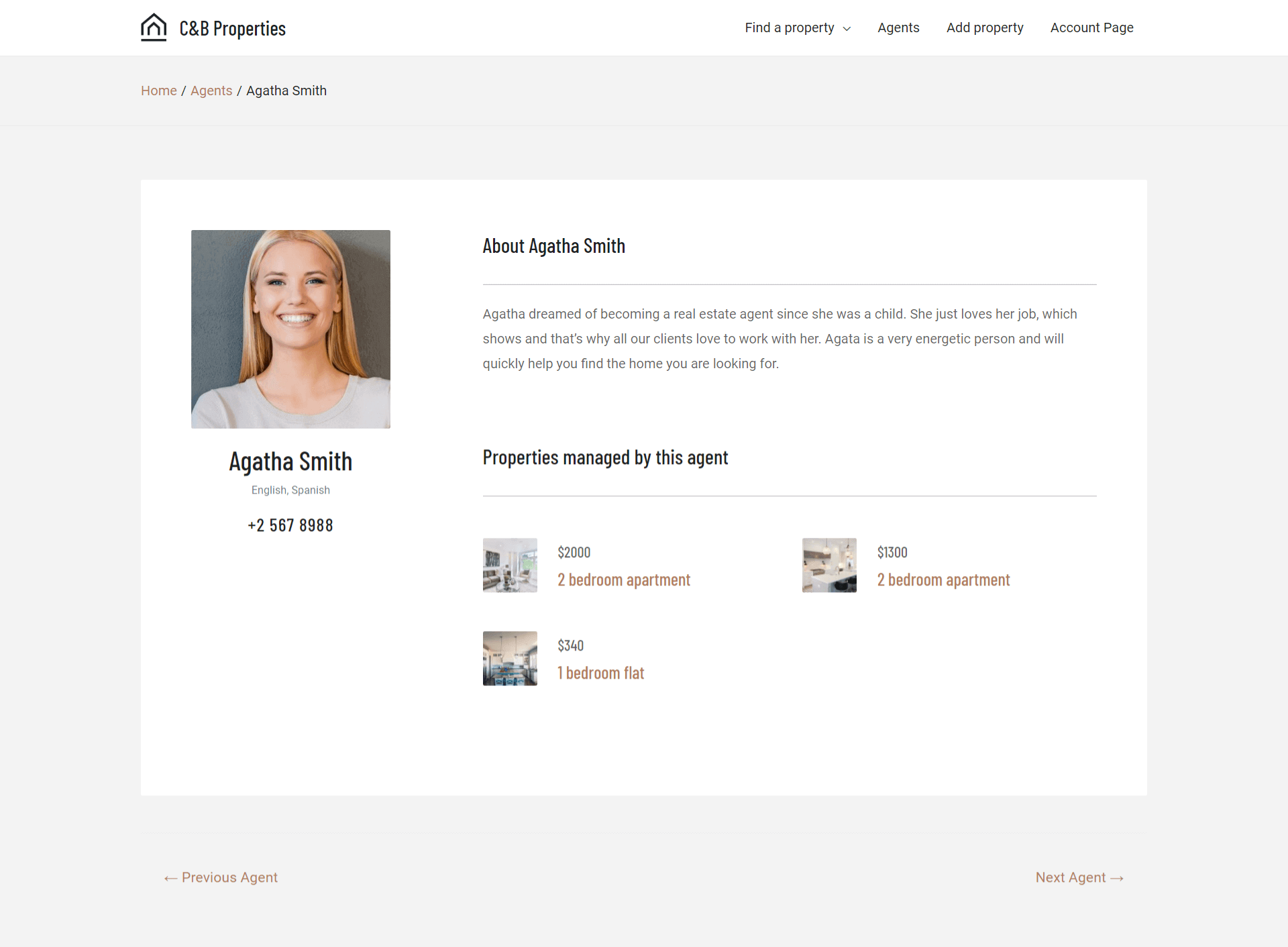
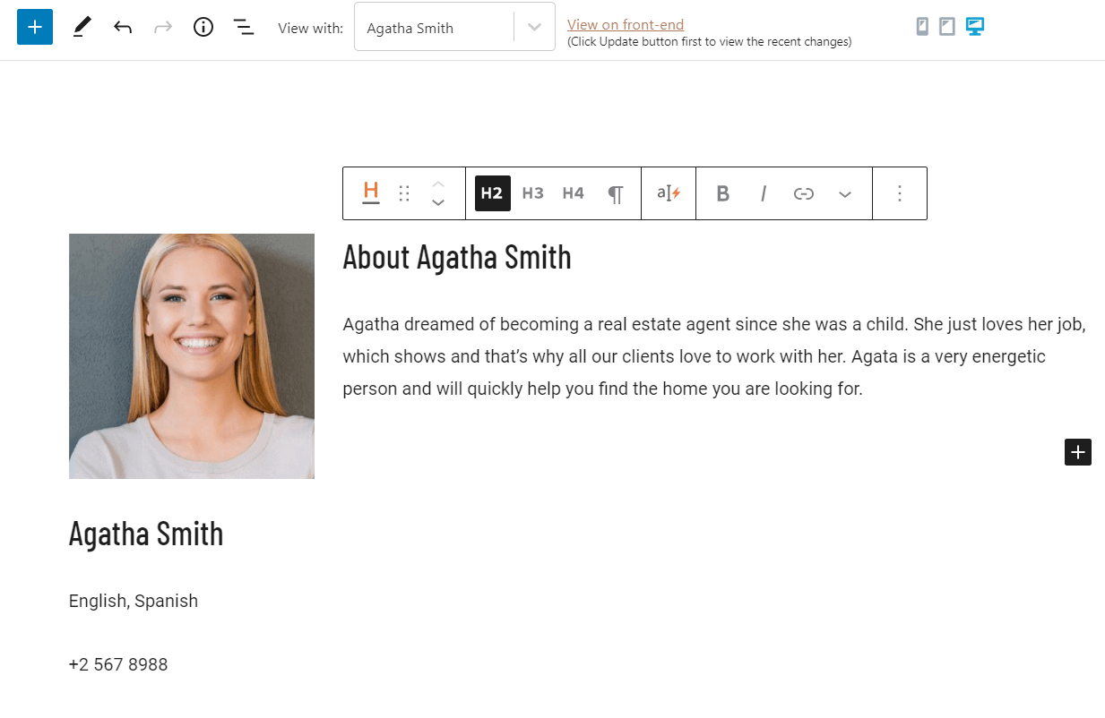
To begin, we open up the block editor for the new single-post template. Here we need to add Toolset blocks to create the layout of the template we want. We need to put the appropriate blocks to recreate the image in the example beneath:
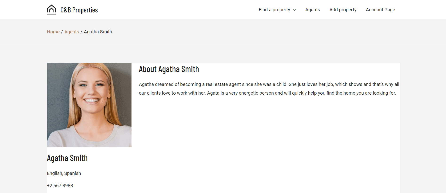
Example of a finished single-post template
This template is very professional and appears simple. However, it takes some time to set up the appropriate blocks to build it.
In the block editor, the very same template appears a bit more complex:
Editing the template in the block editor
Here we can tell that the same layout looks slightly different from what we see on the front-end. However, this is completely normal.
We can always check what the designs look like on the front-end. Click the View on front-end link on the top of the editing page to see the front-end result.
Setting up the layout
To begin, we insert a Toolset Grid block .
The Grid block allows us to organize content well and create a layout with plenty of customizability. For example, we can create multiple columns or control the colors and spacing of content we want to display.
Any changes we make to the grid block apply immediately.
Now that we have added the Grid block, we need to adjust the columns. Our example uses two columns, so we select this option. By default, the columns are all the same width, so we need to adjust this using the Grid Settings .
Resizing the grid columns
Since this is a profile page, the narrower first column contains the image and title, while the wider column holds the body text. This makes sure there is enough space for all the information.
We do this because it is neater, and so our content stays readable.
The final result looks like this:
Grid columns sizes after resizing
In general, we recommend using 2 to 3 columns if there is more information that needs to display on the template. This is enough to show the post title, image, custom fields, and post content.
If it helps, we recommend sketching what the final template must look like on paper and estimating how many columns to use.
Adding block content to the layout
Now that the Grid block is ready, we need to add other blocks to display the content. To recreate our template, we need to add the following blocks:
Image
Heading
Custom field “Languages”
Custom field “Phone number”
Post Content
Of course, we use Toolset’s Dynamic Sources option to select where the content for these blocks comes from (standard and custom fields).
Block contents rated by importance inside the single-post template
The final design in the editor looks like this:
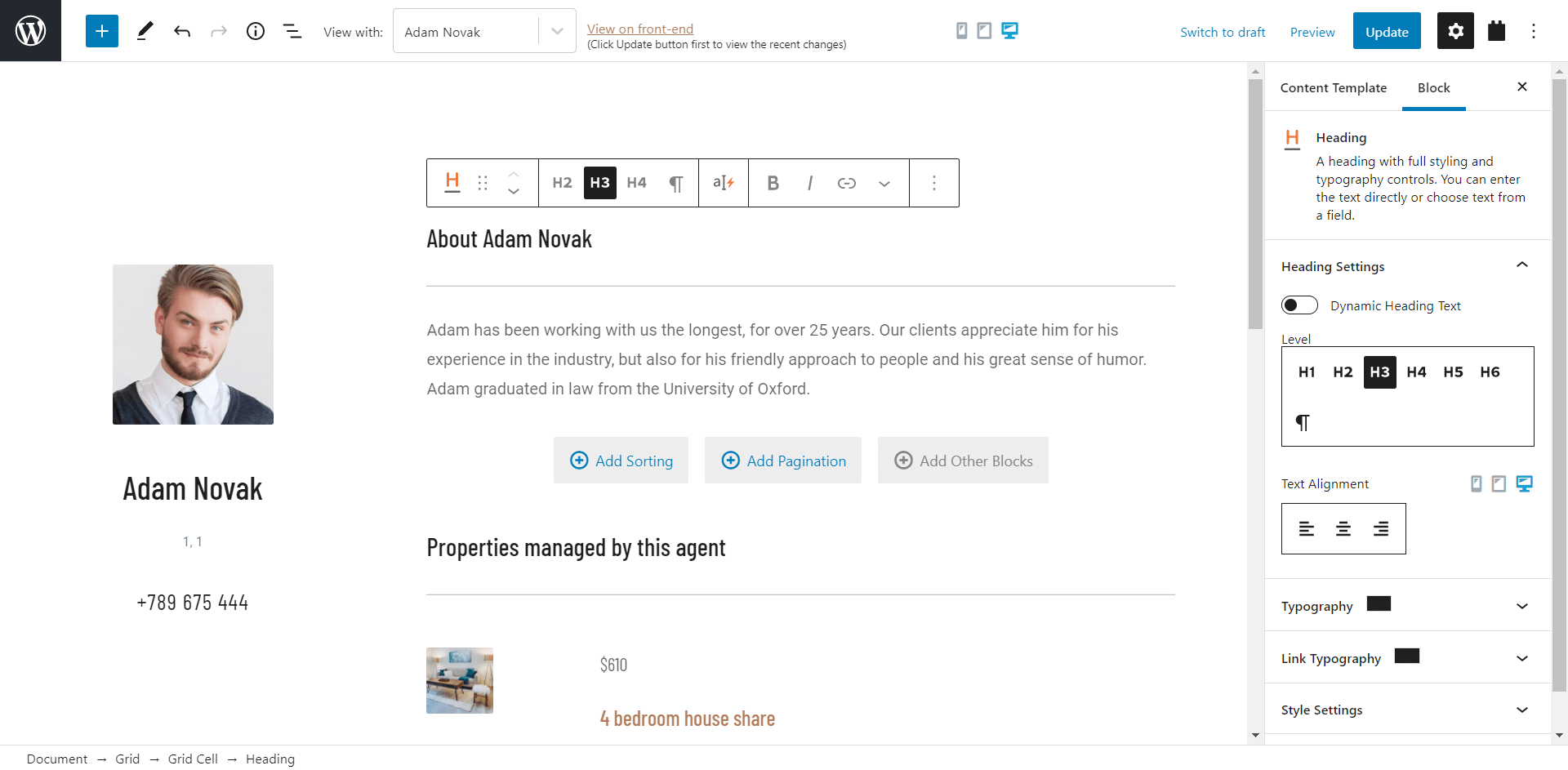
Changing the heading level
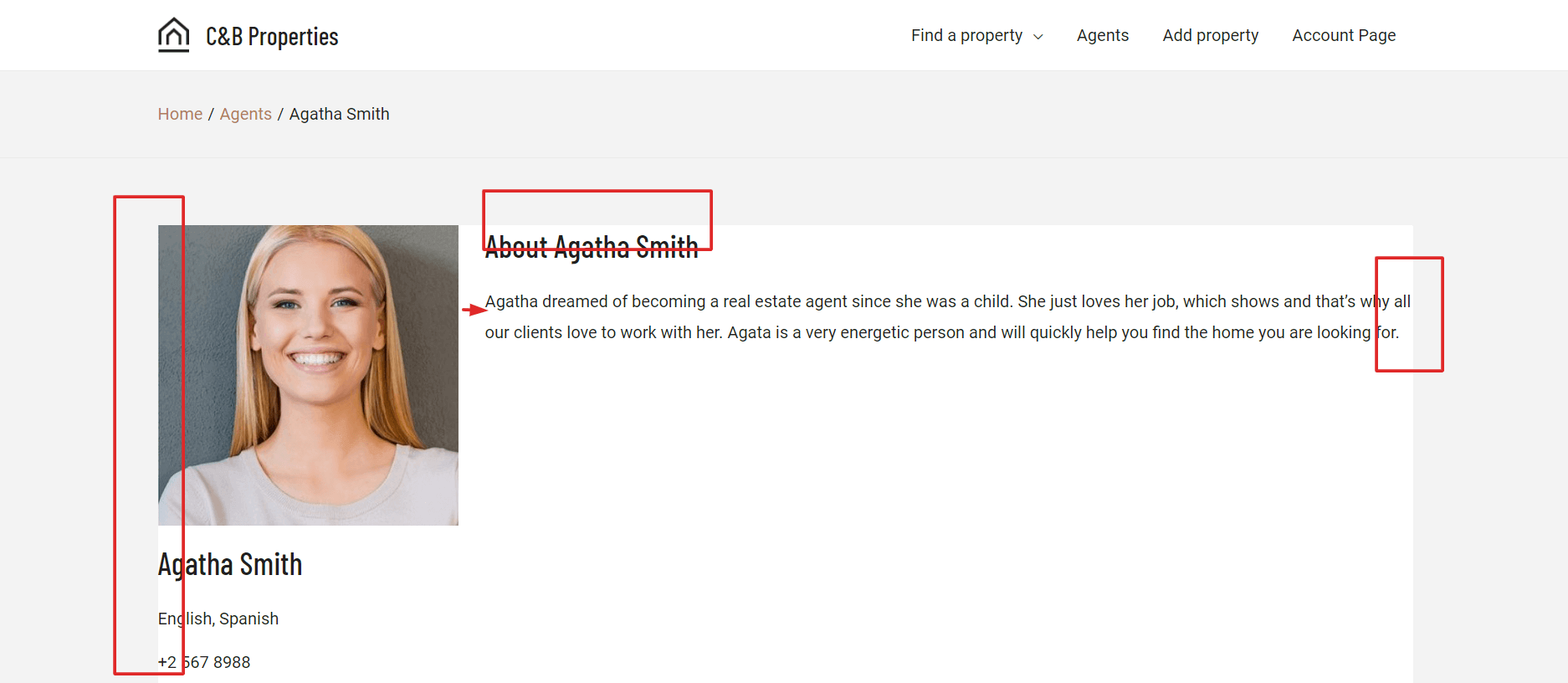
However, the display on the front-end is quite different from what we see in the block editor:
Template displaying the content without spacing configured
On the front-end, the display doesn’t look professional. There are no design elements or styling visible, and the main image rests right on the borders of the Grid box.
To remedy this problem, we simply apply styling to the content blocks and layout.
Styling the content blocks and layout
To style the template, we follow these steps:
Apply padding and margins for spacing
Aligning textual content
Apply text hierarchy
Apply finishing design elements
Applying padding and margins
In design, padding and margins help create what is known as white space or “negative space.” This is the spacing between elements, such as paragraphs, images, buttons, icons, and more. Taking time to apply padding and margins can change the entire appearance of content, so it’s essential to understand it.
The photo and text are on the container edge in the screenshot below and don’t look good. Additionally, the distance between the image and text on the right is too small.
Areas on the template without any spacing configured
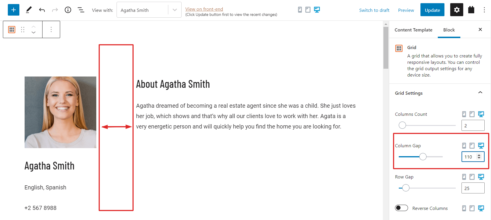
To remedy this, we must add padding to our Toolset Grid block and increase the column gap.
We select the Grid block from Block Navigation, then expand Grid Settings . In Column Gap, we adjust the amount of space we require.
Adjusting the Column Gap for the Grid
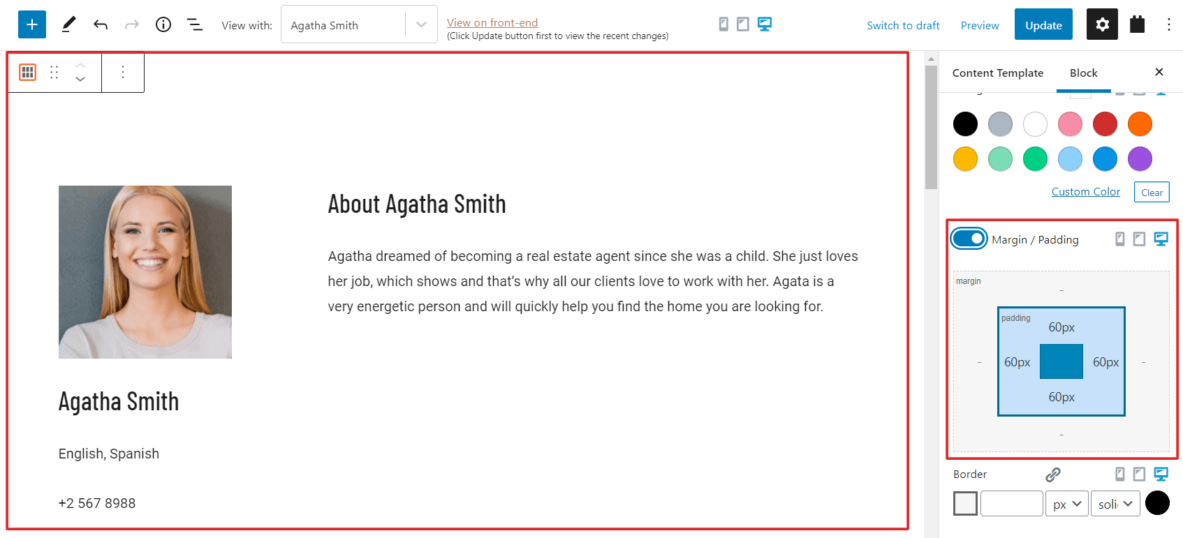
After increasing this gap, we apply padding.
Next to Grid Settings is the panel Style Settings . We expand this panel, then enable the Margins / Padding option. From there, we set 60px of padding on all sides.
Applying padding to the Grid block
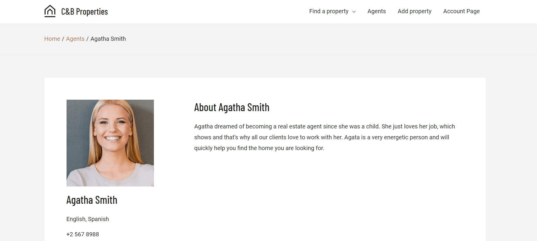
Once we do this, we can take a look at the front-end and compare our results:
Now the content looks much better and is closer to our final design goal.
Aligning textual content
Though the text looks acceptable, we can improve it further by aligning it more professionally. Text alignment is the act of arranging text to fit a layout appropriately. We recommend:
Left alignment for text longer than 3 lines (or right alignment for right-to-left languages)
Center alignment for headings, short phrases, quotes, or captions
In this example, we must apply:
Center alignment to the left column text, since the text is shorter
Left alignment to the right column text, because the text there is very long
After we do this, the content looks much nicer and easier to read.
Applying text hierarchy
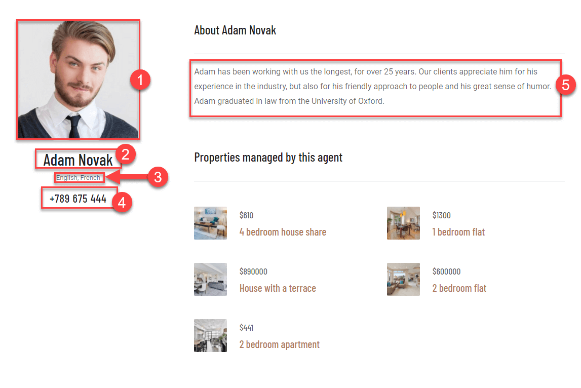
Text hierarchy, or content hierarchy, is vital for establishing the importance of different parts of content. Our example looks good, but we can make it even better by ensuring that the most important information is larger and easier to discern.
In the example below, the numbers (smaller is more important) show us what information is primary and what is secondary, so we know how to style our content.
Hierarchy of different text elements in the template
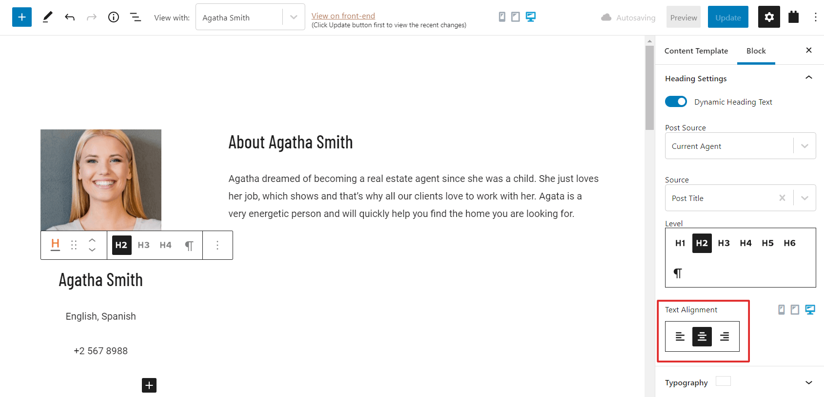
To match the text to their correct hierarchy, we need to apply the correct heading sizes.
We do this by selecting the text blocks from block navigation and styling from the right sidebar under Level. The right sidebar content changes depending on the block we choose. Hence, it should appear automatically.
Editing the Heading Level
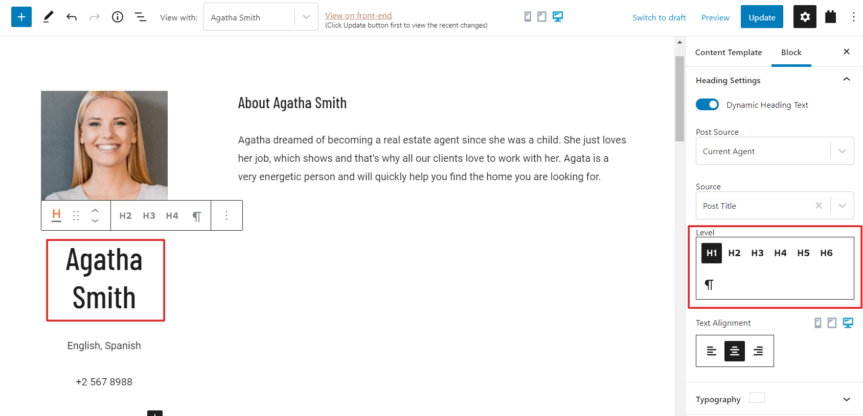
After updating all the text content to the correct sizes, we can see that the text “Agatha Smith” is too big now. Because of SEO rules, we must keep the H1 as it is.
To solve this problem, we just decrease the font size. We expand the Typography panel on the right sidebar and type in a smaller value. In this case, the size is 32.
Setting the Font Size in the block editor
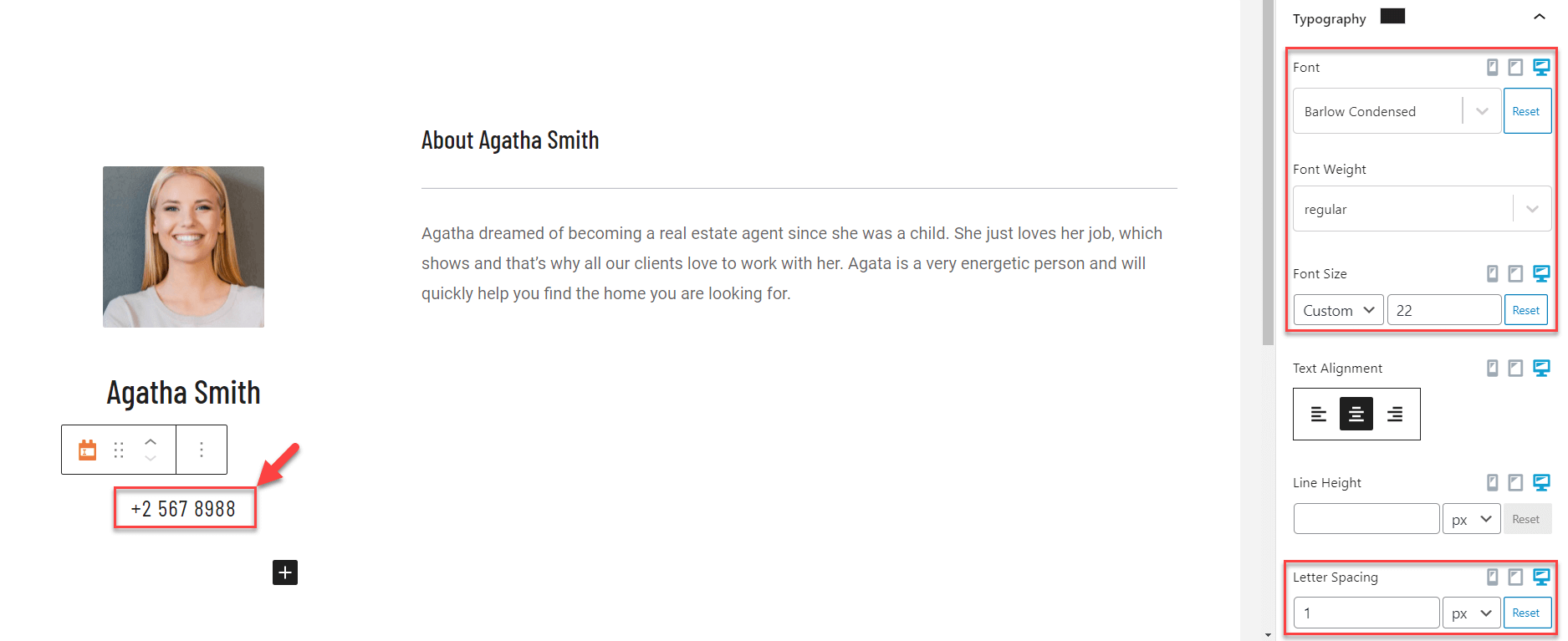
Since the phone number is still very small and hard to see, we need to make it more visible. We simply select the block, and on the right sidebar, increase the text size:
Setting up the custom field’s font type, weight, and letter Spacing
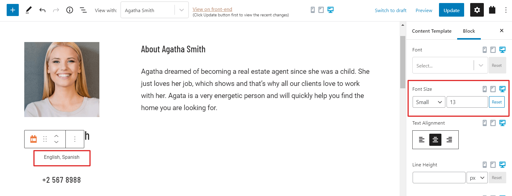
Now that the left column content is larger and easier to read, we can tell that we need to enlarge the body text a bit more to match. We simply select the body text in block navigation, then adjust the size on the right sidebar.
When done, the body text looks much better and fits the rest of the content. The last thing we must do is adjust the size of the text that follows by using the same steps.
Adjusting the font size for the custom field
After making these adjustments, the text appears more evenly spaced and easier to read, which is important for users. Now we are closer to finishing the template’s design.
Applying final design elements
With Toolset, we can add small touches to the content layout, which creates a nice effect. The final design we need to make is to add a light horizontal line below the “About Agatha Smith” heading.
To make this, we simply:
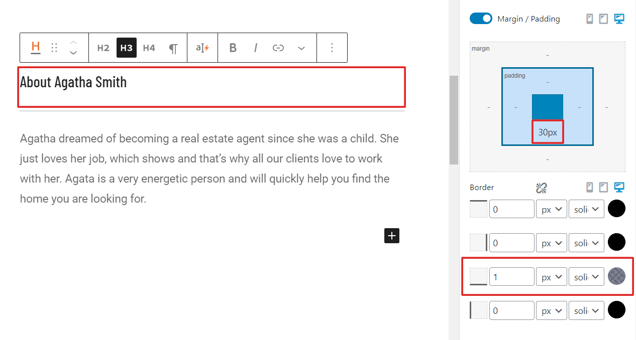
Select the block “About Agatha Smith” from block navigation.
In the right sidebar, we expand the Style Settings panel and enable the Margin / Padding option.
We click on the circle and change its color to grey for the bottom Border. After that, we type in 1 for its size. This creates a faint grey line underneath our block.
Lastly, we add some bottom padding to prevent the line from sticking to the text by typing in 30px in the lower section of the padding box.
Adding a bottom border to the Heading block
Now everything is done, and the final result of the template is ready.
The final design of the template on the front-end
Checking a template’s responsiveness
With Toolset, a template design is automatically responsive. However, if you need to make extra adjustments, then Toolset provides the ability to fine-tune the appearance of different blocks depending on the screen size.
For example, Toolset allows us to control the heading font size for mobile devices regardless of a site’s global typography settings. That means we can make them larger or smaller depending on our preferences and needs.
As an example, we can edit our new template to look different on phones or tablets.
Adjusting the heading for mobile devices
We simply select the phone icon in the sidebar. If we want to see the sizing for tablets or desktops, we can choose one of the other icons. These options allow us to see what our content looks like on different devices.
For example, this is how this template appears on phone screens:
The mobile version of the template showing the Agent’s dynamic content
Since everything looks clean and automatically sized itself, we don’t need to apply any styling or adjustments.


 Send feedback to our documentation team