LnRiLWNvbnRhaW5lciAudGItY29udGFpbmVyLWlubmVye3dpZHRoOjEwMCU7bWFyZ2luOjAgYXV0b30gLndwLWJsb2NrLXRvb2xzZXQtYmxvY2tzLWNvbnRhaW5lci50Yi1jb250YWluZXJbZGF0YS10b29sc2V0LWJsb2Nrcy1jb250YWluZXI9ImQyYzRlYjkyZGIxZTM5ODQ5NmZiYWE0MjRkNmViNzAxIl0geyBwYWRkaW5nOiAwcHggMHB4IDQwcHggMHB4OyB9IC50Yi1jb250YWluZXIgLnRiLWNvbnRhaW5lci1pbm5lcnt3aWR0aDoxMDAlO21hcmdpbjowIGF1dG99IC53cC1ibG9jay10b29sc2V0LWJsb2Nrcy1jb250YWluZXIudGItY29udGFpbmVyW2RhdGEtdG9vbHNldC1ibG9ja3MtY29udGFpbmVyPSI5NmRkNDkzYzE4MzkzYjY2YWQ3N2UzZmEyMjdhNzIyNyJdIHsgcGFkZGluZzogNDBweCAwcHggMHB4IDBweDsgfSAudGItZmllbGRbZGF0YS10b29sc2V0LWJsb2Nrcy1maWVsZD0iN2Q5MzVhZGE3ODIxM2MwOWQ1NDczZjM3YjI5M2I0ZDciXSB7IHRleHQtYWxpZ246IGxlZnQ7IH0gLnRiLWZpZWxkW2RhdGEtdG9vbHNldC1ibG9ja3MtZmllbGQ9IjdkOTM1YWRhNzgyMTNjMDlkNTQ3M2YzN2IyOTNiNGQ3Il0gYSB7IHRleHQtZGVjb3JhdGlvbjogbm9uZTsgfSAgLnRiLWltYWdle3Bvc2l0aW9uOnJlbGF0aXZlO3RyYW5zaXRpb246dHJhbnNmb3JtIDAuMjVzIGVhc2V9LndwLWJsb2NrLWltYWdlIC50Yi1pbWFnZS5hbGlnbmNlbnRlcnttYXJnaW4tbGVmdDphdXRvO21hcmdpbi1yaWdodDphdXRvfS50Yi1pbWFnZSBpbWd7bWF4LXdpZHRoOjEwMCU7aGVpZ2h0OmF1dG87d2lkdGg6YXV0bzt0cmFuc2l0aW9uOnRyYW5zZm9ybSAwLjI1cyBlYXNlfS50Yi1pbWFnZSAudGItaW1hZ2UtY2FwdGlvbi1maXQtdG8taW1hZ2V7ZGlzcGxheTp0YWJsZX0udGItaW1hZ2UgLnRiLWltYWdlLWNhcHRpb24tZml0LXRvLWltYWdlIC50Yi1pbWFnZS1jYXB0aW9ue2Rpc3BsYXk6dGFibGUtY2FwdGlvbjtjYXB0aW9uLXNpZGU6Ym90dG9tfSAudGItaW1hZ2VbZGF0YS10b29sc2V0LWJsb2Nrcy1pbWFnZT0iNzBiYjhjMjYzZDc1ODE4MDg5ZTk1Nzg0YzcyOTI3MDYiXSB7IG1heC13aWR0aDogMTAwJTsgfSAudGItaW1hZ2VbZGF0YS10b29sc2V0LWJsb2Nrcy1pbWFnZT0iNzBiYjhjMjYzZDc1ODE4MDg5ZTk1Nzg0YzcyOTI3MDYiXSBpbWcgeyBib3JkZXI6IDFweCBzb2xpZCByZ2JhKCAyMjIsIDIyMiwgMjIyLCAxICk7IH0gLnRiLWltYWdle3Bvc2l0aW9uOnJlbGF0aXZlO3RyYW5zaXRpb246dHJhbnNmb3JtIDAuMjVzIGVhc2V9LndwLWJsb2NrLWltYWdlIC50Yi1pbWFnZS5hbGlnbmNlbnRlcnttYXJnaW4tbGVmdDphdXRvO21hcmdpbi1yaWdodDphdXRvfS50Yi1pbWFnZSBpbWd7bWF4LXdpZHRoOjEwMCU7aGVpZ2h0OmF1dG87d2lkdGg6YXV0bzt0cmFuc2l0aW9uOnRyYW5zZm9ybSAwLjI1cyBlYXNlfS50Yi1pbWFnZSAudGItaW1hZ2UtY2FwdGlvbi1maXQtdG8taW1hZ2V7ZGlzcGxheTp0YWJsZX0udGItaW1hZ2UgLnRiLWltYWdlLWNhcHRpb24tZml0LXRvLWltYWdlIC50Yi1pbWFnZS1jYXB0aW9ue2Rpc3BsYXk6dGFibGUtY2FwdGlvbjtjYXB0aW9uLXNpZGU6Ym90dG9tfSAudGItaW1hZ2VbZGF0YS10b29sc2V0LWJsb2Nrcy1pbWFnZT0iZWZkMDVmOGI3NGQxZGE0NzY1NjdkZGY1OTM5YTMxNWIiXSB7IG1heC13aWR0aDogMTAwJTsgfSAudGItaW1hZ2VbZGF0YS10b29sc2V0LWJsb2Nrcy1pbWFnZT0iZWZkMDVmOGI3NGQxZGE0NzY1NjdkZGY1OTM5YTMxNWIiXSBpbWcgeyBib3JkZXI6IDFweCBzb2xpZCByZ2JhKCAyMjIsIDIyMiwgMjIyLCAxICk7IH0gLnRiLWltYWdle3Bvc2l0aW9uOnJlbGF0aXZlO3RyYW5zaXRpb246dHJhbnNmb3JtIDAuMjVzIGVhc2V9LndwLWJsb2NrLWltYWdlIC50Yi1pbWFnZS5hbGlnbmNlbnRlcnttYXJnaW4tbGVmdDphdXRvO21hcmdpbi1yaWdodDphdXRvfS50Yi1pbWFnZSBpbWd7bWF4LXdpZHRoOjEwMCU7aGVpZ2h0OmF1dG87d2lkdGg6YXV0bzt0cmFuc2l0aW9uOnRyYW5zZm9ybSAwLjI1cyBlYXNlfS50Yi1pbWFnZSAudGItaW1hZ2UtY2FwdGlvbi1maXQtdG8taW1hZ2V7ZGlzcGxheTp0YWJsZX0udGItaW1hZ2UgLnRiLWltYWdlLWNhcHRpb24tZml0LXRvLWltYWdlIC50Yi1pbWFnZS1jYXB0aW9ue2Rpc3BsYXk6dGFibGUtY2FwdGlvbjtjYXB0aW9uLXNpZGU6Ym90dG9tfSAudGItaW1hZ2VbZGF0YS10b29sc2V0LWJsb2Nrcy1pbWFnZT0iYzBlMTEwNDRmYTE0MTgzYzdkMThjNmJkMDE5YmVjNTMiXSB7IG1heC13aWR0aDogMTAwJTsgfSAudGItaW1hZ2VbZGF0YS10b29sc2V0LWJsb2Nrcy1pbWFnZT0iYzBlMTEwNDRmYTE0MTgzYzdkMThjNmJkMDE5YmVjNTMiXSBpbWcgeyBib3JkZXI6IDFweCBzb2xpZCByZ2JhKCAyMjIsIDIyMiwgMjIyLCAxICk7IH0gLnRiLWltYWdle3Bvc2l0aW9uOnJlbGF0aXZlO3RyYW5zaXRpb246dHJhbnNmb3JtIDAuMjVzIGVhc2V9LndwLWJsb2NrLWltYWdlIC50Yi1pbWFnZS5hbGlnbmNlbnRlcnttYXJnaW4tbGVmdDphdXRvO21hcmdpbi1yaWdodDphdXRvfS50Yi1pbWFnZSBpbWd7bWF4LXdpZHRoOjEwMCU7aGVpZ2h0OmF1dG87d2lkdGg6YXV0bzt0cmFuc2l0aW9uOnRyYW5zZm9ybSAwLjI1cyBlYXNlfS50Yi1pbWFnZSAudGItaW1hZ2UtY2FwdGlvbi1maXQtdG8taW1hZ2V7ZGlzcGxheTp0YWJsZX0udGItaW1hZ2UgLnRiLWltYWdlLWNhcHRpb24tZml0LXRvLWltYWdlIC50Yi1pbWFnZS1jYXB0aW9ue2Rpc3BsYXk6dGFibGUtY2FwdGlvbjtjYXB0aW9uLXNpZGU6Ym90dG9tfSAudGItaW1hZ2VbZGF0YS10b29sc2V0LWJsb2Nrcy1pbWFnZT0iNjY3NzRmMjEzMDQ0OTY0ZDU5NmM2MzE1MjQ1ZmE1NTciXSB7IG1heC13aWR0aDogMTAwJTsgfSAudGItaW1hZ2VbZGF0YS10b29sc2V0LWJsb2Nrcy1pbWFnZT0iNjY3NzRmMjEzMDQ0OTY0ZDU5NmM2MzE1MjQ1ZmE1NTciXSBpbWcgeyBib3JkZXI6IDFweCBzb2xpZCByZ2JhKCAyMjIsIDIyMiwgMjIyLCAxICk7IH0gLnRiLWltYWdle3Bvc2l0aW9uOnJlbGF0aXZlO3RyYW5zaXRpb246dHJhbnNmb3JtIDAuMjVzIGVhc2V9LndwLWJsb2NrLWltYWdlIC50Yi1pbWFnZS5hbGlnbmNlbnRlcnttYXJnaW4tbGVmdDphdXRvO21hcmdpbi1yaWdodDphdXRvfS50Yi1pbWFnZSBpbWd7bWF4LXdpZHRoOjEwMCU7aGVpZ2h0OmF1dG87d2lkdGg6YXV0bzt0cmFuc2l0aW9uOnRyYW5zZm9ybSAwLjI1cyBlYXNlfS50Yi1pbWFnZSAudGItaW1hZ2UtY2FwdGlvbi1maXQtdG8taW1hZ2V7ZGlzcGxheTp0YWJsZX0udGItaW1hZ2UgLnRiLWltYWdlLWNhcHRpb24tZml0LXRvLWltYWdlIC50Yi1pbWFnZS1jYXB0aW9ue2Rpc3BsYXk6dGFibGUtY2FwdGlvbjtjYXB0aW9uLXNpZGU6Ym90dG9tfSAudGItaW1hZ2VbZGF0YS10b29sc2V0LWJsb2Nrcy1pbWFnZT0iOTYwNTNjY2FjNTNhZWY5ZGY0MTAyY2E2YTVlMDE1NDkiXSB7IG1heC13aWR0aDogMTAwJTsgfSAudGItaW1hZ2VbZGF0YS10b29sc2V0LWJsb2Nrcy1pbWFnZT0iOTYwNTNjY2FjNTNhZWY5ZGY0MTAyY2E2YTVlMDE1NDkiXSBpbWcgeyBib3JkZXI6IDFweCBzb2xpZCByZ2JhKCAyMjIsIDIyMiwgMjIyLCAxICk7IH0gLnRiLWltYWdle3Bvc2l0aW9uOnJlbGF0aXZlO3RyYW5zaXRpb246dHJhbnNmb3JtIDAuMjVzIGVhc2V9LndwLWJsb2NrLWltYWdlIC50Yi1pbWFnZS5hbGlnbmNlbnRlcnttYXJnaW4tbGVmdDphdXRvO21hcmdpbi1yaWdodDphdXRvfS50Yi1pbWFnZSBpbWd7bWF4LXdpZHRoOjEwMCU7aGVpZ2h0OmF1dG87d2lkdGg6YXV0bzt0cmFuc2l0aW9uOnRyYW5zZm9ybSAwLjI1cyBlYXNlfS50Yi1pbWFnZSAudGItaW1hZ2UtY2FwdGlvbi1maXQtdG8taW1hZ2V7ZGlzcGxheTp0YWJsZX0udGItaW1hZ2UgLnRiLWltYWdlLWNhcHRpb24tZml0LXRvLWltYWdlIC50Yi1pbWFnZS1jYXB0aW9ue2Rpc3BsYXk6dGFibGUtY2FwdGlvbjtjYXB0aW9uLXNpZGU6Ym90dG9tfSAudGItaW1hZ2VbZGF0YS10b29sc2V0LWJsb2Nrcy1pbWFnZT0iZmE1ZTQ3MjBkZjhhNTFiMDJhMmE0M2I2ZmNjOTc5Y2IiXSB7IG1heC13aWR0aDogMTAwJTsgfSAudGItaW1hZ2VbZGF0YS10b29sc2V0LWJsb2Nrcy1pbWFnZT0iZmE1ZTQ3MjBkZjhhNTFiMDJhMmE0M2I2ZmNjOTc5Y2IiXSBpbWcgeyBib3JkZXI6IDFweCBzb2xpZCByZ2JhKCAyMjIsIDIyMiwgMjIyLCAxICk7IH0gLnRiLWltYWdle3Bvc2l0aW9uOnJlbGF0aXZlO3RyYW5zaXRpb246dHJhbnNmb3JtIDAuMjVzIGVhc2V9LndwLWJsb2NrLWltYWdlIC50Yi1pbWFnZS5hbGlnbmNlbnRlcnttYXJnaW4tbGVmdDphdXRvO21hcmdpbi1yaWdodDphdXRvfS50Yi1pbWFnZSBpbWd7bWF4LXdpZHRoOjEwMCU7aGVpZ2h0OmF1dG87d2lkdGg6YXV0bzt0cmFuc2l0aW9uOnRyYW5zZm9ybSAwLjI1cyBlYXNlfS50Yi1pbWFnZSAudGItaW1hZ2UtY2FwdGlvbi1maXQtdG8taW1hZ2V7ZGlzcGxheTp0YWJsZX0udGItaW1hZ2UgLnRiLWltYWdlLWNhcHRpb24tZml0LXRvLWltYWdlIC50Yi1pbWFnZS1jYXB0aW9ue2Rpc3BsYXk6dGFibGUtY2FwdGlvbjtjYXB0aW9uLXNpZGU6Ym90dG9tfSAudGItaW1hZ2VbZGF0YS10b29sc2V0LWJsb2Nrcy1pbWFnZT0iMTk2MTU3NDVhNTM5MTdlYzE2MzE2YmViOTkzYmIzMDEiXSB7IG1heC13aWR0aDogMTAwJTsgfSAudGItaW1hZ2VbZGF0YS10b29sc2V0LWJsb2Nrcy1pbWFnZT0iMTk2MTU3NDVhNTM5MTdlYzE2MzE2YmViOTkzYmIzMDEiXSBpbWcgeyBib3JkZXI6IDFweCBzb2xpZCByZ2JhKCAyMjIsIDIyMiwgMjIyLCAxICk7IH0gLnRiLWltYWdle3Bvc2l0aW9uOnJlbGF0aXZlO3RyYW5zaXRpb246dHJhbnNmb3JtIDAuMjVzIGVhc2V9LndwLWJsb2NrLWltYWdlIC50Yi1pbWFnZS5hbGlnbmNlbnRlcnttYXJnaW4tbGVmdDphdXRvO21hcmdpbi1yaWdodDphdXRvfS50Yi1pbWFnZSBpbWd7bWF4LXdpZHRoOjEwMCU7aGVpZ2h0OmF1dG87d2lkdGg6YXV0bzt0cmFuc2l0aW9uOnRyYW5zZm9ybSAwLjI1cyBlYXNlfS50Yi1pbWFnZSAudGItaW1hZ2UtY2FwdGlvbi1maXQtdG8taW1hZ2V7ZGlzcGxheTp0YWJsZX0udGItaW1hZ2UgLnRiLWltYWdlLWNhcHRpb24tZml0LXRvLWltYWdlIC50Yi1pbWFnZS1jYXB0aW9ue2Rpc3BsYXk6dGFibGUtY2FwdGlvbjtjYXB0aW9uLXNpZGU6Ym90dG9tfSAudGItaW1hZ2VbZGF0YS10b29sc2V0LWJsb2Nrcy1pbWFnZT0iNDE4NWEyZDY0MzQwM2Y4YzVmMzM0OTI2ODA4MzcyMjMiXSB7IG1heC13aWR0aDogMTAwJTsgfSAudGItaW1hZ2VbZGF0YS10b29sc2V0LWJsb2Nrcy1pbWFnZT0iNDE4NWEyZDY0MzQwM2Y4YzVmMzM0OTI2ODA4MzcyMjMiXSBpbWcgeyBib3JkZXI6IDFweCBzb2xpZCByZ2JhKCAyMjIsIDIyMiwgMjIyLCAxICk7IH0gLnRiLWltYWdle3Bvc2l0aW9uOnJlbGF0aXZlO3RyYW5zaXRpb246dHJhbnNmb3JtIDAuMjVzIGVhc2V9LndwLWJsb2NrLWltYWdlIC50Yi1pbWFnZS5hbGlnbmNlbnRlcnttYXJnaW4tbGVmdDphdXRvO21hcmdpbi1yaWdodDphdXRvfS50Yi1pbWFnZSBpbWd7bWF4LXdpZHRoOjEwMCU7aGVpZ2h0OmF1dG87d2lkdGg6YXV0bzt0cmFuc2l0aW9uOnRyYW5zZm9ybSAwLjI1cyBlYXNlfS50Yi1pbWFnZSAudGItaW1hZ2UtY2FwdGlvbi1maXQtdG8taW1hZ2V7ZGlzcGxheTp0YWJsZX0udGItaW1hZ2UgLnRiLWltYWdlLWNhcHRpb24tZml0LXRvLWltYWdlIC50Yi1pbWFnZS1jYXB0aW9ue2Rpc3BsYXk6dGFibGUtY2FwdGlvbjtjYXB0aW9uLXNpZGU6Ym90dG9tfSAudGItaW1hZ2VbZGF0YS10b29sc2V0LWJsb2Nrcy1pbWFnZT0iODQ0MDlhNjIxNWM1ZTlhNTBjZGQ3MDk0OGM4MGY4YmEiXSB7IG1heC13aWR0aDogMTAwJTsgfSAudGItaW1hZ2VbZGF0YS10b29sc2V0LWJsb2Nrcy1pbWFnZT0iODQ0MDlhNjIxNWM1ZTlhNTBjZGQ3MDk0OGM4MGY4YmEiXSBpbWcgeyBib3JkZXI6IDFweCBzb2xpZCByZ2JhKCAyMjIsIDIyMiwgMjIyLCAxICk7IH0gLnRiLWltYWdle3Bvc2l0aW9uOnJlbGF0aXZlO3RyYW5zaXRpb246dHJhbnNmb3JtIDAuMjVzIGVhc2V9LndwLWJsb2NrLWltYWdlIC50Yi1pbWFnZS5hbGlnbmNlbnRlcnttYXJnaW4tbGVmdDphdXRvO21hcmdpbi1yaWdodDphdXRvfS50Yi1pbWFnZSBpbWd7bWF4LXdpZHRoOjEwMCU7aGVpZ2h0OmF1dG87d2lkdGg6YXV0bzt0cmFuc2l0aW9uOnRyYW5zZm9ybSAwLjI1cyBlYXNlfS50Yi1pbWFnZSAudGItaW1hZ2UtY2FwdGlvbi1maXQtdG8taW1hZ2V7ZGlzcGxheTp0YWJsZX0udGItaW1hZ2UgLnRiLWltYWdlLWNhcHRpb24tZml0LXRvLWltYWdlIC50Yi1pbWFnZS1jYXB0aW9ue2Rpc3BsYXk6dGFibGUtY2FwdGlvbjtjYXB0aW9uLXNpZGU6Ym90dG9tfSAudGItaW1hZ2VbZGF0YS10b29sc2V0LWJsb2Nrcy1pbWFnZT0iMzEwMmFmM2ViNWYxZWVjNGVmODVjODdmZGQ3NDRkYzgiXSB7IG1heC13aWR0aDogMTAwJTsgfSAudGItaW1hZ2VbZGF0YS10b29sc2V0LWJsb2Nrcy1pbWFnZT0iMzEwMmFmM2ViNWYxZWVjNGVmODVjODdmZGQ3NDRkYzgiXSBpbWcgeyBib3JkZXI6IDFweCBzb2xpZCByZ2JhKCAyMjIsIDIyMiwgMjIyLCAxICk7IH0gLnRiLWdyaWQsLnRiLWdyaWQ+LmJsb2NrLWVkaXRvci1pbm5lci1ibG9ja3M+LmJsb2NrLWVkaXRvci1ibG9jay1saXN0X19sYXlvdXR7ZGlzcGxheTpncmlkO2dyaWQtcm93LWdhcDoyNXB4O2dyaWQtY29sdW1uLWdhcDoyNXB4fS50Yi1ncmlkLWl0ZW17YmFja2dyb3VuZDojZDM4YTAzO3BhZGRpbmc6MzBweH0udGItZ3JpZC1jb2x1bW57ZmxleC13cmFwOndyYXB9LnRiLWdyaWQtY29sdW1uPip7d2lkdGg6MTAwJX0udGItZ3JpZC1jb2x1bW4udGItZ3JpZC1hbGlnbi10b3B7d2lkdGg6MTAwJTtkaXNwbGF5OmZsZXg7YWxpZ24tY29udGVudDpmbGV4LXN0YXJ0fS50Yi1ncmlkLWNvbHVtbi50Yi1ncmlkLWFsaWduLWNlbnRlcnt3aWR0aDoxMDAlO2Rpc3BsYXk6ZmxleDthbGlnbi1jb250ZW50OmNlbnRlcn0udGItZ3JpZC1jb2x1bW4udGItZ3JpZC1hbGlnbi1ib3R0b217d2lkdGg6MTAwJTtkaXNwbGF5OmZsZXg7YWxpZ24tY29udGVudDpmbGV4LWVuZH0gLndwLWJsb2NrLXRvb2xzZXQtYmxvY2tzLWdyaWQudGItZ3JpZFtkYXRhLXRvb2xzZXQtYmxvY2tzLWdyaWQ9IjljYmMwMzQ2MWI4N2E0MDQ0N2RkYzQxM2I4YTAxZGQ5Il0geyBncmlkLXRlbXBsYXRlLWNvbHVtbnM6IG1pbm1heCgwLCAwLjVmcikgbWlubWF4KDAsIDAuNWZyKTtncmlkLWF1dG8tZmxvdzogcm93IH0gLndwLWJsb2NrLXRvb2xzZXQtYmxvY2tzLWdyaWQudGItZ3JpZFtkYXRhLXRvb2xzZXQtYmxvY2tzLWdyaWQ9IjljYmMwMzQ2MWI4N2E0MDQ0N2RkYzQxM2I4YTAxZGQ5Il0gPiAudGItZ3JpZC1jb2x1bW46bnRoLW9mLXR5cGUoMm4gKyAxKSB7IGdyaWQtY29sdW1uOiAxIH0gLndwLWJsb2NrLXRvb2xzZXQtYmxvY2tzLWdyaWQudGItZ3JpZFtkYXRhLXRvb2xzZXQtYmxvY2tzLWdyaWQ9IjljYmMwMzQ2MWI4N2E0MDQ0N2RkYzQxM2I4YTAxZGQ5Il0gPiAudGItZ3JpZC1jb2x1bW46bnRoLW9mLXR5cGUoMm4gKyAyKSB7IGdyaWQtY29sdW1uOiAyIH0gLnRiLWltYWdle3Bvc2l0aW9uOnJlbGF0aXZlO3RyYW5zaXRpb246dHJhbnNmb3JtIDAuMjVzIGVhc2V9LndwLWJsb2NrLWltYWdlIC50Yi1pbWFnZS5hbGlnbmNlbnRlcnttYXJnaW4tbGVmdDphdXRvO21hcmdpbi1yaWdodDphdXRvfS50Yi1pbWFnZSBpbWd7bWF4LXdpZHRoOjEwMCU7aGVpZ2h0OmF1dG87d2lkdGg6YXV0bzt0cmFuc2l0aW9uOnRyYW5zZm9ybSAwLjI1cyBlYXNlfS50Yi1pbWFnZSAudGItaW1hZ2UtY2FwdGlvbi1maXQtdG8taW1hZ2V7ZGlzcGxheTp0YWJsZX0udGItaW1hZ2UgLnRiLWltYWdlLWNhcHRpb24tZml0LXRvLWltYWdlIC50Yi1pbWFnZS1jYXB0aW9ue2Rpc3BsYXk6dGFibGUtY2FwdGlvbjtjYXB0aW9uLXNpZGU6Ym90dG9tfSAudGItaW1hZ2VbZGF0YS10b29sc2V0LWJsb2Nrcy1pbWFnZT0iOTJkMGZmYzVkNjQ2Y2I5YWM1ODJmYzk5ZGNiOWZiZTMiXSB7IG1heC13aWR0aDogMTAwJTsgfSAudGItaW1hZ2VbZGF0YS10b29sc2V0LWJsb2Nrcy1pbWFnZT0iOTJkMGZmYzVkNjQ2Y2I5YWM1ODJmYzk5ZGNiOWZiZTMiXSBpbWcgeyBib3JkZXI6IDFweCBzb2xpZCByZ2JhKCAyMjIsIDIyMiwgMjIyLCAxICk7IH0gLnRiLWltYWdle3Bvc2l0aW9uOnJlbGF0aXZlO3RyYW5zaXRpb246dHJhbnNmb3JtIDAuMjVzIGVhc2V9LndwLWJsb2NrLWltYWdlIC50Yi1pbWFnZS5hbGlnbmNlbnRlcnttYXJnaW4tbGVmdDphdXRvO21hcmdpbi1yaWdodDphdXRvfS50Yi1pbWFnZSBpbWd7bWF4LXdpZHRoOjEwMCU7aGVpZ2h0OmF1dG87d2lkdGg6YXV0bzt0cmFuc2l0aW9uOnRyYW5zZm9ybSAwLjI1cyBlYXNlfS50Yi1pbWFnZSAudGItaW1hZ2UtY2FwdGlvbi1maXQtdG8taW1hZ2V7ZGlzcGxheTp0YWJsZX0udGItaW1hZ2UgLnRiLWltYWdlLWNhcHRpb24tZml0LXRvLWltYWdlIC50Yi1pbWFnZS1jYXB0aW9ue2Rpc3BsYXk6dGFibGUtY2FwdGlvbjtjYXB0aW9uLXNpZGU6Ym90dG9tfSAudGItaW1hZ2VbZGF0YS10b29sc2V0LWJsb2Nrcy1pbWFnZT0iMGZlMzdhNWI3MDIxYzUwNjQwYTM0N2EwMTcwNmFlZGIiXSB7IG1heC13aWR0aDogMTAwJTsgfSAudGItaW1hZ2VbZGF0YS10b29sc2V0LWJsb2Nrcy1pbWFnZT0iMGZlMzdhNWI3MDIxYzUwNjQwYTM0N2EwMTcwNmFlZGIiXSBpbWcgeyBib3JkZXI6IDFweCBzb2xpZCByZ2JhKCAyMjIsIDIyMiwgMjIyLCAxICk7IH0gLndwLWJsb2NrLXRvb2xzZXQtYmxvY2tzLWdyaWQtY29sdW1uLnRiLWdyaWQtY29sdW1uW2RhdGEtdG9vbHNldC1ibG9ja3MtZ3JpZC1jb2x1bW49IjMwMzRmYmU4ODZjMTEwNTRlOTViNDZiMDlkM2U0MTEyIl0geyBkaXNwbGF5OiBmbGV4OyB9IEBtZWRpYSBvbmx5IHNjcmVlbiBhbmQgKG1heC13aWR0aDogOTkxcHgpIHsgLnRiLWNvbnRhaW5lciAudGItY29udGFpbmVyLWlubmVye3dpZHRoOjEwMCU7bWFyZ2luOjAgYXV0b30udGItY29udGFpbmVyIC50Yi1jb250YWluZXItaW5uZXJ7d2lkdGg6MTAwJTttYXJnaW46MCBhdXRvfS50Yi1maWVsZFtkYXRhLXRvb2xzZXQtYmxvY2tzLWZpZWxkPSI3ZDkzNWFkYTc4MjEzYzA5ZDU0NzNmMzdiMjkzYjRkNyJdIGEgeyB0ZXh0LWRlY29yYXRpb246IG5vbmU7IH0gIC50Yi1pbWFnZXtwb3NpdGlvbjpyZWxhdGl2ZTt0cmFuc2l0aW9uOnRyYW5zZm9ybSAwLjI1cyBlYXNlfS53cC1ibG9jay1pbWFnZSAudGItaW1hZ2UuYWxpZ25jZW50ZXJ7bWFyZ2luLWxlZnQ6YXV0bzttYXJnaW4tcmlnaHQ6YXV0b30udGItaW1hZ2UgaW1ne21heC13aWR0aDoxMDAlO2hlaWdodDphdXRvO3dpZHRoOmF1dG87dHJhbnNpdGlvbjp0cmFuc2Zvcm0gMC4yNXMgZWFzZX0udGItaW1hZ2UgLnRiLWltYWdlLWNhcHRpb24tZml0LXRvLWltYWdle2Rpc3BsYXk6dGFibGV9LnRiLWltYWdlIC50Yi1pbWFnZS1jYXB0aW9uLWZpdC10by1pbWFnZSAudGItaW1hZ2UtY2FwdGlvbntkaXNwbGF5OnRhYmxlLWNhcHRpb247Y2FwdGlvbi1zaWRlOmJvdHRvbX0udGItaW1hZ2V7cG9zaXRpb246cmVsYXRpdmU7dHJhbnNpdGlvbjp0cmFuc2Zvcm0gMC4yNXMgZWFzZX0ud3AtYmxvY2staW1hZ2UgLnRiLWltYWdlLmFsaWduY2VudGVye21hcmdpbi1sZWZ0OmF1dG87bWFyZ2luLXJpZ2h0OmF1dG99LnRiLWltYWdlIGltZ3ttYXgtd2lkdGg6MTAwJTtoZWlnaHQ6YXV0bzt3aWR0aDphdXRvO3RyYW5zaXRpb246dHJhbnNmb3JtIDAuMjVzIGVhc2V9LnRiLWltYWdlIC50Yi1pbWFnZS1jYXB0aW9uLWZpdC10by1pbWFnZXtkaXNwbGF5OnRhYmxlfS50Yi1pbWFnZSAudGItaW1hZ2UtY2FwdGlvbi1maXQtdG8taW1hZ2UgLnRiLWltYWdlLWNhcHRpb257ZGlzcGxheTp0YWJsZS1jYXB0aW9uO2NhcHRpb24tc2lkZTpib3R0b219LnRiLWltYWdle3Bvc2l0aW9uOnJlbGF0aXZlO3RyYW5zaXRpb246dHJhbnNmb3JtIDAuMjVzIGVhc2V9LndwLWJsb2NrLWltYWdlIC50Yi1pbWFnZS5hbGlnbmNlbnRlcnttYXJnaW4tbGVmdDphdXRvO21hcmdpbi1yaWdodDphdXRvfS50Yi1pbWFnZSBpbWd7bWF4LXdpZHRoOjEwMCU7aGVpZ2h0OmF1dG87d2lkdGg6YXV0bzt0cmFuc2l0aW9uOnRyYW5zZm9ybSAwLjI1cyBlYXNlfS50Yi1pbWFnZSAudGItaW1hZ2UtY2FwdGlvbi1maXQtdG8taW1hZ2V7ZGlzcGxheTp0YWJsZX0udGItaW1hZ2UgLnRiLWltYWdlLWNhcHRpb24tZml0LXRvLWltYWdlIC50Yi1pbWFnZS1jYXB0aW9ue2Rpc3BsYXk6dGFibGUtY2FwdGlvbjtjYXB0aW9uLXNpZGU6Ym90dG9tfS50Yi1pbWFnZXtwb3NpdGlvbjpyZWxhdGl2ZTt0cmFuc2l0aW9uOnRyYW5zZm9ybSAwLjI1cyBlYXNlfS53cC1ibG9jay1pbWFnZSAudGItaW1hZ2UuYWxpZ25jZW50ZXJ7bWFyZ2luLWxlZnQ6YXV0bzttYXJnaW4tcmlnaHQ6YXV0b30udGItaW1hZ2UgaW1ne21heC13aWR0aDoxMDAlO2hlaWdodDphdXRvO3dpZHRoOmF1dG87dHJhbnNpdGlvbjp0cmFuc2Zvcm0gMC4yNXMgZWFzZX0udGItaW1hZ2UgLnRiLWltYWdlLWNhcHRpb24tZml0LXRvLWltYWdle2Rpc3BsYXk6dGFibGV9LnRiLWltYWdlIC50Yi1pbWFnZS1jYXB0aW9uLWZpdC10by1pbWFnZSAudGItaW1hZ2UtY2FwdGlvbntkaXNwbGF5OnRhYmxlLWNhcHRpb247Y2FwdGlvbi1zaWRlOmJvdHRvbX0udGItaW1hZ2V7cG9zaXRpb246cmVsYXRpdmU7dHJhbnNpdGlvbjp0cmFuc2Zvcm0gMC4yNXMgZWFzZX0ud3AtYmxvY2staW1hZ2UgLnRiLWltYWdlLmFsaWduY2VudGVye21hcmdpbi1sZWZ0OmF1dG87bWFyZ2luLXJpZ2h0OmF1dG99LnRiLWltYWdlIGltZ3ttYXgtd2lkdGg6MTAwJTtoZWlnaHQ6YXV0bzt3aWR0aDphdXRvO3RyYW5zaXRpb246dHJhbnNmb3JtIDAuMjVzIGVhc2V9LnRiLWltYWdlIC50Yi1pbWFnZS1jYXB0aW9uLWZpdC10by1pbWFnZXtkaXNwbGF5OnRhYmxlfS50Yi1pbWFnZSAudGItaW1hZ2UtY2FwdGlvbi1maXQtdG8taW1hZ2UgLnRiLWltYWdlLWNhcHRpb257ZGlzcGxheTp0YWJsZS1jYXB0aW9uO2NhcHRpb24tc2lkZTpib3R0b219LnRiLWltYWdle3Bvc2l0aW9uOnJlbGF0aXZlO3RyYW5zaXRpb246dHJhbnNmb3JtIDAuMjVzIGVhc2V9LndwLWJsb2NrLWltYWdlIC50Yi1pbWFnZS5hbGlnbmNlbnRlcnttYXJnaW4tbGVmdDphdXRvO21hcmdpbi1yaWdodDphdXRvfS50Yi1pbWFnZSBpbWd7bWF4LXdpZHRoOjEwMCU7aGVpZ2h0OmF1dG87d2lkdGg6YXV0bzt0cmFuc2l0aW9uOnRyYW5zZm9ybSAwLjI1cyBlYXNlfS50Yi1pbWFnZSAudGItaW1hZ2UtY2FwdGlvbi1maXQtdG8taW1hZ2V7ZGlzcGxheTp0YWJsZX0udGItaW1hZ2UgLnRiLWltYWdlLWNhcHRpb24tZml0LXRvLWltYWdlIC50Yi1pbWFnZS1jYXB0aW9ue2Rpc3BsYXk6dGFibGUtY2FwdGlvbjtjYXB0aW9uLXNpZGU6Ym90dG9tfS50Yi1pbWFnZXtwb3NpdGlvbjpyZWxhdGl2ZTt0cmFuc2l0aW9uOnRyYW5zZm9ybSAwLjI1cyBlYXNlfS53cC1ibG9jay1pbWFnZSAudGItaW1hZ2UuYWxpZ25jZW50ZXJ7bWFyZ2luLWxlZnQ6YXV0bzttYXJnaW4tcmlnaHQ6YXV0b30udGItaW1hZ2UgaW1ne21heC13aWR0aDoxMDAlO2hlaWdodDphdXRvO3dpZHRoOmF1dG87dHJhbnNpdGlvbjp0cmFuc2Zvcm0gMC4yNXMgZWFzZX0udGItaW1hZ2UgLnRiLWltYWdlLWNhcHRpb24tZml0LXRvLWltYWdle2Rpc3BsYXk6dGFibGV9LnRiLWltYWdlIC50Yi1pbWFnZS1jYXB0aW9uLWZpdC10by1pbWFnZSAudGItaW1hZ2UtY2FwdGlvbntkaXNwbGF5OnRhYmxlLWNhcHRpb247Y2FwdGlvbi1zaWRlOmJvdHRvbX0udGItaW1hZ2V7cG9zaXRpb246cmVsYXRpdmU7dHJhbnNpdGlvbjp0cmFuc2Zvcm0gMC4yNXMgZWFzZX0ud3AtYmxvY2staW1hZ2UgLnRiLWltYWdlLmFsaWduY2VudGVye21hcmdpbi1sZWZ0OmF1dG87bWFyZ2luLXJpZ2h0OmF1dG99LnRiLWltYWdlIGltZ3ttYXgtd2lkdGg6MTAwJTtoZWlnaHQ6YXV0bzt3aWR0aDphdXRvO3RyYW5zaXRpb246dHJhbnNmb3JtIDAuMjVzIGVhc2V9LnRiLWltYWdlIC50Yi1pbWFnZS1jYXB0aW9uLWZpdC10by1pbWFnZXtkaXNwbGF5OnRhYmxlfS50Yi1pbWFnZSAudGItaW1hZ2UtY2FwdGlvbi1maXQtdG8taW1hZ2UgLnRiLWltYWdlLWNhcHRpb257ZGlzcGxheTp0YWJsZS1jYXB0aW9uO2NhcHRpb24tc2lkZTpib3R0b219LnRiLWltYWdle3Bvc2l0aW9uOnJlbGF0aXZlO3RyYW5zaXRpb246dHJhbnNmb3JtIDAuMjVzIGVhc2V9LndwLWJsb2NrLWltYWdlIC50Yi1pbWFnZS5hbGlnbmNlbnRlcnttYXJnaW4tbGVmdDphdXRvO21hcmdpbi1yaWdodDphdXRvfS50Yi1pbWFnZSBpbWd7bWF4LXdpZHRoOjEwMCU7aGVpZ2h0OmF1dG87d2lkdGg6YXV0bzt0cmFuc2l0aW9uOnRyYW5zZm9ybSAwLjI1cyBlYXNlfS50Yi1pbWFnZSAudGItaW1hZ2UtY2FwdGlvbi1maXQtdG8taW1hZ2V7ZGlzcGxheTp0YWJsZX0udGItaW1hZ2UgLnRiLWltYWdlLWNhcHRpb24tZml0LXRvLWltYWdlIC50Yi1pbWFnZS1jYXB0aW9ue2Rpc3BsYXk6dGFibGUtY2FwdGlvbjtjYXB0aW9uLXNpZGU6Ym90dG9tfS50Yi1pbWFnZXtwb3NpdGlvbjpyZWxhdGl2ZTt0cmFuc2l0aW9uOnRyYW5zZm9ybSAwLjI1cyBlYXNlfS53cC1ibG9jay1pbWFnZSAudGItaW1hZ2UuYWxpZ25jZW50ZXJ7bWFyZ2luLWxlZnQ6YXV0bzttYXJnaW4tcmlnaHQ6YXV0b30udGItaW1hZ2UgaW1ne21heC13aWR0aDoxMDAlO2hlaWdodDphdXRvO3dpZHRoOmF1dG87dHJhbnNpdGlvbjp0cmFuc2Zvcm0gMC4yNXMgZWFzZX0udGItaW1hZ2UgLnRiLWltYWdlLWNhcHRpb24tZml0LXRvLWltYWdle2Rpc3BsYXk6dGFibGV9LnRiLWltYWdlIC50Yi1pbWFnZS1jYXB0aW9uLWZpdC10by1pbWFnZSAudGItaW1hZ2UtY2FwdGlvbntkaXNwbGF5OnRhYmxlLWNhcHRpb247Y2FwdGlvbi1zaWRlOmJvdHRvbX0udGItZ3JpZCwudGItZ3JpZD4uYmxvY2stZWRpdG9yLWlubmVyLWJsb2Nrcz4uYmxvY2stZWRpdG9yLWJsb2NrLWxpc3RfX2xheW91dHtkaXNwbGF5OmdyaWQ7Z3JpZC1yb3ctZ2FwOjI1cHg7Z3JpZC1jb2x1bW4tZ2FwOjI1cHh9LnRiLWdyaWQtaXRlbXtiYWNrZ3JvdW5kOiNkMzhhMDM7cGFkZGluZzozMHB4fS50Yi1ncmlkLWNvbHVtbntmbGV4LXdyYXA6d3JhcH0udGItZ3JpZC1jb2x1bW4+Knt3aWR0aDoxMDAlfS50Yi1ncmlkLWNvbHVtbi50Yi1ncmlkLWFsaWduLXRvcHt3aWR0aDoxMDAlO2Rpc3BsYXk6ZmxleDthbGlnbi1jb250ZW50OmZsZXgtc3RhcnR9LnRiLWdyaWQtY29sdW1uLnRiLWdyaWQtYWxpZ24tY2VudGVye3dpZHRoOjEwMCU7ZGlzcGxheTpmbGV4O2FsaWduLWNvbnRlbnQ6Y2VudGVyfS50Yi1ncmlkLWNvbHVtbi50Yi1ncmlkLWFsaWduLWJvdHRvbXt3aWR0aDoxMDAlO2Rpc3BsYXk6ZmxleDthbGlnbi1jb250ZW50OmZsZXgtZW5kfSAud3AtYmxvY2stdG9vbHNldC1ibG9ja3MtZ3JpZC50Yi1ncmlkW2RhdGEtdG9vbHNldC1ibG9ja3MtZ3JpZD0iOWNiYzAzNDYxYjg3YTQwNDQ3ZGRjNDEzYjhhMDFkZDkiXSB7IGdyaWQtdGVtcGxhdGUtY29sdW1uczogbWlubWF4KDAsIDAuNWZyKSBtaW5tYXgoMCwgMC41ZnIpO2dyaWQtYXV0by1mbG93OiByb3cgfSAud3AtYmxvY2stdG9vbHNldC1ibG9ja3MtZ3JpZC50Yi1ncmlkW2RhdGEtdG9vbHNldC1ibG9ja3MtZ3JpZD0iOWNiYzAzNDYxYjg3YTQwNDQ3ZGRjNDEzYjhhMDFkZDkiXSA+IC50Yi1ncmlkLWNvbHVtbjpudGgtb2YtdHlwZSgybiArIDEpIHsgZ3JpZC1jb2x1bW46IDEgfSAud3AtYmxvY2stdG9vbHNldC1ibG9ja3MtZ3JpZC50Yi1ncmlkW2RhdGEtdG9vbHNldC1ibG9ja3MtZ3JpZD0iOWNiYzAzNDYxYjg3YTQwNDQ3ZGRjNDEzYjhhMDFkZDkiXSA+IC50Yi1ncmlkLWNvbHVtbjpudGgtb2YtdHlwZSgybiArIDIpIHsgZ3JpZC1jb2x1bW46IDIgfSAudGItaW1hZ2V7cG9zaXRpb246cmVsYXRpdmU7dHJhbnNpdGlvbjp0cmFuc2Zvcm0gMC4yNXMgZWFzZX0ud3AtYmxvY2staW1hZ2UgLnRiLWltYWdlLmFsaWduY2VudGVye21hcmdpbi1sZWZ0OmF1dG87bWFyZ2luLXJpZ2h0OmF1dG99LnRiLWltYWdlIGltZ3ttYXgtd2lkdGg6MTAwJTtoZWlnaHQ6YXV0bzt3aWR0aDphdXRvO3RyYW5zaXRpb246dHJhbnNmb3JtIDAuMjVzIGVhc2V9LnRiLWltYWdlIC50Yi1pbWFnZS1jYXB0aW9uLWZpdC10by1pbWFnZXtkaXNwbGF5OnRhYmxlfS50Yi1pbWFnZSAudGItaW1hZ2UtY2FwdGlvbi1maXQtdG8taW1hZ2UgLnRiLWltYWdlLWNhcHRpb257ZGlzcGxheTp0YWJsZS1jYXB0aW9uO2NhcHRpb24tc2lkZTpib3R0b219LnRiLWltYWdle3Bvc2l0aW9uOnJlbGF0aXZlO3RyYW5zaXRpb246dHJhbnNmb3JtIDAuMjVzIGVhc2V9LndwLWJsb2NrLWltYWdlIC50Yi1pbWFnZS5hbGlnbmNlbnRlcnttYXJnaW4tbGVmdDphdXRvO21hcmdpbi1yaWdodDphdXRvfS50Yi1pbWFnZSBpbWd7bWF4LXdpZHRoOjEwMCU7aGVpZ2h0OmF1dG87d2lkdGg6YXV0bzt0cmFuc2l0aW9uOnRyYW5zZm9ybSAwLjI1cyBlYXNlfS50Yi1pbWFnZSAudGItaW1hZ2UtY2FwdGlvbi1maXQtdG8taW1hZ2V7ZGlzcGxheTp0YWJsZX0udGItaW1hZ2UgLnRiLWltYWdlLWNhcHRpb24tZml0LXRvLWltYWdlIC50Yi1pbWFnZS1jYXB0aW9ue2Rpc3BsYXk6dGFibGUtY2FwdGlvbjtjYXB0aW9uLXNpZGU6Ym90dG9tfS53cC1ibG9jay10b29sc2V0LWJsb2Nrcy1ncmlkLWNvbHVtbi50Yi1ncmlkLWNvbHVtbltkYXRhLXRvb2xzZXQtYmxvY2tzLWdyaWQtY29sdW1uPSIzMDM0ZmJlODg2YzExMDU0ZTk1YjQ2YjA5ZDNlNDExMiJdIHsgZGlzcGxheTogZmxleDsgfSAgfSBAbWVkaWEgb25seSBzY3JlZW4gYW5kIChtYXgtd2lkdGg6IDU5OXB4KSB7IC50Yi1jb250YWluZXIgLnRiLWNvbnRhaW5lci1pbm5lcnt3aWR0aDoxMDAlO21hcmdpbjowIGF1dG99LnRiLWNvbnRhaW5lciAudGItY29udGFpbmVyLWlubmVye3dpZHRoOjEwMCU7bWFyZ2luOjAgYXV0b30udGItZmllbGRbZGF0YS10b29sc2V0LWJsb2Nrcy1maWVsZD0iN2Q5MzVhZGE3ODIxM2MwOWQ1NDczZjM3YjI5M2I0ZDciXSBhIHsgdGV4dC1kZWNvcmF0aW9uOiBub25lOyB9ICAudGItaW1hZ2V7cG9zaXRpb246cmVsYXRpdmU7dHJhbnNpdGlvbjp0cmFuc2Zvcm0gMC4yNXMgZWFzZX0ud3AtYmxvY2staW1hZ2UgLnRiLWltYWdlLmFsaWduY2VudGVye21hcmdpbi1sZWZ0OmF1dG87bWFyZ2luLXJpZ2h0OmF1dG99LnRiLWltYWdlIGltZ3ttYXgtd2lkdGg6MTAwJTtoZWlnaHQ6YXV0bzt3aWR0aDphdXRvO3RyYW5zaXRpb246dHJhbnNmb3JtIDAuMjVzIGVhc2V9LnRiLWltYWdlIC50Yi1pbWFnZS1jYXB0aW9uLWZpdC10by1pbWFnZXtkaXNwbGF5OnRhYmxlfS50Yi1pbWFnZSAudGItaW1hZ2UtY2FwdGlvbi1maXQtdG8taW1hZ2UgLnRiLWltYWdlLWNhcHRpb257ZGlzcGxheTp0YWJsZS1jYXB0aW9uO2NhcHRpb24tc2lkZTpib3R0b219LnRiLWltYWdle3Bvc2l0aW9uOnJlbGF0aXZlO3RyYW5zaXRpb246dHJhbnNmb3JtIDAuMjVzIGVhc2V9LndwLWJsb2NrLWltYWdlIC50Yi1pbWFnZS5hbGlnbmNlbnRlcnttYXJnaW4tbGVmdDphdXRvO21hcmdpbi1yaWdodDphdXRvfS50Yi1pbWFnZSBpbWd7bWF4LXdpZHRoOjEwMCU7aGVpZ2h0OmF1dG87d2lkdGg6YXV0bzt0cmFuc2l0aW9uOnRyYW5zZm9ybSAwLjI1cyBlYXNlfS50Yi1pbWFnZSAudGItaW1hZ2UtY2FwdGlvbi1maXQtdG8taW1hZ2V7ZGlzcGxheTp0YWJsZX0udGItaW1hZ2UgLnRiLWltYWdlLWNhcHRpb24tZml0LXRvLWltYWdlIC50Yi1pbWFnZS1jYXB0aW9ue2Rpc3BsYXk6dGFibGUtY2FwdGlvbjtjYXB0aW9uLXNpZGU6Ym90dG9tfS50Yi1pbWFnZXtwb3NpdGlvbjpyZWxhdGl2ZTt0cmFuc2l0aW9uOnRyYW5zZm9ybSAwLjI1cyBlYXNlfS53cC1ibG9jay1pbWFnZSAudGItaW1hZ2UuYWxpZ25jZW50ZXJ7bWFyZ2luLWxlZnQ6YXV0bzttYXJnaW4tcmlnaHQ6YXV0b30udGItaW1hZ2UgaW1ne21heC13aWR0aDoxMDAlO2hlaWdodDphdXRvO3dpZHRoOmF1dG87dHJhbnNpdGlvbjp0cmFuc2Zvcm0gMC4yNXMgZWFzZX0udGItaW1hZ2UgLnRiLWltYWdlLWNhcHRpb24tZml0LXRvLWltYWdle2Rpc3BsYXk6dGFibGV9LnRiLWltYWdlIC50Yi1pbWFnZS1jYXB0aW9uLWZpdC10by1pbWFnZSAudGItaW1hZ2UtY2FwdGlvbntkaXNwbGF5OnRhYmxlLWNhcHRpb247Y2FwdGlvbi1zaWRlOmJvdHRvbX0udGItaW1hZ2V7cG9zaXRpb246cmVsYXRpdmU7dHJhbnNpdGlvbjp0cmFuc2Zvcm0gMC4yNXMgZWFzZX0ud3AtYmxvY2staW1hZ2UgLnRiLWltYWdlLmFsaWduY2VudGVye21hcmdpbi1sZWZ0OmF1dG87bWFyZ2luLXJpZ2h0OmF1dG99LnRiLWltYWdlIGltZ3ttYXgtd2lkdGg6MTAwJTtoZWlnaHQ6YXV0bzt3aWR0aDphdXRvO3RyYW5zaXRpb246dHJhbnNmb3JtIDAuMjVzIGVhc2V9LnRiLWltYWdlIC50Yi1pbWFnZS1jYXB0aW9uLWZpdC10by1pbWFnZXtkaXNwbGF5OnRhYmxlfS50Yi1pbWFnZSAudGItaW1hZ2UtY2FwdGlvbi1maXQtdG8taW1hZ2UgLnRiLWltYWdlLWNhcHRpb257ZGlzcGxheTp0YWJsZS1jYXB0aW9uO2NhcHRpb24tc2lkZTpib3R0b219LnRiLWltYWdle3Bvc2l0aW9uOnJlbGF0aXZlO3RyYW5zaXRpb246dHJhbnNmb3JtIDAuMjVzIGVhc2V9LndwLWJsb2NrLWltYWdlIC50Yi1pbWFnZS5hbGlnbmNlbnRlcnttYXJnaW4tbGVmdDphdXRvO21hcmdpbi1yaWdodDphdXRvfS50Yi1pbWFnZSBpbWd7bWF4LXdpZHRoOjEwMCU7aGVpZ2h0OmF1dG87d2lkdGg6YXV0bzt0cmFuc2l0aW9uOnRyYW5zZm9ybSAwLjI1cyBlYXNlfS50Yi1pbWFnZSAudGItaW1hZ2UtY2FwdGlvbi1maXQtdG8taW1hZ2V7ZGlzcGxheTp0YWJsZX0udGItaW1hZ2UgLnRiLWltYWdlLWNhcHRpb24tZml0LXRvLWltYWdlIC50Yi1pbWFnZS1jYXB0aW9ue2Rpc3BsYXk6dGFibGUtY2FwdGlvbjtjYXB0aW9uLXNpZGU6Ym90dG9tfS50Yi1pbWFnZXtwb3NpdGlvbjpyZWxhdGl2ZTt0cmFuc2l0aW9uOnRyYW5zZm9ybSAwLjI1cyBlYXNlfS53cC1ibG9jay1pbWFnZSAudGItaW1hZ2UuYWxpZ25jZW50ZXJ7bWFyZ2luLWxlZnQ6YXV0bzttYXJnaW4tcmlnaHQ6YXV0b30udGItaW1hZ2UgaW1ne21heC13aWR0aDoxMDAlO2hlaWdodDphdXRvO3dpZHRoOmF1dG87dHJhbnNpdGlvbjp0cmFuc2Zvcm0gMC4yNXMgZWFzZX0udGItaW1hZ2UgLnRiLWltYWdlLWNhcHRpb24tZml0LXRvLWltYWdle2Rpc3BsYXk6dGFibGV9LnRiLWltYWdlIC50Yi1pbWFnZS1jYXB0aW9uLWZpdC10by1pbWFnZSAudGItaW1hZ2UtY2FwdGlvbntkaXNwbGF5OnRhYmxlLWNhcHRpb247Y2FwdGlvbi1zaWRlOmJvdHRvbX0udGItaW1hZ2V7cG9zaXRpb246cmVsYXRpdmU7dHJhbnNpdGlvbjp0cmFuc2Zvcm0gMC4yNXMgZWFzZX0ud3AtYmxvY2staW1hZ2UgLnRiLWltYWdlLmFsaWduY2VudGVye21hcmdpbi1sZWZ0OmF1dG87bWFyZ2luLXJpZ2h0OmF1dG99LnRiLWltYWdlIGltZ3ttYXgtd2lkdGg6MTAwJTtoZWlnaHQ6YXV0bzt3aWR0aDphdXRvO3RyYW5zaXRpb246dHJhbnNmb3JtIDAuMjVzIGVhc2V9LnRiLWltYWdlIC50Yi1pbWFnZS1jYXB0aW9uLWZpdC10by1pbWFnZXtkaXNwbGF5OnRhYmxlfS50Yi1pbWFnZSAudGItaW1hZ2UtY2FwdGlvbi1maXQtdG8taW1hZ2UgLnRiLWltYWdlLWNhcHRpb257ZGlzcGxheTp0YWJsZS1jYXB0aW9uO2NhcHRpb24tc2lkZTpib3R0b219LnRiLWltYWdle3Bvc2l0aW9uOnJlbGF0aXZlO3RyYW5zaXRpb246dHJhbnNmb3JtIDAuMjVzIGVhc2V9LndwLWJsb2NrLWltYWdlIC50Yi1pbWFnZS5hbGlnbmNlbnRlcnttYXJnaW4tbGVmdDphdXRvO21hcmdpbi1yaWdodDphdXRvfS50Yi1pbWFnZSBpbWd7bWF4LXdpZHRoOjEwMCU7aGVpZ2h0OmF1dG87d2lkdGg6YXV0bzt0cmFuc2l0aW9uOnRyYW5zZm9ybSAwLjI1cyBlYXNlfS50Yi1pbWFnZSAudGItaW1hZ2UtY2FwdGlvbi1maXQtdG8taW1hZ2V7ZGlzcGxheTp0YWJsZX0udGItaW1hZ2UgLnRiLWltYWdlLWNhcHRpb24tZml0LXRvLWltYWdlIC50Yi1pbWFnZS1jYXB0aW9ue2Rpc3BsYXk6dGFibGUtY2FwdGlvbjtjYXB0aW9uLXNpZGU6Ym90dG9tfS50Yi1pbWFnZXtwb3NpdGlvbjpyZWxhdGl2ZTt0cmFuc2l0aW9uOnRyYW5zZm9ybSAwLjI1cyBlYXNlfS53cC1ibG9jay1pbWFnZSAudGItaW1hZ2UuYWxpZ25jZW50ZXJ7bWFyZ2luLWxlZnQ6YXV0bzttYXJnaW4tcmlnaHQ6YXV0b30udGItaW1hZ2UgaW1ne21heC13aWR0aDoxMDAlO2hlaWdodDphdXRvO3dpZHRoOmF1dG87dHJhbnNpdGlvbjp0cmFuc2Zvcm0gMC4yNXMgZWFzZX0udGItaW1hZ2UgLnRiLWltYWdlLWNhcHRpb24tZml0LXRvLWltYWdle2Rpc3BsYXk6dGFibGV9LnRiLWltYWdlIC50Yi1pbWFnZS1jYXB0aW9uLWZpdC10by1pbWFnZSAudGItaW1hZ2UtY2FwdGlvbntkaXNwbGF5OnRhYmxlLWNhcHRpb247Y2FwdGlvbi1zaWRlOmJvdHRvbX0udGItaW1hZ2V7cG9zaXRpb246cmVsYXRpdmU7dHJhbnNpdGlvbjp0cmFuc2Zvcm0gMC4yNXMgZWFzZX0ud3AtYmxvY2staW1hZ2UgLnRiLWltYWdlLmFsaWduY2VudGVye21hcmdpbi1sZWZ0OmF1dG87bWFyZ2luLXJpZ2h0OmF1dG99LnRiLWltYWdlIGltZ3ttYXgtd2lkdGg6MTAwJTtoZWlnaHQ6YXV0bzt3aWR0aDphdXRvO3RyYW5zaXRpb246dHJhbnNmb3JtIDAuMjVzIGVhc2V9LnRiLWltYWdlIC50Yi1pbWFnZS1jYXB0aW9uLWZpdC10by1pbWFnZXtkaXNwbGF5OnRhYmxlfS50Yi1pbWFnZSAudGItaW1hZ2UtY2FwdGlvbi1maXQtdG8taW1hZ2UgLnRiLWltYWdlLWNhcHRpb257ZGlzcGxheTp0YWJsZS1jYXB0aW9uO2NhcHRpb24tc2lkZTpib3R0b219LnRiLWdyaWQsLnRiLWdyaWQ+LmJsb2NrLWVkaXRvci1pbm5lci1ibG9ja3M+LmJsb2NrLWVkaXRvci1ibG9jay1saXN0X19sYXlvdXR7ZGlzcGxheTpncmlkO2dyaWQtcm93LWdhcDoyNXB4O2dyaWQtY29sdW1uLWdhcDoyNXB4fS50Yi1ncmlkLWl0ZW17YmFja2dyb3VuZDojZDM4YTAzO3BhZGRpbmc6MzBweH0udGItZ3JpZC1jb2x1bW57ZmxleC13cmFwOndyYXB9LnRiLWdyaWQtY29sdW1uPip7d2lkdGg6MTAwJX0udGItZ3JpZC1jb2x1bW4udGItZ3JpZC1hbGlnbi10b3B7d2lkdGg6MTAwJTtkaXNwbGF5OmZsZXg7YWxpZ24tY29udGVudDpmbGV4LXN0YXJ0fS50Yi1ncmlkLWNvbHVtbi50Yi1ncmlkLWFsaWduLWNlbnRlcnt3aWR0aDoxMDAlO2Rpc3BsYXk6ZmxleDthbGlnbi1jb250ZW50OmNlbnRlcn0udGItZ3JpZC1jb2x1bW4udGItZ3JpZC1hbGlnbi1ib3R0b217d2lkdGg6MTAwJTtkaXNwbGF5OmZsZXg7YWxpZ24tY29udGVudDpmbGV4LWVuZH0gLndwLWJsb2NrLXRvb2xzZXQtYmxvY2tzLWdyaWQudGItZ3JpZFtkYXRhLXRvb2xzZXQtYmxvY2tzLWdyaWQ9IjljYmMwMzQ2MWI4N2E0MDQ0N2RkYzQxM2I4YTAxZGQ5Il0geyBncmlkLXRlbXBsYXRlLWNvbHVtbnM6IG1pbm1heCgwLCAxZnIpO2dyaWQtYXV0by1mbG93OiByb3cgfSAud3AtYmxvY2stdG9vbHNldC1ibG9ja3MtZ3JpZC50Yi1ncmlkW2RhdGEtdG9vbHNldC1ibG9ja3MtZ3JpZD0iOWNiYzAzNDYxYjg3YTQwNDQ3ZGRjNDEzYjhhMDFkZDkiXSAgPiAudGItZ3JpZC1jb2x1bW46bnRoLW9mLXR5cGUoMW4rMSkgeyBncmlkLWNvbHVtbjogMSB9IC50Yi1pbWFnZXtwb3NpdGlvbjpyZWxhdGl2ZTt0cmFuc2l0aW9uOnRyYW5zZm9ybSAwLjI1cyBlYXNlfS53cC1ibG9jay1pbWFnZSAudGItaW1hZ2UuYWxpZ25jZW50ZXJ7bWFyZ2luLWxlZnQ6YXV0bzttYXJnaW4tcmlnaHQ6YXV0b30udGItaW1hZ2UgaW1ne21heC13aWR0aDoxMDAlO2hlaWdodDphdXRvO3dpZHRoOmF1dG87dHJhbnNpdGlvbjp0cmFuc2Zvcm0gMC4yNXMgZWFzZX0udGItaW1hZ2UgLnRiLWltYWdlLWNhcHRpb24tZml0LXRvLWltYWdle2Rpc3BsYXk6dGFibGV9LnRiLWltYWdlIC50Yi1pbWFnZS1jYXB0aW9uLWZpdC10by1pbWFnZSAudGItaW1hZ2UtY2FwdGlvbntkaXNwbGF5OnRhYmxlLWNhcHRpb247Y2FwdGlvbi1zaWRlOmJvdHRvbX0udGItaW1hZ2V7cG9zaXRpb246cmVsYXRpdmU7dHJhbnNpdGlvbjp0cmFuc2Zvcm0gMC4yNXMgZWFzZX0ud3AtYmxvY2staW1hZ2UgLnRiLWltYWdlLmFsaWduY2VudGVye21hcmdpbi1sZWZ0OmF1dG87bWFyZ2luLXJpZ2h0OmF1dG99LnRiLWltYWdlIGltZ3ttYXgtd2lkdGg6MTAwJTtoZWlnaHQ6YXV0bzt3aWR0aDphdXRvO3RyYW5zaXRpb246dHJhbnNmb3JtIDAuMjVzIGVhc2V9LnRiLWltYWdlIC50Yi1pbWFnZS1jYXB0aW9uLWZpdC10by1pbWFnZXtkaXNwbGF5OnRhYmxlfS50Yi1pbWFnZSAudGItaW1hZ2UtY2FwdGlvbi1maXQtdG8taW1hZ2UgLnRiLWltYWdlLWNhcHRpb257ZGlzcGxheTp0YWJsZS1jYXB0aW9uO2NhcHRpb24tc2lkZTpib3R0b219LndwLWJsb2NrLXRvb2xzZXQtYmxvY2tzLWdyaWQtY29sdW1uLnRiLWdyaWQtY29sdW1uW2RhdGEtdG9vbHNldC1ibG9ja3MtZ3JpZC1jb2x1bW49IjMwMzRmYmU4ODZjMTEwNTRlOTViNDZiMDlkM2U0MTEyIl0geyBkaXNwbGF5OiBmbGV4OyB9ICB9IA==
LnRiLWZpZWxke21hcmdpbi1ib3R0b206MC43NmVtfS50Yi1maWVsZC0tbGVmdHt0ZXh0LWFsaWduOmxlZnR9LnRiLWZpZWxkLS1jZW50ZXJ7dGV4dC1hbGlnbjpjZW50ZXJ9LnRiLWZpZWxkLS1yaWdodHt0ZXh0LWFsaWduOnJpZ2h0fS50Yi1maWVsZF9fc2t5cGVfcHJldmlld3twYWRkaW5nOjEwcHggMjBweDtib3JkZXItcmFkaXVzOjNweDtjb2xvcjojZmZmO2JhY2tncm91bmQ6IzAwYWZlZTtkaXNwbGF5OmlubGluZS1ibG9ja311bC5nbGlkZV9fc2xpZGVze21hcmdpbjowfQ==
Example
The following images display the difference between our own homepage here on Toolset.com when viewed on a desktop and mobile phone.
As you can see, on mobile phones, we display the content in only one column. We also adjusted the font size for the main heading.
How-to Steps
Want to make your sites responsive, so that they look great on any screen size? Follow these simple steps:
Check how the page looks on different screen sizes.
Scroll down this page for a list of common issues and their solutions.
Text elements are too big or too small?
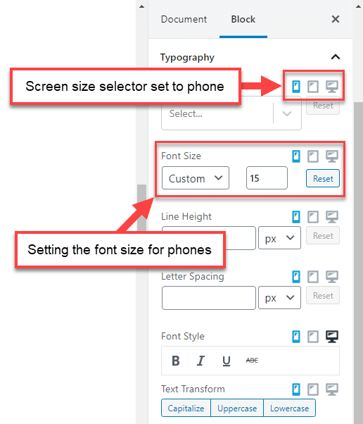
When you edit any block coming from Toolset you will see the screen size selector for each styling option including typography, colors, and more. This allows you to fully control the appearance of any block for different screen sizes.
So, if you need to adjust the size of the text output by a Toolset block, expand the Typography section in the right sidebar, select the screen size, and change the font size.
Changing the font options for the phone screens
Columns are too narrow on phones?
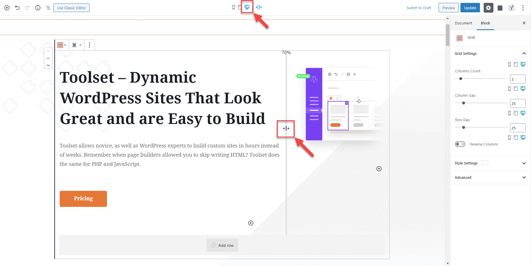
While several columns fit nicely on a desktop screen, on phone screens, typically only one column will fit. Use the Toolset Grid block to completely control the columns in your designs. You can use it for simple columns and for complex grids.
Editing a Toolset Grid block options for phone screens
Click between any two columns to resize them. You can set different column sizes for different screen widths.
Setting the different column sizes for different screen widths
Content in columns appears too close?
Click to select the Toolset Grid block and use the options in the right sidebar to control the gap (space) between columns and rows.
Adjusting the gap between columns
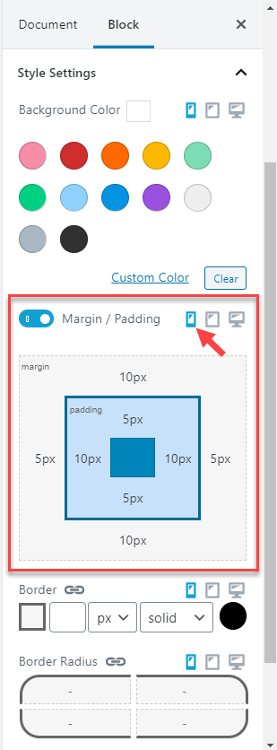
Too large margins and padding?
You can adjust the margins and paddings for any Toolset block and for any screen size. Select the block, expand the Style Settings section in the right sidebar, and select the screen size you want to adjust the settings for. Now, tweak the margins and paddings to your liking.
Adjusting a Toolset block’s margins and paddings for phone screens
Images appearing after the text instead of before it?
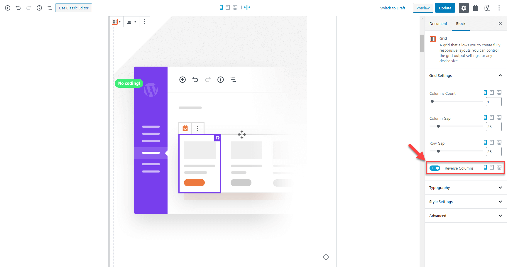
Sometimes, your designs feature floated images next to the text. However, on smaller devices, the texts and images might display in the wrong order.
You can use the Grid block’s Reverse Columns feature to control when “floating” images appear on phones.
The Grid block’s Reverse Column option
Need to hide big images on phone screens?
Your designs might use fancy but large images. While they look great on a desktop, they often don’t contribute much value on phones. You can hide any element, including images, on different screen sizes.
To hide an element, select it and expand the Advanced section in the right sidebar. There, you will see the Hide element toggle.
The option to hide a Toolset block on screen sizes of your choice
Switch to the target screen size on which you don’t want to show an element and hide it.
Toolset will show you a reminder icon for hidden elements. This way you won’t forget them and can unhide it at any time if needed.
Toolset shows you subtle icons for all hidden elements
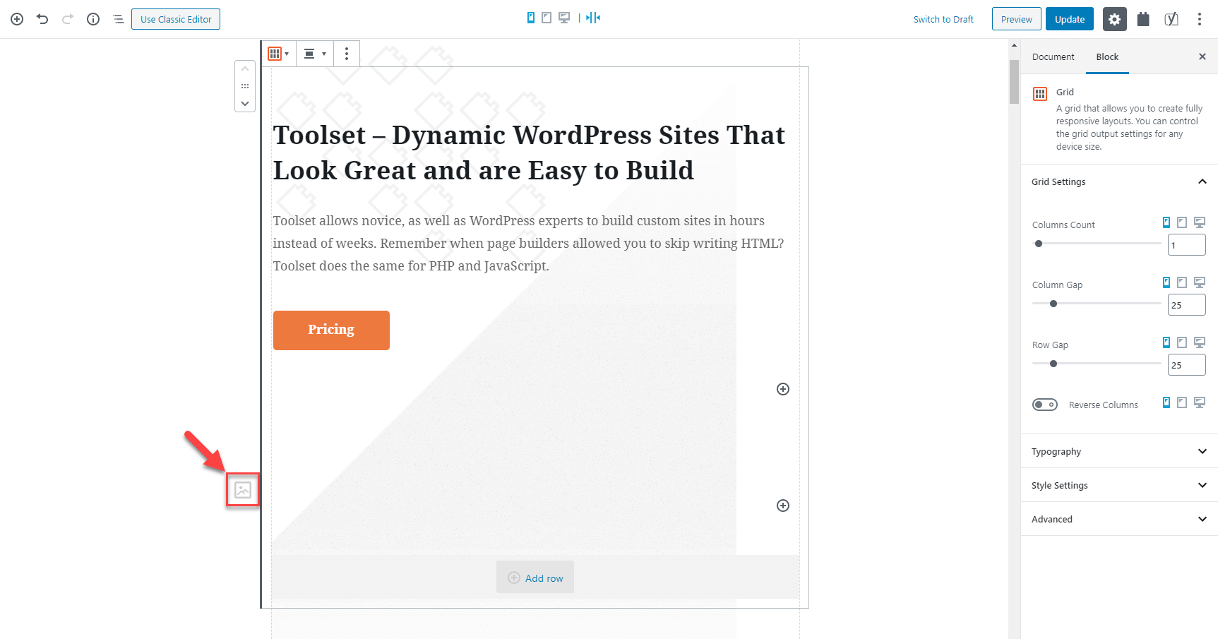
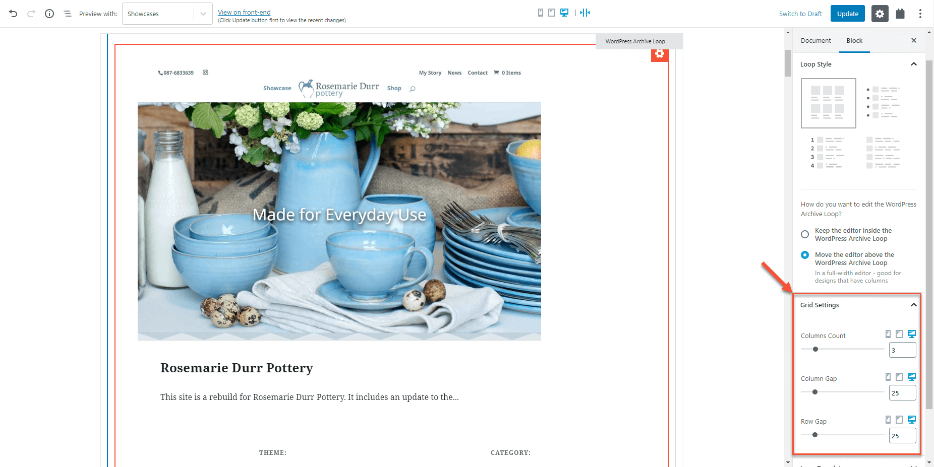
How can I control a View’s grid output?
The features of the Toolset Grid block are also available when you create Views . The new grid layout makes your Views look great on narrow screens.
Select the main View block and expand the Grid Settings section in the right sidebar. You will
Adjusting the Grid Settings for the View block
Setting custom responsive breakpoints
To set custom responsive breakpoints for your site go to the Toolset → Settings page and scroll to the Responsive web design breakpoints for Toolset Blocks section.
Toolset settings for customizing the responsive breakpoints
If you are not familiar with responsive breakpoints it’s best to leave the default values.


 Send feedback to our documentation team