What is white space and why every designer should know about it
Less is more. Every designer knows that sometimes it’s not what you add but it’s the space you leave that will enhance a website.
This is why white space is important. Below I will go through exactly what white space is, why you need it and examples of how you can use WordPress and its tools to transform a web page.
What exactly is white space?
White space is the space between all of your content, whether that is text, images, graphics or anything else. Despite its name, it does not necessarily have to be white. For example, white space might be an image in the background of some text.

White space is important because it makes your web designs easier to read and ensures the reader is not overwhelmed with information.
What do I need in order to create white space?
Margin and padding
One of the best ways to create white space is by creating padding and margins.
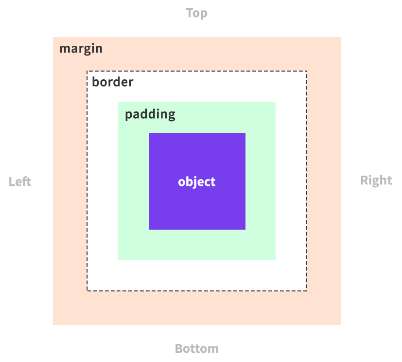
Padding is the space between an element and its border.
Meanwhile, the margin is the space between that border and other elements. Below you can see an example of how this works.
In order to create padding or margin, you would usually need to use CSS but what if you are not a confident coder?
Luckily, you can add margin or padding without coding using the new editor for WordPress, Gutenberg, and one of the extensions to Gutenberg, the Toolset Blocks plugin.
With Gutenberg, you can add your content to your website by using blocks. However, Gutenberg’s own blocks have limitations. This is where Toolset Blocks comes in.
Whenever you build any features using Toolset Blocks you have a number of styling options that you can add instantly and without coding. These include margin and padding.

In addition to margin and padding Toolset also provides another valuable tool that you can use to create white space.
Toolset’s Container block
Toolset offers a block for Gutenberg called the Container block. You can use the Container block to group a number of your items together in order to style them. This includes if you wanted to add margin or padding to a set of blocks.
For example, below you can see the Container block on one of Toolset’s free travel reference websites which you can use to experiment with Toolset’s features. Below I have created a content template for my Tours posts.

As you can see from the arrow the images and text seem a bit to close to each other. I could use the margin/padding styling from Toolset to separate the elements individually.
But an easier way would be to put all of the text elements on the right-hand side inside a Container block. Then you can insert the margin or padding once and everything will change together.

Toolset’s Grid block
In certain cases, you can use Toolset’s Grid block and its settings to create white space between your grid columns.
Below you can see the content template for my personal trainers on the gyms reference website.

As you can see there is not enough space between the two columns in my content.
Luckily, I created the two columns using Toolset’s Grid block which offers an option to increase the gap between the columns.

All I need to do is head to Grid Settings -> Column Gap and adjust it based on how wide I want the gap.
How to add the Container block with margin and padding to create white space

Let’s use the example above of the content template I created for my Sessions posts on Toolset’s gyms reference website – which you can download and check out yourself.
I will show you how I added the “CrossFit Group training” text and how I positioned it at the bottom of the image to create white space for the image.
1. Insert the Container block
I’ve created my content template with information about the session on the left and an image on the right. I want to add a box on top of the image with the title of the session and its difficulty.
First, you add the Container block which is available under Toolset’s list of blocks.

2. Add your content to the Container block
You can now insert your content into the Container block. For example, below I have used Toolset’s Heading block to insert the post title as a dynamic source – a feature that Gutenberg does not offer on its own.

To find out how to add a dynamic source using Toolset check out this video on creating templates to display custom posts.
Below you can see I also have added the custom field for Level of difficulty.

3. Add the padding/margin
Now that I have created all of my content inside my Container block I can add some white space using the padding/margin controls.
I first use the Block navigation on the top left of the page to select the Container block so that I can access the styling options. Note, there is already another Container block that holds the image. The new Container block will go inside of this.

Now I open the Margin/Padding section and can simply insert the numbers depending on where I want the white space.
There are four types of measurements which you can use:
- Pixels (px) – If you want to provide exact measurements for your white space.
- Percentages (%) – The percentage is calculated with respect to the width of the generated box’s containing block. This is also true for margin-top and margin-bottom as well.
- Em – This measurement is based on the font size used when styling an element. In other words, 1em will equal 20px if the font-size is set to 20px.
- Rem – This is similar to em except that for rem the measurement depends on the font-size of the root of the page – the html element.
Below you can see I have added a padding of 25px and a margin of 50%.

You can add padding and margin to all sides of your element. Notice how we haven’t had to use any coding to do it.
Bonus: Another cool way to create white space with Toolset
If you are adding forms using Toolset there is another incredibly simple but effective way that you can create white space.
When you display your form on the front-end you will generally want to insert it into a page. Once again you use the Container block to host it so that we already have white space surrounding the form.
Once you’ve added the Container block you can insert whatever form you have created using Toolset’s Form block.

Once you have selected the right form all you need to do is head to the Container block in the navigation bar and, under Inner Content -> Max-Width, enter in the unit you want depending on how much white space you need.

By using the Max-Width option you are deciding the width for the blocks you put inside the container. If you are working in pixels then the max-width is 800px. I prefer to use percentages which are easier to manage.
Another trick to remember is that Toolset offers responsive designs so you can easily change the Max-Width for different screen sizes. All you need to do is click the icons above the bar and you will be able to edit for mobile, tablet or laptop sizes.
You can then enter the new information and it will automatically adjust for that screen size.

Now you are able to create white space instantly for different screen sizes.
See how easy it is to add white space to your designs today!
Now that you’ve seen how simple it is, you can now try it out for yourself.
Here are the steps to take to add white space using Toolset.
- Download Toolset
- Check out one of our Toolset courses to learn all about styling your content including adding white space. Our WordPress Design Course is a great starting point if you want to learn more about design.
- Practice adding white space and other features using one of Toolset’s free reference sites.
- When you are ready, install and register Toolset on your own website and get started!