This is the technical support forum for Toolset - a suite of plugins for developing WordPress sites without writing PHP.
Everyone can read this forum, but only Toolset clients can post in it. Toolset support works 6 days per week, 19 hours per day.
| Sun | Mon | Tue | Wed | Thu | Fri | Sat |
|---|---|---|---|---|---|---|
| - | 9:00 – 13:00 | 9:00 – 13:00 | 9:00 – 13:00 | 9:00 – 13:00 | 9:00 – 13:00 | - |
| - | 14:00 – 18:00 | 14:00 – 18:00 | 14:00 – 18:00 | 14:00 – 18:00 | 14:00 – 18:00 | - |
Supporter timezone: Asia/Karachi (GMT+05:00)
Tagged: Content Templates, Toolset Blocks, Views, Views plugin
Related documentation:
This topic contains 7 replies, has 2 voices.
Last updated by Waqar 4 years, 11 months ago.
Assisted by: Waqar.
Tell us what you are trying to do?
On your recommendation, I am trying to build a site without Elementor and instead just use Toolset with WP Astra. I have never used Blocks and am struggling hugely with it. What I’m finding is that there doesn’t seem to be any difference to the troubles I had creating content templates and views within them whether I’m using Elementor or not.
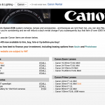
I want to create product pages as a test for a photography shop that might be asking me to redesign their old non WordPress site I did many years ago. Getting the product pages to look like the old site is critical to me getting the job of redesigning the site. The pages need to be a two column ‘price list’ style contained in multiple product category boxes. I’m attaching a screenshot of an existing site’s page to show you what it needs to look like.
I have so far done the following:
Created a test page called Canon Sales (canon-sales). Added a container block, then a two column grid block with background colour and text headings so I can see where the container and grid cells are while putting the design together.
I then created a test Toolset Content Template that would be the first of many product category boxes. The query for each will determine which products show in them.
Toolset > Content Templates> Create New> Named it PCB 001, not assigned to any post.
Added a Container block with border and background colour so I could identify it during the build process.
Within the container, added a heading block with styling and dummy text (will be dynamic when finished).
Under the heading block, added a view called PCB 001 View, selected table as loop style and products for the post type.
Unticked table heading.
Clicked Table View Loop and set 3 columns 65%, 14.99999%, 19.99999% widths.
Clicked Table column (a single pixel line that I found by chance).
I was able to click something but I don’t know what and I added post Title with URL as a dynamic source. This appeared in the first column.
I couldn’t then see how to select the second column to add content to it. After 17 hours over two days of clicking everything, anything, starting again and searching the web I read about something called Blocks Navigator. I then clicked the three horizontal lines next to ‘View With’ in the main edit page horizontal menu and that opened up a tab which allowed me to select the column I wanted to add content to.
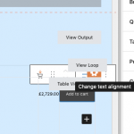
Why was doing this so difficult. Why is there not a visual representation in the edit page of the three cells in one row with plus signs, for me to add blocks to? I don’t understand. I'm not sure how anyone is supposed to use Tables as a view for building content in blocks? Is it me or is there a huge problem with how tables are viewed in the editor window?
Now I have the content in the three table column cells but I can’t see the ‘Add To Cart’ item in the third column as it disappears or is hidden behind the ‘Table View Loop’ label. I have to refresh the page to see it and then resize my screen to a really thin window so I can just about see the corner of the black button and then click it, resize the window, then edit the settings for this block. Then it disappears completely and the middle column, showing a product price, is pushed to the far right edge of the window and then it is only just about viewable among the View Loop and Table View Loop labels.
It seems to me that using Blocks and tables within a view is impossible? I can’t help thinking that building a table using HTML in the old Views section of Toolset would take about 30 seconds so may I ask why was this method stopped in preference of something that doesn’t seem to work.
Why is there no ’stripes’ options for table settings. Is there a setting for this. I can’t see it but maybe I’m just not clicking on the right thing.
Why are there no vertical align settings for tables, rows, columns, individual cells, blocks with dynamic content. The add to cart button is not vertically aligned properly. The gap at the top is wider than that at the bottom. How can I fix this please?
After changing text align in the product price column, the changes and also the font size, is not what I see in the published page. The edit window doesn’t show much in the way of changes and it’s difficult to see what I’m doing. Have I done something wrong or is this just 'how it is'.
I’ve created many test views within test content templates. How can I delete these unused views please? I know I can tick something in settings and turn on the legacy views but that’s defeating the object of what I’m doing. So without doing that how can views be deleted please?
Is there any documentation that you are following? None.
Is there a similar example that we can see? Screenshot attached of old non WP site.
What is the link to your site? hidden link
Hi,
Thank you for contacting us and I'd be happy to assist.
First, an important point to note here is that the Toolset Blocks is not an editor or a page builder on its own. It consists of specialized blocks offering Toolset functionalities, which can be used inside the WordPress' new editor "Gutenberg":
https://wordpress.org/gutenberg/
WordPress is heavily focused on making its new blocks-based editor a success and it has come a long way from where it started. With Toolset Blocks, our goal is also to facilitate the users who are adopting this new "Gutenberg" editor and we're constantly improving our blocks, based on the feedback and suggestions we receive.
The very first question that needs to be addressed is if you feel comfortable with this new editor in general or if it would fit the design and the customization requirements of a particular project. Naturally, there are users who still prefer the classic/legacy WordPress editor or third-party page builders like Elementor, Divi, etc and for those users, the Toolset Blocks plugin still offers the option to switch to classic/legacy editor for creating views, content template, and WordPress Archives.
( you'll see the editing experience options at WP Admin -> Toolset -> Settings -> General ).
Moving to your specific points, sorry to learn that it took you a while to find the blocks navigation feature in the editor. To avoid a similar situation, I'll recommend getting familiar with the new Gutenberg editor, after which using options and settings available in the Toolset blocks will make more sense. Here are some useful guides and tutorials:
hidden link
hidden link
As for working with the table output for views, I can understand that it can be a bit challenging to style and adjust. We have an internal ticket to improve this and I've added your voice to this matter too, but, I'm afraid, I don't have a time estimate to share at this time.
I don't see any screenshot or link to the page/design that you're trying to reproduce. Can you please share the link to the older website's page where this table can be seen? I'll be in a better position to suggest the next steps, accordingly.
To delete the unused views, you can set the editing experience option from WP Admin -> Toolset -> Settings -> General, to "Show both the legacy and Blocks interface and let me choose which to use for each item I build". After that, you'll see the views management screen option in the Toolset admin menu (WP Admin -> Toolset -> Views).
( there are plans to improve this in future releases too )
I hope this explanation helps.
regards,
Waqar
Hi Waqar,
Thank you as always for such a detailed reply. I will try to keep going without Elementor for this project as I'm sure leaving it out will make the site 'lighter' and give it one less layer of complication. I will watch the videos you sent links to.
I enabled the legacy Views and created in 30 minutes what I failed to do in 2 days with Content Templates and Blocks. Such a shame. The problem I now have though is that without Toolset blocks and the styling options I cannot easily style the add to cart button for example. I had to select 'View Page Source' in my browser and manually find the class name for the button and try things out one by one. I am not particularly good at doing things manually which is why I use Toolset to do this for me.
There are two views on the following page: hidden link
At the top there is the original PCB 001 Content Template with the PCB001 View within it created using Blocks.
Underneath that there’s the legacy View called Canon Test created manually with HTML and CSS.
I could go forwards with either of the two views on this test page and I want to use the Content Template version as it’s what Toolset and WordPress want me to do really isn’t it. If that’s the way forwards I need to move forwards with it.
Could there be another option to forget the table view and build something with a grid (fixed so it stays on one line on smartphones). Would that be the sensible thing to do?
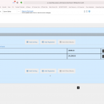
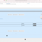
I'm not sure the Content Template Blocks based view (the top one) is safe. So far without making any changes, the dark grey add to cart buttons turned blue and they stuck out of the right hand edge of the cell. To correct it I had to open the Content Template and click save. Weird. I could not afford that to happen with a live site.
I cannot get the 'add to cart' button to fill the cell and keep the text on one line. I edited the padding for the button to get the text to sit on one line as you can see now but now the button doesn’t fill the cell. It's either like it is now or the text is scrunched up on 2 lines in the centre. Padding and line height rules failed to correct it in the CSS window. Can this be made to look neat and tidy like the other view below it?
I cannot get the rows to be any shorter in height. There is a lot of what looks like padding. How can that be edited so the rows are closer together like the view beneath it.
Also, there is a default grey border for the table cells. How do I get rid of the default light grey borders. I only want a bottom border like you see in the manual table view below.
The manual table was super quick to do but because there is no cosy block style editor I will have to work out styling options for smartphones and tablets and build this manually into the code for the view and that's going to push me to my limit. The whole point of Toolset for me is that I shouldn't need to use coding. I can only hope that someone will fix the table building section in Blocks as it really is unusable for me at the moment.
So to sum up, can the top view, created in Content Templates and Blocks, be made to look like the legacy Views view below it. Or would a simpler option be to forget tables and try to use another view loop style, such as a grid which might be able to be styled like my legacy view? Alternatively should I 'go backwards' and use the legacy view which means I have to work hard to make it look good on different devices?
I'm attaching a screenshot to the existing product page which can also be found here? hidden link
Many thanks,
Barry.
Hi Barry,
Thank you for sharing this update and sorry about the delay in getting back on this.
Based on the points and the screenshots you've shared, I'll recommend using the "Grid" block and not the Table output in the view.
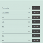
( the attached screenshot shows a simple example of a table-like output, without actually using any table ).
Here are the steps:
1. You'll create a view and in the Loop Style, select the "Unformatted" output.
2. Next, in the view's loop, you'll add a "Grid" block, with 3 columns, and insert the blocks for the title, price, and add to cart button, in each column.
In my example, I've used a "Heading" block, "Single Field" block, and the "Add to Cart Button" block, respectively. And below the "Grid" block, I also added a "Separator" block to show a solid line after each loop item.
Screenshot: hidden link
3. In each "Grid Cell" block's settings, I selected the vertical alignment to "Middle".
Screenshot: hidden link
4. In the "Typography" settings of the "Single Field" block for the price, I set the text alignment to "Right".
5. We have an internal ticket to fix the alignment option in the "Add to Cart Button" block, so for now, I had to include some custom CSS code, to make it align right.
( ref: https://toolset.com/errata/add-to-cart-button-block-alignment-does-not-work-in-product-archive-or-in-views/ )
.wp-block-toolset-blocks-grid-column .wp-block-woocommerce-views-add-to-cart {
text-align: right;
}
Note: You can adjust the font size, line-height, padding, and margin settings in each block as needed, to control the overall look and feel of this table-like output.
I hope this helps.
Hi Waqar,
It seems that your system has stopped allowing support threads to be added at weekends. I’ve had to wait until now to add this.
I’ve made progress but only with using legacy views. There’s no way I can use Views within Toolset Blocks without losing the will to live. Things like the Add To Cart button just disappear from the edit page which has to be refreshed to bring it back. Weird white space appears between blocks and then there’s no whitespace on the bottom 2 rows within a set of data inside a view etc. The layout also changes on the front end without doing anything on the back end so I’ve had to give up with it. I tried everything from unformatted to grids to bootstrap etc. using blocks but nothing made any sense whatsoever so I guess it’s a work in progress for Toolset or I’m stupid, but surely, no-one has ever been able to use Views in Toolset Blocks to make a site have they? I can’t wait for it to work but it’s made me ill just trying to cope with testing it out.
It’s hugely disappointing. I’m still persevering with Toolset Blocks in general without using Elementor to build the site and I’m close to finishing the page which will form the backbone for the site.
This is the page on the client’s live website that I’m trying to copy the look and feel of:
hidden link
Here is my current attempt on the test site:
hidden link
What I’ve got is a Legacy View with a conditional that says if there’s a product image, show it along with excerpt text, if not don’t. It’s as good as I’m going to get I think for now. The top left Legacy View is a bootstrap version and the others are copies of an earlier attempt using tables repeated 3 times just to fill up the page but the boxes will of course show different products when finished.
All I need to do to finish things off is as follows:
ONE
Inside the view I’d like to display ‘In Stock’ in green next to the product name. When I add [types field='views_woo_in_stock'][/types] it displays ‘1’ (you can see it at the end of each product title) and that 1 presumably refers to it being in stock (I added 10 for each product in the inventory so I know the figure is not the amount of stock). So is there an option to say ‘In Stock’? I’m not sure why anyone would want to display ‘1’ instead. Isn’t that a bit odd or have I missed something simple?
TWO
Can the Woocommerce Add To Cart button be edited? I added it within Toolset Fields and Views. It seems to have a fixed width and if I assign it less than 3 columns in Bootstrap it jumps out to the right of the column. If I could make the button width fill the bootstrap column instead then this wouldn’t happen, and I could then bring the right aligned price in the column before it, closer to the button and make more space for the product titles to fit on one line on smart phones.
THREE
I need to create the Sales - Camera & Lighting drop down menu you see above the banner image on the current site here: hidden link
I can’t see any Toolset Blocks called ‘Nav Bar’ nor can I see anything in Widgets (I created an Astra Widget thinking I could add that to the page via Toolset if all else failed).
So how can I add this menu to the body of the page? I know I can do this easily enough in Elementor but surely I can do this in Toolset Blocks. Can you possibly help with this please?
Many thanks,
Barry.
Thanks for writing back and I'm not aware of any restriction on adding support forum replies over the weekend.
I saw some replies coming over the weekend on the other threads, so did you see any error or warning when you tried?
As discussed above, the choice of editors is a combination of personal preference and the design requirements as a whole, but you're welcome to start individual tickets to share specific feedback/suggestion points for the features available Toolset Blocks.
ONE
Your observation is correct and "views_woo_in_stock" field stores value '1' for the ‘In Stock’ products.
You can think of this value "1" as a "yes" and use it in a conditional evaluation so that some text for example ‘In Stock’ is shown only if the value "1" is returned.
In the Blocks environment, you can use the "Conditional" block and in the classic/legacy editor you can use the conditional shortcode block:
https://toolset.com/documentation/legacy-features/views-plugin/using-shortcodes-in-conditions/
Example:
[wpv-conditional if="( '[types field='views_woo_in_stock'][/types]' eq '1' )"]
<span class="in-stock-text">In Stock</span>
[/wpv-conditional]
TWO
If your goal is to make sure that the add to cart button fills the full available width of its container, you can include some custom CSS code, for example:
.woocommerce .button.add_to_cart_button {width: 100%;text-align: center;padding-left: 0;padding-right: 0;}
Tip: To check which CSS code is applying to different page elements, you can use Google Chrome's inspect element tool, as explained in this guide:
hidden link
THREE
I'm afraid, there is no built-in feature available for this and to create a select/dropdown field that redirects to a different page, you'll need some custom code and script.
Here are some good examples:
https://stackoverflow.com/questions/7562095/redirect-on-select-option-in-select-box
hidden link
For more personalized assistance around custom code, you can also consider hiring a professional from our list of recommended contractors:
https://toolset.com/contractors/
Let me know if you have any follow-up questions and for a new question or concern, please start a new ticket.
Hi Waqar,
I've been trying to reply to this all week but the 'My Issue Is Resolved' and 'I Still Need Assistance' buttons have not appeared on my screen. That's why I initially said I could not reply at week-ends, thinking that your system disabled the buttons while staff were not working. That's all I could think it was but it's been like this all week. I'm attaching two screenshots to show you the top and bottom of the thread. It would seem to indicate to me that I wasn't logged in but I was. I would say that the reply buttons wouldn't be there if I wasn't logged in so there must be a reason why although I was logged in, the system or the browser didn't show that I was?
Thank you for all your help. I'll just have to use Elementor and legacy Views until things get better. I could not make any site worth building without legacy Views so I hope this is not going to be phased out any time soon. It's just so perfect at being able to pull data with queries and to display anything. I'm so confused why Blocks is being pushed so much as it's totally and utterly useless for anything.
Anyway, thank you for your support.
Many thanks,
Barry.
You're very welcome and glad I could help.
Some updates were applied to the support forum last week, which would explain the temporary missing of options.
Can you please clear your browser's cache and cookies and then log in again to see if the support ticket's options are showing now?
