Hi there,
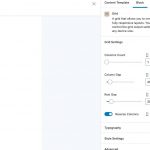
Column reverse for iPad. Am I right in thinking that this when using a Toolset grid, only works for phone even though there is an option to activate this for iPad also?
Been going crazy as to why this wasn't working, then checked the Toolset docs and it only indicates its for phone...no mention of iPad etc.
Is this 'really' correct?
Thank you.
Hi Pete,
Thank you for contacting us and I'd be happy to assist.
The "Reverse Columns" setting in the Grid block can be set for each responsive web design breakpoint, independently.
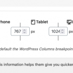
You can see and adjust the values for these breakpoints at WP Admin -> Toolset -> Settings -> General.
By default, screens wider than 781px are treated as "Desktop".
Screen widths between 781px to 600px are treated as "Tablet".
And any screen width with 599px or less is treated as "Mobile".
The three device icons next to the "Reverse Columns" setting indicates which device group is being selected for the setting and you can set the value of this setting for each device group independently, by highlighting its icon.
I hope this explanation will make it more clear.
regards,
Waqar
Hi there Waqar,
Thanks for your reply.
We have our breakpoints set to match the theme, Kadence in this instance, these the standard.
The column swap options certainly does not work for a tablet on inspector or on a real device.
However if we use Kadence blocks and the below CSS it works fine:
@media (max-width: 1024px) {
.reverse-mobile .kt-row-column-wrap {
flex-direction: column-reverse;
}
}
This on both inspector and real device testing.
Something isnlt right with the column swap function, we saw this a couple of months back and just didn't bother however revisiting this...the issue I can confirm.
A shame as we have abandoned using Toolset Blocks for the purpose.
No big issue as we can work around this.
Thanks, Pete
Thanks for writing back.
You're welcome to share temporary admin login details for a website where this issue can be seen. I'll be able to troubleshoot and report it accordingly.
Note: Your next reply will be private and please make a complete backup copy, before sharing the access details.

