Tell us what you are trying to do?
Hi. I have my grid set to two columns on desktop (working as should) and 1 column mobile (also working as should). However, even though I have the grid set to 1 column on tablet, it's showing as two.
hidden link
Also, Even though I have my width set to 100% on both tablet and mobile, it's showing margin on both sides even though the browser inspector says margin is set to 0
Is there any documentation that you are following?
Responsive grids with toolset article
Is there a similar example that we can see?
hidden link
What is the link to your site?
hidden link
Hi,
Thank you for contacting us and I'd be happy to assist.
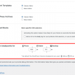
You'll find the settings for the responsive web design breakpoints at WP Admin -> Toolset -> Settings -> General.
( example screenshot attached )
By default, the breakpoint for the tablets is 781px and for mobiles it is 599px. From your website's code, it seems that the same breakpoints are set on your website too
If you'll check your page on screens wider than 781px (desktops), the grid is showing in two columns, and on screens equal to or lower than 781px ( tablets & mobiles ), the grid is showing in a single column. You're welcome to change these breakpoints as needed.
I'm not sure exactly which margins are you referring to, so you're welcome to share some screenshots.
regards,
Waqar
Waqar,
Thanks for giving me that little tip! That worked great.
As far as the margins that I'm talking about...... my container and grids are set to 0px margin and padding, as well as the container set to full width. I want the menu at the top to be stretched across the width of the screen on mobile and tablet with no padding or margin left and right.
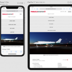
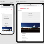
Please see the screen shot of the dev site: hidden link
and the screen shot of the live site: hidden link
How can I achieve the same look as the live site?
Thanks,
Deanna
Thanks for the update and the screenshots.
The header menu section is actually being controlled by the Divi theme's own styles and not by Toolset plugins.
Using Chrome's inspect element tool ( hidden link ), you'll see that the theme sets the header container area to max-width of 100%, on screens equal to or wider than 981px. And for screens smaller than that, sets the max-width to 1100px and width to 80%.
( screenshot: hidden link )
You can add some custom CSS code in your theme's general custom CSS code, to override that. For example:
@media (max-width: 980px) {
.et_fullwidth_nav #main-header .container {
    width: 95%;
    max-width: 95%;
    padding-right: 0px;
    padding-left: 0px;
}
}
You can read more about CSS media queries at:
hidden link
Note: The custom code examples from our forum are shared to get you started in the right direction. You're welcome to adjust them as needed and for more personalized customization assistance, you can consider hiring a professional from our list of recommended contractors:
https://toolset.com/contractors/
My issue is resolved now.. Thanks Waqar! You are a master of your craft.


