Hi there,
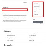
Ok this test page, we have a view in the left hand column (as in pic attached)
hidden link
Currently it is one column yet becomes two on smaller screens, this we created over a year ago on our other site.
On smaller screens it becomes two columns, then one for phone.
I have spent over two hours trying to make it permanently two columns and in a new location as shown in the pic.
However this never works right and breaks the page competently.
What is it I need to do to make this two columns on desktop and iPad, one column on phones please?
Looked at Bootstrap and tried all kinds of variations. To no joy!
Any help would be gratefully appreciated.
Hello,
You are using Oxygen page builder to design the single "Portfolio" post template, they are using custom CSS style to style/format the layouts, according to our support policy, we don't provide other plugin support:
https://toolset.com/toolset-support-policy/
You will need to check with Oxygen support for it.
With WordPress built-in blocks editor, it is very easy to design the page/post for different devices, see our document:
https://toolset.com/course-lesson/creating-responsive-designs/
Lou,
This has nothing to do with Oxygen and its layouts, the View in question uses Boostsrap!!!!
Typically this is part of the code:
<div class="col-xs-12 col-sm-6 col-md-12">[wpv-post-body view_template="loop-item-in-list-features-sidebar"]</div>
So again, I ask the same question...
Currently it is one column yet becomes two on smaller screens....
I'm not a developer so sending a ton of links about Bootstrap wont be helpful, this I have spent 2 hours looking into
Let me check again your website and your screenshot, one moment
I assume we are talking about the items of the sidebar "Sleeps up to 6",
Please try this:
Edit the post view "List Features Sidebar":
hidden link
in section "Loop Editor", replace all the CSS class name from "col-md-12" with "col-md-6", and test again.
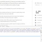
See my screenshot col-md-6.JPG
More help:
hidden link

