Tell us what you are trying to do?
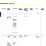
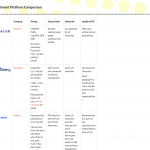
I'd like to work out how to improve the look of a series of tables I've built using tb-grid.
My grids are populated via a CPT and then displayed in a view.
I have to allow ten columns to accommodate a range of different data that the template will be used for.
Recently Waqar helped me resolve an issue with hiding unfilled cells by writing JS. The only downside being that tables which have fewer columns do not fill the container.
A more pressing problem is what happens when the table is viewed on other devices. It's not at all pretty.
At the very least, I'd like to be able to have horizontal scroll, but have not yet worked out how best to do that.
Is there any documentation that you are following?
Is there a similar example that we can see?
I've attached images of various table so you can see what happens.
What is the link to your site?
Hi,
Thank you for contacting us and I'd be happy to assist.
Reviewing the screenshots, the use of Toolset Grid for a comparison table layout like this doesn't seem like a good idea.
Can you please share temporary admin login details, along with the link to an example page with this comparison table view? I'll be in a better position to suggest an alternative, after understanding the source for these columns.
Note: Your next reply will be private and it is recommended to make a complete backup copy, before sharing the access details.
regards,
Waqar
Thank you for sharing the access details, but, I'm not able to access the WordPress admin area.
Jetpack's "Secure Sign On" feature, keeps asking to connect a WordPress.com account.
Can you please temporarily disable this feature?
( ref: hidden link )
Jetpack's security features have been disabled now.
Thank you
Thank you for enabling the admin access.
As you're using the repeatable field group entries, to generate each row in the comparison table, it would be more intuitive to generate the actual table mark up using the classic/legacy view.
You'll find a new example view "View to show the related Table rows" that I've created for this at WP Admin -> Toolset -> Views. Here is the code that is being used in the view's loop editor:
[wpv-layout-start]
	[wpv-items-found]
	<!-- wpv-loop-start -->
	<div class="table-responsive">
	<table width="100%" class="table">
		<tbody class="wpv-loop js-wpv-loop">
		<wpv-loop>
			<tr>
		<td class="logo-cell">[types field='logo-image' title='%%TITLE%%' alt='%%ALT%%' size='thumbnail' resize='proportional'][/types]</td>
              	<td>[types field='col-1'][/types]</td>
              	<td>[types field='col-2'][/types]</td>
              	<td>[types field='col-3'][/types]</td>
              	<td>[types field='col-4'][/types]</td>
              	<td>[types field='col-5'][/types]</td>
              	<td>[types field='col-6'][/types]</td>
              	<td>[types field='col-7'][/types]</td>
              	<td>[types field='col-8'][/types]</td>
              	<td>[types field='col-9'][/types]</td>
			</tr>
		</wpv-loop>
		</tbody>
	</table>
    </div>
	<!-- wpv-loop-end -->
	[/wpv-items-found]
	[wpv-no-items-found]
		<strong>[wpml-string context="wpv-views"]No items found[/wpml-string]</strong>
	[/wpv-no-items-found]
[wpv-layout-end]
You'll also find the following custom CSS code in the view, to adjust some cell spacing and padding:
table tbody.wpv-loop tr td {
vertical-align: top;
padding: 2% 1% 0% 1%;
}

table tbody.wpv-loop tr td.logo-cell {
width: 10%;
min-width: 10%;
display: table-cell !important;
}
I've placed this view's shortcode in the content template "Template for comparisons", so that you can compare the output of the two views.
Oh WOW! That's fantastic!
So, did you just write that especially?
A quick question: What decides the column widths? Some of the columns are narrow so that the text breaks and if that an be remedied That would be great!
Thank you so much!
Thanks for the update and glad that I was able to help.
Preparing a view like this isn't complicated, once you've become familiar with the classic/legacy views editor and the basic HTML and CSS code.
You'll find useful guides on the topic of using classic/legacy views at:
https://toolset.com/documentation/legacy-features/views-plugin/
The width of the table columns (except for the first one for the logo) are getting set automatically, based on the content available inside them.
As the first column's usage and position are expected to be the same and it will always be used for the image logo, you'll note that I've added a class "logo-cell" to its "td" tag:
( screenshot: hidden link )
<td class="logo-cell">[types field='logo-image' title='%%TITLE%%' alt='%%ALT%%' size='thumbnail' resize='proportional'][/types]</td>
And then, through the custom CSS code, minimum width of 10% is assigned to this column.
( screenshot: hidden link )
If you'd like to set a fixed minimum width for any other column, you can repeat the same for that column too.
Note: The custom code examples from our forum are shared to get you started in the right direction. You're welcome to adjust them as needed and for more personalized customization assistance, you can consider hiring a professional from our list of recommended contractors:
https://toolset.com/contractors/
My issue is resolved now. Thank you!


