Hi there,
We cloned a site today that uses Elementor, our intention to use Oxygen Builder.
Pages created using Toolset and Gutenburg should be unchanged however our grid no longer scales. CSS and everything is the same and I can't work out why.
This the original site - the grid scales down fine:
hidden link
This the new site - the grids wont scale down in size:
hidden link
I'm frustrated not to see something obvious however I just can't see why Toolset Grids wont scale.
Any thoughts would be gratefully appreciated.
Many thanks.
Hi,
Thank you for contacting us and I'd be happy to assist.
I'm not sure exactly what you meant from "the grid scales down", but the only thing I noticed different on the new page is that on the smaller screens, the grid images extend beyond the available width.
The reason for that is the following CSS code, which is included in the old page, but not the new one:
img {
    border-style: none;
    height: auto;
    max-width: 100%;
}
If there is something else that I'm missing, you're welcome to share some screenshots, to highlight the difference.
regards,
Waqar
Hi there Waqar,
Thank you for getting back to me.
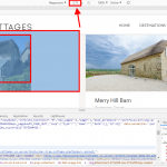
That worked great, many thanks. Sorry, I should have attached an image of what the issue was, this is it, you were right.
The images were extending beyond their width.
I'll now need to dig about for the original CSS as I thought all Toolset CSS was 'in' Toolset however this seems not to be the case.
Thank you again for your help.
Pete
You're very welcome and glad I could help, Pete.
Please feel free to start a new ticket for each new question or concern.
Hi Waqar,
Sorry to bother you again ref this issue however just discovered by chance that the images aren't scaling like they used to on mobile.
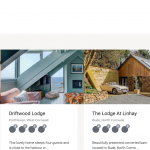
Image attached is iPad, similar issue for phone too.
I don't understand is the width is set to 100%, why isn't the image filling the area like it used to?
This a page: hidden link
Thanks again.
Thanks for writing back.
The image thumbnail size selected for that view's images is not wide enough that it can cover the available width.
To fix this, you can:
1. Select a different image thumbnail size, which has more width.
OR
2. You can change the wrapping grid class from "col-sm-4 col-sm-6" to "col-sm-6 col-md-4".
This will make sure that on medium screens that grid shows in three columns and only switches to two columns, on smaller screens.
(right now, it switches to 2 columns even on medium screens)
There is another option of using custom CSS code to force the images to cover the full available width, but that will result in stretching and pixelation, so I'll not recommend that.
Hi there Waqar,
Thanks for getting back to me again.
An update or something changed since we created this a year ago, this we would never left...so really odd!
the thumbnail is set to size="custom" width="373" height="260"
This for desktop which is import for speed.
Is there a way of setting a different size just for medium screens?
We did just 2 columns on medium screen because if we used three, it crushes the text info too much.
Many thanks, pete
I can't think of any update from Toolset plugins that could affect this.
What's happening is that the view's output is switched to two columns when the screen becomes smaller than 1280 px.
And the image is not able to cover the full width starting from the screen width of 1279 px up to 1025 px.
(from 1024 px the container is narrowed down enough that the images are wide enough to cover the full-width)
As shown in the attached screenshot, the available width to cover the container at the widest point of this problem (i.e. 1279 px) is 575 px, which means to naturally solve this, you'll have to change the image's thumbnail width from 373 px to 575 px.
( this much increase in the image's size shouldn't significantly affect the page speed )
If you'd like to keep the image's thumbnail size and the column numbers the same as they're now, then you'll have to include some custom CSS code in the view to force the images to cover the full-width:
.feat-image-link a img {
    width: 100%;
}
Ok I did as you suggested:
"you'll have to change the image's thumbnail width from 373 px to 575 px."
When I did this the images were not right on desktop? Happy to change them on your recommendation however what is it I need to do so it works on desktop 'and' smaller screens please?
It is strange that those images were extended beyond the container, on the desktop resolution.
Can you please share temporary admin login details, in reply to this message?
Note: Your next reply will be private and please make a complete backup copy, before sharing the access details.
Thank you for sharing the admin access.
It seems that you've shared the example link with me from the actual website but the last screenshot which showed the images stretching beyond the container from this development website, whose access details you've shared now.
If you'll try the larger image thumbnail size on the actual website, you won't see the images stretching the same as they're on the development website. The reason is that some safety CSS styles are being loaded on the actual website just to avoid this, but not on the development one:
img {
    border-style: none;
    height: auto;
    max-width: 100%;
}
You should load this CSS code globally on this development website too.
My issue is resolved now. Thank you!


