On the custom post content template example here --> hidden link
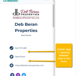
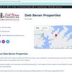
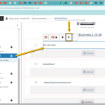
I am having trouble controlling the spacing in between the phone, email and website fields. They are in individual grids, each with one column for the icon and one column for the value. Each of these grids are in their own Conditional block because I only want it to show if the custom post Advertiser enters a value for that field.
I have been able to get them to look right in the desktop view, but in mobile there is too much spacing and I have been unsuccessful figuring out which settings to adjust specifically for mobile view.
Hi,
Thank you for contacting us and I'd be happy to assist.
In the Toolset blocks settings, you can independently set the styles like padding and margins for different device screen sizes, as explained in this guide:
https://toolset.com/course-lesson/creating-responsive-designs/
You can adjust the top and bottom margin values for the 'Grid Cell' blocks used for these text lines while selecting the 'mobile' device icon selected.
Tip: To decrease the vertical spacing between these lines further, you can even use negative values (e.g. -5, -10, etc) for the top and bottom margins.
I hope this helps and please let me know if you need further assistance.
regards,
Waqar
Waqar-
Thank you, I have gotten the spacing to behave on those elements in the mobile view for that page.
Next, I'm working on the Archive page for that CPT here: hidden link
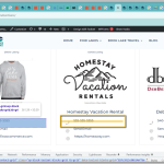
and have used the same contact information grid elements as before, but I am unable to get the content in each cell to align vertically in this case.
I would like the icons on the left to appear as if it's on the same line as the text, just as they do in that first url I sent you.
Both Grid cells have the vertical alignment set to center, but the content looks like the icon is center aligned, but the text is aligned to the top of the cell. Do I have to employ additional css here for some reason?
The grid cells appear to align properly in this page: --> hidden link
But they are misaligned on this archive page: --> hidden link
Thanks for writing back.
Some styles from the theme are adding some bottom margin to the paragraph tag, inside the grid block. That bottom margin makes the text miss-align.
In your archive's custom CSS section you can include the following CSS code to apply the equal top and bottom margin to those paragraph tags:
#contact-grid .tb-grid-column p {
    margin-bottom: 15px;
    margin-top: 15px;
}
My issue is resolved now. Thank you!


