The Updated Reference Sites Help you Learn Toolset and Build Sites for Clients
Together with the recent release of Toolset plugins, we also updated all reference sites. If you haven’t used Toolset reference sites before, you’re missing out.
Toolset reference sites are a great way to learn how to do things with Toolset and you can even use them as a starting point for your client projects.
All reference sites now use Toolset in the best possible way, so you can see what you can achieve and get creative ideas. When you see a reference site that you like, you can download it fully, customize and use as the starting point for your own development.
Zero learning curve using the front-end Layouts editing
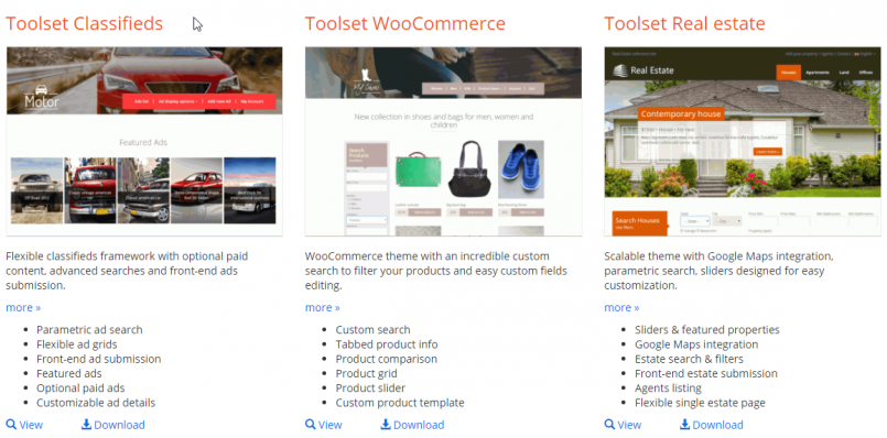
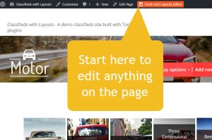
Look at any page on the site. To edit any of the elements on that page, click on the Front-end Layouts Editor button. You need to be logged in to your own site in Discover WP to do this.
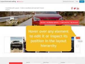
Now that you’re in front-end editing, hover over any part of the page to edit it. You will see a ‘pencil’ for editing and a ‘wrench’ for the hierarchy inspector.
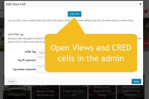
When you edit Views, CRED and WordPress Archive cells, you’ll open the editor in the admin, so you have the full width of the browser.
When you open ‘simple’ cells (Visual Editor, image, Youtube, etc., you’ll be able to edit in a popup, from the front-end.
So now, there’s no need to guess how we’ve built the different pages. Open any page and click through it.
Customize everything in the admin from Toolset->Dashboard
Of course, the Toolset Dashboard is still there and it’s still useful.
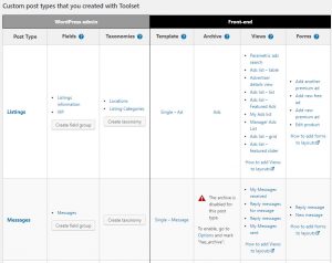
From the Dashboard, you can modify custom types, fields and taxonomy. You can also directly reach the templates and archives that display each type on the front-end.
Use as the basis for client sites
You can think of our reference sites as sets of pre-assembled Legos. The Framework Installer plugin lets you download complete reference sites. You can download to your local development PC and even to online servers.
Since everything on our reference sites is built using Toolset, you can customize, move, add and delete whatever you want. Of course, you’ll want to remove our sample content and you also need to remove images (the stock images that we use are not for redistribution). Then, you’re very welcome to continue your development from this point. Toolset reference sites will help you reduce the development time, while starting from a design that uses best practices.
Feedback?
What do you think about Toolset reference sites? Leave your comments and we’ll get back to you.
What about editing the css styling that you have added in the reference sites, for instance how do I remove the menu spacer lines in the top headings, can’t find that css code anywhere?
CSS is probably a little “overqualified” but basically something like this will do it. You may not need the body tags. Been a while since I used it.
body .nav>li>a:after, body .ddl-nav>li>a:after {
background: none;
}
HTH
Scott
The easiest way to remove spacer lines is to prevent them from displaying. You can add the below code into Custom CSS section of the Theme Customizer.
body .nav>li>a:after, body .ddl-nav>li>a:after {display:none;}
See here lies the problem they have styled the main menu which cannot be overwritten in the css editor, I know which code to change yet I can’t remove any :after tags.
Both the same menu. The row at the top with an id of #topbar. Here is a screenshot.
http://pasteboard.co/EPhrDsoIF.png
It was a bit of a pain so I used MicroThemer and then pasted the CSS into the Layouts CSS editor box.
/*Layouts css goes here*/

#topbar {

	color: #ffffff;

	background-color: #3B5998;

  	height: 45px;

}
div#topbar-menu div.ddl-navbar-collapse-ea009f1cb07e213d89c8e71a56637018 {
height: 45px !important;
padding-top: 0 !important;
padding-right: 0 !important;
padding-bottom: 0 !important;
padding-left: 0 !important;
}
div#topbar-menu div.ddl-navbar-collapse {
background-color: rgba(255, 255, 255, 0) !important;
height: 45px !important;
margin-top: -50px !important;
}
div#topbar-menu nav.ddl-nav-horizontal {
background-color: rgba(255, 255, 255, 0) !important;
}
I’d like to get rid of that negative margin and I didn’t do the mobile menu yet … but it is possible.
Now that Reference Sites have been updated to the 1.9 layouts format, I was wondering about the roadmap for doing the same thing with the WooCommerce Views plugin?
I asked about it on one of the previous blog posts during beta, and was told that it would be updated.
I assumed that meant that the plugin would create a default 1.9 template for Basket, Checkout, My Account, Shop and Product, and maybe add some WooCommerce specific layout cells based around the display shortcodes (e.g Basket, Checkout and MyAccount).
However, I just installed a fresh site with WooCommerce Views and it still creates a blank install as far as layouts goes.
This is exactly what we’re working on right now. A few minutes ago we released the updated Avada integration. It includes a full set of WooCommerce templates. Documentation for the Avada/Layouts integration will be updated this week. We’re continuing to do the same for all other theme integrations, as well as for our own Toolset Starter theme. I think that it’s a 2-week project to finish all of this.
So currently the WooCommerce templates are available for people that use the Avada integration only? But over the next week or two Toolset Starter, TwentySeventeen (and so on) will also have the woo templates? Is that right?
Currently, because this is what we managed to complete by yesterday. We’re continuing right now with the rest of the integrations. We’re going to release one at a time. It takes us a couple of days per theme, so we’ll be all done either by the end of next week, or the following week.
We can do a lot of things related to Module Manager and this import. Let’s finish this project for adding WooCommerce templates to all integrations. When it’s ready for the theme that you’re using, you’ll see the full picture. Then, it would be better to talk about what other features you need.
Sounds OK?
One other thing on this line that I’d like to request.
Currently, the wizard that adds the templates, archives, views and layout cells will only run on a blank site. While this makes sense to avoid compatibility issues, it would be nice to have some way of grabbing them later in the process.
Would it be possible to add a few new modules to the module manager, containing the default stuff for blogs and woocommerce? They could perhaps be imported as un-assigned templates with a module manager prefixed name to avoid name clashes?
I would say there is a lot more work to do. I looked at one of the demo frontends (classifieds) and every page took forever to load. That’s not good in today’s internet world.
Are you looking at the classifieds reference on your own local site or on discover-wp.com? Please keep in mind that our demo server can be pretty loaded at times. Long load times typically means that a lot of people are using the admin of that server. To evaluate real load times, it would be far better to install it on your server and run benchmarks there.
I wasn’t looking at the admin just browsing the front end and besides if your demos are slowing down due to high volumes of traffic what would happen to mine if i had a high level of traffic browsing my website?
Sorry for the confusion. The speed of every site on the Internet, no matter how it’s built, it directly related to the server capacity and the load on it. If a site runs on a huge server (or a cluster of servers, like Google.com), the impact of individual visitors is negligible. Our demo server runs on a normal machine.
Okay, that makes sense.