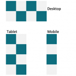
Hi Kelvin,
Thank you for contacting us and I'd be happy to assist.
To achieve a grid layout that changes based on the screen size and adapts to alternate background colors, you can use Bootstrap 4, with some additional custom CSS and JS code.
1: The first step would be creating a post view with "Unformatted" loop style:
( screenshot: hidden link )
2. Next, you can adjust the code in the "Loop Editor" section to make use of the Bootstrap column classes, so that the columns can change with respect to the screen size:
( ref: hidden link )
[wpv-layout-start]
	[wpv-items-found]
	<div class="row custom-grid-container">
	<!-- wpv-loop-start -->
	<wpv-loop>
		<div class="col-lg-3 col-md-6 col-sm-12 custom-grid-item">
			[wpv-post-body view_template="loop-item-in-view-to-show-books"]
		</div>
	</wpv-loop>
	<!-- wpv-loop-end -->
	</div>
	[/wpv-items-found]
	[wpv-no-items-found]
		<strong>[wpml-string context="wpv-views"]No items found[/wpml-string]</strong>
	[/wpv-no-items-found]
[wpv-layout-end]
Note: Please replace "loop-item-in-view-to-show-books" with the actual slug of your view's content template.
3. Next, in the view's "JS editor", you'll need to include some custom script to insert extra hidden divs in the view's output, so that the even & odd selectors can work for the alternating color blocks:
jQuery(window).on('load resize', function () {
	jQuery( ".custom-grid-item-hidden" ).remove();
	var screenWidth = jQuery(window).width();
	console.log(screenWidth);
	if(screenWidth >= 992 ) {
		jQuery('.custom-grid-container > .custom-grid-item:nth-child(4n)').after('<div class="col-lg-3 col-md-6 col-sm-12 custom-grid-item custom-grid-item-hidden"></div>');
	} else if(screenWidth >= 768 ) {
		jQuery('.custom-grid-container > .custom-grid-item:nth-child(2n)').after('<div class="col-lg-3 col-md-6 col-sm-12 custom-grid-item custom-grid-item-hidden"></div>');
	};
});
4. The last step would be to include some custom CSS code in the "CSS editor" to apply different background colors to alternating cells:
.custom-grid-container .custom-grid-item:nth-child(even) {
background: grey;
}

.custom-grid-container .custom-grid-item:nth-child(odd) {
background: blue;
}

.custom-grid-item-hidden {
display:none;
}
Feel free to adjust the background colors in the CSS code as need and for more personalized assistance around custom code, you can consider hiring a professional from our list of recommended contractors:
https://toolset.com/contractors/
regards,
Waqar
