Hello,
I have a very serious issue where the Toolset Image Blocks we placed in our Single View does not maintain responsiveness on smaller displays.
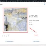
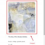
Images were set to display their original full height-width aspect ratio, but they become cropped square as the view adjusts.
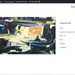
The screenshots attached show the original and how it becomes cropped. I sincerely hope there is a way to resolve this issue.
Thank you.
Hello and thank you for contacting Toolset support.
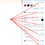
With Toolset Blocks, the design is not responsive out of the box. You need to specify the block's settings for each type of display. Check this screenshot hidden link
I see that you are using Elementor on your website, please first, try a blocks-based content template to make sure that's not affected by Elementor or a 3rd party component. Then, check with Elementor or any other component you intend to use.
How do I specify the block's settings for each type of display?
Also, the screenshot provided would not display.
Thank you.
I'm confused by your second remark because I used a Toolset image "Block" as per the tutorial when I create the view.
Isn't that the same as creating a "... blocks-based content template"?
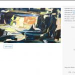
I attached the image here in this ticket. As you can say, you can click on each display's icon and specify the settings for it.
Check this article for more information https://toolset.com/course-lesson/creating-responsive-designs/
I'll remain at your disposal if you have any further questions.
I have made every attempt to follow along but on our sites, what you have described is not the case.
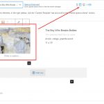
Yes, I can see in the visual editor the three stags for desktop, tablet and phone, and even though they appear responsive in the editor (see screenshots attached), they as you can see in other provided screenshots that they in fact are NOT responsive.
I have tried switching themes, disabling plugins and reading your docs.
The fact is, if I used a regular image block on a page or post, it would be responsive.
I ONLY have a responsive image display in the Toolset integration, image block and view.
If the images in the Toolset image block can display responsively as you say, can someone please login an provide a working example?
Here is another example from another subsite on the same multisite installation, using the same Toolset integration and view structure.
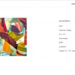
In this case, showing in the screenshots attached, there is a wide image with the left and right sides cropped on every display. There is no display, except for the lightbox popup, where this image shows in the full height and width image area not cropped.
I am sure there is something I am doing correctly and I respectfully ask for your assistance in resolving this issue.
UPDATE: I'm not sure if this means anything but I created a test "Page" and inserted an image block. The image was NOT responsive in the default template, but it was perfectly responsive using "Elementor Full Width" hidden link
By comparison, the Toolset view I created with the exact same image fill is no where near responsive: hidden link
Thank you.
Thank you for your feedback, I can see the issue between the regular page and the Toolset content template.
Would you allow me temporary access to your website to check this closely? Your next reply will be private to let you share credentials safely. ** Make a database backup before sharing credentials. **
Hello and my apologies for the late reply, but I do not work on Wednesdays and Thursdays as you may check on my profile page https://toolset.com/forums/users/jamal-b/
From a Toolset side, I don't see any issue. All the images that are generated for the Image block respect the original aspect ratio. These are the generated images:
hidden link
hidden link
hidden link
hidden link
hidden link
The original image's size is (1453x2000). The aspect ratio is respected for all resized images:
(1453/2000) = (218/300) = (744/1024) = (768/1057) = (1116/1536) = 0.726
The issue happens because of a CSS rule from the Astra theme. In fact, the issue does not appear if you test with a default theme such as Twenty Twenty-One.
We can fix it with the following CSS:
.ast-single-post .entry-content .wp-block-image img {
    height: auto !important;
    object-fit: fill !important;
}
I tested it on the content template and it looks good on multiple devices dimensions(browser emulator). Check this screenshot Check this screenshot hidden link.
Please note that this CSS code will affect any image within the content template.
I hope this helps. Let me know if you have any questions.
Thank you. Sorry for the delay and any misunderstanding.
I appreciate your help and yes, on the staging site, I can see that (pending final margin settings) the images are now responsive on mobile.
However, this caused greater display issue for our single item template display which was set additional CSS to display the item image with a (vh) vertical height max to ensure the full images is displayed, top to bottom, without the need to scroll.
Item with vh: hidden link
Item page without vh: hidden link
Please note: I did contact WP Astra first, but the reply was for us to contact Toolset support.
In reality, the vertical height max is more important than the response images on mobile. Is there a way to resolve both?
Is it possible to resolve both issues?
The "object-fit" needs to be "fill" instead of "cover". But then, it won't work well if you have a fixed "height". Try max-height instead:
.ast-single-post .entry-content .wp-block-image img {
    max-height: 65vh;
    object-fit: fill !important;
}
The issue appears to be resolved and the images no longer crop when scaling responsively.
I appreciate your looking into this further and providing a clear resolution.
Thank you
Thank you for your feedback. I am glad I could help. Please feel free to open a new ticket for any other issues or questions.
In the meantime, I have to kindly ask you to mark this ticket as resolved.
My issue is resolved now. Thank you!


