This is the technical support forum for Toolset - a suite of plugins for developing WordPress sites without writing PHP.
Everyone can read this forum, but only Toolset clients can post in it. Toolset support works 6 days per week, 19 hours per day.
| Sun | Mon | Tue | Wed | Thu | Fri | Sat |
|---|---|---|---|---|---|---|
| - | 9:00 – 13:00 | 9:00 – 13:00 | 9:00 – 13:00 | 9:00 – 13:00 | 9:00 – 13:00 | - |
| - | 14:00 – 18:00 | 14:00 – 18:00 | 14:00 – 18:00 | 14:00 – 18:00 | 14:00 – 18:00 | - |
Supporter timezone: Asia/Karachi (GMT+05:00)
I'm trying to organize the taxonomy terms output alphabetically in a taxonomy type view that I'm making in the Legacy Views section.
It does this already using bootstrap to output in the loop wizard, but from column to column, which isn't the traditional way to read through an alphabetical list.
I want to show them alphabetically from top to bottom of column 1, then the next terms top to bottom alphabetically into column 2 and 3, etc.
Right now they show up from left to right through the columns, ie. all the A terms going across the top of all the columns, then B's cross left to right and so on.
This is regarding this post of mine, in case this helps any one else,
The code Minesh provided worked great to make the columns, and the links were helpful but I'm still struggling to get the output into top to bottom alphabetical order.
Are there any other examples of this being done that someone could point me to or is there something probably rather obvious that I'm missing from this helpful link from Minesh?
Should I be keeping the main code from the Loop Wizard for 4 columns desktop, 3 tablet, and 2 mobile, and then adding the customizations from the link above?
as in just modify the div classes in this code?,
<div class="container wpv-loop js-wpv-loop">
<wpv-loop wrap="4" pad="true">
[wpv-item index=1]
<div class="row ">
<div class="col-md-3 col-sm-4 col-xs-6">
[wpv-taxonomy-title]
</div>
[wpv-item index=other]
<div class="col-md-3 col-sm-4 col-xs-6">
[wpv-taxonomy-title]
</div>
[wpv-item index=4]
<div class="col-md-3 col-sm-4 col-xs-6">
[wpv-taxonomy-title]
</div>
</div>
[wpv-item index=pad]
<div class="col-sm-3"></div>
[wpv-item index=pad-last]
<div class="col-sm-3"></div>
</div>
</wpv-loop>
</div>
Thanks for any pointers or examples they're really appreciated! 🙂
G
Nigel
Languages: English (English ) Spanish (Español )
Timezone: Europe/London (GMT+01:00)
Hi there
you want to go from
A   B   C
D   E   F
G   H   I
to
A   D   G
B   E   H
C   F   I
yes?
Using conventional markup and the bootstrap columns it's impossible to perform that kind of switch.
However, in the output of your View (using the legacy editor) you have complete control over the markup that is generated, and with flexbox it is fairly easy to flip whether you are outputting items in rows (the first example) or columns (the second).
For that you would need to set up a container outside the wpv-loop elements and your flex items will be what is output for each iteration within the wpv-loop elements.
You should ditch the bootstrap grid and manually edit or re-run the loop wizard so that you are effectively outputting the content without formatting, which you will apply yourself with custom CSS.
See, for example, hidden link for more info about flexbox.
Yes that's exactly what I want to do, thank you, and then have it scale in number of columns depending on device.
Ok so just so I understand you correctly, because I think I'm using the right terminology to say that, "I'm using the legacy Views editor", as in, within the editor where I have the Search & Pagination, Loop Editor, and Output Editor where I can add in custom CSS code. And then I'm inserting this View into my block editor view for a page view the fields and text box.
So I need to turn off the bootstrap editor, switch to unformatted, and now, is it within the Loop Editor I need to make the flex box coding, or within the Output Editor?
So a regular container in the Loop Editor and then Flex container in the Output Editor or Flex within the Loop Editor?
Loop Editor:
<div class="container"> (or "flex-container")
<wpv-loop>
[wpv-post-body view_template="loop-item-in-taxonomy view for taxonomy title with link"]
</wpv-loop>
</div>
<!-- wpv-loop-end -->
Or is it actually in the Loop Item code editor section?
Thank you very much for the point in the right direction here! 🙂
G
Nigel
Languages: English (English ) Spanish (Español )
Timezone: Europe/London (GMT+01:00)
That's pretty much it, yes.
You effectively need a wrapper div for the entire output (to set flex display) and then a wrapper div around each loop iteration.
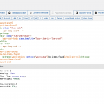
You could add that second div within the linked template itself, or wrap the template shortcode in a div, as per my screenshot.
The CSS is just for illustration, you may need quite a bit of trial and error—plus media queries—to get the results you need.
Hi Nigel,
thank you for your help on this , this is really awesome.
Interesting, when I copied the code example from your screen shot, this actually resulted in no view being displayed, didn't give any errors, just didnt show up.
But I removed things one at a time, and I found, that if I simply removed the <div class="flex-iteration">, then it just started working, with the CSS code you provided.
Just went into the correct columns top to bottom, exactly same code as your example just removing the div class flex iteration.
It gave 3 columns no matter what screen size, doesn't look bad AT ALL actually.
But on mobile, because these are all clickable elements I want to put it in to two columns to try and give a better user experience.
I added a little snippet of code I made up from looking at the Flex box guide page, but it hasn't changed anything the view just shows up exactly the same.
Could you maybe see if I've got a little error here?
Seems like this solution is going to work awesome!
from the CSS editor box:
.flex-cols{
display: flex;
flex-flow: column wrap;
max-height: 400px;
}
.flex-iteration{
max-width: 33%;
}
//this is what I added to try and make it 2 columns for mobile, I figured by setting a max screen width then this would only get //applied to mobile devices, but hasn't made any changes
@media all and (max-width: 500px){
.flex-iteration{
max-width: 50%;
}
}
Thank you SO much for the help on this!
G
Using the following code in the CSS editor I was able to get it to display 3 columns on desktop and tablet, and 2 for mobile.
.flex-cols{
display: flex;
flex-flow: column wrap;
max-height: 400px;
}
@media (max-width: 800px){
.flex-cols{
max-height: 600px;
}
}
The only thing is that, the website will end up with hundreds of pages showing their taxonomy links using this styling code.
I wonder if there is a more "sustainable" or "flexible" way to code this that will work better regardless of the number of link iterations the page will end up showing?
Appreciate any and all of your comments and thoughts on this.
Thanks again!
Hi,
Thanks for the update and glad that it is working now.
To review and suggest some improvements, I'll need to see how these taxonomy links are being shown on the page.
Can you please share the link to the page that you're working on, along with the example layout that you're planning?
regards,
Waqar
Hey Waqar,
please see the attached screenshots, you can see, one, states list, and the other states list narrow (this is where I pulled the window narrower and as you can see it switched to two columns).
The states list, with 3 columns, is how it appears on desktop.
This is actually the layout that I want for these pages.
What I'm asking about, is if there is a way to do this which isn't based off just setting a max height in px.
The reason I ask this, is because this code will be applied to many hundreds of sub taxonomy pages and I want to make sure that it doesn't matter what length the list of taxonomy terms is (much shorter, or much longer), that it will still display nice neat columns ordered like this.
Thanks again for the input 🙂
G
Thank you for sharing these details.
I've performed some tests on my website and I had to include some custom script to dynamically make the adjustments.
This is how the content in the "Loop Editor" was set:
[wpv-layout-start]
  [wpv-items-found]
  <div class="flex-cols">
  <!-- wpv-loop-start -->
  <wpv-loop>
    <div class="flex-iteration">
      [wpv-post-link]
    </div>
  </wpv-loop>
  <!-- wpv-loop-end -->
  </div>
  [/wpv-items-found]
  [wpv-no-items-found]
    <strong>[wpml-string context="wpv-views"]No items found[/wpml-string]</strong>
  [/wpv-no-items-found]
[wpv-layout-end]
This is the custom CSS code, that was included in the view:
.flex-cols {
display: flex;
flex-direction: column;
flex-wrap: wrap;
}
And the following custom script applies the height, based on the number of items and the height of individual items, and sets the column to 2 or 3 based on the screen width:
jQuery(window).on("load resize",function(e){

  var screenWidth = jQuery(window).width();
  if (screenWidth >= 801) {
    jQuery('.flex-iteration').css("width", "33%");
  }
  else
  {
    jQuery('.flex-iteration').css("width", "50%");
  }

  var maxHeight = -1;
  var totalItems = 0;

  jQuery('.flex-iteration').each(function() {
    maxHeight = maxHeight > jQuery(this).height() ? maxHeight : jQuery(this).height();
    totalItems++;
  });

  jQuery('.flex-iteration').each(function() {
    jQuery(this).height(maxHeight);
  });

  if (screenWidth >= 801) {
    var itemsPerColumn = Math.ceil(totalItems/3);
    jQuery('.flex-cols').css("height", itemsPerColumn*maxHeight);
  }
  else
  {
    var itemsPerColumn = Math.ceil(totalItems/2);
    jQuery('.flex-cols').css("height", itemsPerColumn*maxHeight);
  }

});
Note: The custom code examples from our forum are shared to get you started in the right direction. You're welcome to adjust them as needed and for more personalized customization assistance, you can consider hiring a professional from our list of recommended contractors:
https://toolset.com/contractors/


