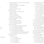
Our site has a custom taxonomy called CSI Divisions. On the add/edit form created with Toolset, I've been able to style the taxonomy the way I'd prefer
<div class="csi-columns">[cred_field field='csi-division' force_type='taxonomy' output='bootstrap' display='checkbox']</div>
On the Custom Search created for this taxonomy, I have the following code
<div class="csi-columns">[wpv-control-post-taxonomy taxonomy="csi-division" type="multi-select" url_param="wpv-csi-division"]</div>
(The custom class changes the font size and creates three columns. The search has fewer taxonomy terms listed, as those that are currently empty are not being displayed.)
The first results in a hierarchy being displayed and the second does not. Additionally, the first has a slight space after the checkbox while the second is crushed against it.
As this is Toolset behind-the-scenes, I'd like to ask how to get the search styling to match the other form's styling.
Thank you!
Hi,
Thank you for contacting us and I'd be happy to assist.
To suggest some CSS style adjustments, I'll need to see how this view with the custom search is set up in the admin area.
Can you please share temporary admin login details, along with the link to the page with this view?
Note: Your next reply will be private and making a complete backup copy is recommended before sharing the access details.
regards,
Waqar
Due to NDAs, I cannot give you admin access.
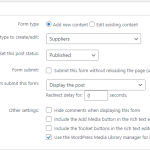
The Add form settings are attached as an image.
The Form Editor box contains:
[credform]
[cred_field field='form_messages' class='alert alert-warning']
<div class="container-fluid">
<div class="row">
<h3>Company Contact Information</h3>
<div class="form-group col-md-12">
<label for="%%FORM_ID%%_post_title">[cred_i18n name='post_title-label']Supplier Name[/cred_i18n]</label>
[cred_field field='post_title' class='form-control' output='bootstrap']
</div>
</div>
<div class="row">
<div class="form-group col-md-12">
<label for="%%FORM_ID%%_csi-division">[cred_i18n name='csi-division-label']CSI Divisions[/cred_i18n]</label>
<div class="csi-columns">[cred_field field='csi-division' force_type='taxonomy' output='bootstrap' display='checkbox']</div>
</div>
</div>
<div class="row">
<div class="col-md-12">
[cred_field field='form_submit' output='bootstrap' value='Submit' class='btn btn-primary btn-lg']
</div>
</div>
</div>
[/credform]
The form is called on the Add page as per my original post. This displays in the desired manner.
----------
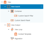
The Search page contains the View Search natively.
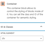
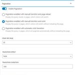
I've attached the block settings as images. (If any settings are not shown, they are set to the default.)
Thank you!
Thank you for sharing these screenshots.
Based on the testing on my website, I can confirm that when the taxonomy search filter is used in the view, as the 'checkboxes' type, it doesn't show the options in a hierarchal format.
The output also doesn't have any information about the hierarchal position of each element, which is why it can't be targeted with the custom CSS code either.
If you're open to the idea of changing the field type to a 'multi-select' field, instead of the 'checkboxes' field, that will show the results in a hierarchal format:
( interestingly in your first reply, the screenshot for the search field shows the field type to be 'checkboxes', while the shortcode in your message was set with the 'type' value 'multi-select' ):
[wpv-control-post-taxonomy taxonomy="csi-division" type="multi-select" url_param="wpv-csi-division"]
As for adding some space between the checkboxes and the labels, you can use the following custom CSS code:
( feel free to adjust the margin-right value, as needed )
.wpv-filter-form .form-group input[type="checkbox"] {
    margin-right: 5px;
}
( interestingly in your first reply, the screenshot for the search field shows the field type to be 'checkboxes', while the shortcode in your message was set with the 'type' value 'multi-select' ) - Good catch! I was messing around with this before I posted and gave you the wrong shortcode. My apologies.
My users, for better or worse, are not exactly tech-savvy. The thought of having to instruct them in using SHIFT or CTRL to multi-select doesn't sound pleasant. I'll stick to the checkboxes, and your additional space CSS works perfectly.
It would be a nice feature to have for hierarchical taxonomies to have the search honor that hierarchy, but I can wait.
Thank you!
Thank you for understanding and glad the code worked.
We have an internal ticket for this, but I don't have a time estimate for this at the moment.
You're welcome to mark this ticket as resolved and start a new one for each new question and concern.

