This is the technical support forum for Toolset - a suite of plugins for developing WordPress sites without writing PHP.
Everyone can read this forum, but only Toolset clients can post in it. Toolset support works 6 days per week, 19 hours per day.
| Sun | Mon | Tue | Wed | Thu | Fri | Sat |
|---|---|---|---|---|---|---|
| 8:00 – 12:00 | 8:00 – 12:00 | 8:00 – 12:00 | 8:00 – 12:00 | 8:00 – 12:00 | - | - |
| 13:00 – 17:00 | 13:00 – 17:00 | 13:00 – 17:00 | 13:00 – 17:00 | 13:00 – 17:00 | - | - |
Supporter timezone: America/New_York (GMT-04:00)
Related documentation:
This topic contains 19 replies, has 2 voices.
Last updated by simonM-5 5 years, 1 month ago.
Assisted by: Christian Cox.
Tell us what you are trying to do?
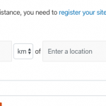
We would very much like to use the feature from Toolset Maps to "Show results within xxx km of [some location]" or "near my current location" as a search criterion in our filter controls for users, however out of the box, it looks really ugly unforunately.
Is there any documentation that you are following?
https://toolset.com/documentation/user-guides/display-on-google-maps/filtering-and-ordering-map-markers-by-distance/
Is there a similar example that we can see?
1) From the site referenced on your website to showcase Maps: hidden link
2) On your real estate reference-site. I installed one of those but cannot see any styling pertinent to the styling of this box on the Map Search page...
What is the link to your site?
hidden link
They have managed to change the style of the prompt somehow so that
a) it fits nicely in one line
b) the number of km box is an appropriate size
c) the km/miles drop-down is an appropriate size (would it be possible to make this a Radio button instead of a select box, as its an either/or option?)
d) the box for Enter a location is an appropriate size
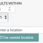
e) on their site and on ours, the Near Me has some icon on the left which is never shown correctly, can this be fixed and what icon is actually expected here?
We chose to remove the search filter from our site, as in our opinion, in the out-of-the-box style, it does not look nice.
Thanks and regards
Simon
Hi, there aren't many customization options built-in for this filter, and to some extent the style depends on your theme and other plugins, whether your site uses a library like Bootstrap, and so on. Custom CSS can be used to add your own look-and-feel, or to incorporate the styles from your theme. I can make some recommendations but I would need to see the inputs added back to your dev site so I can inspect them in the browser.
a) it fits nicely in one line
b) the number of km box is an appropriate size
...
d) the box for Enter a location is an appropriate size
I think we can collaborate on some CSS to help with this once I can see the inputs in dev.
c) the km/miles drop-down is an appropriate size (would it be possible to make this a Radio button instead of a select box, as its an either/or option?)
The size is adjustable with custom CSS, and I can make some recommendations. Unfortunately there is no option for a radio button instead of a select at this time. That could be added to the software in the future - please submit the form here to put that request in place: https://toolset.com/home/contact-us/suggest-a-new-feature-for-toolset/
e) on their site and on ours, the Near Me has some icon on the left which is never shown correctly, can this be fixed and what icon is actually expected here?
It can be fixed by enqueuing the FontAwesome 4 CSS library. The icon looks like the attachment shown in the screenshot here when the library is loaded. I can show you how to enqueue that library with some custom code if necessary. Unfortunately the icon cannot be removed right now as it is hard-coded in the plugin files. Again, a feature request is the best way to get that improved.
HI Christian
I have added the Distance object again to our View "Find a Native Nanny Search and Results View"
I managed to tweak the size of the various boxes using CSS, but am still a bit stuck getting it to display on one line. At the moment each control element is breaking onto a new line, resulting in 6 rows where only 1 is necessary, see screenshot.
Ideally we would like to have it spanning across the top line of all the filter controls, with
a) a box to display max a 3 digit number, so any "useless" white space to the right of digits should be minimised
b) the km box as small as possible (is it possible to force/hardcode it to km and never use miles?)
c) ensure the icon is displayed correctly for current location. (We use FontAwesome icons elsewhere on this page, and these all display fine, so I'm curious as to why this one icon is not showing well?)
Thanks a lot for any tips!
Best regards
Simon
I managed to tweak the size of the various boxes using CSS, but am still a bit stuck getting it to display on one line.
Add the CSS class "form-inline" to the form-group div that contains these filters in your View's Search and Pagination panel. This toggles the Bootstrap inline form style: https://getbootstrap.com/docs/4.3/components/forms/#inline-forms
a) a box to display max a 3 digit number, so any "useless" white space to the right of digits should be minimised
This isn't simple, because different browsers and devices display different interfaces for this input field. I don't have a single cut and paste solution, but you can try overriding the built-in style like this:
.form-inline .js-toolset-maps-distance-value {
  width: 60px !important;
}
Adjust the 60px as needed.
b) the km box as small as possible (is it possible to force/hardcode it to km and never use miles?)
It is not currently possible to hardcode it to never allow miles. You could use custom CSS to hide the input altogether:
.form-inline .js-toolset-maps-distance-unit {
  display: none;
}
Some custom JavaScript could be used to place text just after that input, see below.
c) ensure the icon is displayed correctly for current location.
The problem here, I believe, is that the other icons use FontAwesome 5 and Toolset only supports up to FontAwesome 4. You could downgrade, or use custom JavaScript to hide the icon altogether.
Sample JavaScript you can use as a template:
jQuery(document).ready(function(){
  jQuery('.form-inline .js-toolset-maps-distance-unit').after('<span>km</span>');
  jQuery('.form-inline .js-toolset-maps-distance-current-location').val('Use my location');
});
Hi Christian
1) We managed to get everything on one line using the same code example from the RealEstate Reference Site, ie using form-grouphorizontal class:
<div class="form-grouphorizontal">[wpv-control-distance
default_distance="15"
compare_field="family-approximate-location"
distance_center_url_param="toolset_maps_distance_center"
distance_radius_url_param="toolset_maps_distance_radius"
distance_unit_url_param="toolset_maps_distance_unit"
inputs_placeholder="RADIUS %%DISTANCE%% km OF LOCATION %%CENTER%%"]
</div>
2) We hid the distance unit altogether and the ability to use the Current Location button by hiding the controls in CSS:
.form-grouphorizontal .form-control {
display:inline-block;
width:auto;
}
.js-toolset-maps-distance-value {
width: 70px !important;
}
.js-toolset-maps-distance-unit {
display: none !important;
}
.js-toolset-maps-distance-center {
width: 45% !important;
}
.js-toolset-maps-distance-current-location {
display: none !important;
}
3) Now we notice however that when the user enters a location, it disappears after about 2 seconds, but the user may think that the location has been entered by the time they scroll down to the Submit button below. We do not understand what could be causing this behaviour. Any ideas?
Thanks and best regards
Simon
Not sure offhand, but it could be a conflict with another theme or plugin. Can you try:
- Temporarily switch to Twenty Nineteen and deactivate all plugins except Types, Views, and Maps
- If the problem is not resolved, I'll need to take a closer look at this View's configurations in wp-admin.
- If the problem is resolved, reactivate Avada and the Fusion Plugins, then test again.
- Continue activating other plugins until the problem returns.
Let me know what you find out.
Hi Christian
I just performed the test on the 2019 theme with only Types, Views and Maps active. The behaviour is the same.
Please feel free to duplicate our dev site on your side to perform further testing.
Let me know if you need logins etc
Kind regards
Simon
There appears to be a problem when splitting the filters and results into separate blocks or separate shortcodes. I'm escalating this problem to my 2nd tier support team, because I can replicate it reliably on my own local environment. I'll let you know what I find out when I have some feedback to share. In the meantime, you may be able to fix this by displaying both the filters and results using the same shortcode.
Okay it turns out there are a couple of known issues with split filters, and you can follow along in the errata post here for more information: https://toolset.com/errata/toolset-maps-distance-search-location-input-cannot-be-used-when-the-views-is-displayed-in-split-mode/
Our developers are aware of the issue and working on a fix. I will keep you posted here as I receive more information, but in the meantime it's best not to split a View into separate filter and results shortcodes or separate blocks if you plan to use the location filter.
Hi Christian
We have just tested this again using one view. Both the sorting and the location work correctly.
This is of course functionally great but aesthetically a bad user experience.
Can you give us any rough indication at all of when this is likely to be fixed based on experience? I appreciate that you can't promise any dates etc but are talking either weeks or months? Is it already in QA in an upcoming plugin update, for example?
Thanks and regards
Simon
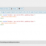
I can see that the solution is not yet ready for QA and it's not yet scheduled for the next plugin release. Beyond that, I am not able to predict anything because those schedules are not set yet. Based on recent experience, most of our resources are devoted to the Blocks project. With a bit of custom HTML / CSS in the Output editor panel, you can separate the filters and results visually without using separate shortcodes. I recommend this approach in the interim while the bugs are addressed. If you cannot see the Output Editor panel, scroll to the top right corner of the View editor and click "Screen Options". You can activate the panel here.
Hi Christian
Thanks for the update, and the very helpful tip about styling in the Output Editor. We can live with this workaround for now. We have made a few adjustments and it works well. So please just keep us informed when the fix is available.
Kind regards
Simon
Hello, I have been informed that the erratum post now includes a patch for the problem where location is not working in split Views. Please find that patch available here: https://toolset.com/errata/toolset-maps-distance-search-location-input-cannot-be-used-when-the-views-is-displayed-in-split-mode/
Hi, our developers have informed me that Maps 2.1 will include the permanent fix for the location problem in split Views. I will update this ticket to let you know when that release is available. Thanks for your patience as we worked to resolve this.
Hi Christian
This is good news! Thanks for the update.
I appreciate you can't give exact dates but any chance you can give me a rough indication of when we can expect 2.1? Weeks/months? If it's imminent, I'd rather wait and use my valuable time to test the permanent solution rather than testing workarounds that will become obsolete very quickly.
Thanks and best regards
Simon


