Skip Navigation

[Resolved] Pages are not responsive on mobile. Layout is interfering with pages

This thread is resolved. Here is a description of the problem and solution.

Problem:

I expected to see: responsive page on mobile, I previously inquired about the same issue with the custom posts, but this issue is also affecting ordinary pages.

Solution:

It is a custom CSS codes problem, in the HTML source codes of problem page you mentioned above,
view-source:https://mindfulness.ie/about/fiona-odonnell/

line 144, there is a CSS code:

@media (min-width: 0px){
.container {
    width: 750px;
}
}

You can try to modify it to:

@media (min-width: 0px){
.container {
    width: 100% !important;
}
}

And test again, see screenshot CSS3.JPG
https://cdn.toolset.com/wp-content/uploads/2018/01/606638-css3.JPG

Relevant Documentation:

This support ticket is created 6 years, 11 months ago. There's a good chance that you are reading advice that it now obsolete.

This is the technical support forum for Toolset - a suite of plugins for developing WordPress sites without writing PHP.

Everyone can read this forum, but only Toolset clients can post in it. Toolset support works 6 days per week, 19 hours per day.

Sun Mon Tue Wed Thu Fri Sat
- 9:00 – 13:00 9:00 – 13:00 9:00 – 13:00 9:00 – 13:00 9:00 – 13:00 -
- 14:00 – 18:00 14:00 – 18:00 14:00 – 18:00 14:00 – 18:00 14:00 – 18:00 -

Supporter timezone: Asia/Hong_Kong (GMT+08:00)

Author
Posts
#606498
screenshot3.jpg

I am trying to: get pages to be responsive

Link to a page where the issue can be seen:
hidden link

I expected to see: responsive page on mobile

Instead, I got: non responsive
I previously inquired about the same issue with the custom posts, but this issue is also affecting ordinary pages.

#606638
css3.JPG

Hi,

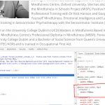
It is a custom CSS codes problem, in the HTML source codes of problem page you mentioned above,
view-source:hidden link

line 144, there is a CSS code:

@media (min-width: 0px)
.container {
    width: 750px;
}

You can try to modify it to:

@media (min-width: 0px)
.container {
    width: 100% !important;
}

And test again, see screenshot CSS3.JPG

#606738
screenshot5.jpg
screenshot4.jpg

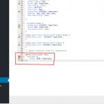
Hello Luo, I have tried what you suggested, but the rule is not being applied. See screenshot4.jpg and screenshot5.jpg below.
What would be causing this in the first place, as it is affecting other pages as well?
I think there is a a problem with the way I am using the plugin.

#606761
screenshot6.jpg

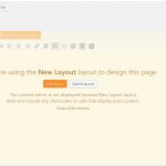
Also, why can I not create a new page without getting the pale yellow overlay on the editing screen?
See screenshot6.jpg
How do I stop this happening? Thank you.

#606971

Q1) but the rule is not being applied
You can try below CSS codes:

@media (min-width: 0px){
.container {
    width: 100% !important;
}
}

It is only an example, you can customize it to what you want.

Q2) why can I not create a new page without getting the pale yellow overlay on the editing screen?
This is a new question, since you are using layout to design your wordpress pages:
hidden link
You can put a post content cell into it, and test again.
If you still need assistance for it, please create new thread for it, that will help other users to find the answers.

#607040

OK Luo, that worked. It was the second set of brackets that soled the issue. I would have liked an explanation as to why this was happening in the first place. Thank you