Skip Navigation

[Resolved] Issues with layout of location field and map preview in edit screen

This thread is resolved. Here is a description of the problem and solution.

Problem: Several issues in the Repeating Field Group editor cause usability problems in the post editor screen.

Solution: Update to the latest versions of Toolset plugins to get the updated editing experience for RFGs.

This support ticket is created 5 years, 3 months ago. There's a good chance that you are reading advice that it now obsolete.

This is the technical support forum for Toolset - a suite of plugins for developing WordPress sites without writing PHP.

Everyone can read this forum, but only Toolset clients can post in it. Toolset support works 6 days per week, 19 hours per day.

Sun Mon Tue Wed Thu Fri Sat
8:00 – 12:00 8:00 – 12:00 8:00 – 12:00 8:00 – 12:00 8:00 – 12:00 - -
13:00 – 17:00 13:00 – 17:00 13:00 – 17:00 13:00 – 17:00 13:00 – 17:00 - -

Supporter timezone: America/New_York (GMT-04:00)

This topic contains 12 replies, has 3 voices.

Last updated by Christian Cox 4 years ago.

Assisted by: Christian Cox.

Author
Posts
#1325399
Screen Shot 2019-08-27 at 11.03.42 AM.png
Screen Shot 2019-08-27 at 10.52.59 AM.png

I am trying to:
Edit a custom post type with a repeatable field group of locations

Link to a page where the issue can be seen:
You'd need admin access to see it on our site but easy to reproduce:
Create a post type
Add a repeatable field group with a name field, a location field and a textfield for a description
Give each field a short description
Add one of these locations to a post and try to edit the location

I expected to see:
A normal editing experience

Instead, I got:
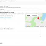
The map preview overlays part of the field description and sometimes the show/hide coordinates link.
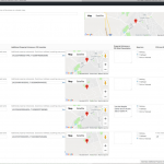
On large screens, the name field and the location field are on the same row, making the problems even worse and requiring horizontal scrolling.

It would be really useful for the map preview to always be in its own row and to be 100% width and a bit taller than 200px in order to actually find the location of a point of interest but also to avoid the above issues.

The whole section for the repeatable field group needs a max-width or some other mechanism to keep it from putting too many fields in one row on wider screens.

The client has a 30" monitor and had a lot more issues than I have on a 15" laptop but I have run into some issues too.

Two screenshots attached. 2019-08-27 at 11.03.42 AM is from my 15" laptop with just a bit of overlap of the map and the field description. 2019-08-27 at 10.52.59 AM is client's 30" monitor.

#1325461

As discussed, I'm escalating this issue to our 2nd tier support team for further investigation. I'll keep you posted here in the forum.

#1327105

Hi just a quick update to let you know our 2nd tier team has escalated this issue to our developers. I'll keep you posted here as I receive more information.

#1364941

Hello, I have a quick update for you. Our developers have let me know that this issue will be addressed in Types 3.3.6, which is currently under development. I don't have a timeline available for release just yet, but I'll continue to keep you up-to-date through the forum here. Thanks for your patience while we work to resolve these map / RFG display issues in wp-admin.

#1365659

Please find Types 3.3.6 available for download or automatic update. Let me know if the display issue is not resolved completely. Thanks!

#1365909
Screen Shot 2019-10-21 at 8.10.30 PM.png

Thanks for the update. I installed it and it does help. We can always access the zoom buttons and the map/satellite title toggle and terrain checkbox.

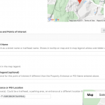
However, the repeatable field group area for locations extends beyond the right side of the screen and requires horizontal scrolling. This isn't a big deal but isn't exactly correct.

Overall this is much better than before. It'd still be nice if the map could be on its own row and bigger but, again, this version is much better simply because we can always access the zoom buttons.

Attached screenshot shows the width issue with the repeatable field group that has location fields.

#1366359

Thanks, I will report this to the team and follow up with you shortly.

#1366775

Quick update, the issues with the horizontal scrolling are from the description of the field not wrapping (the map also lays on top of the instructions in some cases). I added line breaks to our descriptions to fix the issue but you may want to give the area for the description a max width to prevent the floated map from being on top of them and to prevent the screen becoming wider than the viewport.

#1366821

Thanks, I just found out that this problem was broken into two parts, and the horizontal scrolling issue hasn't been completely addressed yet. Sorry for the confusion.

#1774865

Hello, our developers have reported that the horizontal scrolling and display issues you mentioned will be resolved in Types 3.4.1 and the next version of Toolset Maps. I'll keep you posted here as I receive more information about the release of these plugins.

#1817613

Nigel
Supporter

Languages: English (English ) Spanish (Español )

Timezone: Europe/London (GMT+00:00)

The fix on the Types side is actually included in version 3.4.2, which is released today, please update and check.

#1818215

Thanks Christian and Nigel. The latest fix works. It'd be nice to be able to configure the height of the map so clients that need pinpoint pin placement by zooming in on the map can use a bigger map preview than the default but the main problems are fixed with the 3.4.2 update. You can close this ticket.

#1842117

Closed per request