Tell us what you are trying to do?
I've recently changed the theme and everything else I have managed to make it work.. I realised that the theme works fine with Toolset .. however the Image Slider is giving a lot of issues because of which I have disabled it on all my content templates..
Here's the issue.. hidden link
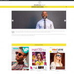
Visually the arrows come way below the image.. but that's not all.. Minesh in an ealier ticket provided me some CSS for this but I don't think that's the real solution.. there's something more..
When I am EDITING this page and I use the slider the default is that it tries to show 3 images in SLIDER SETTINGS for desktop, tablet and mobile view.. when I keep it in mobile view and change the slider setting to 1 image per slide it's fine.. it's fine again for tablet view .. but the moment I change the setting to 1 image per slide for desktop view, the image zooms to a size that makes the whole page unmanageable and the mouse can't scroll horizontally any more..
Please do have a look at this.. I can share you my credential in the next message.
Is there any documentation that you are following?
Is there a similar example that we can see?
What is the link to your site? hidden link
hidden link
This is another post which has a image slider and seems to work fine on the frontend but on EDIT it stretches the EDIT page and makes it unmanageable..
Here's the frontend view.. hidden link
Regards,
Alim
Hi,
Thank you for contacting us and I'd be happy to assist.
When working with content that is very wide like an image slider, you can set the maximum editor width to a value lower than 100%, for example, 75%.
( screenshot: hidden link )
If you feel it is something different than the available editor width, you're welcome to share temporary admin login details and some screenshots.
Note: Your next reply will be private and please make a complete backup copy, before sharing the access details.
regards,
Waqar
Hi Waqar
Sorry to bother you with this follow up.. but I was just curious to know if there's been any update..
The site that I am working on is live and I wanted to disable the faulty slide but I don't know if you are still working on it.. please do advise..
Regards,
Alim
Hi Alim,
Thank you for sharing these details.
I've checked the post with the slider "Gigi Hadid Stylish in DMY by DMY" and noticed that the content area was extending beyond the available screen width.
I unchecked the option "Adjust Editor Maximum Width" from the Toolset settings and now the same editor screen is showing correctly.
( screenshot: hidden link )
Can you please test and confirm the same?
regards,
Waqar
Hi Waqar
Yes, unchecking it worked.. It was confusing initially on how to uncheck..;-).. as if you are in desktop view mode the button doesn't function.. first I had to go to mobile view and then uncheck the button and then test the desktop view..
I tried it on the fourplusmedia.com home page as well and the view worked once I had unchecked the setting.. but the slider arrows are still below the image.. any way to fix that?...
Regards,
Alim
Thanks for the update and glad that it worked.
I've checked the page with the slider on a couple of different web browsers but, I can see the navigation arrows in the slider correctly centered.
( screenshot: hidden link )
Can you please share a screenshot of how they're showing on your screen?
Hi Waqar
Please find the screenshot ..
https://toolset.com/wp-content/uploads/tmp/Screen_Shot_2021_03_02_at_4.19.27_PM.png
it's a very zoomed out view.. the empty space below the slider image has the arrows.. At times on clickig the right arrow the arrows re-align properly (the second screenshot)
https://toolset.com/wp-content/uploads/tmp/Screen_Shot_2021_03_02_at_4.20.57_PM.png
Regards,
Alim
Thank you for the screenshots and I can see the issue on the slider used on the home page.
I couldn't reproduce this on my test website, so it seems something specific to your website is involved.
Can you please deactivate all cache, code, and image optimization plugins like Smush Pro, Hummingbird Pro, etc, during the course of this troubleshooting?
I'll need to see the default unchanged output, to see which styles are responsible for this extra height.
Hi Waqar
you were absolutely right..:-).. it was the SMUSH PRO plugin.. actually it was a specific feature Lazy Load of Smush which is in beta stage.. I think in the past too it had caused some issues.. I'll remember next time I have a problem to first check on this part..
Thanks again..:-)..
Regards,
Alim

