This is the technical support forum for Toolset - a suite of plugins for developing WordPress sites without writing PHP.
Everyone can read this forum, but only Toolset clients can post in it. Toolset support works 6 days per week, 19 hours per day.
| Sun | Mon | Tue | Wed | Thu | Fri | Sat |
|---|---|---|---|---|---|---|
| - | 9:00 – 13:00 | 9:00 – 13:00 | 9:00 – 13:00 | 9:00 – 13:00 | 9:00 – 13:00 | - |
| - | 14:00 – 18:00 | 14:00 – 18:00 | 14:00 – 18:00 | 14:00 – 18:00 | 14:00 – 18:00 | - |
Supporter timezone: Asia/Karachi (GMT+05:00)
Tagged: Toolset Blocks
This topic contains 19 replies, has 3 voices.
Last updated by Francisco Ramón Molina Busquiel 5 years, 4 months ago.
Assisted by: Waqar.
Hi,
I have been talking to Amir and he has offered me help to completely convert the web "hidden link" from DIVI 4 to Toolset Blocks.
But I would need 2 essential requirements:
1) That has exactly the same appearance it currently has.
2) That is ready, at most, for January 3.
Thanks for your help.
Regards,
Hi,
The first thing is to see the feasibility of the project.
What I would not like is to waste all this time so that later I ask you something and tell me that it is not possible to do so.
1) Before starting I would like you to analyze the pages of my website so that you can tell me if it is possible to do all this without DIVI.
2) What theme should I use so that the header and footer can take on the same appearance as the DIVI theme?
3) What Toolset block can I use to add the subscription capability to all pages simultaneously? taking into account that the subscription is made for the mailster plugin.
4) How you can make semi-transparent separations between sections with Toolset, just like the one I have done in the "hero" section of my website. Look at the screenshot.
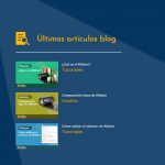
5) How can you make a section of last articles like the one in the screenshot?
6) How can I make the header of each product as in the shop page?
7) How can you design a product page like my product pages, background, product images view, zoom, ...? hidden link
8) How can I design a slider like the one on the blog page? hidden link
I have prepared a new web clone of the main web to do the conversion.
hidden link
Please, I would like quick answers to the questions, otherwise it will be impossible to have the website ready by January 3.
Thanks for your help.
While this ticket is waiting for our supporters to come online and take it (it's Xmas day today), I can help with what I know myself:
1. We used GeneratePress theme for most of our reference sites. GP allows us to customize the header and footer without writing PHP. For that, we used the WordPress Customizer and GP options.
2. Gutenberg has a "full width" mode for blocks. You should use that to achieve the look of hidden link .
3. Our Toolset Container block will be your best friend in this project. It allows you to apply styling, classes, IDs and background images. For example, you should create your heading from different blocks (Toolset Heading, Text and Fields and Button). Then, place all of them inside a Toolset Container to achieve the background image and full-width.
4. You can use the native Gutenberg columns for the columns that I'm seeing in the rest of the page. Inside columns, place the blocks that you need. Again, most of your sections should be inside Toolset Container blocks, so you can control them accurately.
5. For your "recent posts", you should definitely use a View block. You could do the same for the services block.
I'm not sure about your schedule, but I can give you an example. Our designer, Julia, managed to build this website with Gutenberg and Toolset in 1/2 day:
hidden link
Julia is a designer. She does not code in PHP or JS. She used very simple CSS together with the design controls inside Toolset Blocks.
So, your project is doable, but it's not trivial. When you start migrating it, if you run into any difficulty of have a specific question, please post here.
Amir,
I only have the Astra pro theme available, but I have no idea how to give the same appearance to the header and footer.
I tried, but the footer only allows one color or one image, but not one image colored by one color.
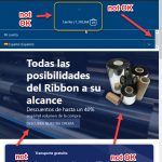
For some reason, the text in the cart on the top bar has not been blank.
Scrolling down the page is very rough way to stay fixed the header.
I cannot make the header or footer take the entire width of the page.
How can the search magnifier be placed next to the menu?
Look at the differences:
hidden link
hidden link
You haven't told me how to put a subscription form for mailster.
The page that Julia has designed is very basic.
If for that page it has taken 1/2 day then we do not arrive safe to the estimated date.
That has worried me even more. 🙁
I am also very concerned about the issue of animations of page elements when browsing the page.
And the icons ?, those icons are already in DIVI.
Frankly, I think I'm going to waste time, and that would be really very unfortunate. With all the time I've already wasted, if I waste more time ...
Tomorrow is Friday, the weekend you won't support me. 🙁
Amir,
The color overlay does not allow you to enter a hexadecimal value.
The color overlay does not allow a gradient or gradient types, so it is impossible to simulate the "hero" section of my homepage.
How do I separate the section lines?
The columns are not responsive. The image of the "hero" on the right does not go to the line below when the screen is smaller. Look at the difference with DIVI.
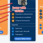
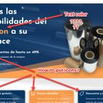
How can I put icons next to the text, like in the "hero" of my homepage?
You cannot put margins to the columns. I have to put a margin for each element it contains and if I do so the text of the button in my "hero" section is misaligned.
I can't put different colors in a text.
With a fluid design in astra you cannot give margins by percentage
In Astra it cannot be given a maximum content width when the design is fluid.
The blocks of a column cannot be aligned to the center vertically.
You cannot define the spacing between the columns.
You cannot copy styles to other elements.
When you scroll on the page, the secondary menu bar turns white in the background color.
Making the "hero" section in DIVI is immediate, super-easy, do you know the work I had to do to create the hero section on the new website? In addition, as much as I tried I could not give the appearance of the same section of DIVI on my original website.
Until you solve all these problems I will not spend more time. Frankly, I don't think I can achieve the same appearance and functionality on the new website, it gives me the feeling that I'm wasting my time.
Regards,
Hi Jose,
Thanks for writing back and for sharing your concerns related to the redesign.
Strictly technically speaking, any design created through one theme or builder can be recreated, using another theme or builder. However, since the available features and options will vary, this will require a fair deal of familiarity with HTML, CSS, JS and PHP code.
Based on the points you've shared, I understand that the initial results of the redesign through a different theme aren't very encouraging and to achieve the same look even for the static theme elements (like header, footer, etc) tend to require customizations through CSS code.
(and we haven't discussed the inner content blocks yet)
Considering all the factors, I feel you have two options at this point:
1. For this specific project where most of the work is already done and you're on a strict timeline, you can continue using Divi and for any showstopper issues or difficulties which will stop you from handing over the project, we can work on finding the workarounds.
You're welcome to start a new ticket for each new question and concern and we'll work to sort it out together.
OR
2. If you're ready to invest time and effort into a redesign through a different theme, you can consider hiring a professional ( https://toolset.com/contractors/ ) to help you customize the new theme's static elements to match the existing design.
I can understand that this won't be ideal since it will also affect your budget, but since there is a tight timeframe involved, having someone who is proficient in customizations, will prove very valuable.
As for the inner Blocks related usage recommendations and steps, we'll be available to assist and will do our best to guide you reach your goal.
My personal recommendation would be to go with option 1, but the final decision would depend on what kind of roadblocks are faced while completing the project with Divi.
As for the support over the weekend, Saturday and Sundays are my off days, but I'll be happy to make an exception and will continue to assist you over the weekend too.
Regardless of which option you pick, it is very important that we discuss one issue/question per ticket. This way we'll both have a clearer picture of what's done and what's outstanding.
I hope this helps and I'll wait to hear back from you.
regards,
Waqar
Hi Waqar,
From what you're saying, I get the feeling that you haven't talked to Amir.
He offered me special help / collaboration.
Check out the latest comments on this blog of yours.
https://toolset.com/2019/12/learn-how-to-build-templates-archives-and-views-with-blocks/
The idea was that you help me from support very quickly to demonstrate that the design of my website could be done with Toolset blocks, since Toolset with DIVI forces to enable the classic DIVI editor, which causes problems in the management of DIVI modules, since you did not have time to improve compatibility with DIVI and you were focused exclusively on improving Toolset Blocks.
Amir was convinced that the design could be converted to Toolset Blocks and finalized the conversion on the specified date.
I put my objections, however, yesterday I lost all day creating a clone of my site and trying to start the conversion, but I found many obstacles, it is assumed, as Amir told me, that you had to put 100% of your efforts to achieve the goal, however, if it is not so, because what I was supposed to have turned out, I have lost a whole day of work for nothing.
Regards,
Thanks for writing back and I apologize for the confusion.
I've got special confirmation from Amir to assist you with the specific design adjustments.
Can you please share temporary admin login details for the demo website that you're working on for the redesign?
( hidden link )
This will allow me to see which of the items from your last messages would require changes in the theme's setting and which would require some CSS code tweaking.
Note: your next reply will be private.
regards,
Waqar
The login info works, thank you.
I'll be reviewing this demo website in light of the challenges that you've shared and will share my suggestions, point-by-point.
( it shouldn't take more than a couple of hours )
regards,
Waqar
Thanks Waqar.
If you see that it is not possible to have all the changes ready so that the web has an appearance and functionality exactly the same as the original and can be available on the scheduled date, do not bother to investigate much more, you tell Amir and tell me to me too. It is not a matter of wasting time at all.
I have observed that the Astra theme, and this is the PRO version, is quite shabby, it seems that they have made it beginners.
The secondary menu bar has strange behaviors, when the screen is set with a mobile width it is very shabby and when it returns to its normal size the texts have lost their color or have disappeared.
The search button of the main menu in the mobile menu is not displayed.
I don't know how all these problems are going to be solved.
You should not advise using these badly make themes.
In my humble opinion I believe that in about 3 or 4 months, after Astra has solved many problems, it has incorporated improvements, and Toolset Blocks has many more functionalities, the conversion could be addressed. From what I've seen, it doesn't seem possible to do it now and less in 4 days.
Tell me your opinion.
You can use the same username and password to login to the dashboard of the original website.
Thanks for your help.
Waqar,
Something new?
It's been 6 hours and you haven't told me anything. 🙁
Regards,
Thank you for waiting and I apologize that this testing and research is taking more time than I initially anticipated.
Here are the findings related to your points, that I've gathered so far. I didn't manage to cover them all, but I'm sure, I can work on the rest of them, first thing tomorrow morning.
( it is already pretty late here and it has been a long day )
> I tried, but the footer only allows one color or one image, but not one image colored by one color.
- To use the background color and image both for the footer widget areas, you can set the background image through the theme's controls ( at Appearance -> Customize -> Footer -> Footer -> Footer Widgets ), and for the color, you can include the custom CSS code:
.site-footer .footer-adv-overlay {
	background-color: #063661!important;
}
> For some reason, the text in the cart on the top bar has not been blank.
- To make the text for cart in the above header bar more readable, you can include some custom CSS code:
.ast-site-header-cart-li a.cart-container {
	color: #ffffff;
}

.ast-site-header-cart-li a.cart-container:hover,
.ast-site-header-cart-li a.cart-container:focus {
	color: #1daef7;
}

.ast-site-header-cart-li .ast-cart-menu-wrap .count,
.ast-site-header-cart-li .ast-cart-menu-wrap .count:after {
	border-color: #ffffff;
	color: #ffffff;
}
> Scrolling down the page is very rough way to stay fixed the header.
- I'm not exactly sure what you meant by this point, but if you're referring to the changing background color of the above header section when the page is scrolled, you can override it using custom CSS code:
.ast-above-header-wrap .ast-above-header,
.ast-above-sticky-header-active .ast-above-header-wrap .ast-above-header {
background-color: #004377 !important;
}
> I cannot make the header or footer take the entire width of the page.
- For the header sections, you'll find the option for this at Appearance -> Customize -> Header. You'll find the "Width" option in both "Primary Header" and the "Above Header" sub-sections.
A similar option is also available under the Footer -> Footer Widgets.
> How can the search magnifier be placed next to the menu?
- A search icon is already showing inline with the header menu, so it looks like you've already managed to make this work.
( screenshot: hidden link )
> You haven't told me how to put a subscription form for mailster.
- For showing a subscription form section above footer widgets on all pages, you can use the Astra theme's "Custom Layouts" feature:
hidden link
It basically works the same way as the "Theme Builder" feature in Divi and you can hook custom content areas, based on the set criteria, including site-wide.
> I am also very concerned about the issue of animations of page elements when browsing the page.
- Your observation is correct and at the moment Toolset and Astra don't offer built-in controls for animation, same as the Divi.
( this is something that is planned to be included in the next development phase of Blocks )
For now, you'll either have to use custom CSS code ( ref: hidden link ) or a third-party plugin. Here are some plugins that you can check out:
https://wordpress.org/plugins/animate-it/
https://wordpress.org/plugins/animated-blocks/
I'll update you on the remaining points tomorrow and feel free to let me know if any point is not clear.
regards,
Waqar
Hi Waqar,
Thanks for your help.
I have included your fixes and added some more elements to the page.
- For showing a subscription form section above footer widgets on all pages, you can use the Astra theme's "Custom Layouts" feature:
hidden link
It basically works the same way as the "Theme Builder" feature in Divi and you can hook custom content areas, based on the set criteria, including site-wide.
Well, comparing this thing with the DIVI Theme Builder is a bit exaggerated, hahahaha ... it can't be designed even using gutenberg.
In addition, it cannot be used correctly, it completely replaces the footer with what is put in it, so you would have to design the footer entirely with HTML and CSS. That would be going down to the suburbs too much. Don't you think?
- I have no idea how to make the "hero" section look like my original website and behave in the same way.
The button is distorted. I don't know how to put an icon next to the texts. Is there something in Toolset to put icons?, for example Font Awesome icons? DIVI has a collection of icons and a special module that allows you to align it, mark its size, color, etc., put a title and text, etc.
The image of the "hero" has a gradient overlay. It also has semi-transparent section dividers.
Look at the video: hidden link
- I cannot specify the width between each of the columns, nor can I select an icon for each of the 3 elements.
- In the footer, how can I give the format and appearance of each of the columns of the footer?
- I have put the mailster form on the page, but how can it be formatted to take the appearance of my subscription section, text color, button, ...
- I have installed and tried using the Animated Blocks plugin, but I have not succeeded. 🙁
- With Toolset or Gutenberg can block sections be copied between pages?
- On the main page there are several section separators, how can it be make?
- With blocks, how do the elements align vertically to the center of the section?
- How can you give a minimum size for the image of the "hero" so that it does not shrink?
- The resizing of the columns is a real fudge. Look at the video: hidden link
- You have to simulate these animations. Videos:
hidden link
hidden link
Keep in mind that one of the essential requirements is that the website has exactly the same appearance and functionality.
Look at the screenshots.
Thanks for your help.
Regards,
Hi Jose,
I just wanted to update you that I've resumed working on the remain points from your earlier message and will share my findings around them in few hours.
After that I'll move to the questions in your recent message.
regards,
Waqar
Some questions of the last message had already indicated them before, but I wanted to highlight them to focus efforts.
Thank you very much for the help Waqar.
Regards,

