I am trying to:
add a "Custom search filter" of date field, with "Using this comparision" value "between" and "Compare value as a "number" and try to enable "Display in two columns" setting
Link to a page where the issue can be seen:
hidden link
I expected to see:
2 calendar picker icons displayed in 2 columns
Instead, I got:
1 column with stacked icons
Hi,
Thank you for contacting us and I'd be happy to assist.
During testing on my website, I couldn't make the option "Display in two columns", work either.
I've reported this to the concerned team and for now, you can use the following workaround, to show those fields in two columns:
1. In the "Custom Search Filter" block for this date field search filter, you can include a custom CSS class "date-field-container".
( screenshot: hidden link )
2. In the "View" block's "Custom CSS" field, you can include the following CSS code:
( screenshot: hidden link )
.date-field-container > div {display: flex;}

.date-field-container > div .form-group {width: 50%;}
I hope this helps and please let me know if you need any further assistance around this.
regards,
Waqar
Thanks for your answer.
With your workaround, I can't show 2 date field in 2 columns.
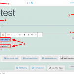
Can I show a label different from field label?
For example:
My field name is "Date", but I would show
Date from:
Date to:
Thank you for waiting and I see that the date fields are showing in two columns now.
To show 2 separate date fields in two columns, you can use the same workaround, but, you'll first include a "Grid" block to show the filter for those two fields in two columns and then the remaining steps will be the same.
As for the labels, yes you can show different labels for the both fields, by directly typing the text in the preview pane.
( example screenshot attached )
My issue is resolved now. Thank you!
