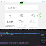
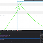
because you are edited the width of the block-editor-writing-flow class to change the editor width, all style represention is injected inline which works well for toolset blocks.... However what if I use the WP columns block, those are set to stack of phone size and go 100% width, however because you are just adding a width to the block-editor-writing-flow wrapper media queries affecting other blocks will not be represented this is a big issue for clients seeing a mobile representation with toolset. You should be also adding a class somewhere to hook styles into like .is-mobile-size or something on that wrapper so we can style our blocks to match the toolset breakpoints.
Also a setting to have ignore device width checked as the default when creating a new post would be a simple super nice add!
Hello and thank you for contacting the Toolset support.
Thank you for reporting this, but I am not sure to understand what are the issues that our styles are creating. Can you describe a simple scenario I can test on my local installation?
Is this happening with a default WordPress theme or a custom theme?
Can you add some screenshots to demonstrate the issue?
You may want to add a custom class when using mobile with the following plugin or the custom code on the tutorial:
- https://wordpress.org/plugins/add-device-type-to-body-class/
- hidden link
No sorry you have missunderstood my request. what I mean is that toolset has buttons that Preview device widths, so you can add different attributes to different device widths. The PROBLEM is when you click a button that it should also add a class to the block-editor-flow or another parent div something like .is-toolset-mobile-size , something for developers to hook into. Because I need to use for instance the build in WP columns for a site where the toolset Grid is not an option so please don't recommend that as a solution, I think working with standard WP modules is NOT too much to ask. As a developer I would like the option to add a style such as .is-toolset-mobile-size .wp-column { width: 100%;} so that the client is not confused why they hit the phone preview and the columns still show 3 in a row. explaining that these only show you the toolset blocks is too confusing my my clients. This should be a very simple add to put a class toggle on click of the sizing.
The controls to switch preview from Desktop, tablet, and the phone is not a Toolset feature. It is provided by the Block editor(Gutenberg Editor) from WordPress core.
What Toolset offers, on the other hand, is a "Classes & ID" section, and an advanced section, where you can put a class the way you need.
It also offers a Desktop/tablet/phone button, inside the styling sections of the Toolset Blocks, such as this one in this screenshot hidden link
We are happy about your feature request, and we'll do our best to better serve you. But I can't escalate a feature request to our 2nd Tier before gathering all the information and being sure to understand your request very well.
Looking forward to your reply.
The controls to switch preview from Desktop, tablet, and the phone is not a Toolset feature
Excuse me??? please disable your toolset and tell me where the buttons go??? these ARE part of the blocks plugin. WordPress has no built in responsive view for the backend of gutenberg merged into the core as of yet. I have been very descriptive with this request and my language used has been very clear to describe my concerns. With all respect if you are still unable to see this issue please pass the ticket along to another employee as I am unable to provide any more of a clear explanation.
Thank you for your feedback. My apologies for the mistake.
Please let me some time to discuss this internally with the involved teams and get back to you.
Our 2nd Tier has filled a feature request to the developers. We do not have an estimated date for when it will be published.
I'll get back to you as soon as we have a fix or a workaround.
Thank you!
Hey again,
agree with both of your feature requests:
- applying a CSS class based on the selected media size
- storing the state of the toggle. So once it's off it will also be off after a reload / new page. This way we could avoid an extra setting for that toggle - what do you think?
Have a nice day,
Christian
That sounds perfect thanks!!!
Good 🙂
I put both on my list. Can't promise that I will manage to squeeze them in the next release, but at very least in the one afterwards.
Thanks for your feedback!
Christian
I'll put this ticket in the "Fixed in next release" status, and I'll get back to you as soon as we have this feature released or if the developers provide a workaround.


