Hi there,
Slowly getting used to Blocks however can't work something out.
On this page we are testing: hidden link
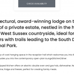
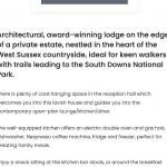
The large text starting with: Architectural, award-winning lodge on the edge of a private estate....
When viewed on tablet portrait (image iPad port)
It looks fine and is the size it should be.
However when viewed on smaller laptops and iPads landscape, the text is the size set for larger desktops (image iPad Land)
The issue is the rest of the page stays to mobile settings while the text Fields & Text Block doesn't for smaller laptops and iPads landscape.
Any help with this would be great.
Hi Pete,
Glad that you're making progress with the new blocks editor.
If you'll go to the WP Admin -> Toolset -> Settings -> General, you'll see the settings for "Responsive web design breakpoints for Toolset Blocks", at the bottom.
By default, the cut-off point between the desktops and tablets screen width is 781 px and for tablets and phones, it's 599 px.
On iPads (and other similar tablets) the screen width in portrait mode is 768 px, which falls within the tablets range. But, when it is switched to landscape mode, the screen width changes to 1024 px, which is treated as a desktop screen.
If you'd like to increase the gap between the desktops and tablet screens, you can increase the cut-off value from 781 px to 1024 px or 1200 px.
I hope this helps and please let me know if you need any further assistance around this.
regards,
Waqar

