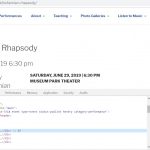
If I have Toolset load Bootstrap 3.0 in settings (which makes everything look very nice) it makes my pages wider so that even with the desktop browser at full screen I get a horizontal scroll bar such as here:
hidden link
and here:
hidden link
If I choose "this site is not using using bootstrap css" in settings than everything is normal but some toolset elements like pagination do not look right. Am I misunderstanding how to set this up?
I am trying to:
Link to a page where the issue can be seen:
I expected to see:
Instead, I got:
Hello,
I assume you are using Layouts plugin to design the post content.
If it is, please edit the layout of URL:
hidden link
Edit each row's setting, make sure you are using row mode: "Row same as container width", see our document:
https://toolset.com/documentation/user-guides/learn-how-rows-can-displayed-different-ways/
It will change the row's CSS class to "container-fluid", I have tested your web page in my Chrome browser, it works fine, see screenshhot container-fluid.JPG
Thank you for your prompt reply.
I read the article and applied the changes but did not see any effect from them.
Here is what I did:
I tried with several layouts but none worked so the only one that currently has the changes applied is the layout for "recordings" as it only has one row and thus the simplest one to try:
hidden link
I added: <div class="container">
<div class="row"> to the row as per the instructions you sent. They appear in the first 2 lines of the visual editor as in the instructions. But after saving I still get extra padding to those pages.
In general I'm seeing this behavior:
On any standard wordpress page or post on my site I have the normal single column layout at any screen size. The header image fills the window horizontally as it should.
On a page using any of my layouts there is extra padding on both sides of the header image making the page wider and forcing horizontal scroll bars in desktop and laptop browsers at full size though the scroll bars disappear at several small sizes when you shrink the browser window. The page appears normally on mobile no problem.
For comparison see the view used on the recordings page: hidden link
and then click on any title to see the layout for an individual recording: hidden link and you will see the change in page size.
I am happy to provide back-end access but I no longer see that option since my original post.
Thanks for your help.
Robbie
I have enabled the private message box, please provide your website credentials, thanks
I have tried the "WordPress access details" you provided above, it is not valid, I get this error:
ERROR: The password you entered for the username toolset1 is incorrect.
Please check it, thanks
Sorry about that. I had forgotten that even though I set the password in the dashboard WordPress sends out a set new password email to the user and I had not checked the email account I used to set it up.
Since this does not appear to be a private message box I have reset the password to the same one I sent you before. Hopefully that works.
Thanks!
Thanks for the details, I can log into your website, will update here if there is anything found.
I have done below modifications in your website:
1) Edit the layout "Template for Events":
hidden link
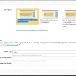
2) Edit three rows in it, see screenshot edit-row.JPG
3) Change the "Row type" to: Row as wide as post content (recommended)
See screenshot row-type.JPG
Test it in front-end, it works fine, for example:
hidden link
Please check if it is fixed, thanks
Thank you, Luo. I realized my problem was that I was not seeing the option to edit the row, only edit the cell. I saw other posts here relating to that and once I cleared my browser cache I was able to see the edit row option.
Your fix, of course, worked. But until I cleared the cache I was not able to apply it to any other layouts. Everything works fine now. Thank you for your help.
My issue is resolved now. Thank you!


