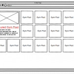
I was wondering if there was a way to target and style the first item in a grid view completely differently from the rest of the view. I have attached a screenshot to show the requirements.
What I am trying to achieve is to have a featured post which should appear as the first item at the top left of my grid of posts which should be styled differently. The styling is significantly different for example the standard grid items have just a white background with some text and link to the post whereas the featured item has a featured image a fancy label which might have to be achieved with a background image and excerpt etc.
I aim to create a custom post type (called Gym for example purposes) within the custom post type I will add a checkbox so users can select whether a post is featured. Then I will create a grid view of the Gym posts and the most recent featured post would show at the top left differently styled from the rest of the grid.
I could create 2 separate views one for the grid and one for the featured image but that wont work in this scenario as the grid has to wrap around the featured item (see screenshot)
Hello, the solution you choose depends on whether you are using the Block Editor or the legacy editor to build the View, as well as the layout you expect at different screen resolutions (i.e. responsive design that changes based on device size). You'll have more fine-grain control over the loop markup output with the legacy editor, but it also requires some knowledge and understanding of HTML and CSS code. In the legacy editor, you have the ability to use the wpv-item shortcode index attributes to create different markup structures for specific items in the loop as explained in the legacy documentation here: https://toolset.com/documentation/legacy-features/views-plugin/digging-into-view-outputs/#loop-shortcode-wpv-item-and-the-index-parameter
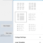
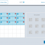
The Block Editor does not provide an easy way to manipulate the design of each result individually like that - the template for each result is effectively identical. If you're creating this View in the Block Editor, the closest thing you'll be able to achieve is a custom "collage" loop style. You can use the custom collage designer feature to specify a collage grid layout like you've shown in the mockup (screenshots attached). One problem in this approach is that the collage allows you to set different grid layouts for each result in the View, but it doesn't really help you adjust the contents of each element in the collage. The template for the contents of each cell is identical. In other words, if you display a featured image, title, and excerpt in the first featured image block, those same elements will appear in the other smaller grid cell results as well, just scaled down to fit in the smaller grid cell. If you want to show different content in the smaller cells, you would need to use custom CSS to hide specific elements or use conditional blocks somehow.
Let me know your thoughts and your plans for building the View, and we can discuss further.
Hi Christian - thanks for this detailed answer.
So up until recently I have been using the legacy views - really for this reason as some of the more advanced options don't seem to be available in blocks. We should be ok with most customisations needed (HTML, CSS etc). I'm keen to move onto Blocks as this seems to be the way Toolset (and WordPress) is heading. Is there a way of using Blocks for most things and views for more complex scenarios? Or any other suggestion you have.
Thanks!
Is there a way of using Blocks for most things and views for more complex scenarios? Or any other suggestion you have.
Sure, you can use both approaches in the same site. There is a setting in Toolset > Settings > General tab: "Editing Experience". You can activate both the Blocks experience and the legacy experience. That will allow you to choose the editor you prefer for each View. Views you create in the legacy editor cannot be edited in the Blocks Editor, and vice versa, but you can place a View you create in the legacy editor using a View Block.
Hi Christian
I am a little confused on the difference between using Block and Views. To be honest Blocks doesn't really work as well as Views for our workflow. I would prefer to use Views but I see that Views is now considered a legacy plugin.
Does Toolset recommend that it is ok to continue to use Views or could that cause problems in the future? Do you intend to eventually retire Views, not update it with new features as frequently etc?
Thanks!
Understood, we have many clients who prefer the Views interface. Some prefer having the ability to customize the markup and structure of the resulting output more precisely. We plan to continue supporting this editor and UI. We do not expect it to cause problems in the future - we expect that the existing features in Views will continue working as expected as the software evolves. However, some blocks-based features will not be made available in shortcode format for implementation outside of the Blocks editor. That is already the case with Toolset's Image Slider and Gallery blocks - these features are not available in shortcode format, so you must add those features in a Blocks-based Content Template if you want to include them in a legacy View. Toolset Blocks also provides options for the collage-style output we discussed earlier, and also a "Masonry" style output. Those loop styles are not built-in to the legacy editor, and are only available for Blocks-based Views. The tradeoff is that the output isn't easily modified or customized. I expect you'll find this to be the case with some features in the future as well.
My issue is resolved now. Thank you!


