Ok, I now have everything displaying as we want it within the grid block. But the grid block itself doesn't seem to be nearly as wide as we thought it would be. Please view the page here:
hidden link
I'm viewing on a 4K monitor and the amount of white space to the left and right of the page content is very large. I thought this would display at the full width.
One thing I notice is the text in the main column (left) is being constrained to the same width as the image in the top field (450px).
Compare that to how the text is showing here at a much wider width than the image above it.
hidden link
I think the page built by Toolset's template would look much better if the text part would be much wider. That would push the right column over more and would make things look nicer. Can you let me know how I would do that with the grid?
Hi there,
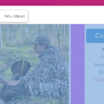
I created a screenshot and attached it to this response. Would you please check and see if your problem is the purple annotated space?
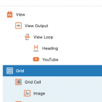
If that is the issue, please make sure that you click the navigator at the top to show the blocks, and make sure that you select the Grid block. (navigation.png)
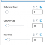
Then on the right sidebar you will have set of options to set the Grid spacing and there you can set them. For you it will be the Column Gap that needs to be set. (grid-settings.png)
Thanks.
No, the problem is the large amount of white space to the left and right of the content.
What I'm seeing in the CSS is the page content is being forced into an area that is much smaller than the available area. I found this in the CSS:
.col-md-offset-2 {
margin-left: 16.66666667%;
}
So it's adding that 16.66666667% margin on the left and it looks to me like it's the same on the right even though I'm not seeing that defined by any CSS. This might be a theme issue though. We will be installing a new theme shortly, so if you think it's totally a theme issue then I'll wait to see how it looks there. But if there is anything with the grid block causing this, let me know.
OK, we've installed the new theme we'll want to use and it looks much better in that. So it was a theme issue. I still have some styling I need to do for this, but I think we can call this one solved.
I am seeing another issue where we'll need some advice with the sidebar, but I'll start a new ticket for that.
Thanks for the assistance on this one.
My issue is resolved now. Thank you!


