This is the technical support forum for Toolset - a suite of plugins for developing WordPress sites without writing PHP.
Everyone can read this forum, but only Toolset clients can post in it. Toolset support works 6 days per week, 19 hours per day.
| Sun | Mon | Tue | Wed | Thu | Fri | Sat |
|---|---|---|---|---|---|---|
| 8:00 – 12:00 | 8:00 – 12:00 | 8:00 – 12:00 | 8:00 – 12:00 | 8:00 – 12:00 | - | - |
| 13:00 – 17:00 | 13:00 – 17:00 | 13:00 – 17:00 | 13:00 – 17:00 | 13:00 – 17:00 | - | - |
Supporter timezone: America/New_York (GMT-04:00)
Tagged: Toolset Blocks, Views plugin
This topic contains 6 replies, has 2 voices.
Last updated by smileBeda 4 years, 11 months ago.
Assisted by: Christian Cox.
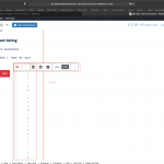
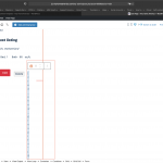
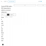
The screenshots represent a grid with each s HTML Text Editor Cell and a CRED cell.
Each Grid column is a bit narrow, namely 33% of a 33% of a screen width, so ca. 130px on a 1200 px screen.
On the front end it looks just fine, of course, buttons with proper width, etc.
Now, in light of the big praise that we can edit in the backend how it looks in the front end or however that is formulated, I would expect *at least* to see my button in the backend as I see it in the front end OR a placeholder for named button if it is not possible to render it.
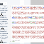
But, as you can see, I get 2 grid cells with perhaps 10px width. I can't click in it, I can't even see what is in it, I need to actually ... edit in code mode to even reach those lines and make an amendment to the code in HTML editor for example.
Questions that pop up:
1. Are you aware that this makes the UI unusable and are you planning to do something about it, or does it need a number of clients reporting it first? Please understand that named clients might simply not have the time, patience and love for Toolset to report such issues which seem - to me- pretty obvious and in need of attention of a Product Quality Assessment and not a client.
2. (When) can we expect some fix in regard? Currently, this issue makes it close to impossible to edit an HTML or else block when in a grid of that size once added. And in other words, it makes it doubtful to use Blocks anywhere because, well, the scenario is as you might imagine not so uncommon, to have 3 buttons in a card, for example, or even just a silly heading prefixed with a "This post was written by"...
Suggestion time!!
A possible approach would be to Pop up the actual cell when clicked, so we can edit what is inside in a modal or such, instead of the editor.
I don't know, I am neither a designer nor a studied developer but this is not what I call agradable (Edit what you will see in the front end) editor.
It is a waste of time, actually. Each time I encounter this, I want to ditch Toolset and go back to my bed 🙂 because it is a big waste of time going to click successfully in the proper area to expand the text editor for example.
Perhaps you can do something about this?
Steps:
1. Create a grid, insert a HTML cell of Toolset and do something in that HTML editor. Or just insert a block of other nature, it will present similar issues as long the grid cells are narrow enough.
Thanks for considering and please don't take my sarcasm the wrong way 🙂
Perhaps, I am missing something, and I would then be happy to know how I can avoid this really annoying situation ....
If you need numbers, I stopped time
1. I needed to change ONE STRING in the Bootstrap Modal I have added in the Toolset HTML editor (the narrow thing). I need to change delete to trash. Really, that's it.
2. I need to change right next to it the other modals button text from Hide to a dynamic hide/unhide (with a wpv condition)
Lets be honest. In HTML editor, we click the WPV conditional to add condition, and we type a few letters (name of button).
We save. We are done
How long do you think this would take in a normal editor? 10 minutes, right?
Well, this client just needed to pay me full hourly fee of 35 USD to change 2 strings, because that is what it took: 1 hour of copy paste the HTML editor block out of the narrow grid, into a new (dummy) editor (a CT I use for sketching purpose) and there, since the editor is now acceptably large, make the changes, copy the whole block back to the actual CT where I need it, "insert after", then delete the existing block and repeat for the second block.
Rinse and Repeat if you dare to Make a simple typo.
Jump and Die if you dare to save and probably, why not, the editor freezes (because it got tired?) and you'll need to reload the page, and start again.
It took (measured by upwork time tracker) one hour - one full hour.
How do I explain this to a client?
I mean, the whole promise is you will be able to edit your templates on your own afterwards because it is all a block based tool and very nice, point and click editing experience!"
But if I, the clients hired *developer*, need ONE HOUR to make that a simple change, how can I pretend that the client - who has no experience whatsoever with these tricks - to edit his templates once the site is delivered?
He will have to hire a developer (or lets say: a "GUI Artist", because you don't need to be a developer to edit block contents, you just need to be creative in finding tricks how to actually edit them) to make a simple string change?
See, this, from the perspective of a user, or developer, is what makes Toolset (and the entire blocks UI of course, not just Toolset) a second, third or even a "no way" choice when building sites
If it (Toolset and Blocks etc) wants to build a position in serious sites development, then it needs to address these issues, I think.
Otherwise it will remain a toy, honestly, more or less working fine and more or less powerful, but not usable for real, scalable and more than anything else lucrative sites because of very simple, and no-brainer issues, I am not speaking of a world breaking feature here, but of a simple, real simple and visible issue. Editors are too narrow, hence we need a solution 🙂
Note that "The Fastest Way to Build Advanced WordPress Sites" (to use your own words 🙂 is really not what is happening here. Yes, it takes 2 minutes to add a complex "thing" with the blocks editor, but what then? What is it good for, if I after need to spend 5 times more time than usual to make simple changes.... I hope you get the point where I am coming from
I know, complaining is not the way, but then, if no one complains, no one ever fixes the issues
Thanks!
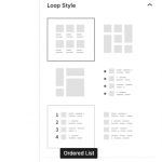
Hey Beda, it looks like you're designing a View Loop that uses columns, and the editor is narrow. Are you aware that you can pop the editor above the loop while editing? See the attachment. It's probably the most practical solution here, because it makes the entire editor area wider than the containing columns. You must select the View Loop block in the editor to see these settings.
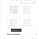
That's strange, I do not see such setting, I see only the loop settings (see screenshot)
I am going to try re-install the Blocks Plugin, perhaps it didn't update properly - this is a recent feature, right?
Because I've not yet seen it in other sites either.
However, even if I will be able to do that, the issue kind of persists.
The most minimal case is this:
1. Create a Grid with a few (3 in my example) columns (full width of editor, so each column is approximately 33% of the edit area). No view required, just the Grid Block.
2. In a column, insert a HTML Editor and add some contents to it
3. It looks OK and is editable OK as long the HTML editor holds just a line or two.
As soon there is something more elaborated in it, which kind of is the purpose or usage case of this Block, the block pushes down and becomes extremely "tall". This disrupts the "see what you get" editing experience totally, and is not really edit friendly because often HTML that you want structured and indented becomes almost unreadable.
More friendly would be to "detach" the HTML edit part (perhaps on click of a button in the blocks controls bar), that would allow a semi-full width editor size (kind of a bootstrap modal, so it doesn't distract and push around the other content).
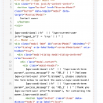
See in the screenshots what I mean.
Nevermind the blueish backgrounds which are something that seem to be pushed by the theme this client uses. The entire issue, or disadvantage of the editor becomes obvious when adding a bit more than a few lines in it.
Popping it out of the usual position into a sort of modal when editing, by choice perhaps, would really help a lot, make the experience a lot clearer and cleaner to edit too.
I'll now re-install Block to test out the feature you mention which at least would allow me to click in the editor in the first place...
That's strange, I do not see such setting, I see only the loop settings (see screenshot)
Ah okay yes, the option is only avaiable for Grid loop style, but I see you have selected Masonry style. It seems that the option should be available for Masonry and Collage as well Grid, since all three styles may produce columns. Let me ask about whether that is a feature request or bug, and see if we can do something about it.
Popping it out of the usual position into a sort of modal when editing, by choice perhaps, would really help a lot, make the experience a lot clearer and cleaner to edit too.
More friendly would be to "detach" the HTML edit part (perhaps on click of a button in the blocks controls bar), that would allow a semi-full width editor size (kind of a bootstrap modal, so it doesn't distract and push around the other content).
I can understand how a modal editor interface might be useful for extensive content editing, but that also obscures the live update of results in the View loop preview. You would probably have to dismiss a modal to see the on-the-fly design updates, which as you've said isn't ideal. You should be able to see those things change as you modify blocks in the loop editor, so I think the "Move the editor above the View loop" option would be a more Gutenberg-friendly solution in a View with columns.
1. Create a Grid with a few (3 in my example) columns (full width of editor, so each column is approximately 33% of the edit area). No view required, just the Grid Block.
True, and this is how the Block Editor works by design. WP's native column blocks do not include extended-width editors either, and what you see in a Toolset Grid block is similar to the native experience. A native paragraph or custom HTML block editor is contained within the parent native Column block, even in tightly nested columns. See the attachment here showing the native experience in the Blocks Editor. I honestly don't know if it's possible to show a block editor input area that extends outside beyond its parent container, or if this is a limitation inherent in the design of the Block Editor.
In any case, the spirit of Gutenberg/Block Editor is to make it simple to edit content with Blocks, not code, so editing code inline just isn't a priority of the Gutenberg editor, and IMO, neither should it be Toolset's. Improving a code editing experience in Blocks would be going backwards, not forwards. Instead, we must focus on providing the functionality needed in Blocks without code.
Issue where the "move editor above loop" option isn't available in Collage or Masonry Views has been escalated as a Usability Issue. I'll keep you posted here.
Well, the update to latest WP and Toolset actually did exactly what I proposed should be done.
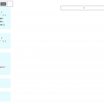
I bet, this was intended to work like that before already but was broken, or well, "feature" was implemented silently, I don't know, what I know is that now it is not anymore pressing the editor in a column so narrow you can't edit it, but instead, it expands it.
The only what now needs to be solved is the transparent background of named editor, but that is smaller of a detail
See screenshots of new, updated system and how the HTML editor works there.
Since both me and you saw the issue just a few days ago, I can be assured I do not yet suffer from common loss of mental stability.
Closing as the issue I reported, wether expected or not, now surely is solved.
