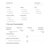
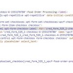
I am trying to: I am working to create a form for a cpt that simply stores the info submitted but the single checkbox fields seem to have an issue as they display the label twice, the checkbox is inconsistent size compared to the multi-checkbox fields, and as you'll see in the screenshot the checkbox is covering up one of labels, and there is a random line appear that looks to be the top border of the checkbox possibly.
I attempted to just hide the secondary label, but it has the same class as the check box so it ends up removing both elements.
You will also see in the screenshots that the menu that was placed in the left hand sidebar runs off the page even at large screen sizes. I attempted to adjust this as well in the layout, but even placing empty rows to the left for testing provided no changes.
Link to a page where the issue can be seen:
It's behind a login, but if you need access to the site I will create a login for you.
I expected to see:
consistently formatted checkbox fields in the form that are clean and unobstructed.
Instead, I got:
what you see in the screenshots.
Hi Matt,
Thank you for contacting us and I'll be happy to assist.
From the screenshots, it seems some CSS code from the theme or a third-party plugin may be affecting the checkbox styles.
To check which CSS code is applying to different page elements, you can use Google Chrome's inspect element tool, as explained in this guide:
hidden link
It would also be a good idea to test the page with all non-Toolset plugins disabled and a default theme like Twenty Nineteen, to rule out some code/style conflict.
In case the issues still persist, you're welcome to share temporary admin login details, in reply to this message.
(I've set your next reply as private)
Important note: Please make a complete backup copy of the website before sharing the access details.
regards,
Waqar
Hi Matt,
Thank you for sharing these details.
During troubleshooting, I noticed the following points:
1. By default, the checkbox field shows the text that is added in the "Field name" inline with the checkbox.
( screenshot: hidden link )
The other main label on the top is added by the form editor so that any other information can be shown independently from the field name text.
( screenshot: hidden link )
If you don't need the label twice, you can remove it from the form editor, as shown in the screenshot above.
2. The inline text label for the checkbox fields is overlapping the checkbox, as there is not enough width available in the container.
But you can remove the "form-control" class from such fields in the form and they'll be more compact to better fit.
( screenshot: hidden link )
The following screenshots show how the same fields will show, with and without this class:
With: hidden link
Without: hidden link
3. At the moment the website's theme was set to default "Twenty Nineteen", which is why I couldn't see the menu issue.
But in case the issue still persists when you switch back the theme, you can use Google's inspect element tool, to see which of styles from theme are forcing it to show off-screen.
( ref: hidden link )
I hope these points will help and please let me know if you need any further assistance around this.
regards,
Waqar
Waqar,
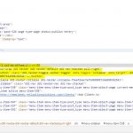
Thank you for the info, I was able to modify the form and it looks much better now. I am still having some issues with the menu on the left hand side moving off the page when resizing the window. I made adjustments to the layout (Client Pages) but it looks like there is something else going on here. I just have a simple layout with the menu side bar and post content next to it, but it does some very odd things when you resize the page. When I inspect the elements it looks like there are additional elements being placed in between the menu and the content, that are there for responsive purposes, but seem to be taking up space when not in use, see the highlighted sections in the screenshot.
Thanks,
Matt
Hi Matt,
Thanks for writing back.
To evenly distribute the grid space between the menu, page's content and the sides, it would be better to leave one empty grid column on each side and in between the menu and the page's content, as shown in this example screenshot:
hidden link
This way the page's layout will better adjust on different screen sizes.
regards,
Waqar
Waqar,
Thanks for taking a look but I wasn't able to get the menu working properly with layouts. I just removed it and I'm using the standard wp sidebar. I really appreciate your help as always sir.
Thanks,
Matt


