Dear Sir/Madam,
As Toolset support Bootstrap 4, may I know how I can make the grid layout like
<div class="container">
  <div class="row">
    <div class="col-12 col-sm-12 col-md-6 col-lg-8 col-xl-8">
        ....
    </div>
    <div class="col-12 col-sm-12 col-md-6 col-lg-4 col-xl-4">
      ....
    </div>
  </div>
</div>
I have no idea how I can make it use the block editor.
Hello and thank you for contacting the Toolset support.
Please check the documentation of the Bootstrap 4 grid system on this page hidden link
Basically, letters are bound to the screen sizes, and the grid is based on 12 columns:
- col-xs-* are for extra small screens.
- col-sm-* are for small screens.
- col-md-* are for medium screens.
- col-lg-* are for large screens.
- col-xl-* are for extra large screens.
The following example will hold 4 columns for large(3 columns or each one) screens and 2 columns for small screens(6 columns on each one):
<div class="container">
  <div class="row">
    <div class="col-sm-6 col-lg-3">
        ....
    </div>
    <div class="col-sm-6 col-lg-3">
      ....
    </div>
    <div class="col-sm-6 col-lg-3">
        ....
    </div>
    <div class="col-sm-6 col-lg-3">
      ....
    </div>
  </div>
</div>
Dear Jamal,
Thanks for your reply, yes I understand the grid system of bootstrap 4, I want to know how I can configure it using the Toolset Grid instead of HTML
My apologies, I did not understand what you want in the first message.
You can change the number of columns for Desktop/Tablet/Mobile in the View loop block settings. Check this screenshot hidden link
You can set a different number for each screen.
I hope this helps. Let me know if you have any questions.
Dear Jamal,
As there are 5 breakpoints from bootstrap 4 but WP or Toolset Grid can only have 3, I have no idea what breakpoints to the Desktop/Tablet/Mobile
The breakpoints are configurable in Toolset->Settings->General(tab)->Responsive web design breakpoints for Toolset Blocks at the bottom of the page. Check this screenshot hidden link
Dear Jamal,
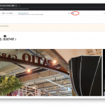
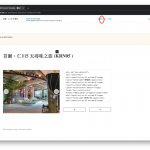
I got a problem when setting up the content template on a different viewport, refer to the screenshot, when I select the tablet viewport, everything looks ok, but when I select the desktop viewport, the image in the Toolset Image slider enlarge and I can't scroll to the right and do the configuration, do you have any suggestion?
I think that you are encountering an already reported issue where the Slider block overflows the whole page. This happens when the "Adjust Editor Maximum Width" Toolset setting is activated. Check this animation
hidden link
I'll suggest that you switch to tablet view in order to get the right sidebar, click on the Toolset icon at the top right, deactivate the setting. Then switch back to the desktop view and continue building your page. Check this screenshot hidden link
If this does not work as expected, I'll need to take a copy of your website for some local debugging. Let me know if that's fine with you.
My issue is resolved now. Thank you!

