Skip Navigation

[Closed] Set responsive video dimensions in template

This support ticket is created 3 years, 9 months ago. There's a good chance that you are reading advice that it now obsolete.

This is the technical support forum for Toolset - a suite of plugins for developing WordPress sites without writing PHP.

Everyone can read this forum, but only Toolset clients can post in it. Toolset support works 6 days per week, 19 hours per day.

Sun Mon Tue Wed Thu Fri Sat
8:00 – 12:00 8:00 – 12:00 8:00 – 12:00 8:00 – 12:00 8:00 – 12:00 - -
13:00 – 17:00 13:00 – 17:00 13:00 – 17:00 13:00 – 17:00 13:00 – 17:00 - -

Supporter timezone: America/New_York (GMT-04:00)

This topic contains 1 reply, has 2 voices.

Last updated by Christian Cox 3 years, 9 months ago.

Assisted by: Christian Cox.

Author
Posts
#1969547

hi ive created a toolset content template, which has a fields & text for videos. On a website the videos work perfectly by on mobiles the sizes are different for youtube and vimeo. is there a way to control the size via the template?

#1969575
responsive-controls.png
toolset-video.png
sidebar.png

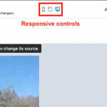
Hello, normally you will use the block editor's responsive display controls to set different display options at different screen resolutions. You can find the responsive display controls at the top of the editor screen - see responsive-controls.png.

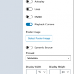
If you are using a Toolset Video block to display the video(s), you can find settings for video dimensions in the block configurations sidebar - see sidebar.png.

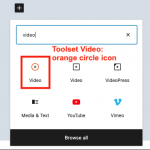
You mentioned fields & text. Are you using a Fields and Text block to display the video(s)? If so, it will be more difficult to set specific dimensions for the videos, since the Fields and Text block is a generic block without any video-specific features. Is it possible to use a Toolset Video block instead of Fields and Text? The Toolset Video block has an orange circle icon - see toolset-video.png

The topic ‘[Closed] Set responsive video dimensions in template’ is closed to new replies.