I am trying to:
Determine why that in spite of the code being the same my Search Filters and Content Template layouts are broken on two specific pages on my site.
Link to a page where the issue can be seen:
A. The filter design and layout on both pages should be the same since the code is the same.
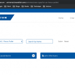
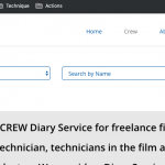
- The layout of the filters at the top of this page is wrong: hidden link
Expected Filter Design - It should resemble the layout of the filters on this page: hidden link
B. Though the data is different the layout and design of both of these pages should be the same as they are from the same Content Template!
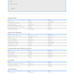
- Corrupted Content Layout Template: hidden link
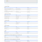
Expected Layout Design - Normal and correct Content Layout Template: hidden link
I would appreciate any CSS or other plugin advice to have consistent results in the output. I have no idea why the results differ because for a time they were similar and appeared as correct on the site.
- The layout of the filters at the top of this page is wrong: hidden link;
I'm attaching screenshots showing what I see in Chrome on a Mac laptop (filters1 and filters2). The problem I see is that the submit and reset buttons are overlapping. Am I missing anything else? If so, what browser are you using? Are you on a phone or other device?
A. The filter design and layout on both pages should be the same since the code is the same.
That's not really accurate, because you must also consider the context where the code is placed. If you place the same code in one area of the site, it may not behave exactly the same way in another area. In this case, the amount of horizontal space available in the parent container is a major factor in the way filters are rendered.
B. Though the data is different the layout and design of both of these pages should be the same as they are from the same Content Template!
We must be looking at different things. Can you clear your browser cache and try again? I'm attaching screenshots showing what I see in these two posts (template1 and template2). They are formatted very much like each other, so maybe I'm missing something. Are you testing on a small screen or device? A specific browser?
Dear Christian,
1. With regards to the filters: "The problem I see is that the submit and reset buttons are overlapping. Am I missing anything else? If so, what browser are you using? Are you on a phone or other device?" That is indeed the problem.... then filter buttons are overlapping.
Do you have any solutions?
I am using Chrome on a laptop that is also connected to a large screen.
2. With regards to the content templates your screenshots are displaying the templates accurately. So the problem may be elsewhere... I will double check on more device at my end.
Thanks
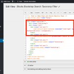
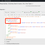
If you check the WordPress Archive and the View, you can see that the markup structure for the filters is not identical. You should probably change the archive's filter markup structure and layout to match the View. Try adding a wrapping div around the column divs and give it a class of "row".
Thanks to Christian the issue is resolved now. The issue related to incorrect markup in the archive code. Thank you!
