Hi there,
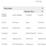
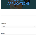
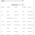
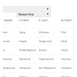
Mobile version is not looking good neither it is responsive.
Can see properly banner and can't scroll horizontally to see all columns
This is the link
I have attached images
hidden link
Hello,
I have tried the URL you mentioned above:
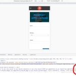
1) banner
You are using fixed font style setting:
font-size: 50px;
Please try to change it to:
font-size: 2.5em;
And test again, see my screenshot font-size.jpg
More help:
hidden link
2)scroll horizontally
please try below custom CSS codes:
.wpv-view-wrapper{
overflow: scroll;
}
More help:
hidden link
1 - Not allowing me
hidden link
2 - It works but not fully
Its allowing to scroll left right
but it does the whole page
any way we can do it so it only scrolls the columns?
Thanks
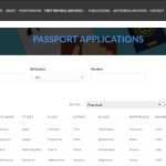
and this is what happens to desktop version when I put your code
hidden link
Since it is a custom CSS codes issue, if you need more assistance for it, please provide your website credentials in below private message box, I can setup a demo for you.
Thanks for the details, I have done below modifications in your website:
1) Edit the WordPress Archive:
hidden link
Find and select "WordPress Archive" block, in the block setting panel, section "Custom CSS", add below CSS codes:
h2.tb-heading.has-text-color{
font-size: 2.5em;
}
2) add below CSS codes:
.js-wpv-view-layout{
overflow: scroll;
}
Please test again, check if it is fixed, thanks
header title part is fixed
but not table part
please check on a mobile device so you understand what I mean
Also there's a scroll bar for some reason that shows up after you added the code
I have tried the URL again, but I don't see the scroll bar you mentioned above, see my screenshot
Is this issue resolved? please let me know if you still need assistance for it.
check the desktop version
still same issue
hidden link
You can add CSS Viewport limitation on your custom CSS codes, for example:
@media screen and (max-width: 800px) {
  /* CSS goes here */
  .wpv-view-wrapper{
    overflow: scroll;
  }
}
So those custom CSS codes can only take effect on mobile device
More help:
hidden link
is this what you mean?
@media screen and (max-width: 800px) {
/* CSS goes here */
.js-wpv-view-layout{
overflow: scroll;
}
.wpv-view-wrapper{
overflow: scroll;
}
}
So I added the following on all 3 pages
/* CSS MOBILE SCROLL */
@media screen and (max-width: 800px) {
/* CSS goes here */
.wpv-view-wrapper{
overflow: scroll;
}
}
hidden link
hidden link
hidden link
but only 1 page works with mobile scroll
hidden link
is it a different code for each page?
Thanks
In other URLs you mentioned above, you can use other CSS selectors, for example:
hidden link
@media screen and (max-width: 800px) {
/* CSS goes here */
.js-wpv-view-layout {
    overflow: scroll;
}
}
More help:
hidden link
I can use the same for the 2 others?
