This thread is resolved. Here is a description of the problem and solution.
Problem:
We are using a mix of Toolset Blocks with our theme blocks, Kadence.
What do I change here to make this work 'with' our theme rather than on it's own settings please?
Solution:
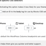
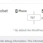
You can try the breakpoints of Toolset settings:
Responsive web design breakpoints for Toolset Blocks
Relevant Documentation:
This is the technical support forum for Toolset - a suite of plugins for developing WordPress sites without writing PHP.
Everyone can read this forum, but only Toolset clients can post in it. Toolset support works 6 days per week, 19 hours per day.
| Sun | Mon | Tue | Wed | Thu | Fri | Sat |
|---|---|---|---|---|---|---|
| - | 9:00 – 13:00 | 9:00 – 13:00 | 9:00 – 13:00 | 9:00 – 13:00 | 9:00 – 13:00 | - |
| - | 14:00 – 18:00 | 14:00 – 18:00 | 14:00 – 18:00 | 14:00 – 18:00 | 14:00 – 18:00 | - |
Supporter timezone: Asia/Hong_Kong (GMT+08:00)
This topic contains 2 replies, has 2 voices.
Last updated by 4 years, 9 months ago.
Assisted by: Luo Yang.

