Skip Navigation

[Resolved] Make a card from Toolset grid

This support ticket is created 5 years, 6 months ago. There's a good chance that you are reading advice that it now obsolete.

This is the technical support forum for Toolset - a suite of plugins for developing WordPress sites without writing PHP.

Everyone can read this forum, but only Toolset clients can post in it. Toolset support works 6 days per week, 19 hours per day.

Sun Mon Tue Wed Thu Fri Sat
- 9:00 – 13:00 9:00 – 13:00 9:00 – 13:00 9:00 – 13:00 9:00 – 13:00 -
- 14:00 – 18:00 14:00 – 18:00 14:00 – 18:00 14:00 – 18:00 14:00 – 18:00 -

Supporter timezone: Asia/Karachi (GMT+05:00)

This topic contains 6 replies, has 2 voices.

Last updated by Waqar 5 years, 6 months ago.

Assisted by: Waqar.

Author
Posts
#1295959

Hi there!

So a while ago I tried to make my site work with divi and Toolset. I gave up. With someone that has my skills it was undoable. So now I installed elementor on my site and I'm trying to make the grid from my custom view look a bit better. I want to make it into a card and preferably create a denser shadow around it as soon as I hover over it. But I have no clue on how to pull this off. Can you please help me? The page where you'll find the view is: hidden link.

Thanks a bunch!

#1296347

Hi Kerim,

Thank you for waiting.

I've performed some tests and research to see how can Elementor's builtin components or styles can be used to generate an individual loop item in a Toolset View, as a shadowed card.

It turns out that the builtin Elementor grid and card styles are too complicated for this task and a simpler alternative is to add a few lines of custom CSS code, in the view.

Note: Your view's results are already wrapped in a special div with class "postborder". This custom CSS code will turn all such divs into cards of equal heights.
( screenshot: hidden link )


.js-wpv-view-layout .row {
	display: -webkit-box;
	display: -webkit-flex;
	display: -ms-flexbox;
	display:         flex;
	flex-wrap: wrap;
}

.js-wpv-view-layout .row > [class*='col-'] {
	display: flex;
	flex-direction: column;
}

.postborder {
	text-align: center;
	margin-right: 2%;
	margin-left: 2%;
	width: 100%;
	height: auto;
	background: white;
	box-shadow: 0px 0px 0px grey;
	-webkit-transition: box-shadow .6s ease-out;
	box-shadow: 0.8px 0.9px 3px grey;
	padding: 20px 40px;
	height: 100%;
}

.postborder:hover{ 
	box-shadow: 1px 8px 20px grey;
	-webkit-transition:  box-shadow .6s ease-in;
}

I hope this helps and for more personalized assistance around custom code, you can also consider hiring a professional from our list of recommended contractors:
https://toolset.com/contractors/

regards,
Waqar

#1296361
mindmonks2.PNG

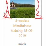
Aah thank you soo much!!! There is one thing that I'm not capable of doing. The images are now just a square withing the box. But I would really like it them be the full width of the card. To give an example, I'll upload a screenshot where the red represents the part of the card I want to fill with the image.

And I would really like the entire card to be a clickable link. Would be awesome if you can explain to me how I can pull this off :). Thank you so much!

Greetings,

Kerim

#1296381

And also; When i look at the view on mobile it doesn't look right :S. Could you please help me with code to optimize for mobile too?

#1297253

Hi Kerim,

Thanks for writing back and glad my suggestion helped.

It is important to remind that as much as we would like to help, 1-1 custom code assistance is beyond the scope of support that we provide ( ref: https://toolset.com/toolset-support-policy/ ). But we do our best to guide in the right direction, whenever possible.

1. To show some content like image in the card to be full width, you can follow these steps:

a). Change the padding value that is applied to div with "postborder" class from "padding: 20px 40px;" to "padding: 0px;".

b). You can split the content of this "postborder" div in two parts:


<div class="postborder">
	<div class="postborder-full">
		Image
	</div>
	<div class="postborder-padded">
		Rest of the content
	</div>
</div>

Using custom CSS, you can apply the padding only to the div with class "postborder-padded". To check which CSS code is applying to different page elements and include your own custom CSS, you can use Google Chrome's inspect element tool, as explained in this guide:
hidden link

Here is another guide on CSS syntax and selectors:
hidden link

2. To make the entire Card ( div with class "postborder") clickable in a way that works safely in all browsers, you'll need to include some custom script:

a). You can include the link in a "data-url" attribute, in div "postborder", so that it will change from:


<div class="postborder">

To:


<div class="postborder" data-url="[wpv-post-url]">

b). In your view's "JS editor" tab in the "Loop Editor" section, you can include the following script that takes the visitors to that link, when clicked:


jQuery( document ).ready( function( $ ) {
	
$(".postborder").click(function() {
	window.location = $(this).attr("data-url"); 
	return false;
});

});

c). To change the cursor to a pointer, when the card is hovered, just as a normal link does, you can update the custom CSS block, from:


.postborder:hover{ 
	box-shadow: 1px 8px 20px grey;
	-webkit-transition:  box-shadow .6s ease-in;
}

To:


.postborder:hover{ 
	cursor: pointer;
	box-shadow: 1px 8px 20px grey;
	-webkit-transition:  box-shadow .6s ease-in;
}

3. To improve the responsiveness of these cards on smaller screens, you can wrap the first two blocks of custom CSS code from my last message inside a media query, so that they only apply to screens with at least 768 px width:

Existing code:


.js-wpv-view-layout .row {
    display: -webkit-box;
    display: -webkit-flex;
    display: -ms-flexbox;
    display:         flex;
    flex-wrap: wrap;
}
 
.js-wpv-view-layout .row > [class*='col-'] {
    display: flex;
    flex-direction: column;
}

Updated code:


@media only screen and (min-width: 768px) {
.js-wpv-view-layout .row {
    display: -webkit-box;
    display: -webkit-flex;
    display: -ms-flexbox;
    display:         flex;
    flex-wrap: wrap;
}
 
.js-wpv-view-layout .row > [class*='col-'] {
    display: flex;
    flex-direction: column;
}
}

You can learn more about CSS media queries from:
hidden link

I hope this helps.

regards,
Waqar
#1298067

You're a hero sir! Thank you very much. Making my dreams come true :). I get that you guys can help me up to a certain point so I really appreciate the help you're giving me.

I found a solution to the image problem. I just needed to change the image from featured image to one that's in a custom field. The featured images have a thumbnail size that I just couldn't get rid of.

Now the only problem is that I want to make the top border radius round, but I have no idea why it's not working. I tried to implement border-radius: 10px 10px 10px 10px to class "postborder", I tried to implement border-radius: 10px 10px 0px 0px to "postborder-ful", that's not working either. The only thing that seems to work within inspect element is when I use the class attachment-custom image-post-view. But when I try to add this in my custom css file it's not working (I think I'm not implementing it properly). So if you can help me with this, I think I'm all set :). The rest I can do on my own.

Hero!

#1298249

Hi Kerim,

Glad you're making progress and appreciate your understanding.

If your goal is to make the top of the card rounded, you can apply the "border-radius" to the image itself:


.postborder-full img {
   border-radius: 10px 10px 0px 0px;
}

I hope this helps and you're welcome to start a new ticket for each new question/concern.

regards,
Waqar