Hi there,
On this test custom post type: hidden link
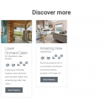
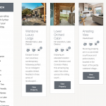
When viewed on an iPad the 3 column gird is very squashed. There are only 2 showing at the moment, we are due to add more shortly. Is it possible to have 3 columns on PC, and just 2 on iPad?
Worth an ask as we have done some digging about and couldn't find anything ref this.
Thanks, P
Hi Pete,
Thank you for contacting us and I'd be happy to assist.
Since the view in question is using Bootstrap to control the grid layout, this can be easily achieved by adjusting the grid class names.
In your view's "Loop Editor" section, you'll see one or more instances of div with class "col-sm-4".
Example:
You can update all those instances to:
<div class="col-md-4 col-sm-6">
In Bootstrap's grid system, the available width is distributed in 12 equal columns. The div with class "col-sm-4" means that the individual item should be shown covering 4 of those columns ( 1/3 ), on small and large screen devices.
When you'll change it to "col-md-4 col-sm-6", it would translate to using 4 columns (1/3 ) on medium and large screens, but use 6 columns ( 1/2 ), on smaller screens.
I hope this helps and you can learn more about the Bootstrap's grid layout from its official documentation:
hidden link
regards,
Waqar
Thank you Waqar,
Didn't know you could add more than one class like this, resulting in the layouts being adjusted depending on the screen size.
While Toolset seems 'crazy' complicated, it's certainly very flexible.
Thanks for your help ref sorting this 🙂
Have a great day. Pete
Sorry to reopen this however I have tried what you suggested on another page and it doesn't work like it did on the previous page.
On this page: hidden link
I have added to the Loop Editor, the same however on smaller devices the grid maintains 3 cols wide rather than going down to 2.
This is the rived code with the col-sm-6 added:
<!-- wpv-loop-start -->
<wpv-loop wrap="3" pad="true">
[wpv-item index=1]
<div class="row ">
<div class="col-sm-4 col-sm-6">[wpv-post-body view_template="loop-item-in-home-page-search-bar"]</div>
[wpv-item index=other]
<div class="col-sm-4 col-sm-6">[wpv-post-body view_template="loop-item-in-home-page-search-bar"]</div>
[wpv-item index=3]
<div class="col-sm-4 col-sm-6">[wpv-post-body view_template="loop-item-in-home-page-search-bar"]</div>
</div>
[wpv-item index=pad]
<div class="col-sm-4 col-sm-6"></div>
[wpv-item index=pad-last]
<div class="col-sm-4 col-sm-6"></div>
</div>
</wpv-loop>
<!-- wpv-loop-end -->
Hi Pete,
Thanks for the update and glad you liked the Bootstrap grid's flexibility.
On your other page ( hidden link ), I've noticed that class names used for the wrappers are:
<div class="col-sm-4 col-sm-6">
Please update them all to:
<div class="col-md-4 col-sm-6">
regards,
Waqar
Goodness, just when Toolset couldn't get anymore complicated 🙂
That worked...I guess...thank you.
Is there a way fo changing the breakpoint for just this grid?
On a smaller laptop the grid starts to get squashed 'before' they grid snaps to two columns wide.
If not, I'll need to rethink if two wide would be better than 3.
Worth an ask.
Thank you Waqar.
My issue is resolved now. Thank you!

