I am trying to: Use a repeatable group and display this in a content template using Views. The images are appearing (the two 50% images towards the bottom of the page), however there seems to be left padding added to the row, and I can not figure out where this is coming from.
Link to a page where the issue can be seen: hidden link
As you can see on the page, I am in general struggling with the layout – I am using VC for the content template, but for some reason the content looks really strange. Once you resize the browser window a little, it resizes itself. Some of the content is also contained in one small area of the row, rather than being full width.
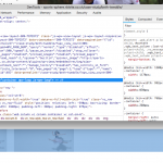
Okay let's try to figure out what's happening. I don't see any left padding applied to the row, what I see is a Bootstrap container element, which is a fixed width, centered in the window. (beth-1.png)
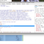
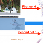
Then a row inside that container, and two divs in that row set to 6 columns width. (beth-2.png) Each of those two columns have some horizontal padding - that's part of the Bootstrap grid system. So I don't see any abnormal padding here, I just see that your View results are contained in the div with the "container" class. Is this not what you're expecting? If not, what do you expect instead?
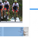
If I resize to a smaller browser, I can see some strange things happening. It looks like the images are not resized effectively at lower screen sizes. This is causing them to spill outside the bounds of the Bootstrap columns described above. (beth-3.png) I added some responsive classes you can see in that pic of the inspector, but you can get the idea. The blue area is the bounds of the row. I'm not clear what is happening here but it appears that the combination of Visual Composer's column system and Bootstrap's column system isn't producing the desired results.
Please edit this View and copy all the code from the Loop Output editor. Paste it in your next reply for me to review. Then edit this Visual Composer Content Template and take a screenshot showing the entire editor. I would like to see how this is configured.
Hi Christian,
Code for Views attached:
<p>[vc_row full_width="stretch_row"][vc_column width="1/2"][vc_column_text]{!{types field='left-image-col-6' title='%%TITLE%%' alt='%%ALT%%' align='center' size='full'}!}{!{/types}!}[/vc_column_text][/vc_column][vc_column width="1/2"][vc_column_text]{!{types field='right-image-col-6' title='%%TITLE%%' alt='%%ALT%%' align='center' size='full'}!}{!{/types}!}[/vc_column_text][/vc_column][/vc_row]</p>
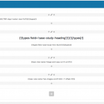
And also a screenshot attached of VC content template.
Is it worth ditching VC and using solely bootstrap to achieve the desired result? Let me know what your thoughts are.
Apologies, I didn't get back to you on what I want to see – I would like everything to be centered – it seems I am having an issue where I have two col-6 and then within one of those is my content, hence why it is off to the side. It should really be one image in one col-6 and then other image in the other col-6. So you have two images that essentially fill the width of the page.
Is it worth ditching VC and using solely bootstrap to achieve the desired result?
I would not use VC grid code in the View. The Bootstrap and Visual Composer grid systems are not designed to work together this way, and are bound to cause problems in responsive designs. I'm not a Visual Composer expert so I'm not able to offer much responsive design advice using their software, but I do have more experience with Bootstrap and would be able to provide more guidance.
It should really be one image in one col-6 and then other image in the other col-6. So you have two images that essentially fill the width of the page.
Only one col-6 has content right now. It looks like the View is placed inside the first col-6? Or maybe there's a missing div tag somewhere? Screenshot attached.
