Skip Navigation

[Resolved] I’ve set view loop grid to 2 columns in tablet view, but it displays 3 columns

This thread is resolved. Here is a description of the problem and solution.

Problem:
I am having an issue with the grid settings in a view loop while using Toolset. I intended for three columns on desktop, two columns on tablet, and one column on mobile for my portfolio page. However, the tablet view is displaying three columns instead of two, affecting the layout.

Solution:
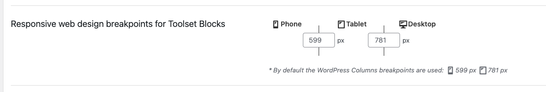
Adjust the responsive design breakpoints in Toolset. Go to Toolset > Settings > General and change the "Responsive web design breakpoints for Toolset Blocks" option to ensure the desired number of columns are displayed at various screen sizes.

Toolset settings

This is the technical support forum for Toolset - a suite of plugins for developing WordPress sites without writing PHP.

Everyone can read this forum, but only Toolset clients can post in it. Toolset support works 6 days per week, 19 hours per day.

This topic contains 1 reply, has 2 voices.

Last updated by Christopher Amirian 8 months ago.

Assisted by: Christopher Amirian.

Author
Posts
#2642171
outputshowing3columnstabletview.jpg
gridsettingsblocksettings.jpg

Tell us what you are trying to do?
I'm using the grid settings in a view loop to pull in content from custom post types created using toolset.
I have tried to get three columns on desk top (fine), 2 columns on tablet (shows three, which messes up the layout of each piece of content) and 1 column on mobile (seems to work okay). This is for my portfolio page.

Is there any documentation that you are following?
As far as I can tell I'm following the toolset documentation correctly and amending the 'grid settings' correctly with the right columns for different screen sizes.
I have looked at it live and also in the customizer, and I have also cleared the cache multiple times.

Is there a similar example that we can see?

What is the link to your site?
hidden link

#2642593

Christopher Amirian
Supporter

Languages: English (English )

Screenshot 2023-09-11 at 09.46.34.png
Screenshot 2023-09-11 at 09.43.46.png

Hi there,

I checked the front-end layout and the grid does what it is supposed to do. If you shrink the browser window, in the width lower than 782 pixels you will see that the two-column mode kicks in.

If you are interested in changing the breakpoint for the tablet devices you can do that by going to Toolset > Settings > General and change the Responsive web design breakpoints for Toolset Blocks option.

Please check the attached screenshots.

Thanks.

#2642685

That's brilliant, thank you. I had set the view settings in the theme, but didn't realise I could/should also do this in Toolset. Have now amended these and it's working great. Thank you very much, Christopher!

This ticket is now closed. If you're a WPML client and need related help, please open a new support ticket.