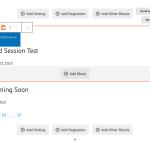
I'm getting some strange styling issues while using the "single field" widget in the Block Editor.
I have a Toolset container widget, with a single field widget inside. I've set all the margin and padding to the container and the single field widget to 0px for testing. No matter what I do, I can't seem to get rid of vertical space above and below the single field widget. Everything appears correct in the editor preview, but then on the actual page, additional space is being added. In the screenshots below, I had the outside container set to left align, but with alignment set to none I get the same vertical padding result(except the alignment changes as expected).
My guess is this is probably some kind of interaction between Toolset and the theme(we're using Astra), but I'm not exactly sure where to start looking.
The issue was the line-height settings of the text.

