Hi there,
I have been trying something and just cant get it right, I thought I was getting my head round using Bootstrap grids.
On this page: hidden link
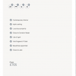
AT A GLANCE is a single column on desktop and phone. However on tablet (see image) I would like it two column.
I have added different bootstrap codes to try this and it just messes things up.
Any thoughts please?
Code I am using is below.
[wpv-layout-start][wpml-string context="wpv-views"]No items found[/wpml-string]
Minesh Supporter
Languages:
English (English )
Timezone:
Asia/Kolkata (GMT+05:30)
Hello. Thank you for contacting the Toolset support.
Can you please try to change the div class from:
To:
<div class="col-md-3 col-xs-6 col-xs-12">
Please check the following example:hidden link
Hey Minesh,
Thanks for the reply.
I have tries so many variation of this 🙂
Ok added your code however it messes up the desktop view and does nothing for tablet?
Check it our here: hidden link
Thank you.
Minesh Supporter
Languages:
English (English )
Timezone:
Asia/Kolkata (GMT+05:30)
So, you want to display two columns on a tablet and one column on mobile and on the desktop (as it is)?
Can you please share admin access details.
*** Please make a FULL BACKUP of your database and website.***
I have set the next reply to private which means only you and I have access to it.
Minesh Supporter
Languages:
English (English )
Timezone:
Asia/Kolkata (GMT+05:30)
Can you please check now: hidden link hidden link
I've adjusted the view's loop editor content as given under:
[wpv-layout-start]
	[wpv-items-found]
	<!-- wpv-loop-start -->
	<div class="container wpv-loop js-wpv-loop">
      <div class="row ">
	<wpv-loop wrap="2"  pad="true">
		[wpv-item index=1]
			<div class="col-xs-12 col-sm-6 col-md-12">[wpv-post-body view_template="loop-item-in-list-features-sidebar"]</div>
      	[wpv-item index=other]
			<div class="col-xs-12 col-sm-6 col-md-12">[wpv-post-body view_template="loop-item-in-list-features-sidebar"]</div>
		[wpv-item index=pad]
			<div class="col-xs-6 col-sm-12"></div>
		[wpv-item index=pad-last]
			<div class="col-xs-6 col-sm-12"></div>
	</wpv-loop>

	</div>
	<!-- wpv-loop-end -->
	[/wpv-items-found]
	[wpv-no-items-found]
		<strong>[wpml-string context="wpv-views"]No items found[/wpml-string]</strong>
	[/wpv-no-items-found]
[wpv-layout-end]
can you please confirm it works as expected now.
Perfect Minesh 🙂
Thank you for your time and help, I can finish styling this for mobile now.
Have a great day and thanks again.
My issue is resolved now. Thank you!
