Hi,
I am trying to use the Toolset Grid block with a left and right grid cell (2 columns) in desktop mode. On tablet and mobile I have 1 column and selected "Reverse Columns".
Link to a page where the issue can be seen: hidden link
I expected to see the left column to move below the right column on tablet and mobile.
Instead, it only worked on mobile. On tablet, "Reverse Columns" seems to be ignored.
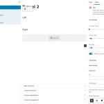
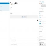
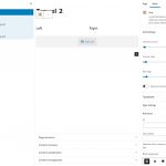
You can see my configuration attached.
I noticed you're already working on the Grid block but that seems to be a different issue: https://toolset.com/errata/cells-from-the-toolset-grid-block-disappear-on-tablet-size/
Hello,
I have tried it in my localhost with a fresh WP installation + the latest version of Toolset plugins, it works fine, I don't see the problem you mentioned above, see my screenshot grid-block.JPG
It should be a compatibility issue of your website, please try these:
1) deactivate all other plugins, and switch to WordPress default theme 2021, and test again
2) If the problem is fixed, activate other plugins/theme one by one, try to locate the problem plugin/theme
Hello Luo,
I can't see from the screenshot if it works on your end. Did you activate Reverse Columns for tablet and mobile?
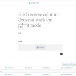
I have a test site with all plugins except Toolset disabled, and the 2022 theme activated. The issue still persists. Please see hidden link and the attachments. Tablet should look the same as mobile ("right" on top).
I can get you a login if needed, in case it can't be reproduced on your end.
Kind regards,
Arno
I can see the problem you mentioned above, but in the mobile + tablet devices, you are using options:
- Only one column
- enable option "Reverse columns"
There is only one column in the grid block, so option "Reverse columns" won't work as expected, I suggest you disable option "Reverse columns" in the mobile + tablet devices, so it should be able to work same as in admin side.
Yes, that's the setup. I didn't think about the strict definition of a "column". In any case, the same settings for mobile and tablet result in a different placement of the "columns" ("rows" in that case). It seems like something that can be fixed. It works as I expected for mobile, but not for tablet while the settings are the same.
Anyway, my goal is this: the "cell" that is on the right on desktop, should be on top on mobile and tablet. Is there an alternative way to do that?
The right cell will contain filters for a view with its output in the left cell, so it's kind of a standard setup to position the filters like that for desktop, tablet, mobile. I don't want the filters below the view results on tablet and mobile.
There isn't such kind of built-in feature within Toolset Grid block, the option "Reverse Columns" is designed for multiple columns grid, but in your case, it is single column grid block, it won't work as you expected.
As a workaround, you can use custom CSS codes to reverse the rows in tablets device, for example:
1) Add a CSS class name to the grid block: my-reversed-grid
2) Setup the custom CSS codes, like this:
@media only screen and (max-width: 781px) {
.my-reversed-grid{
display: flex;
flex-direction: column-reverse;
}
}
Thanks, I may give that a try. Although I prefer as few customizations as possible, so I may rethink the entire layout.
For others facing the same issue: I used a Kadence Row Layout block to solve this. It has a Collapse Order setting that can be set either "left to right" or "right to left", and this also works if 2 columns are stacked vertically on mobile.
I think the Toolset block should be able to do this too, but I'm happy to have solved this.
My issue is resolved now. Thank you!
