Dear Beda,
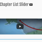
How can I fix the number of column in Table-based grid? I set the number of column as 4 and apply the Table-based grid in horizontal slider, each slider contain 4 post, if I have 5 video post to be showed, the first slider show the first 4 grid at evenly width, but when I click next to view the second page, the 5th video is showed full width across all 4 grids.
You can visit this hidden link and click the next or see my attached screenshot.
I want to keep 4 girds no matter how many post I have, if only one post to be viewed, keep 1 grid with content and 3 grids with empty content.
I manually hardcode the td with style="width: 25%" to fix the width of each td element. Is there any alternative solution suggested from Toolset?
<!-- wpv-loop-start -->
<table width="100%" class="wpv-loop js-wpv-loop">
<wpv-loop wrap="4" pad="true">
[wpv-item index=1]
<tr>
<td style="width: 25%">
[wpv-post-body view_template="Program Chapter List Slider - slide"]
</td>
[wpv-item index=other]
<td style="width: 25%">
[wpv-post-body view_template="Program Chapter List Slider - slide"]
</td style="width: 25%">
[wpv-item index=4]
<td style="width: 25%">
[wpv-post-body view_template="Program Chapter List Slider - slide"]
</td>
</tr>
[wpv-item index=pad]
<td style="width: 25%"> </td>
[wpv-item index=pad-last]
<td style="width: 25%"> </td>
</tr>
</wpv-loop>
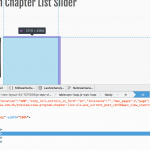
As you can see in my ScreenShot, the empty Grid Tables are there.
You can insert a Image, Placeholders or whatsoever in your Pad and Pad last section of HTML
Currently you insert No Breaking Spaces, and I would not use this for this purpose:
hidden link
Let me know if I misunderstood the issue
Dear Beda,
Sorry there is no screenshot from you. I find it is not necessary to add the non-breaking-space but must to set the style="width: 25%", is it the normal practices?
Best regards,
Kelvin.
I'm sorry, here we go with the screenshot.
If you fix the grid with 25% it means the GRID always will be that width, otherwise it will responsively adapt to your content.
Thanks
Dear Beda,
Ok, seem adding the width style is to fix the number of grid.
While we selecting the Table-based grid, it may be a bit misleading to the Number of columns, I assume this is the expected layout no matter how many post we have, of course the grid is responsively adapt the content but keeping the number of column.
I would suggest changing the title as "Max. number of columns" or adding an option "Fixed Grid Width" in the setting (see screenshot), if enable "Fixed Grid Width" always show number of column and using the solution I provided, otherwise contest is responsively adapt.
You can closed this ticket if you read this. Thanks a lot.
Best regards,
Kelvin.
This is not used to define the number off columns, but there width.
If you have wide content, those might get adjusted, but still you would have 4 columns.
If you fix their Width, those will display no matter the width of your content, with the give with.
The amount of columns in the table are defined via HTML by:
<tr>
  <td></td>
//Add more <td></td> to add more columns
</tr>
Since your content is empty, you don't insert any placeholders, and the Video obviously is wider natively, it stretches over the empty cells.
If you would add placeholders, those would "hold the place" and the last item (the video) would not stretch.
I hope we did not misunderstand each other 🙂
Dear Beda,
Thanks for you clarification.


