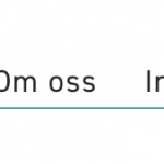
Trying to make the filter controls to horisontal boxes, or lists, but its not working as excepted. I believe I should not style the form anymore because it is very hard to make it work on every browser.
Search and Pagination
[wpv-filter-start hide="false"]
[wpv-filter-controls hide="false"]
<div class="form-group multitobox">
	[wpv-control-post-taxonomy taxonomy="category" type="multi-select" url_param="wpv-category" class="multitobox"]
</div>
[wpv-sort-orderby type="select" options="post_title" label_for_post_title="Navn" orderby_ascending_for="post_title"][wpv-sort-order type="select" options="asc,desc" label_for_asc="Ascending" label_for_desc="Descending" label_asc_for_post_title="Stigende" label_desc_for_post_title="Synkende"]
[/wpv-filter-controls]
[wpv-filter-end]
Upload a screenshot on how I want it, and how it turns out. If its not possible it would be great they turn into boxes.
This is what I have tried to far, but apperently only works in Chrome and not Safari:
CSS
 /* Checkbox to box */
 .multitobox option {
    display: inline;
    padding-left: 10px;
    padding-right: 10px;
    border-bottom: 1px solid #20A7AE;
    font-size: 18px;
 }
 .multitobox option:hover {
     color: #20A7AE;
 }
.multitobox option.selected, .multitobox option:checked {
      border-bottom: 2px solid #20A7AE;
      font-weight:600;
      background: white;
 }
 select:-internal-list-box option:checked {  background-color: red!important;}
  .multitobox option:focus {
    font-weight: 600;
    border-bottom: 2px solid #20A7AE
 }
 .multitobox option::selection {
 }
 select.multitobox {
    overflow: hidden;
    padding: 0;
    margin: 0;
    height: 50px;
    border: 0;
    text-align: center;
    margin-top: 15px;
 }
Any guesses how I should solve this?
Hi there,
Thank you for contacting us and I'll be happy to assist.
My suggestion would be to change the type of this taxonomy filter to "checkboxes" ( from "multi-select" ):
[wpv-control-post-taxonomy taxonomy="category" type="checkboxes" url_param="wpv-category"]
This way the functionality of the filters will remain the same, but you'll find that the checkboxes are much easier to style, ensuring the cross-browser compatibility.
The actual "input" tags of the checkboxes can be hidden using "visibility: hidden;" CSS property and you can style the "label" tag as needed.
To differentiate between the checked and un-checked options, you can use a custom script, to add/remove an additional class to "label" tag.
( example: https://stackoverflow.com/questions/14468156/if-checkbox-checked-add-class-to-parent-element )
I hope this helps and for more personalized suggestions and recommendations around custom CSS and scripts, you can consult specialized forums like:
https://stackoverflow.com/
hidden link
regards,
Waqar

