This is the technical support forum for Toolset - a suite of plugins for developing WordPress sites without writing PHP.
Everyone can read this forum, but only Toolset clients can post in it. Toolset support works 6 days per week, 19 hours per day.
This topic contains 3 replies, has 2 voices.
Last updated by hernanL 3 years, 7 months ago.
Dear Toolset team,
I'm learning about web design and I consider Toolset an amazing tool! I have a couple of questions that maybe you can help me
To learn I have created the following web page:
hidden link
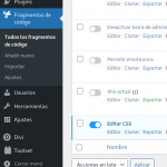
I can provide admin username and password with no problem. By the way the toolset view is on the "raw-grid-original-built-with-blocks" page, what is on the homepage is just a divi module (it works basically as a shortcode, please don't consider this page). The CSS code is in snippers (The Snipper is called "Editar CSS")
My first doubts are small, they are details that I have not been able to resolve:
1- I can't give a central alignment to the grid. I would like the last two elements to be centered so there are never any lonely elements left (I think it would be a fantastic addition to a future version of Toolset, a lot of people should be looking for that finish)
2- I have centered text by CSS in hover effect but for some reason some words move slightly to the right, the code seems correct
3- What is the best way to make the grid full width? I was able to achieve the effect by using (or abusing) the divi module on the HomePage, but in my heart I know that it is not the best practice and in the future it may cause a problem
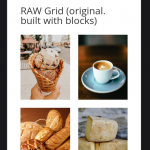
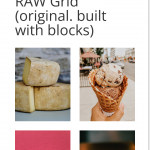
3- Perhaps the most difficult problem that I am facing, the number of columns that I have indicated in the block constructor are not respected on mobile devices. This is very strange, in the browser (applying responsive mode) all the CSS styles and the number of columns are applied as I have indicated in the constructor. But testing the URL on a real smartphone doesn't work. All images appear one after another
PS: I intend for mobile devices to be two columns, occupying the best possible space (that's why I need a good way to make the grid full width). On mobile devices I would like to occupy the hover effect in a merely decorative way, occupying a white icon that in some way supports the real project
By the way I'm learning, if I'm doing something wrong I appreciate being corrected, any advice is very welcome
Thank you very much
Cheers !
Nigel
Languages: English (English ) Spanish (Español )
Timezone: Europe/London (GMT+00:00)
Hi there
let me give you some feedback on each point.
Q1. If you mean that you would like the two items on the last row of the grid to be centred (empty grid positions on the left and the right) then that's not possible, without writing some custom JS to manipulate the markup, as you essentially need to insert an empty grid element in the third-from-last position, and only when there are two elements on the final row (not one, not three; I'm not sure what happens in those cases).
Q2. You have absolutely positioned the text in the center (top: 50% and left: 50%) and then applied a negative left margin (-25px) to shift the text over to the left a bit, which would only centre the text when it was exactly 50px wide.
Check hidden link for ideas on how to centre the text.
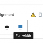
Q3. When you have the View block itself (not one of its nested blocks) selected, in the sidebar settings you should be able to set the block alignment to Full Width (screenshot).
Q3. I visited your test page (with the View) on my mobile phone and the grid displays in 2 columns, as intended (screenshot).
Thank you very very much !
I have more clarity regarding how toolset and CSS work, I feel almost ready to jump into my real project. Also thank you very much for the article, I was able to center without problems (using transform: translate), I'm going to study it to have a better understanding of CSS. Something curious happens to me with mobile devices, I have noticed that the modifications I make appear on mobile several hours later (for now I can live with that mystery, until now I have had consistency between what the browser shows in responsive mode and what finally appears on mobile devices)
The only thing I still can't figure out is that I can't get to the full width. I found the option you mention in Astra Theme, but it doesn't appear in Divi Theme. I would like to make the effort to stay on the Divi Theme (Astra looks like a great theme, but in Divi I have full control as a newbie) what would you recommend?
Thank you very much !
I think I have got ! the Toolset module itself in Divi has the option (now that I've taken a closer look at it, it's actually quite a bit more advanced than just a shortcode). The only thing to do is to modify the row (not the module itself) with widths at 100% (and max width) the result looks good. (by emptying the cache on the page I can force the update of the changes on mobile devices)
I am very happy with Toolset and with the help received, I have learned a lot and I am getting closer to my goals
Thank you very much !!! You are the best !!!
