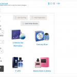
Tell us what you are trying to do? I am creating an archive view for a custom post and the default behaviour seems to have the search buttons on the top row.. I'd like to have a view with 2 columns and the one of the left should have the search fields to filter while the column on the right should display the VIEWS..
I can't seem to add a column and move the search fields to the column as it says that the search fields should be within the ARCHIVE LOOP or something like that..
Is there any documentation that you are following?
Is there a similar example that we can see?
What is the link to your site? hidden link in this view you will see the two search fields are above the VIEW .. i'd like them to be on the left.. please advise
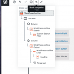
Hi, normally you would create a two-column block below the Archive Output block, then you can drag the Archive Search block into one column and the Archive Output block into another column. It sounds like you might have the columns blocks inside the Archive Output block, which is a problem. As the message says, you cannot place the Archive Search block inside the Archive Output block. You should move the columns block outside the Archive Output block, then you can drag the Archive Search block and the Archive Output block into two separate columns. See the Block Navigation menu here.
Hi Christian
Thanks for the update..:-)..
yes, you are right.. that option of creating a column under WORDPRESS ARCHIVE block but above WORDPRESS SEARCH and WORDPRESS ARCHIVE OUTPUT works... but it's a real pain to create that column... everytime I tried to add it would automatically create it under the SEARCH or the ARCHIVE OUTPUT and then if I tried to drag and move this to under the ARCHIVE it would disappear.. is this normal? Please advise.
Finally by some luck/chance clicking on the right + sign I could directly create a column under the ARCHIVE output..
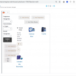
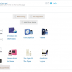
but this column like earlier would not stretch full view and I did drag and drop the search and archive output to work properly but as the WHOLE COLUM BLOCK is occupying 1/3rd of the whole screen the internal columns are way to narrow to really select the custom fields.. I managed somehow and here's the result
hidden link
But while editing it, could you please suggest if there was an easier way to add the column below the ARCHIVE and if the column width while editing the archive could be full width .. I am attaching a screenshot to show you how cramped it currently is and you would understand what I am working with..
Also is there a way to show the TOTAL number of products that this view shows as a number that I could display on this view? maybe in the search section.. I could show something like 'There are 1,300 products' and each time the submit button is triggered and the search number is different the newer number would reflect.. please do advise.
Regards,
Alim
Hi Christian
I wanted to add a search filter that is the BRAND of the product.. which is not a part of the custom post type but it has a relationship with the BRAND.. this field shows an error 'The ancestors attribute is missing'.. but I am not sure how to show this attribute.. please advise.
Regards,
Alim
Yes, the column can be full-width. I can see at the top of the screen in your screenshot, you have "mobile" selected. That's why the screen is so narrow. You should select the desktop width to design the display for full width devices. You can choose different devices at the top of the screen to design different displays for different devices.
You can use Views shortcodes to display the number of results found with pagination:
Showing [wpv-items-count] posts of [wpv-found-count] posts found.
https://toolset.com/documentation/programmer-reference/views/views-shortcodes/#wpv-found-count
I've split your question about post relationship filters into a separate ticket. We try to keep tickets limited to one topic, and I would like to focus on the Block Editor's column design in this ticket.
Hi Christian
Thanks for the update... :-)..
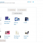
you were right about the mobile view but it seems when I move from mobile to tab to desktop, there's not much extra space occupied by the view.. it seems to remain the same...
Please check my screenshot and advise.. I think I am doing something wrong...
Regards,
Alim
My issue is resolved now. Thank you!
